Design-minded: the importance of visual consistency
For the same reason I don’t cut my own hair or fix my own car, I generally discourage do-it-yourself design and branding. It’s a job best left to a professional. But then again I do, on occasion, cut my own hair. So I shouldn’t be surprised if there’s a barber somewhere designing himself a logo or using an old copy of PageMaker to lay out one of those snazzy hair-do selector catalogs.
It’s for that barber, or anyone else in this generally poorly designed world we live in, that I post the first in a series of basic principles and practical approaches to design called “Design Minded.”
No matter who you are or what your business is, there are a couple things that you can do right off the bat to bring a semblance of order to your visual identity.
It doesn’t require hiring a branding firm (although eventually you might want to consider it) and doesn’t have to cost a lot of money. What it will require, however, is discipline.
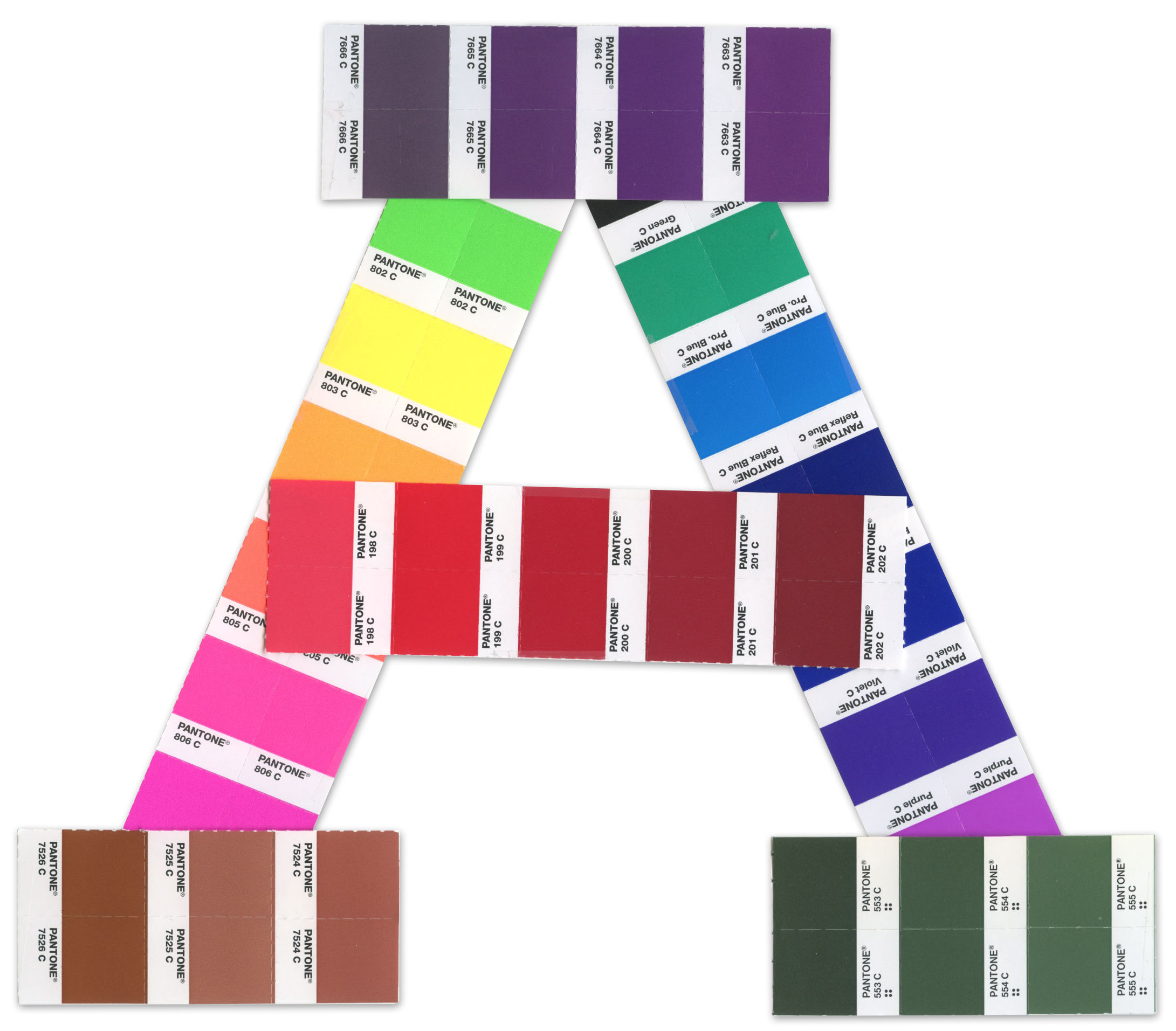
Pick a color. Any color.
First, choose a color. Chances are that one has already been chosen for you. Either way, settle on one that works for your organization. As a designer, I can tell you that a lot goes into selecting colors for a brand identity. However, your goal in this exercise is consistency, plain and simple. The fact that white is the color of mourning in Japan, but in Egypt it’s orange is neither here nor there. You can sidestep the nuances of color theory for now.
In a nutshell, choose a color that you can live with, one that reproduces well and isn’t the same color your direct competitor uses.
Choose a font. There are millions of them.
Well, there are. But you can probably discount half of those up front. Fonts based on bent paperclips, donuts, or the Klingon language probably aren’t the most practical of choices. Also, avoid using something that came preloaded on your Dell, dude. System fonts, while widely accessible, tend to be overused for the same reason. Websites like typography.com or fontfont.com are good places to acquaint yourself with the different font families and styles. When you find one that fits, buy a license and get going.
The trick here is legibility and functionality. You don’t need a lot of dingbats and flourishes. You need a typeface that will confidently and coherently deliver your message.
Apply generously, rinse, and repeat.
By far, the biggest challenge for the untrained when tending to a visual identity is the temptation to “try something different.” Picking colors is fun. Choosing typefaces, a treat. But the time will come when you look around and say, “Hey, if the New York Yankees can make a baseball cap in red or teal or florescent green, maybe we should get more creative with our stuff!” RESIST THIS URGE. This is when bad things will happen. Instead, armed with your font and color, and a logo if you have one, set out to be as consistent, expected, and repetitive as possible.
It sounds counterintuitive, but the objective is consistency, not creativity. Use the same logo, in the same position, with the same font in the same color. Do it over and over. Relentlessly.
Taking these steps will begin to establish a consistent baseline for your visual communications, which is a lot more than many organizations can claim. Your customers will more easily recognize you. You’ll begin to build equity in your singular logo, font, and color. And you will set the stage for a future opportunity to sit down with a branding expert to figure out how to take things to the next level.
