Origin International was a startup with a heavy load to tow. Its business plays an important role in environmental sustainability but can be easily misinterpreted given oil’s reputation for being a dirty pollutant and a lack of awareness that it can be recycled and reused. Origin had to promote itself to both customers and investors, while also appealing to the communities in which its plants were located. To help Origin achieve its communication goals, Thinkso created a visual identity that is direct, clean, and green, as well as messaging in the same vein. Collectively, the brand elements position Origin as a modern, forward-thinking company whose work helps protect the environment and supports the communities in which it operates.
“Our branding sends a strong message of sustainability to investors and the community while also imparting an industrial practicality that our customers can relate to. ” Nicholas Myerson, CEO, Origin International Inc
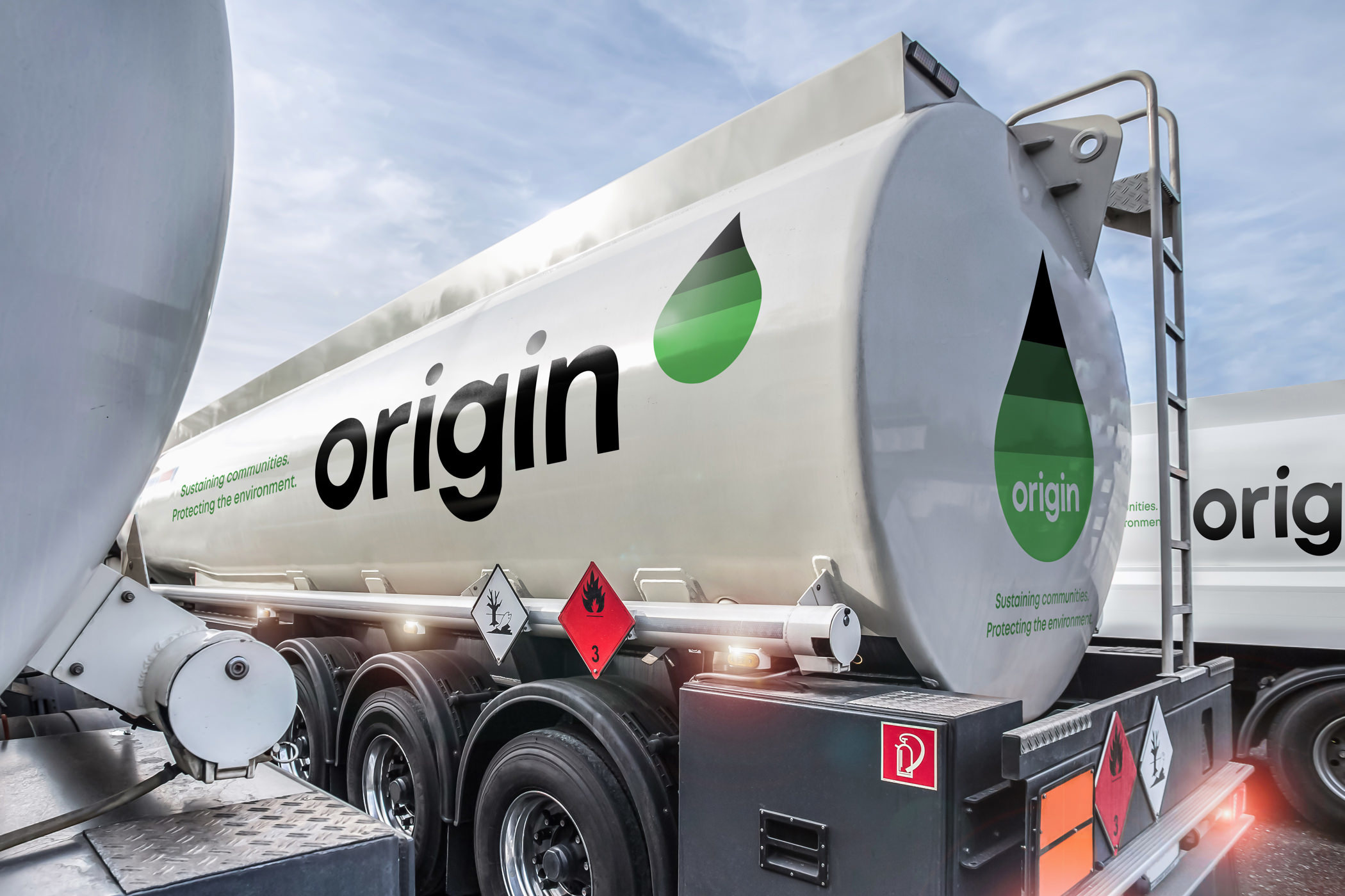
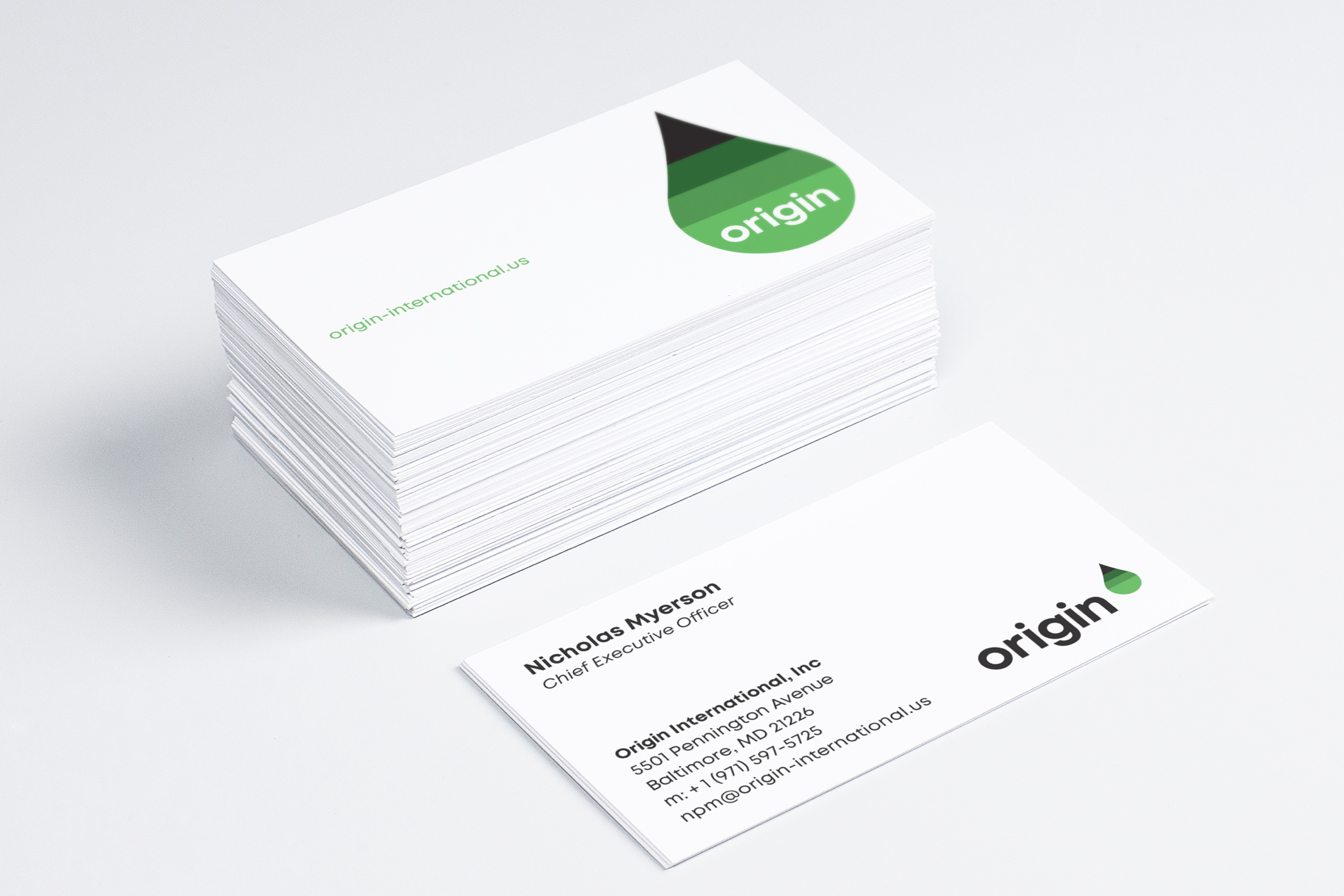
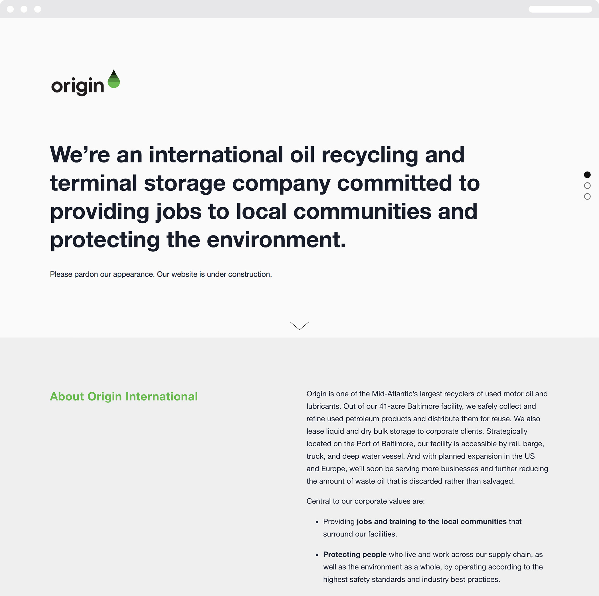
The Origin brand identity utilizes a crisp color palette, custom typography, and iconography, all of which communicate both industrial strength and sustainability. The droplet symbol depicts a simple concept—the filtration and refinement of used oil and its conversion to a new, recycled resource.
In addition to basic elements such as business stationery and an interim website, we also explored designs for the company’s storage facility on the Port of Baltimore and a new fleet of trucks that collect used oil and transport it for processing.