Named after Max Warburg, a brave and determined young man who lost his battle to leukemia at age 11, the Max Warburg Courage Curriculum offers year-long language arts programs focused on reading books that inspire courage in young people. Since its inception in 1991, the program has expanded tremendously, reaching 99% of Boston public middle schools, as well as schools in Cambodia, the United Kingdom, and countless other locations around the globe. As the curriculum’s founders looked to further extend its reach, they realized they needed a suite of professional marketing materials. After becoming Thinkso’s 2015 Give a Brand! winner, the nonprofit received a vibrant new identity, complete with an engaging website and fundraising tools.
With the help of our sponsors, Thinkso completed Max Courage’s rebrand in one day. Here’s a look at the highlights.
We shortened the organization’s name to "Max Courage," which references “maximum” transformation and honors Max Warburg for being the superhero-like inspiration that he is.
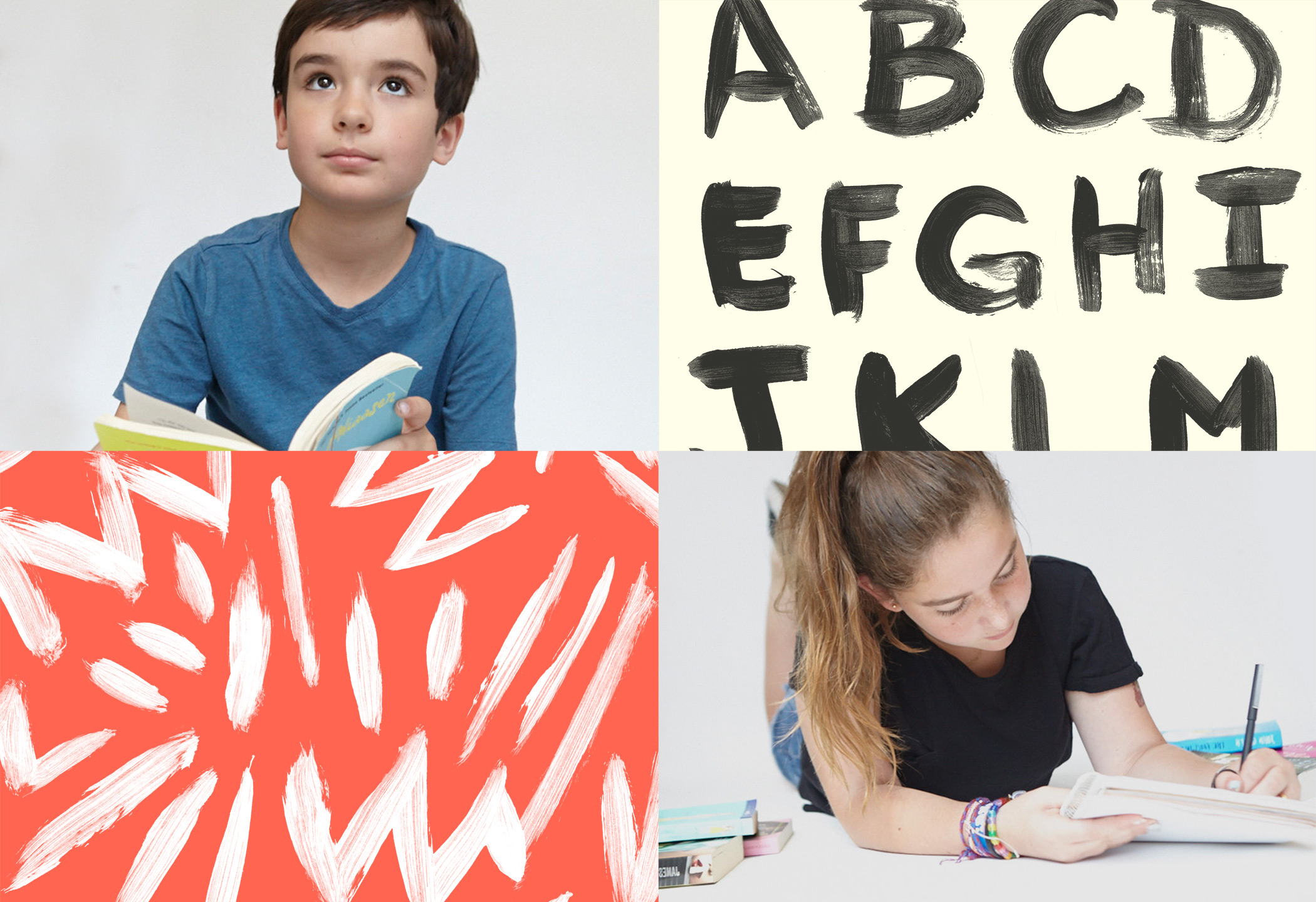
Images of children reading, photographed by Matthew Septimus, establish a focal point for the marketing collateral. In turn, those same children helped create the patterns and hand-painted typography that became key graphic elements of the identity.
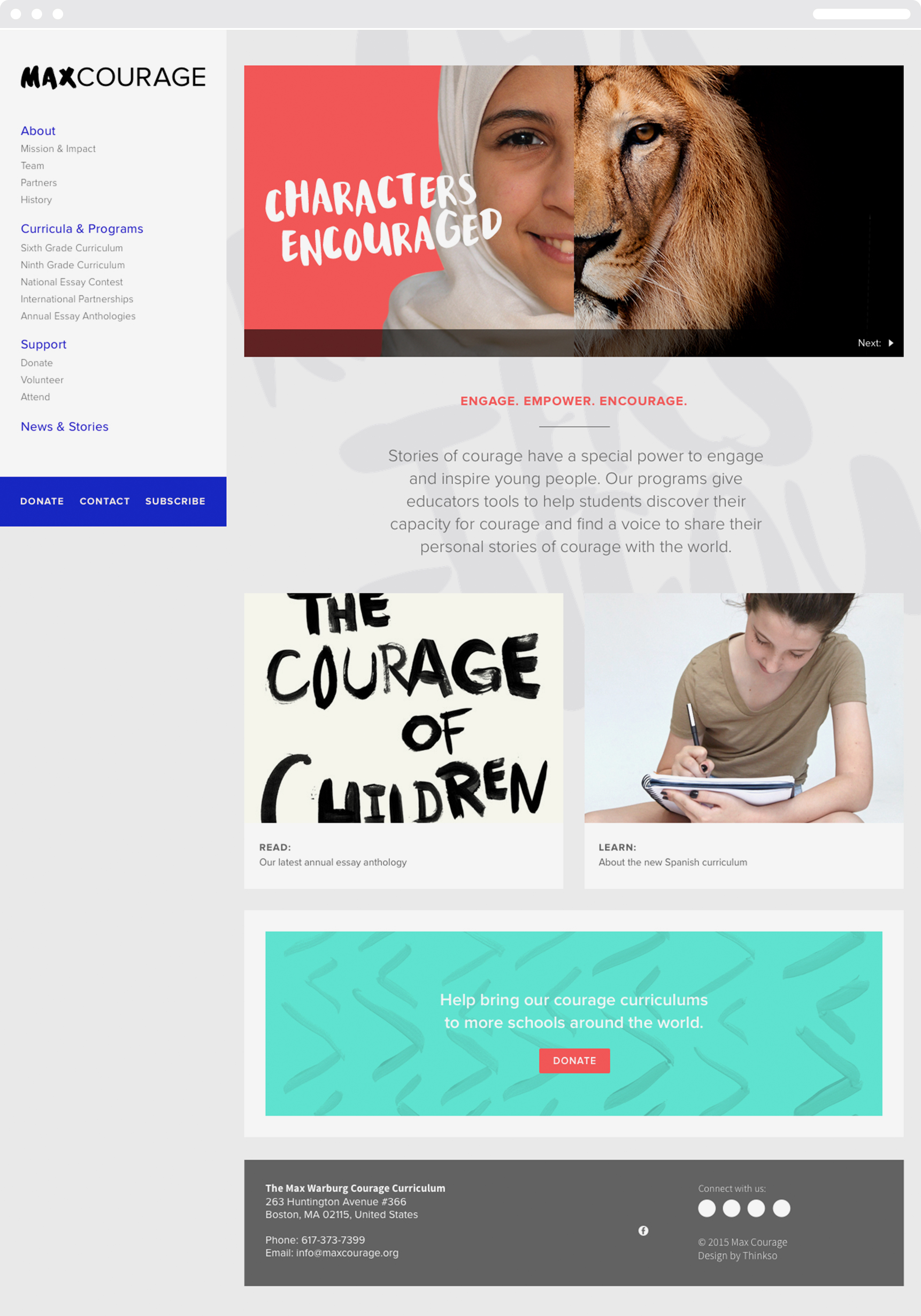
With web development partner Surprise Highway, we designed a clean, highly functional website that completely reorganized Max Courage's online content.
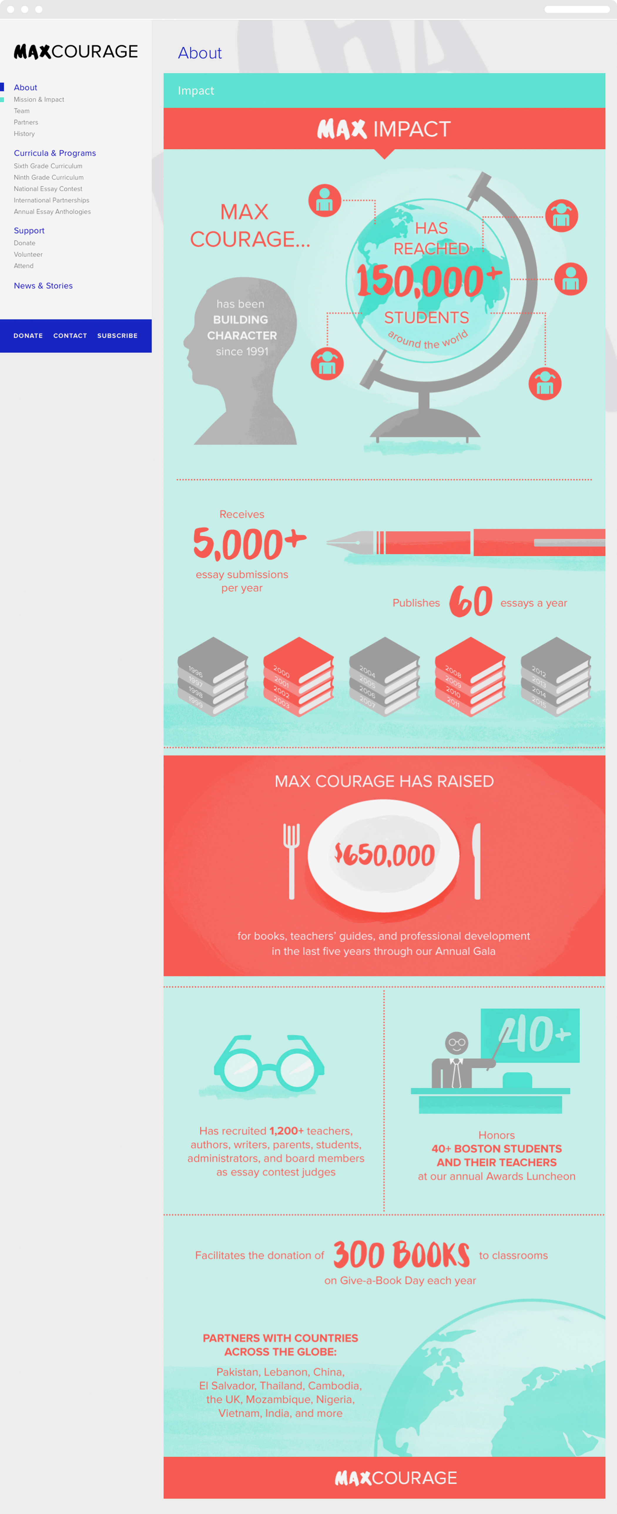
Textbook-like iconography and Max Courage identity elements are used as an overall visual approach to distilling information, presenting statistics, and engaging readers.
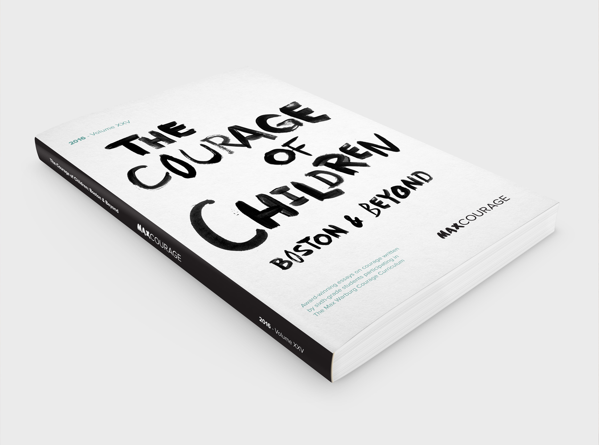
We redesigned the book cover for The Courage of Children: Boston and Beyond
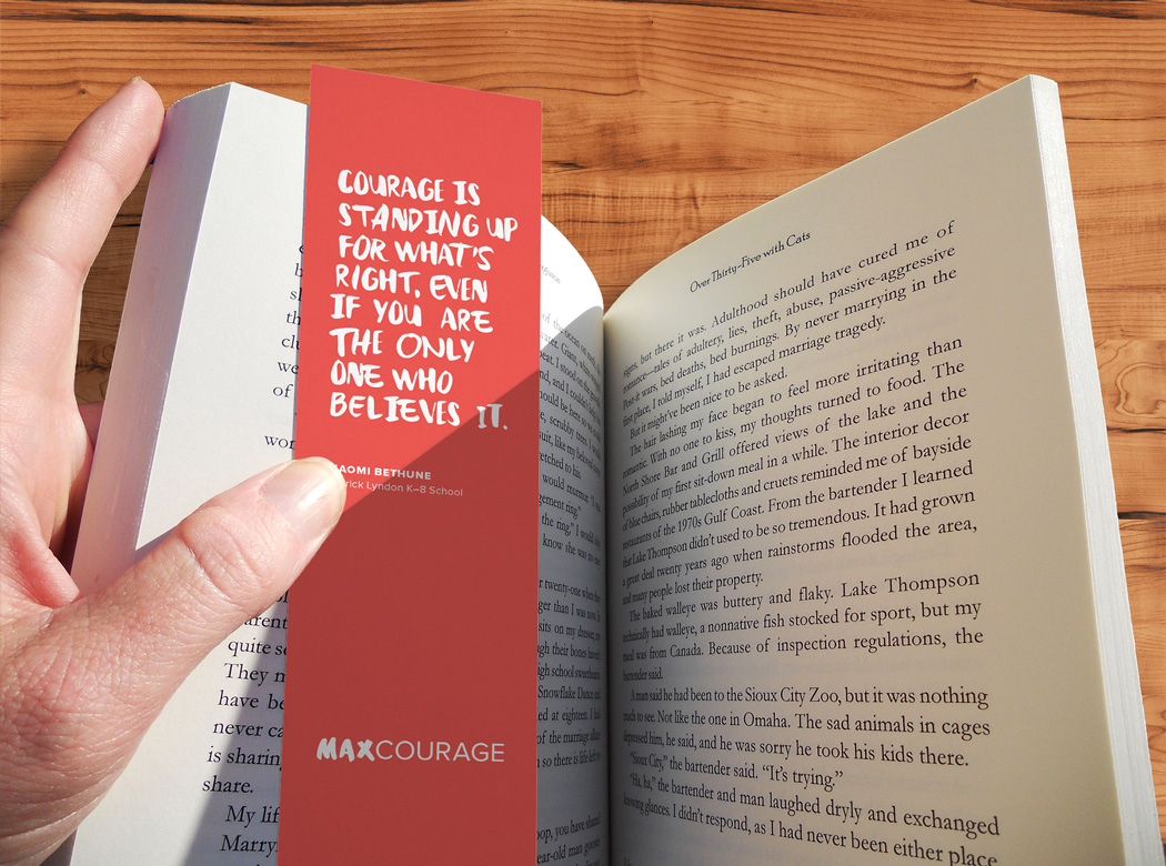
Simple, inexpensive bookmark giveaways were created in multiple colors and feature courage-related quotes from students.
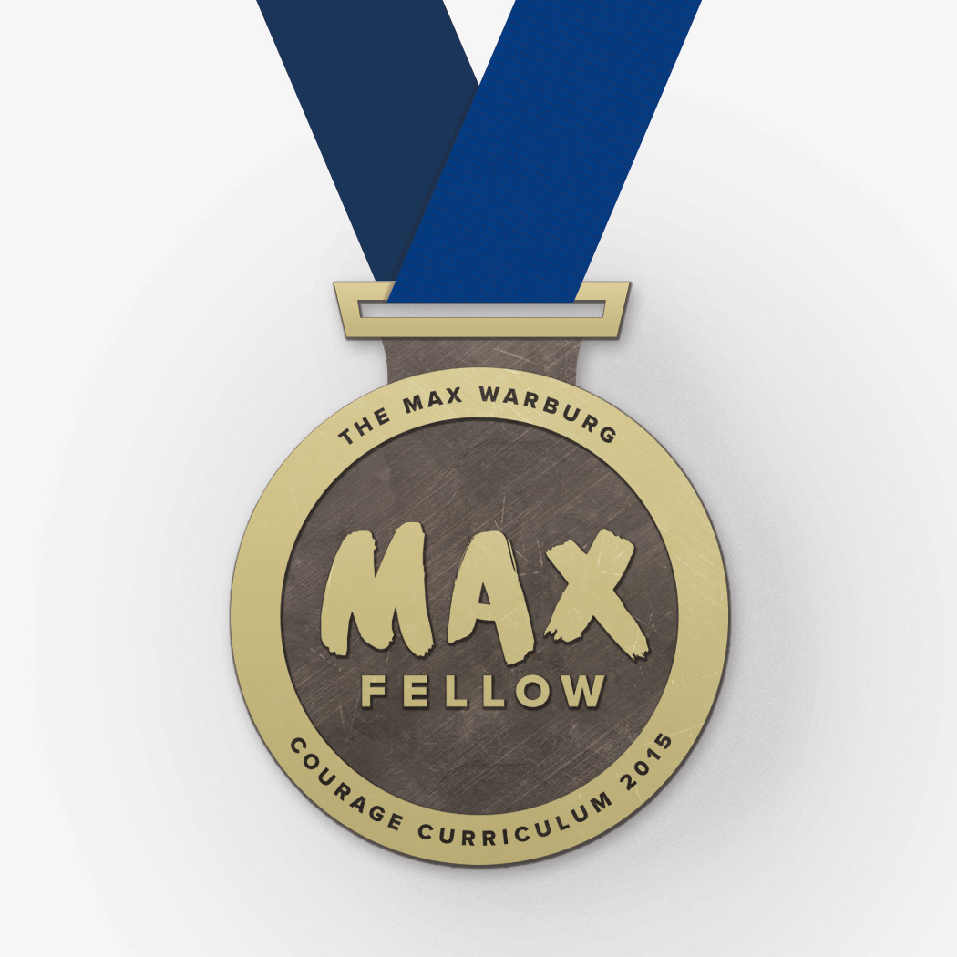
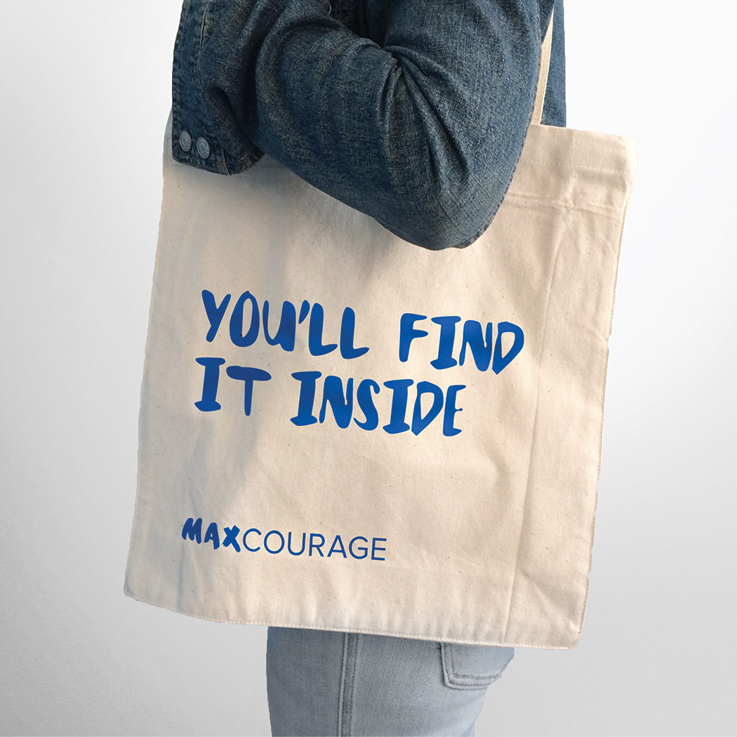
We redesigned the Max Fellow medal to better reflect the achievement it represents. The treatment of the name also established a model for sub-branding. The tote bag combines “Max Courage” with clever editorial to create messaging that’s both literal and inspirational.
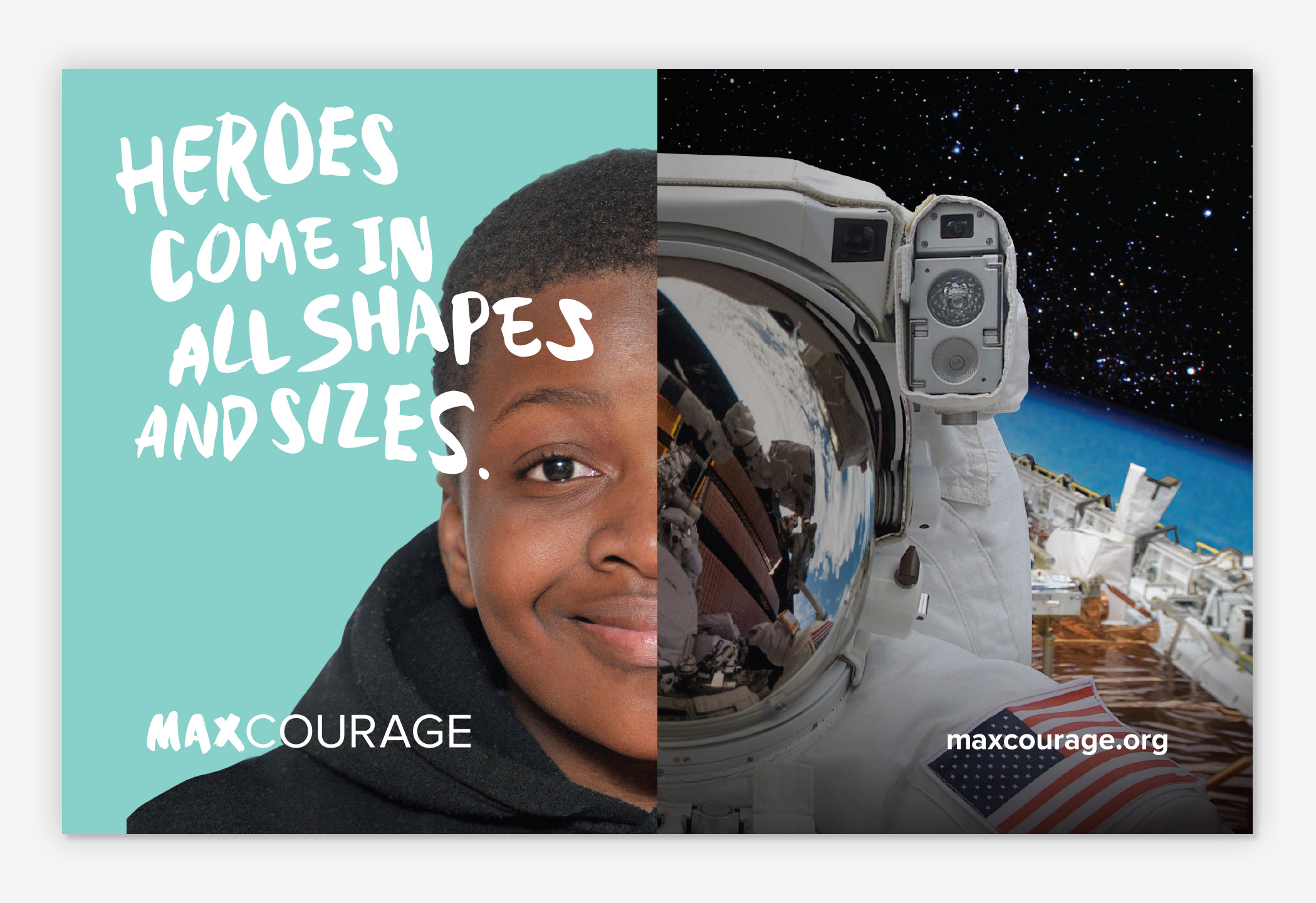
A series of split-screen photo illustrations pair children’s faces with characters from literature to underscore the power of literature in the development of personal courage.
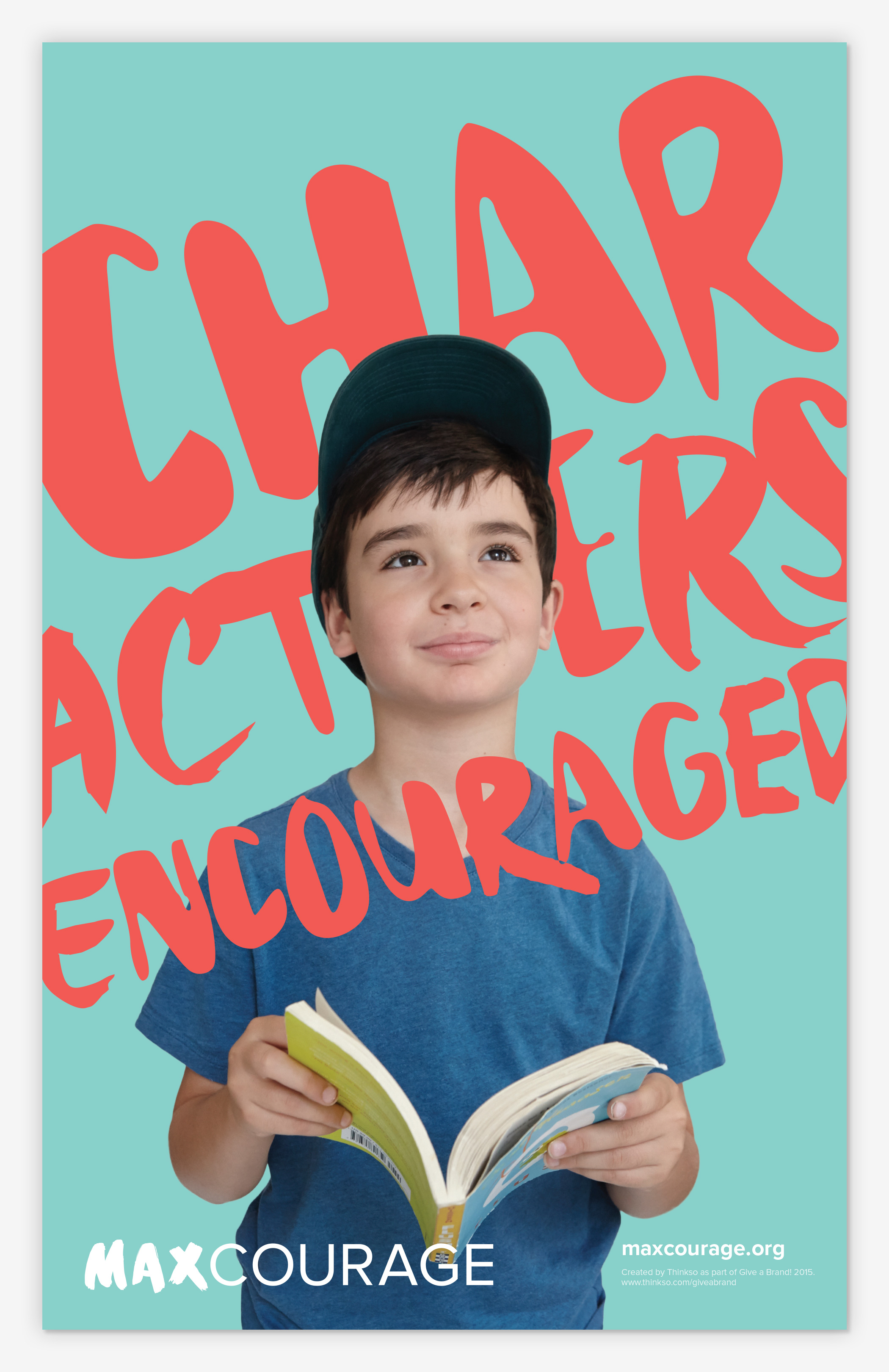
The overview brochure includes program information and unfolds to reveal a poster that boldly displays the organization’s new tagline, “Characters encouraged.”