Texas-based plastic manufacturer, Rodeo Plastic Bag & Film, had hired a young, energetic president to breathe new life into the company. On a mission to inspire passion for sustainable plastics, Rodeo’s new president chose Thinkso to reimagine their brand identity. To carve out their unique space as an eco-friendly manufacturer within a tough-as-nails market, we crafted editorial messaging and design elements that underscored product durability first and sustainability a close second. We executed this messaging with an editorial voice that infused humor and a healthy dose of Texas-twang. With a revitalized identity, website, product packaging, marketing collateral, custom photography, and branded gear, we helped Rodeo position itself for entry into the retail market.
BACKGROUND
Family-owned Rodeo Plastics had a great product on their hands — sturdy plastic products made almost exclusively from post-consumer recycled material — all produced locally and sustainably in Mesquite, Texas. But their identity and marketing collateral were falling flat, failing to harness the aspects of their brand that truly differentiated their product. Rodeo’s new president was eager to dust off the 30 year-old brand and make a shift into the retail market. He brought in Thinkso to reposition and reinvigorate the brand by telling their story of rugged responsibility.
“The rebrand tells our unique story with clarity and impact. With it, we’ve renewed our credibility in the eyes of our customers and employees—spearheading our entry to the national retail market.” Scott Coleman, President, Rodeo Plastic Bag & Film
APPROACH
Rodeo had a lot going for them. All of their products are made in the U.S., and they are the only industry player to manufacture construction grade plastics containing up to 90% post-consumer recycled material. We knew we had to be delicate in our approach to framing the sustainability aspect. After all, this market had no space for a product perceived as weak or substandard in the name of eco-friendliness. To appropriately balance these pillars, we developed messaging that positioned the brand’s products as industrial-strength, rugged, and resilient that also happen to be recycled, environmentally sustainable and EPA-compliant. In our editorial voice, we incorporated humor and classic Texan-style idioms to resonate with customers and pay homage to Rodeo’s homegrown roots, without resorting to the played-out “MADE IN AMERICA” cliche.
Rodeo’s new website would primarily function as a catalog of product specs. But to pump some energy into this otherwise drab subject matter (and thus stand out), we continued to communicate core messages by using clever Texan-isms, like “Tough as nails. Green as grass.”, throughout the website’s editorial. The site’s programming budget was limited, so we built the site on Squarespace, customizing the template. The resulting site is unique to Rodeo with an organized navigation and professional look and feel, all achieved without breaking the bank.
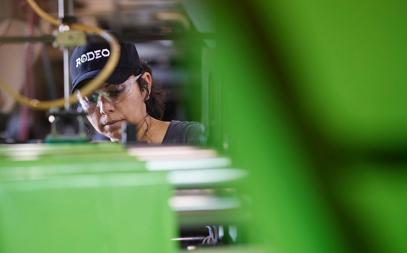
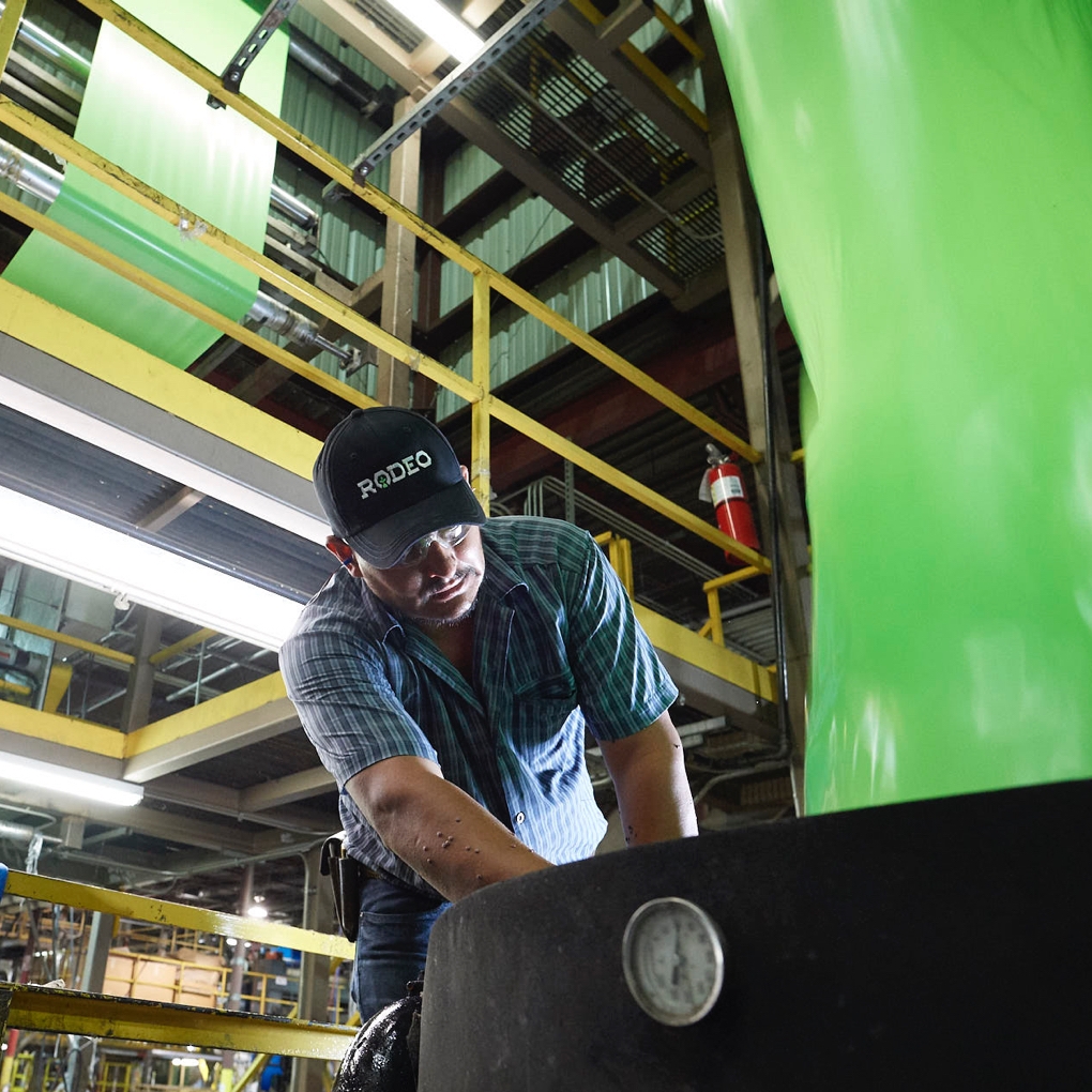
We carried this “rugged, but eco-friendly” position through all deliverables and set the brand apart from a sea of yellow and orange by introducing fluorescent green and black as their signature brand palette. The new logotype features a vibrant, young seedling nestled in a protective scaffold of custom drawn typography — inspired by horseshoes and cattle-brands. Never afraid to get our hands dirty, we traveled to Mesquite to collaborate with prolific Texan-photographer Tom Hussey to produce a beautiful library of photography featuring Rodeo’s hardworking staff in their element.
RESULT
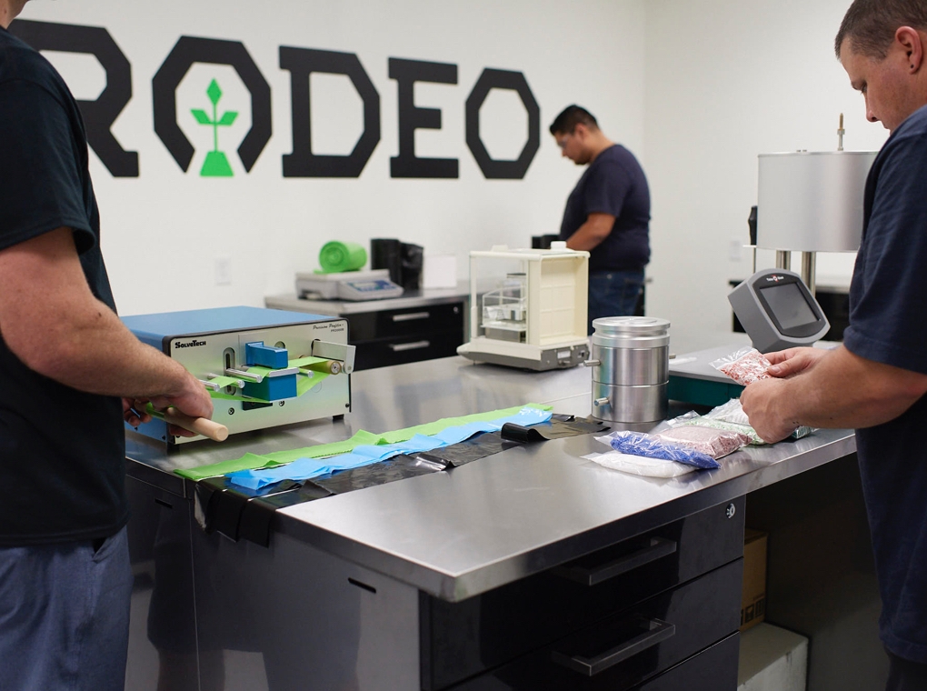
The rebrand caused just the kind of ruckus Rodeo was hoping for. It boosted morale among employees who were not only thrilled to be centerstage in the company’s new look, but took immediate pride in their new, branded gear that was distributed far and wide. Sales people and executives were energized by the fact that Rodeo’s unique story had finally been composed in a way that did their products justice — and immediately set upon using them to get a foot in the door with new retailers. Finally, we worked with company leadership to coordinate the launch of the new identity with other high-profile initiatives, such as the debut of a new, state-of-the-art R&D lab to add to the hype.
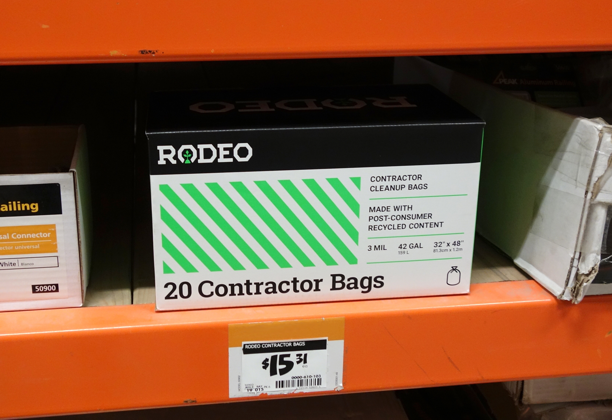
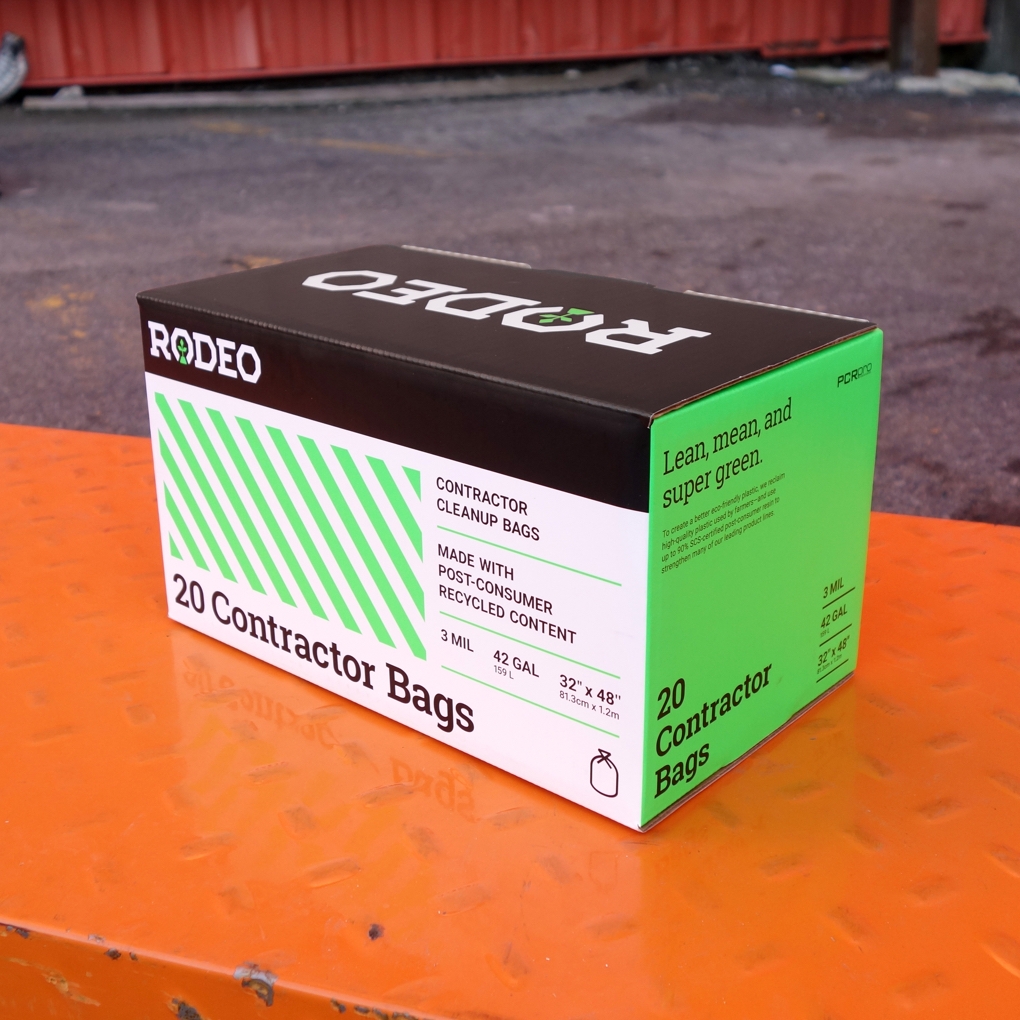
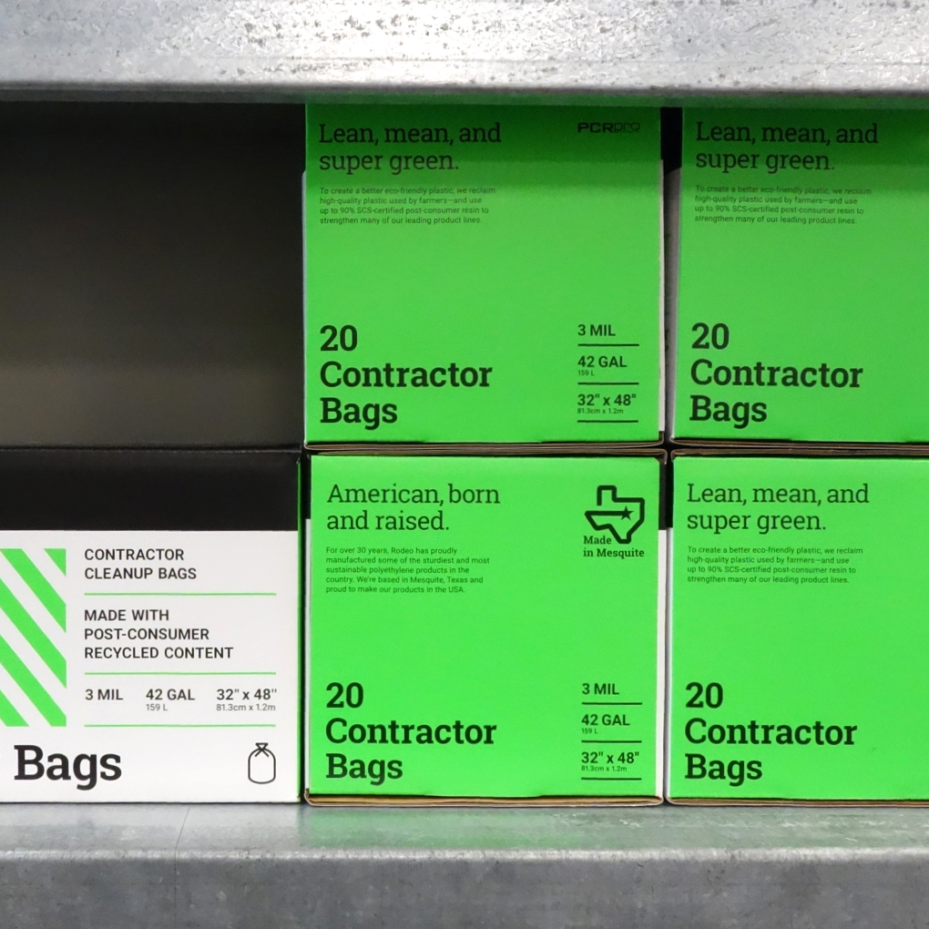
Packaging features a combination of Rodeo’s signature fluorescent green and black colorway—contrasting nicely from an overuse of yellow and orange by competitors. Safety striping helps communicate an industrial-grade quality and strength, while further underscoring Rodeo’s commitment to sustainability.
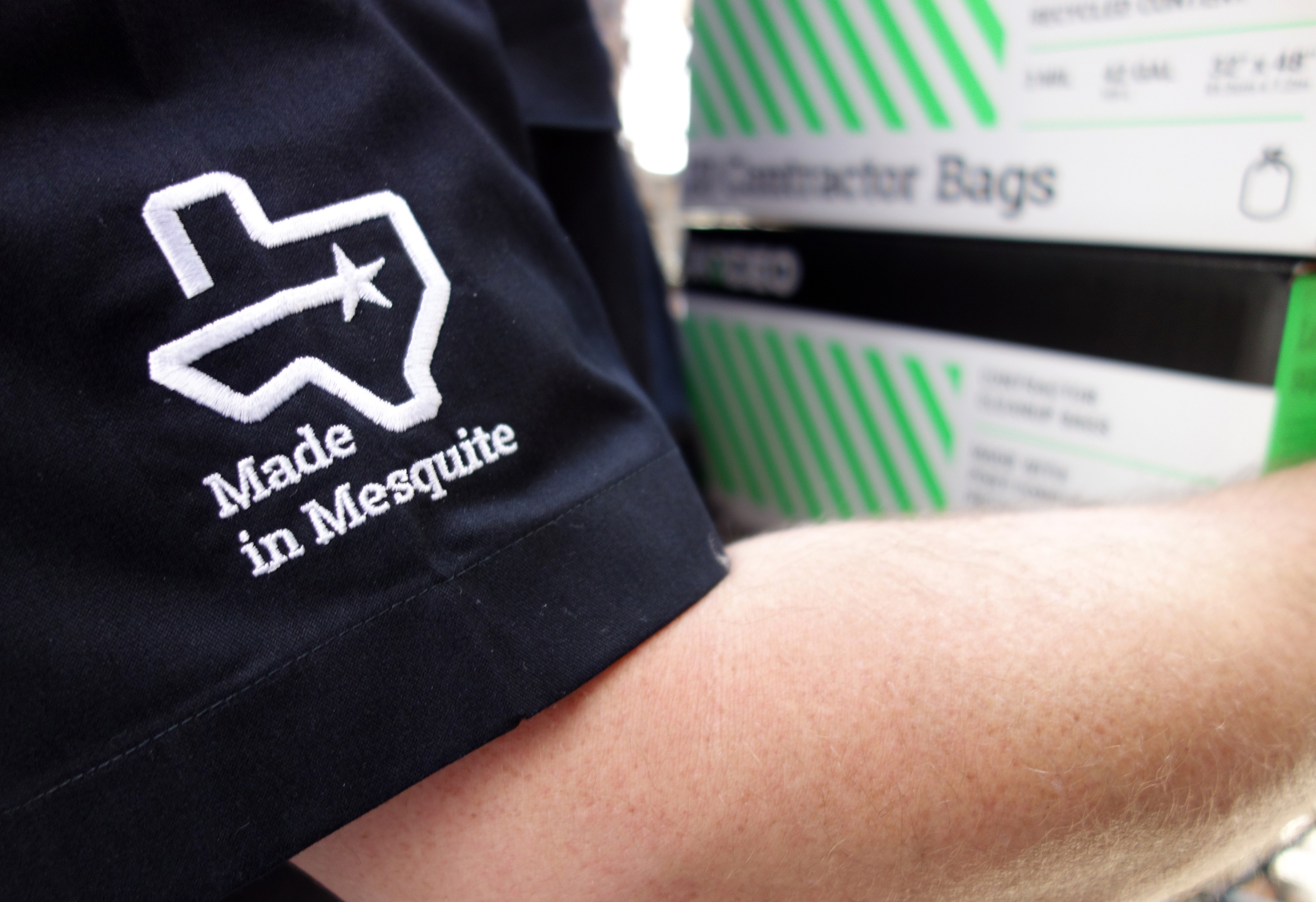
To avoid the appearance that Rodeo was jumping on the “MADE IN AMERICA” bandwagon with many of their competitors, Thinkso suggested a more genuine approach. The company is headquartered in Mesquite, Texas—home of the famous Mesquite Rodeo and a place known for the pride it takes in its local community. By indicating that their products are “Made in Mesquite,” we emphasize the hometown heroes and “Made in America” aspect in a distinct, true-to-brand way.
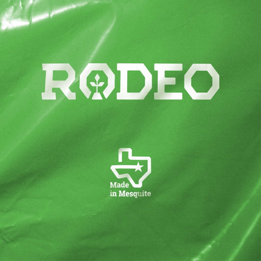
Plastic bags and sheeting begin life as resin, in pellet form. The resin is melted and blown into vertical tubes several stories tall, before cutting it down into bags or put on rolls. Thinkso worked with Rodeo to formulate a shade of green plastic to approximate their signature color. An otherwise generic product could now be printed with their new logotypes to create a more ownable, branded consumer product.
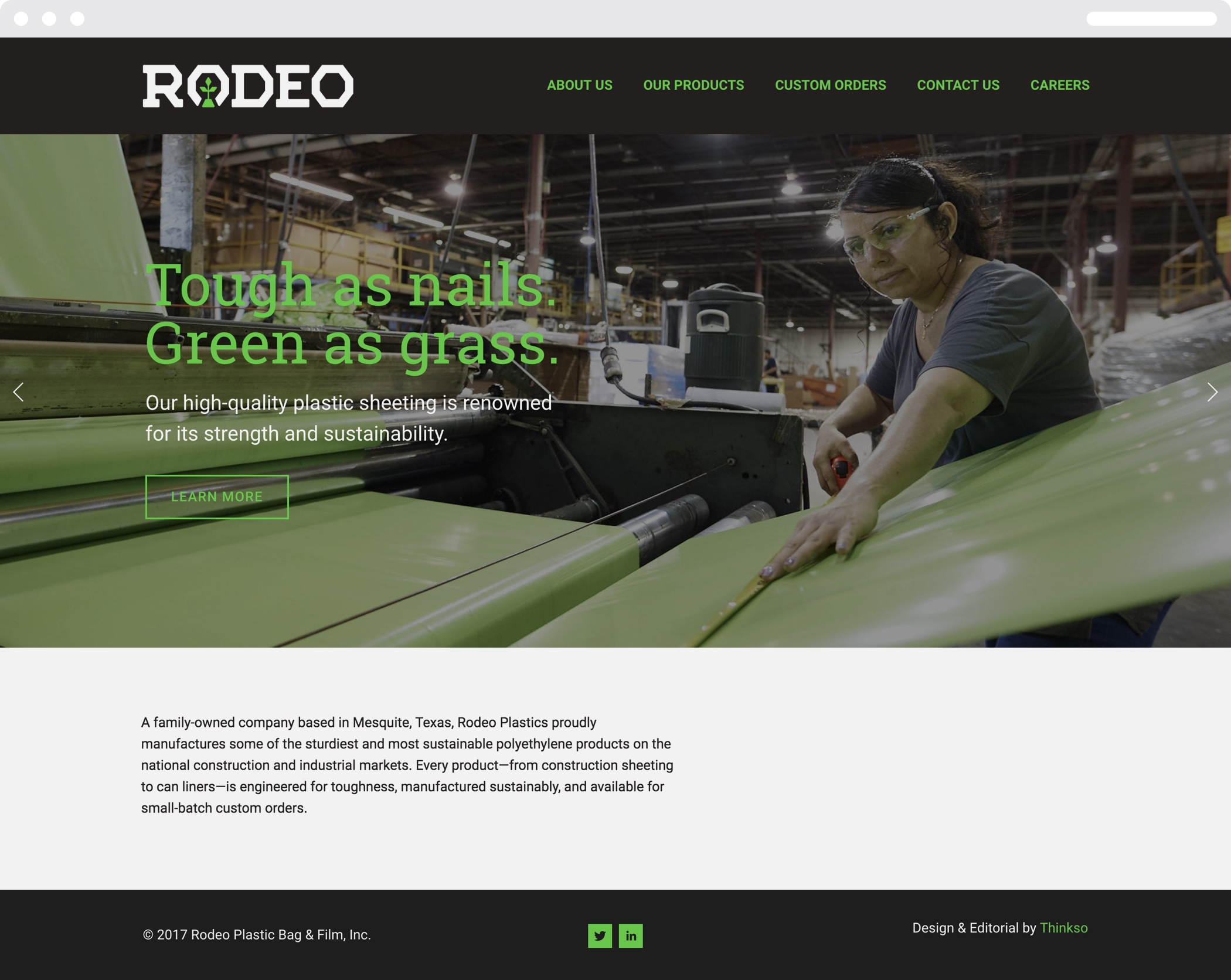
Thinkso organized, wrote, designed, and built the new Rodeo website. Headlines inspired by Texan-style idioms provide moments of wit and personality while most of the site is geared to serve its core purpose of communicating product specs.
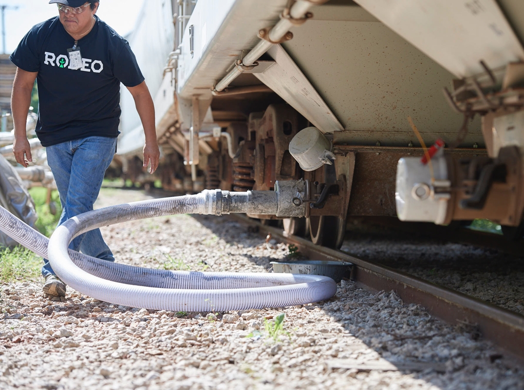
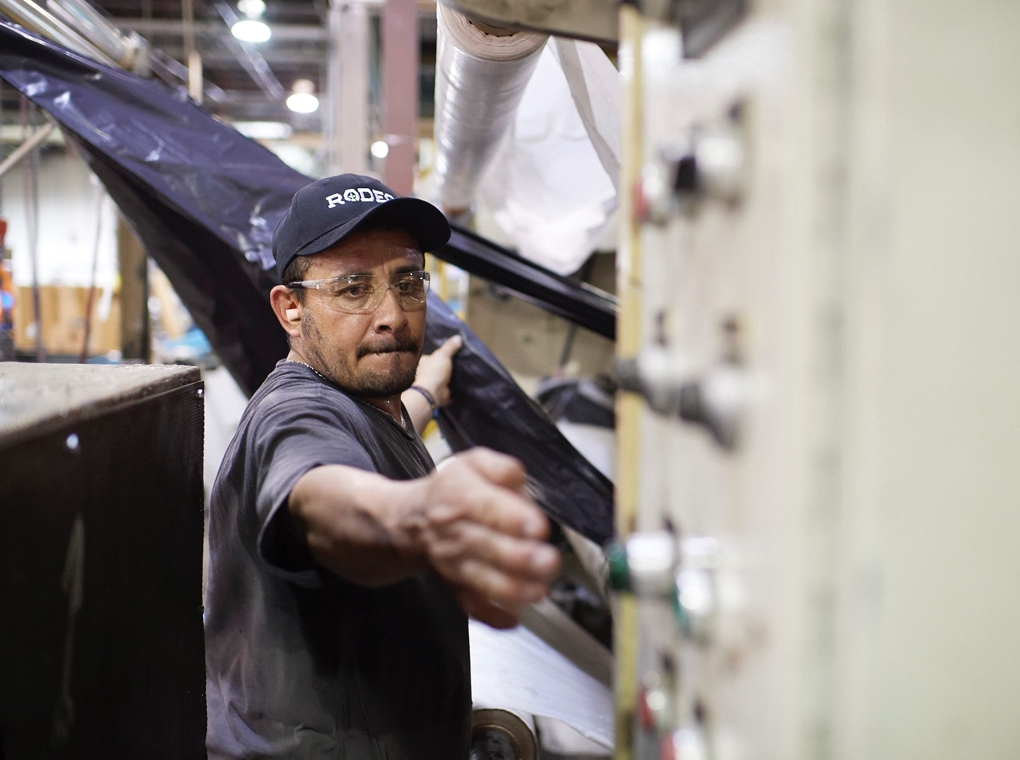
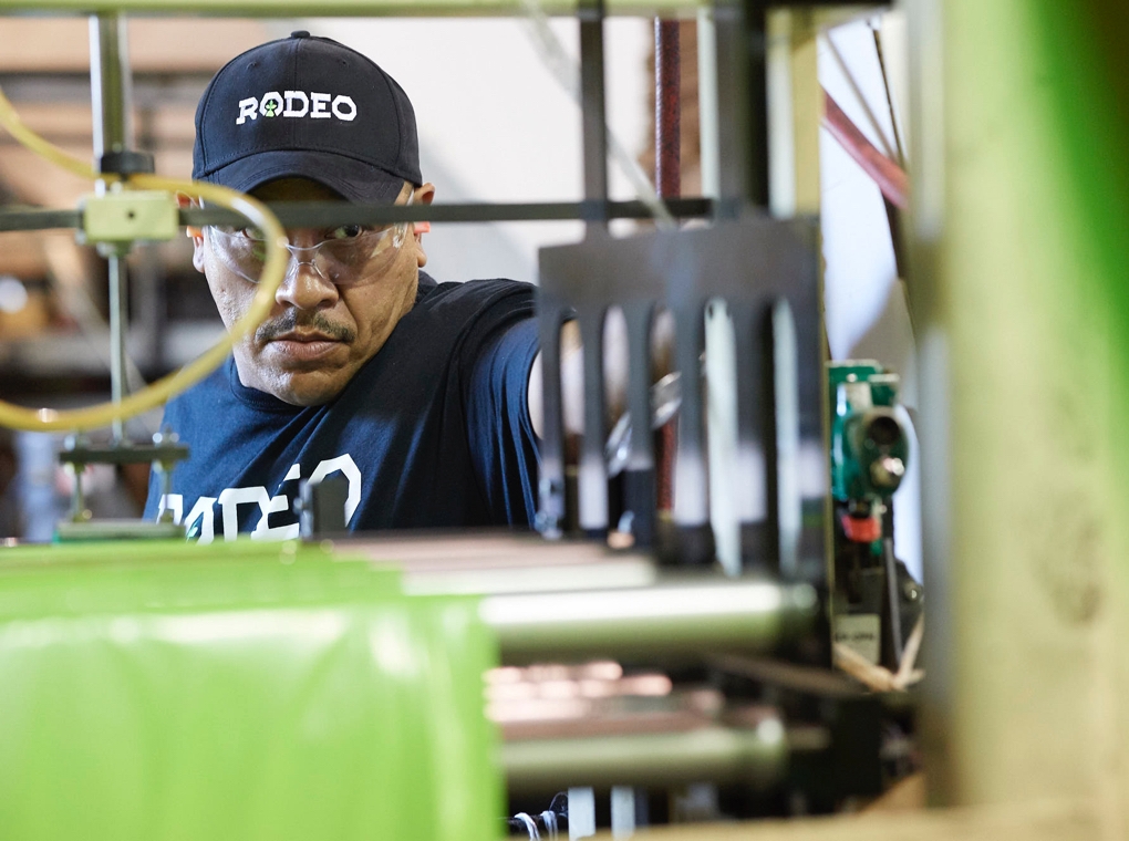
Thinkso spent a day at Rodeo’s plant with acclaimed Texan photographer, Tom Hussey, creating a library of custom photography for Rodeo’s new brand identity. We featured the faces of their hardworking people doing their jobs in a genuine, unvarnished way—underscoring Rodeo’s no-nonsense, hands-on, image.
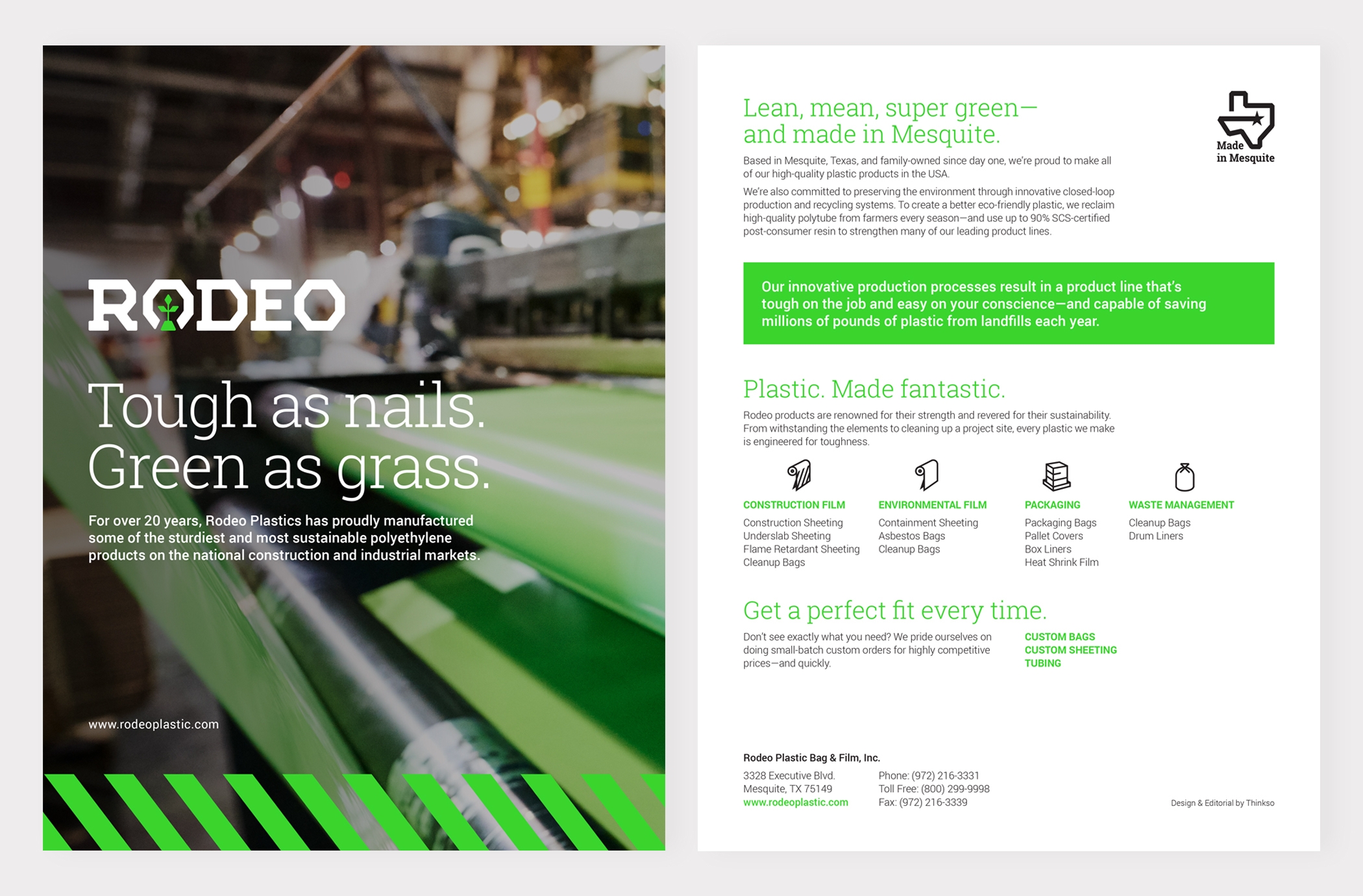
A simple one-sheet overview brochure communicates the brand’s core values and offerings, easily mailed or handed out at events.
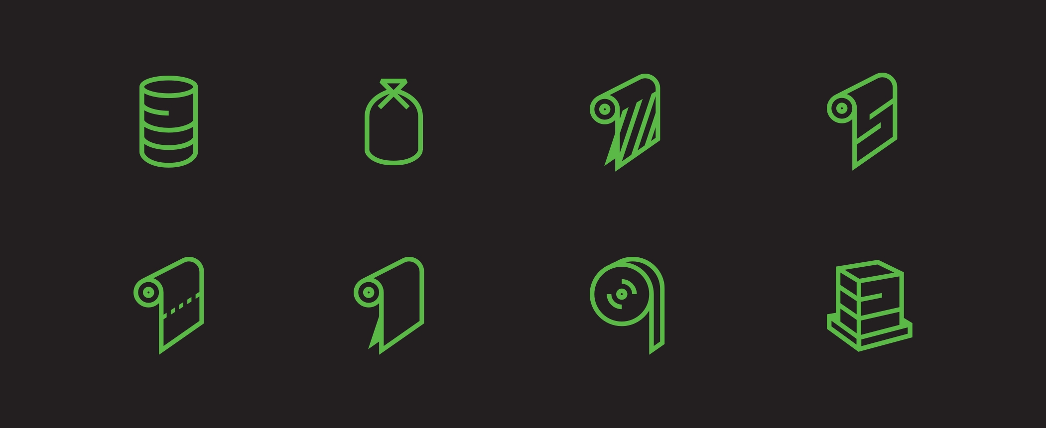
We created a set of ultra-simplistic icons that evoke industrial safety graphics to help distinguish product lines.