Family Health Alliance came to us as a small but mighty nonprofit that uses culturally responsive strategies to advance women’s reproductive health and rights in male-dominated societies. After more than a decade working in this capacity, the organization was ready to transition from leading its own field efforts to helping international governments and NGOs make theirs more effective. To accomplish this, FHA needed a new identity that underscores its unique, experience-based approach. And because they won Thinkso’s 2016 Give a Brand!, we were able to give it to them. We transformed Family Health Alliance into Think Responsive, giving it a comprehensive rebranding, strategic repositioning, and a new name that better reflects its mission.
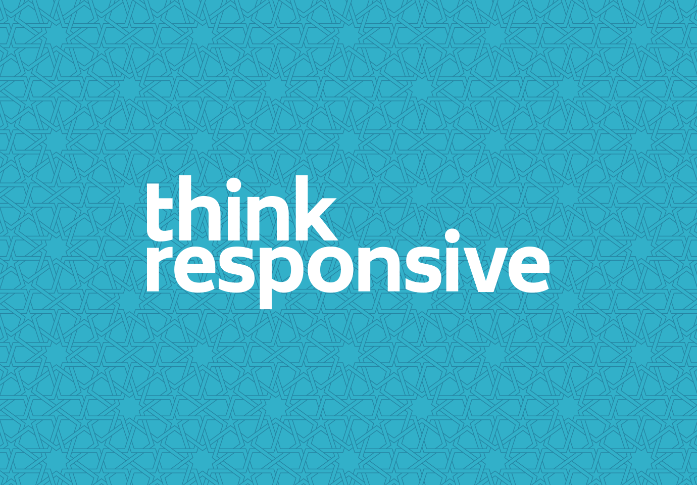
We paired a modern, sans-serif word mark with a suite of custom-drawn patterns inspired by the regions where male-dominated cultures are prevalent: the Middle East, Africa, and Asia. Combined with a lively color palette, the patterns give texture and context to Think Responsive’s marketing communications.
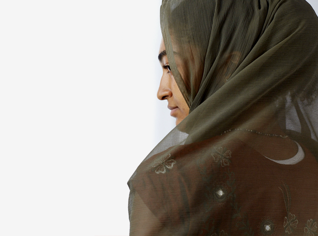
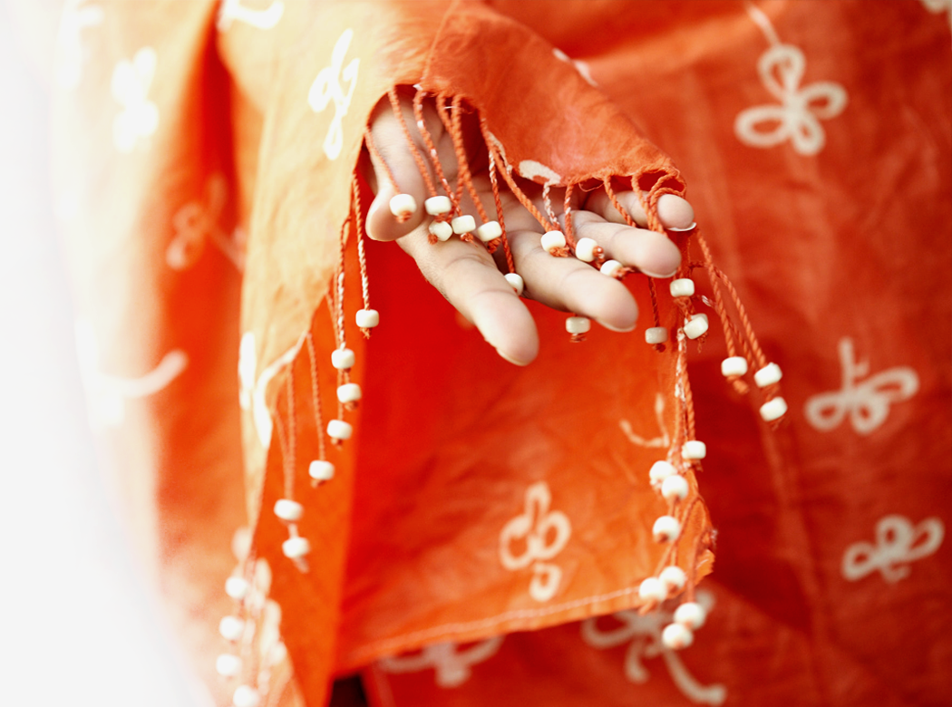
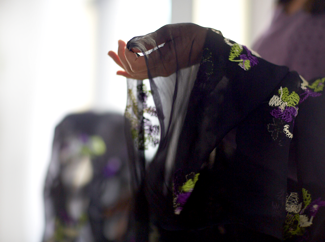
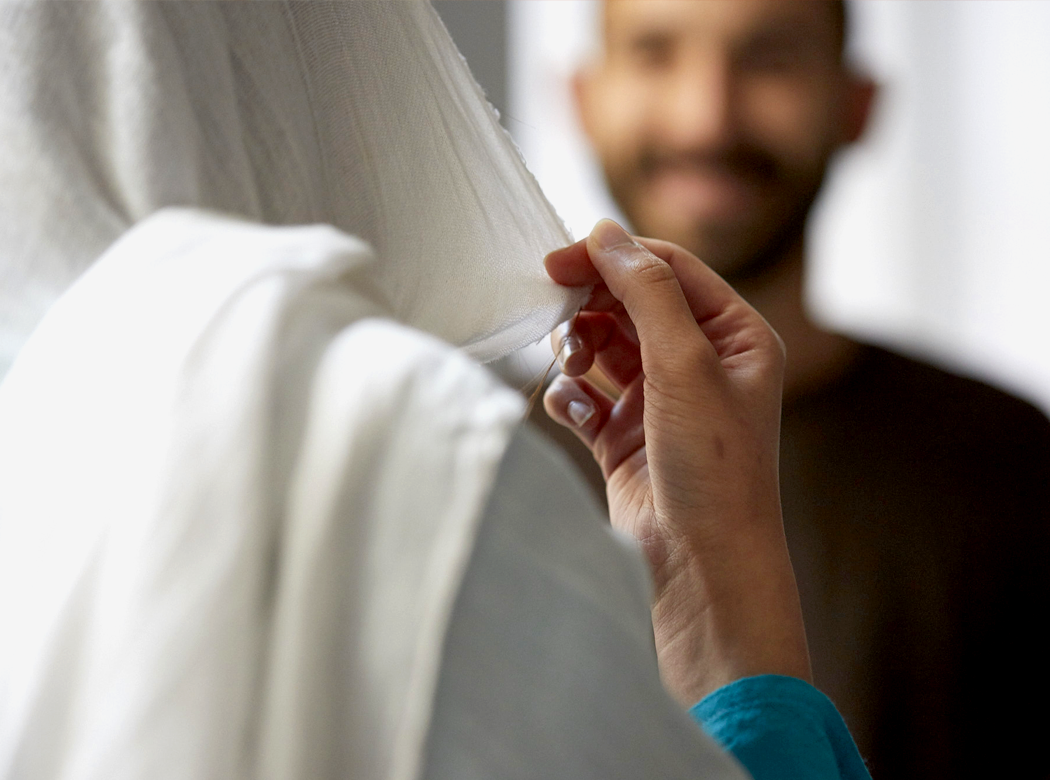
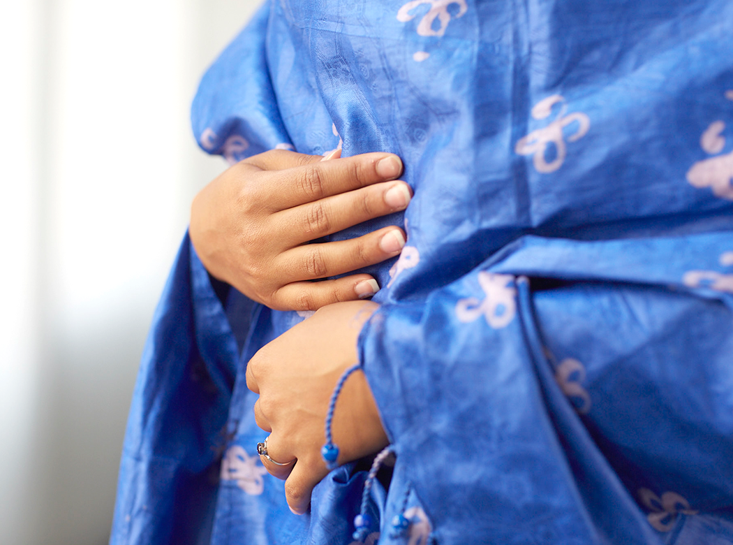
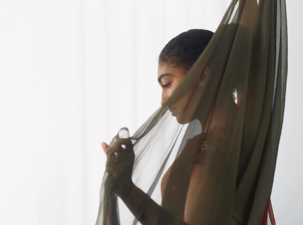
Because so much of the organization’s existing photography had come directly from the field, most of it was not of sufficient quality for the new brand identity. Working with photographer Matthew Septimus, we created artful images that reflect the confidence, dignity, and poise of the women served, while honoring their cultures and backgrounds. Throughout Think Responsive’s new materials, we use these display images for impact and to convey the organization's professionalism, but then complement them with field snapshots for authenticity.
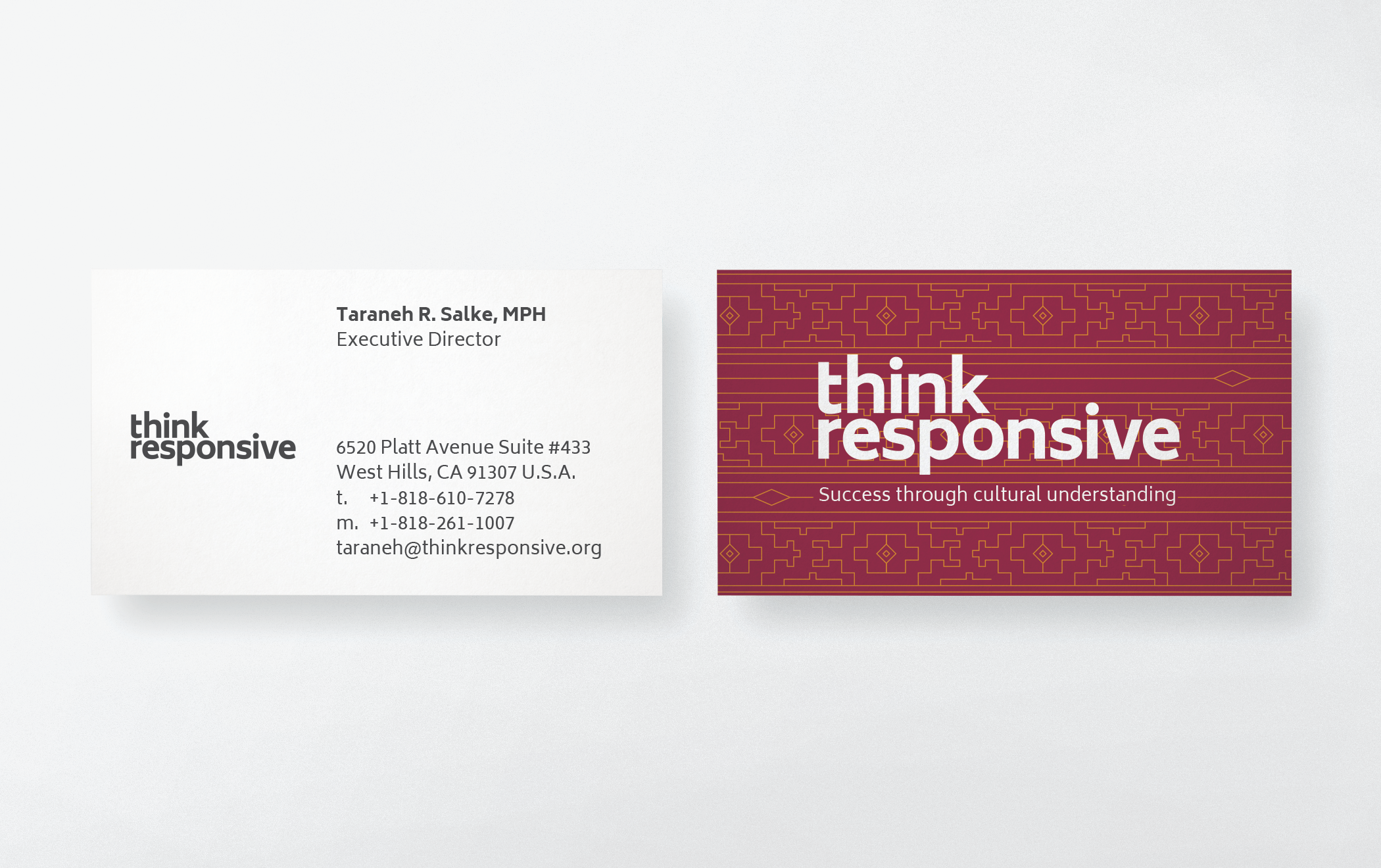
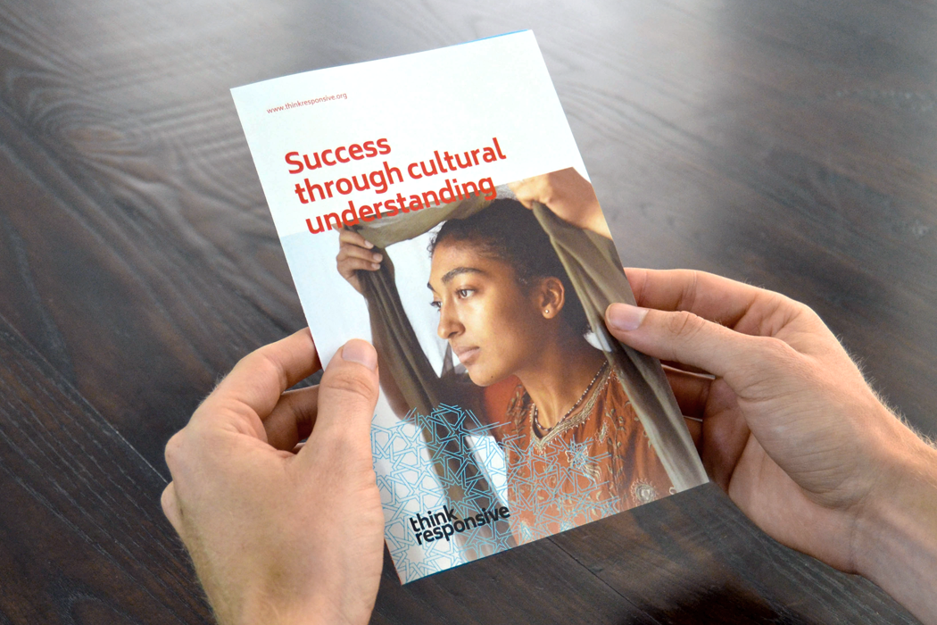
We created Think Responsive’s new tagline, “Success through cultural understanding,” which captures the value that its unique methodology provides to its clients. The materials we created to carry this message include business cards, an overview brochure, and notecards—all designed to introduce and explain the organization’s purpose to an audience of NGOs and grant providers like the Gates Foundation. Sponsors Rolland and Allied provided the paper and printing, respectively.
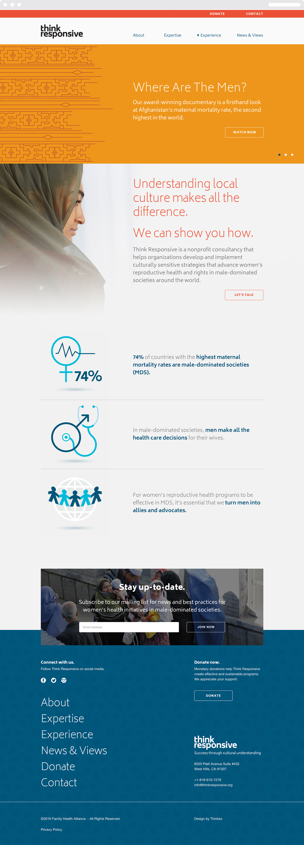
Working with our web developer partner Surprise Highway, we created a custom website with simple, intuitive navigation. We rewrote the entire site to reposition the organization as a consultancy, distill its core service offerings, streamline and standardize its case studies, and demonstrate the value of the organization’s experience and expertise. Before writing the site or any collateral, we mapped out all copy needs on a master level. Using this “structured content” approach made producing consistent, high-quality content for different media much more efficient—and more doable in a single day.
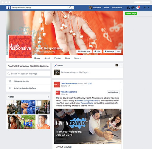
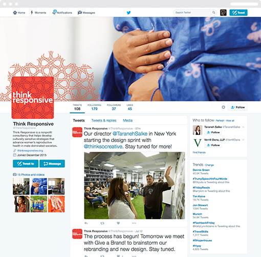
Thinkso created new social media accounts, wrote a cache of posts and tweets, and carefully coordinated each handle, page design, and profile picture to reflect the new name and brand identity.
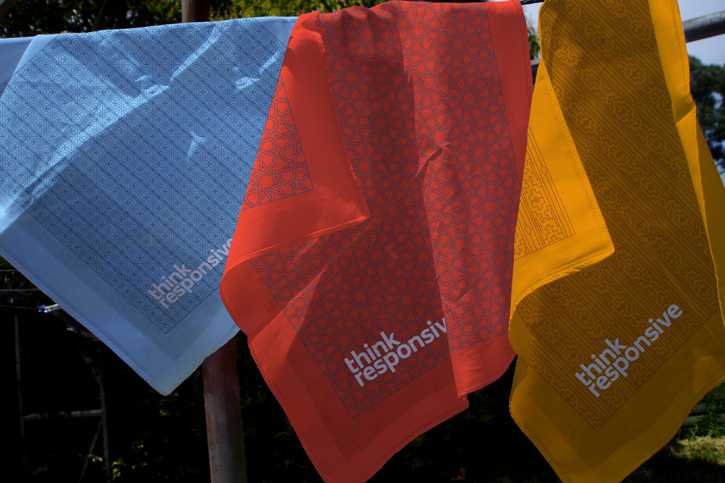
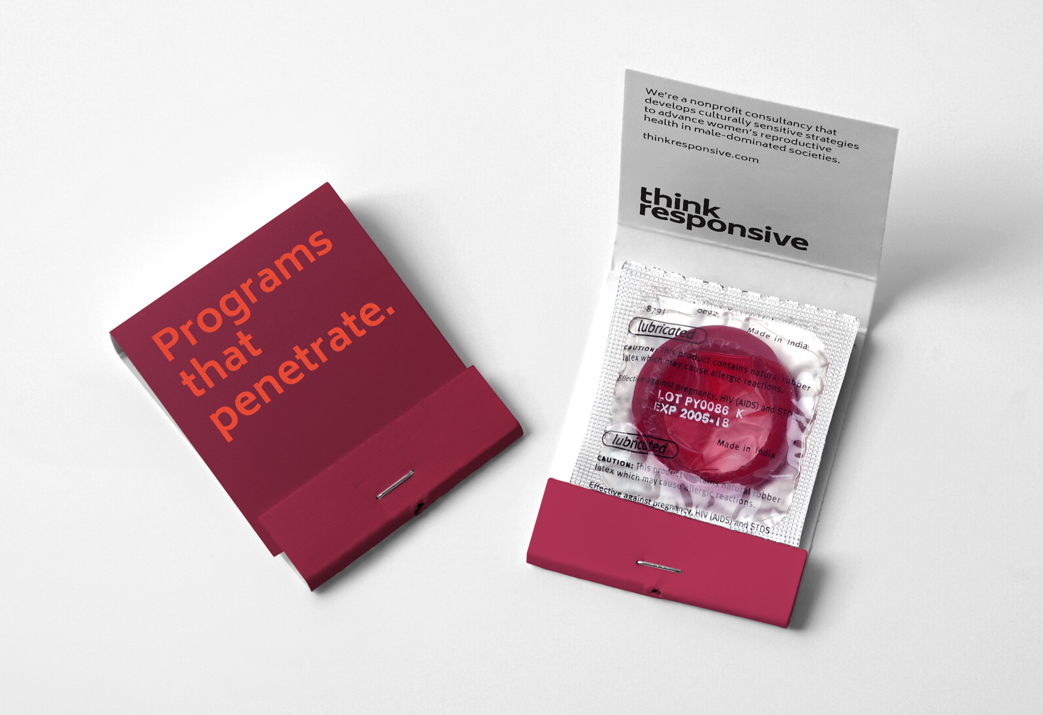
Executive director Taraneh Salke frequently speaks to university and activist audiences to provide insight on working in male-dominated societies and explain Think Responsive’s innovative approach. To create a lasting impression on audiences, Thinkso developed giveaways that showcase elements of the new brand identity and reiterate key themes. We designed custom bandanas featuring the brand’s colorful patterns, which staff and associates can wear to signal their support. We also created “matchbook” condom packaging with clever messages that speak to Think Responsive’s goals and philosophy. Give a Brand! sponsor Premier generously contributed to this effort.