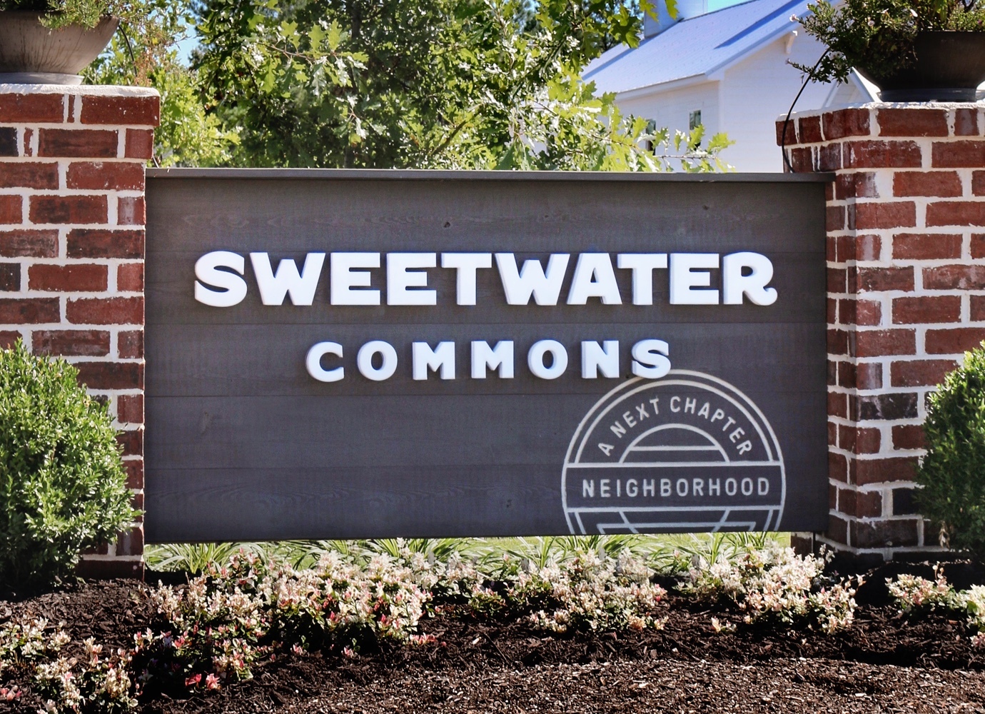
The American dream is shifting away from home ownership to a more flexible lifestyle, and Next Chapter Neighborhoods was founded to capitalize and deliver on it. This new concept in rental properties provides its tenants with all the benefits of home ownership (freestanding houses and neighborhood-like communities) without the burdens (upkeep, immobility). The start-up tapped Thinkso to bring their concept to life in branding and marketing. We established the brand identity and architecture for the development company and property suite, and designed, wrote, and produced marketing communications for their first property, Sweetwater Commons. The concept was so successful that Next Chapter had to start a waiting list before Sweetwater’s first tenant even moved in.
BACKGROUND
Following the housing crash and recession of the late 2000s, the U.S. saw a shift away from home ownership toward renting in both cities and suburban areas. At the same time, people were increasingly seeking a sense of community and connection. Next Chapter Holdings saw the market opportunity that these two converging trends provided: a new housing concept that delivered all the comforts of owning a home in a real neighborhood with all the convenience of renting.
The vision for Next Chapter’s developments was single-family freestanding cottages with porches, sidewalks, and community programming to encourage relationships among neighbors. Our client understood their market and were well-positioned to offer value, but needed a brand strategy that communicated their value proposition, along with an identity that would bring it to life and help it stand out in the crowded residential rental market. They also had plans to expand across the country, with each property taking on the flavor of the local geography.
APPROACH
Thinkso saw a real opportunity to use branding to set this new housing concept apart from the many others out there. The notion of “neighborhoodness” had to come through in every consumer touchpoint, so we would use “neighbors” and “the American dream” as central inspirations in our design and editorial development.
Our goal was to develop a parent brand that was distinctive, but not overwhelming, and a branding system that allowed the development properties to be unique but still hold together as a single real estate portfolio. The Next Chapter logotype works as a badge that can be paired with any of the development’s logos, acting as a seal of approval. (“Oh, that’s a Next Chapter Neighborhood property. I know we’ll not just have a place to live there, we’ll have a true home.”) We put a system in place for efficiently naming and creating property brands, and included provisions for capturing the local culture and environment without veering too far from the core brand.
We ensured that everything created for the brand related back to the communal qualities of a neighborhood. We recommended a name change from “Next Chapter Holdings” to “Next Chapter Neighborhoods.” We established a warm, friendly, and honest editorial voice. We specified that property photography should feel authentic, cozy, and welcoming as opposed to the typically cold and spacious style used in most real estate marketing. And we complemented it with stock imagery that showed neighbors engaged in neighborly things.
A real estate concept this unique needed a typeface equally so. Inspired by the folksy and familiar qualities of vintage sign painting, we designed a custom typeface used primarily for the logotype of each Next Chapter development property, but that can also be employed for other emblematic applications such as house numbers and signage.
To help promote the start-up to investors and the first development to prospective tenants, Thinkso created two websites, printed marketing collateral including brochures, an advertising campaign, business cards, t-shirts, and more.

The Next Chapter Neighborhoods logo establishes a stand-alone identity for the development company. A simplified “badge” variation is featured within the neighborhood identity as an optional element.
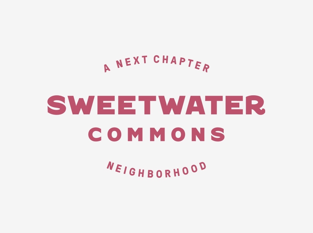
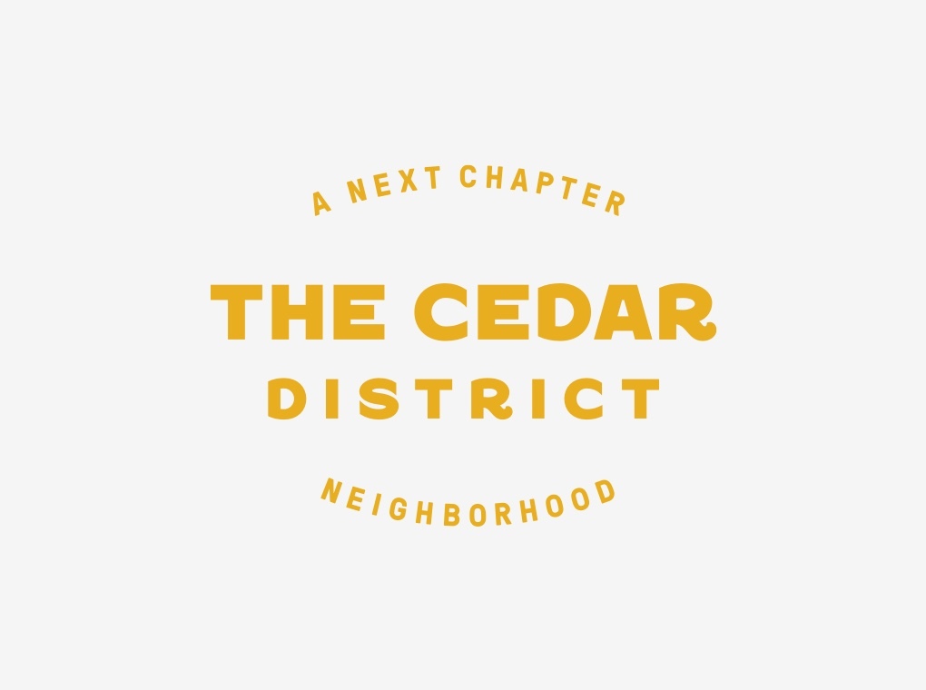
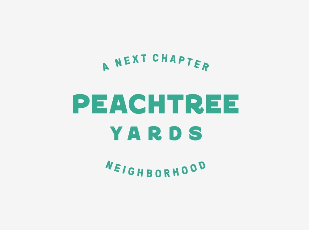
Neighborhood names are inspired by local geographic points of interest and are typeset in a custom-designed font inspired by vintage painted signs. Each neighborhood identity is treated in a signature color and features photography of its development.
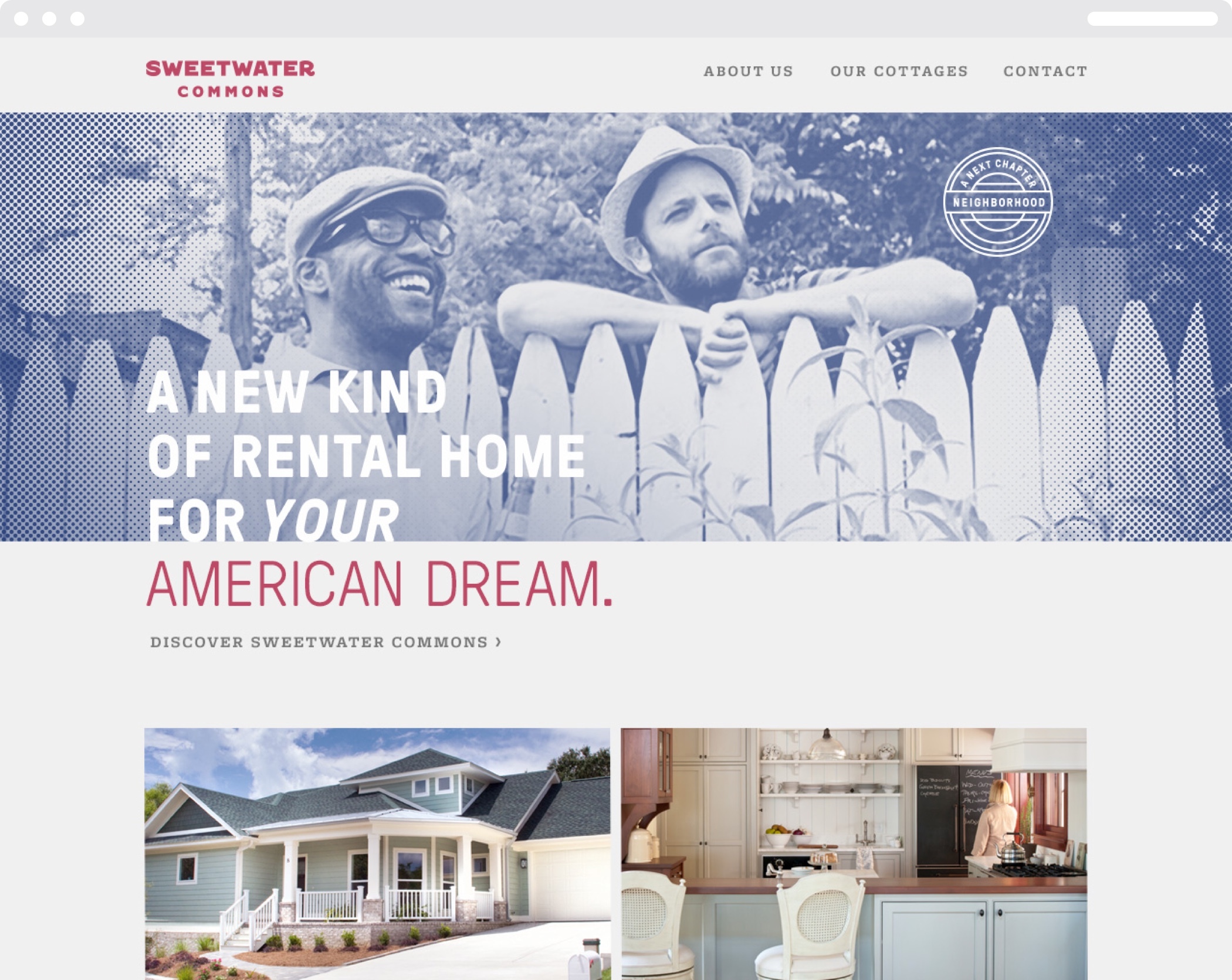
Distinctly treated brand imagery and quick-witted messaging underscore the value, benefit, and community of the neighborhood focus. Full-color photography of the homes and property amenities provide a true representation of what is being offered.
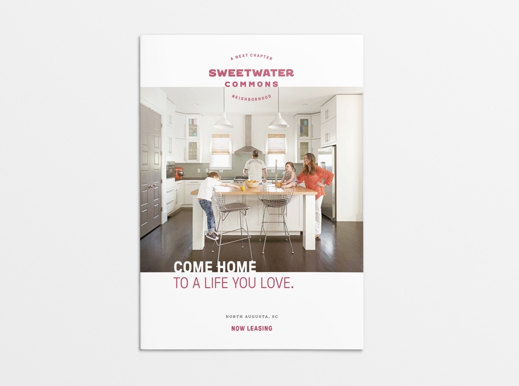
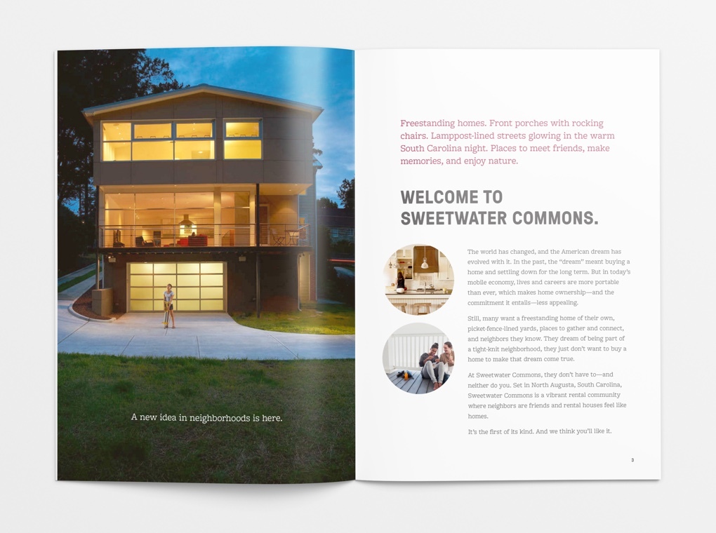
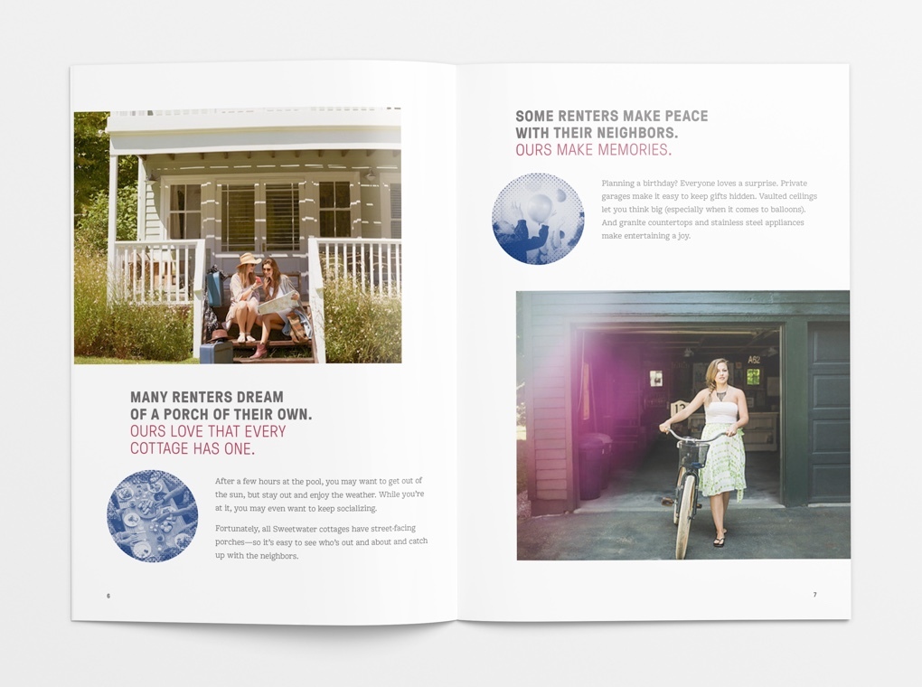
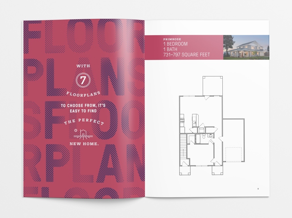
We developed print and digital versions of a leasing brochure that provides prospective tenants with an overview of the Next Chapter Neighborhoods concept and highlights of the unique features at Sweetwater Commons. Additionally, the brochure includes cottage floor plans, maps and information about the local area, and instructions for submitting a leasing application.
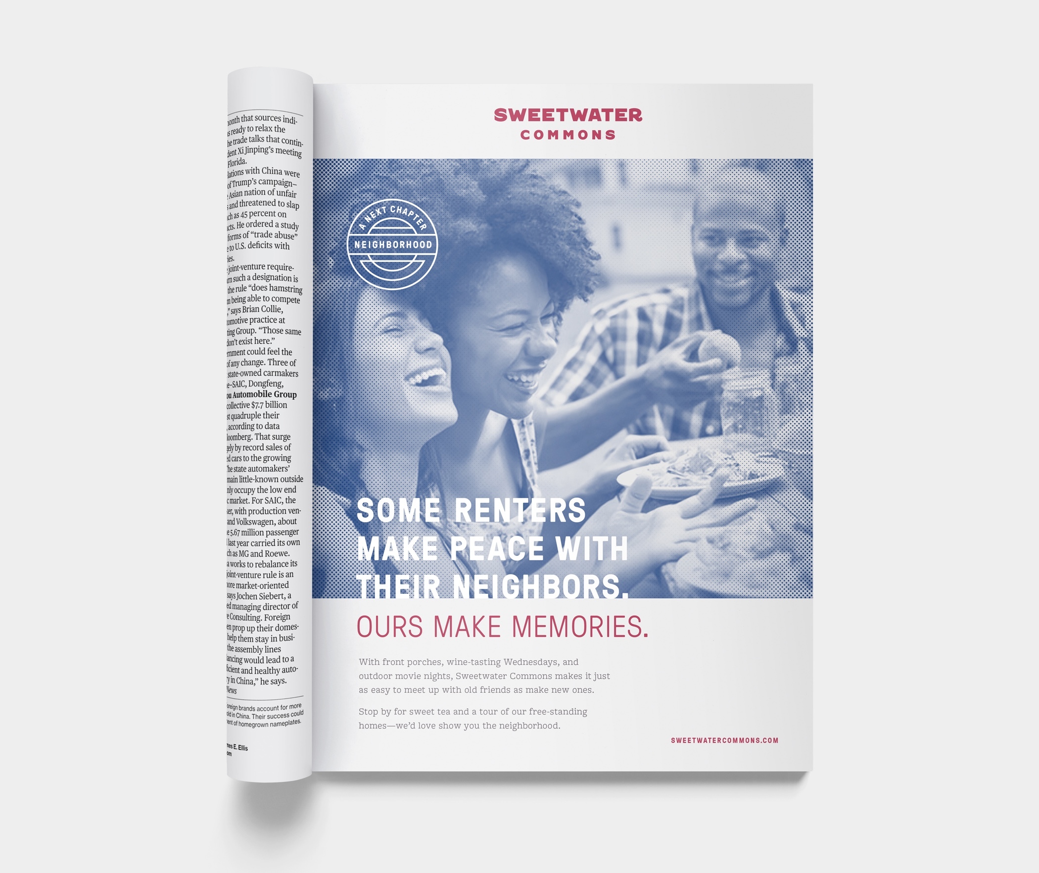
Image advertisements were designed to run in local newspapers and magazines before property construction was finished. They introduce the novel Next Chapter concept as well as create buzz around the specific development in the area.
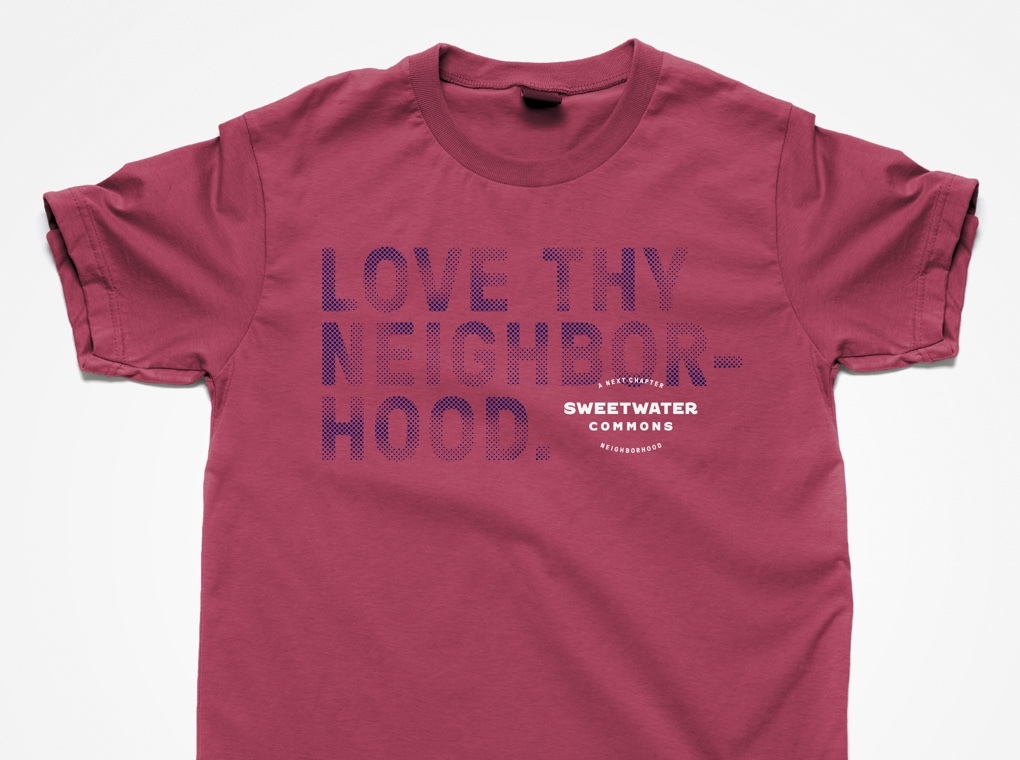
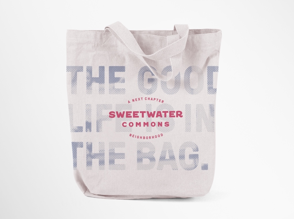
Cleverly branded giveaways were created as promotional items and tenant welcome gifts.