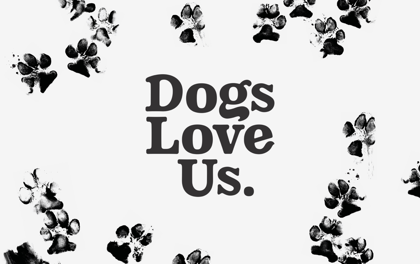
Dogs Love Kale, a Florida-based dog treats company, had carved out a unique niche for itself: super-healthy treats made with quirky ingredients such as kale, snap peas, and even hummus. To expand and clarify their offering, they tapped Thinkso to rebrand them as Dogs Love Us, organize the brand architecture, and design packaging that would help them better compete in an ultra-competitive category. The branding concept we developed celebrates the uncontainable feeling of excitement and emotion that dogs have at treat time, which we termed the “happy dance.” To illustrate it, we employed Fred, a pit bull rescue whose paw print artwork prances across the product line.
“‘Happy dance’ sums up the rebrand perfectly. It’s the reason we started this business—to take care of and enjoy our furry family members—and it really resonates with our customers.” Paula Savarese, President & Co-Founder, Dogs Love Us
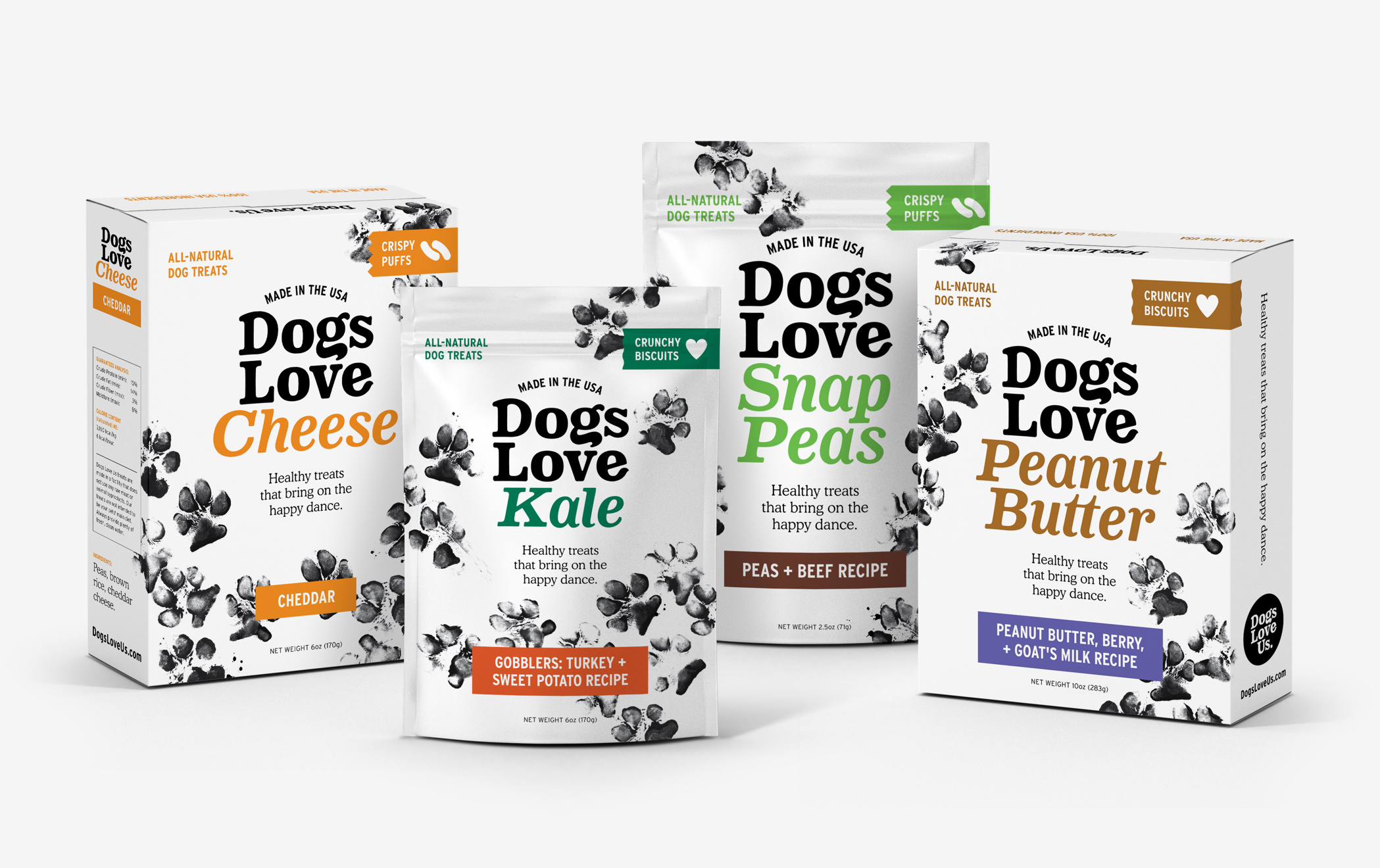
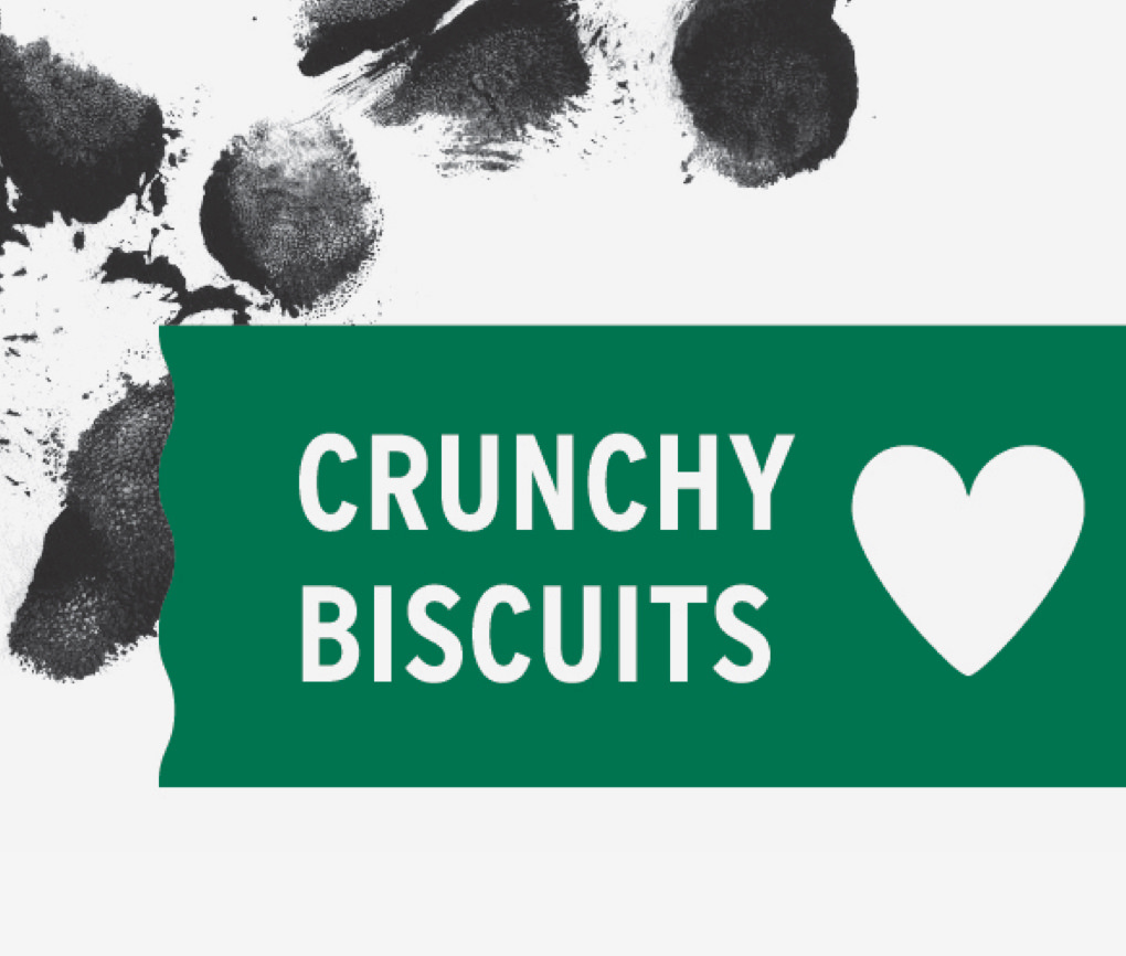
With crowd-pleasing flavors such as peanut butter, cheese, and liver added to the plant-based legacy flavors, Thinkso designed a product logotype system that allows for variability across the packaging program.
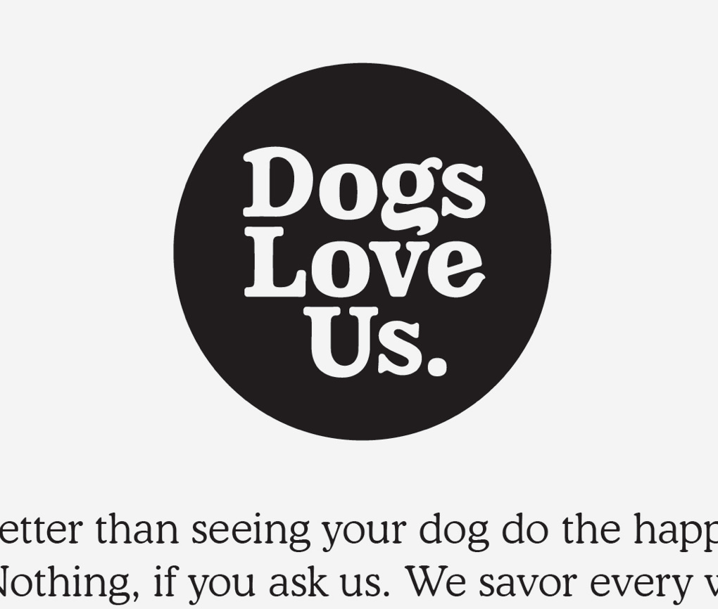

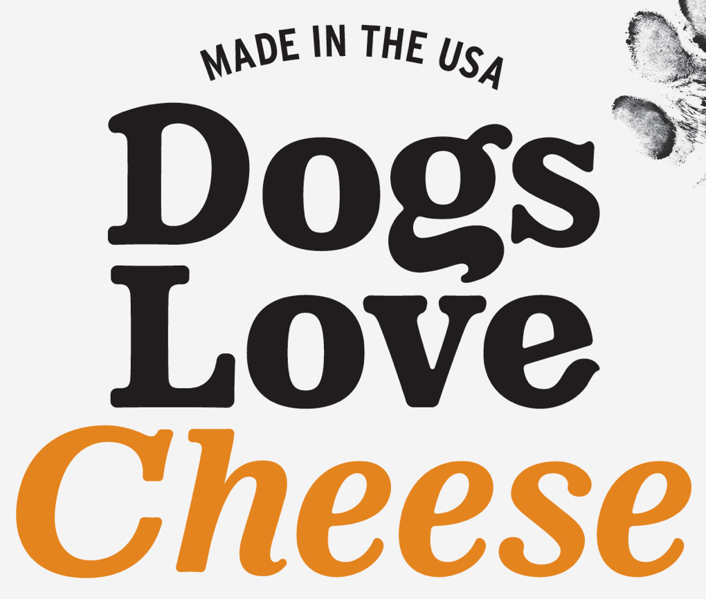
The Dogs Love Us logotype appears when representing the brand overall. We custom drew it to look “huggable” using soft, round letterforms and flourishes reminiscent of tails and ears.
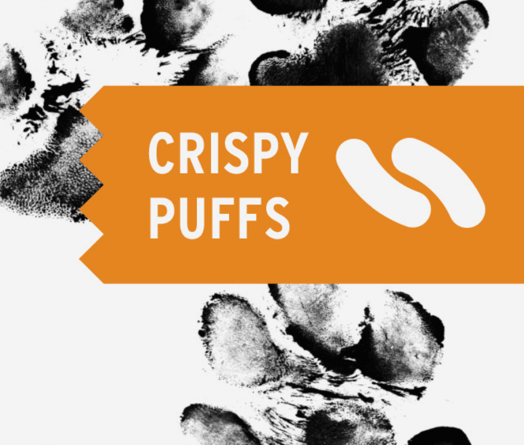
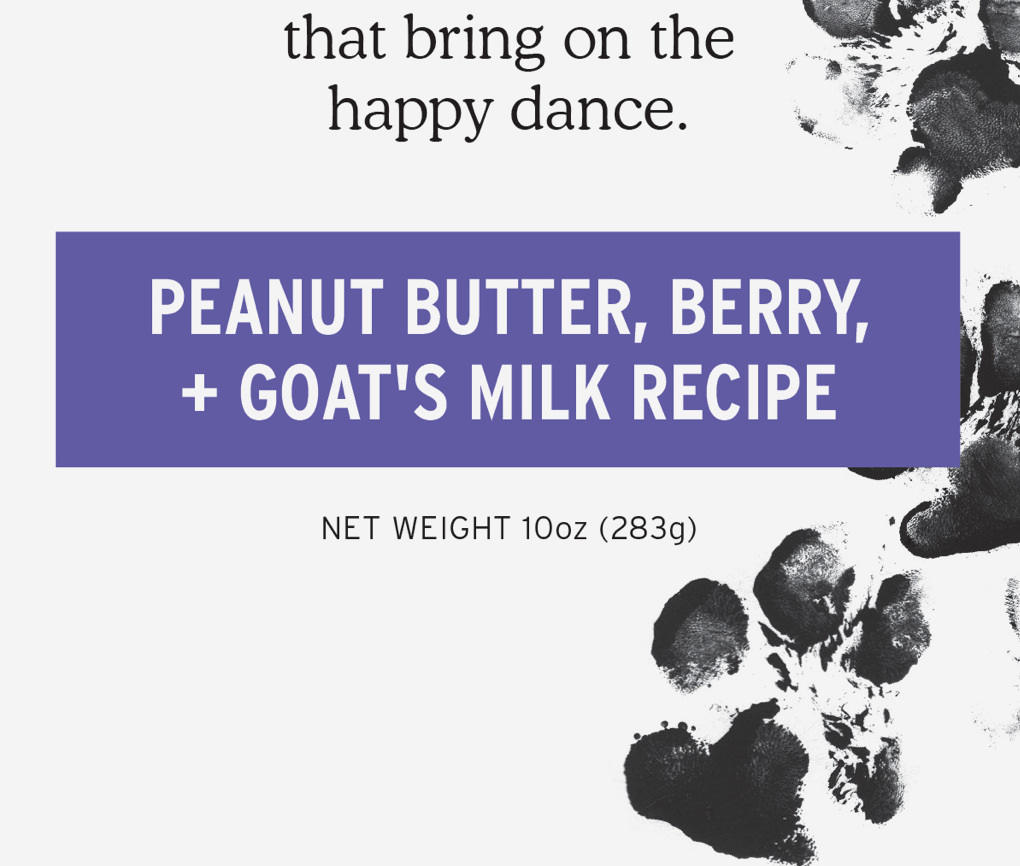
We designed a range of boxes and pouches across six flavors and three forms, using color to distinguish featured flavors and sub-flavors.
Our simple but thoroughly considered editorial tells the story of the happy dance and articulates the brand’s commitment to healthy, pure ingredients.
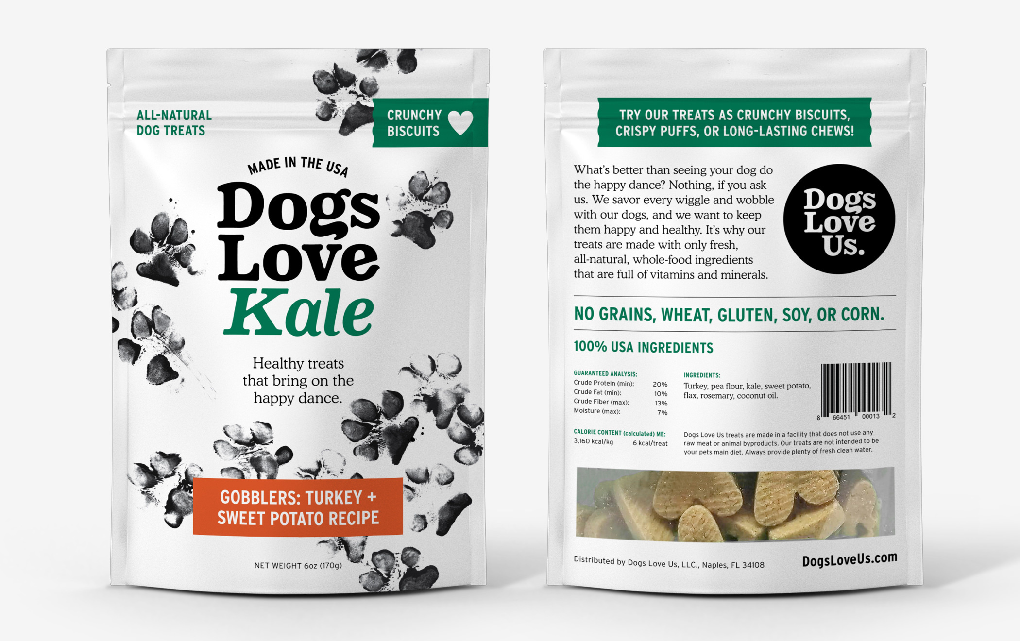
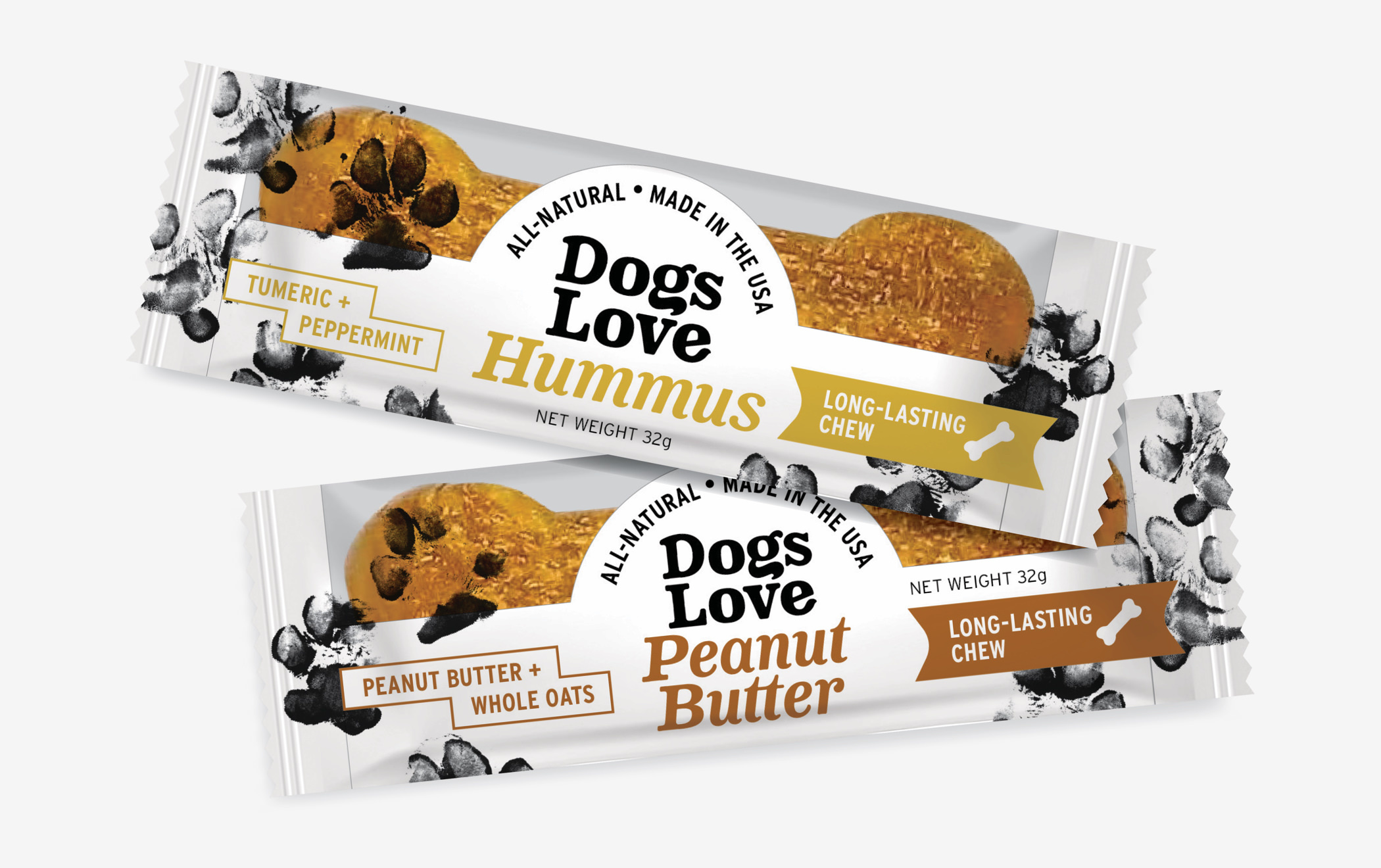
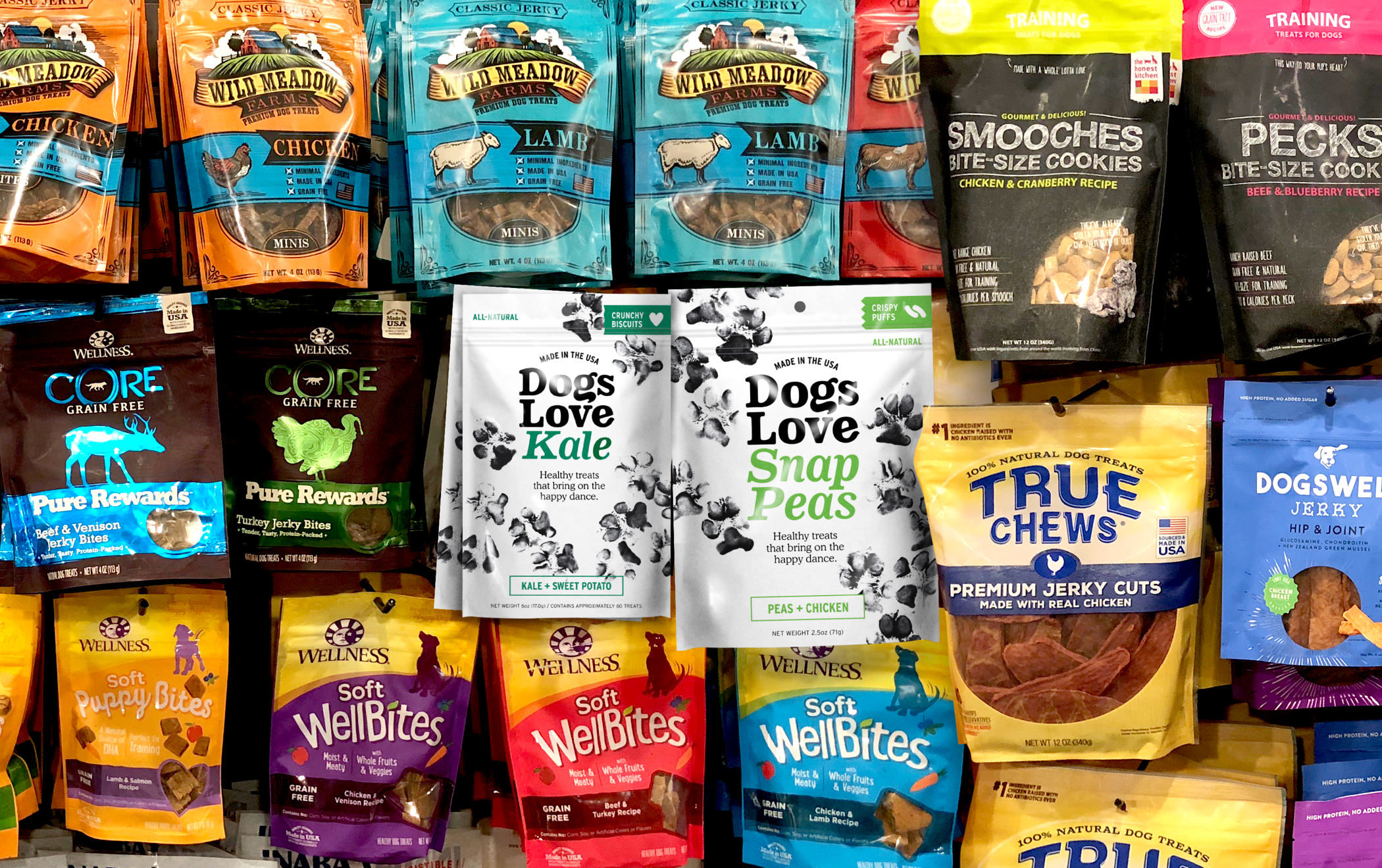
Most dog treat brands opt for saturated color schemes in bright or earthy hues. Our strategy was to differentiate the Dogs Love Us packaging with a bright-white, clean canvas. The packages stand out well in retail, underscore the all-natural message, and allow the unique flavors and happy dance paw illustrations to pop.
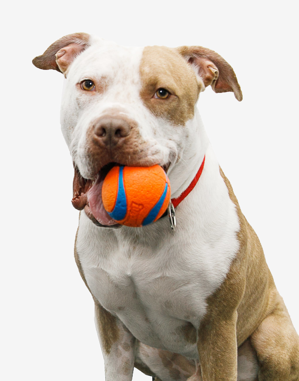
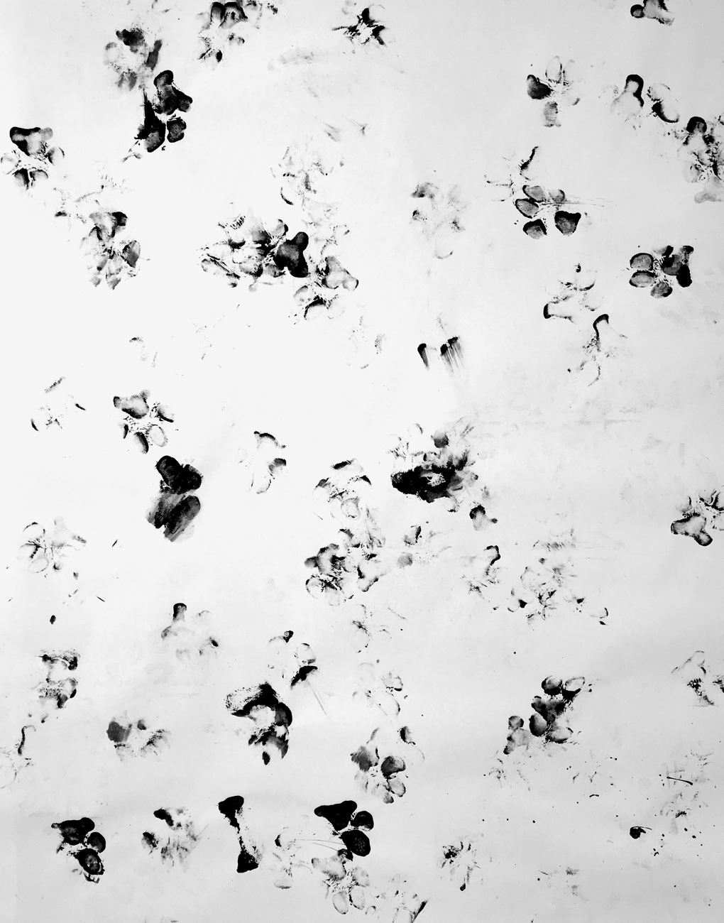
Just one year after jumping into his eventual owner’s open car door as she attempted to help him out of oncoming traffic, Fred, homeless at the time, is now a working illustrator who splits his time between his New York City office and his Vermont studio-barn.