Over five decades, Haynes Boone built itself into a strong, respected firm — competing with its larger and more well known peers on the coasts. Still, it struggled to move beyond its reputation as a top-tier, Texas-based, regional player. To help them break out and pursue an aggressive five-year growth plan, Thinkso infused their new brand identity with sophistication, energy, and humanity that perfectly complements the firm’s modern take on a trust-based, relationship-driven model. Now, with a look to match the depth of their expertise, Haynes Boone can more effectively compete for top clients and legal talent anywhere in the world.
“Our rebrand embraces our growing international profile while still preserving the warmth, commerciality, and dedication to community engagement that Haynes Boone is known for.” Murray M. Coffey, Chief Marketing Officer, Haynes Boone
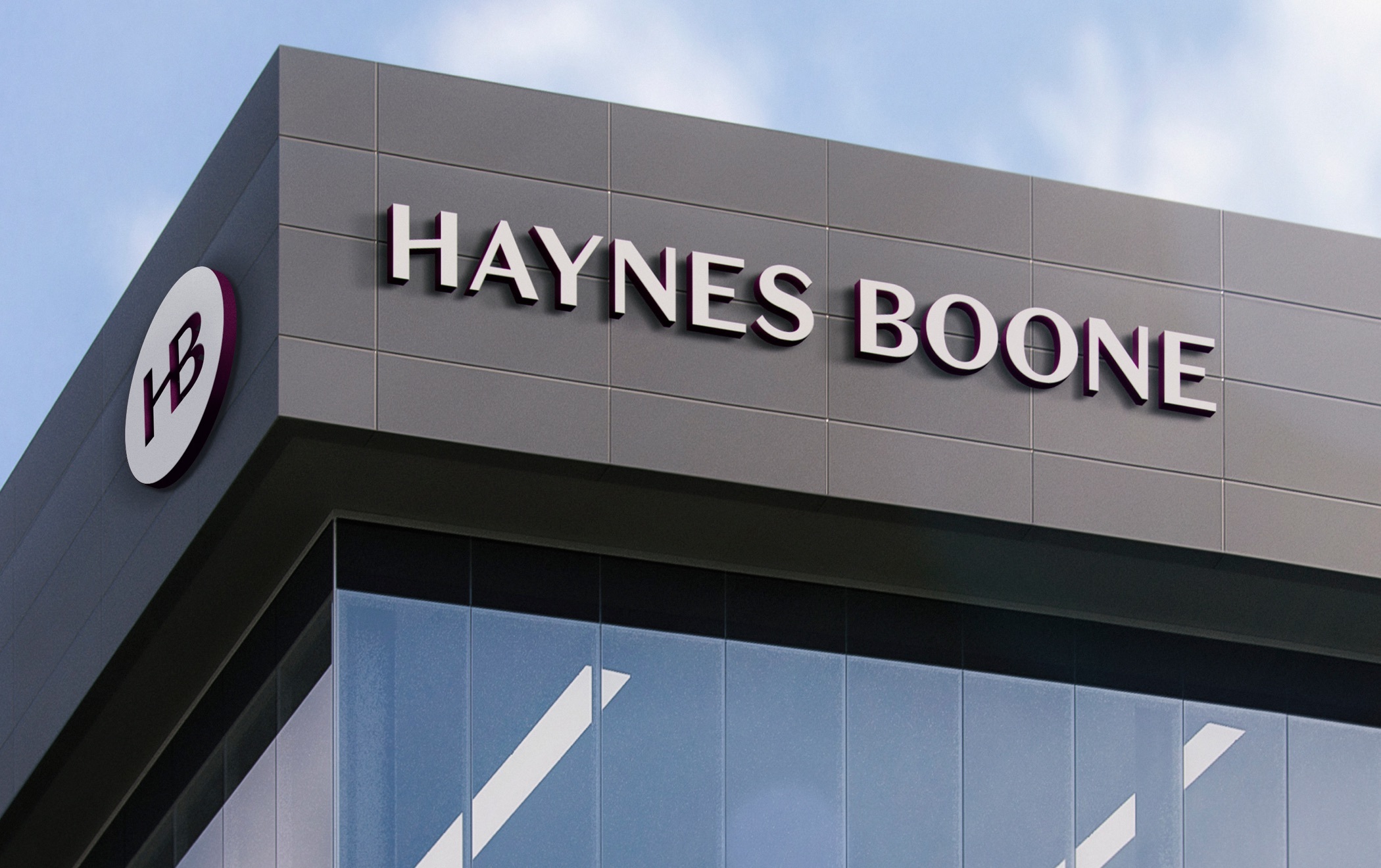
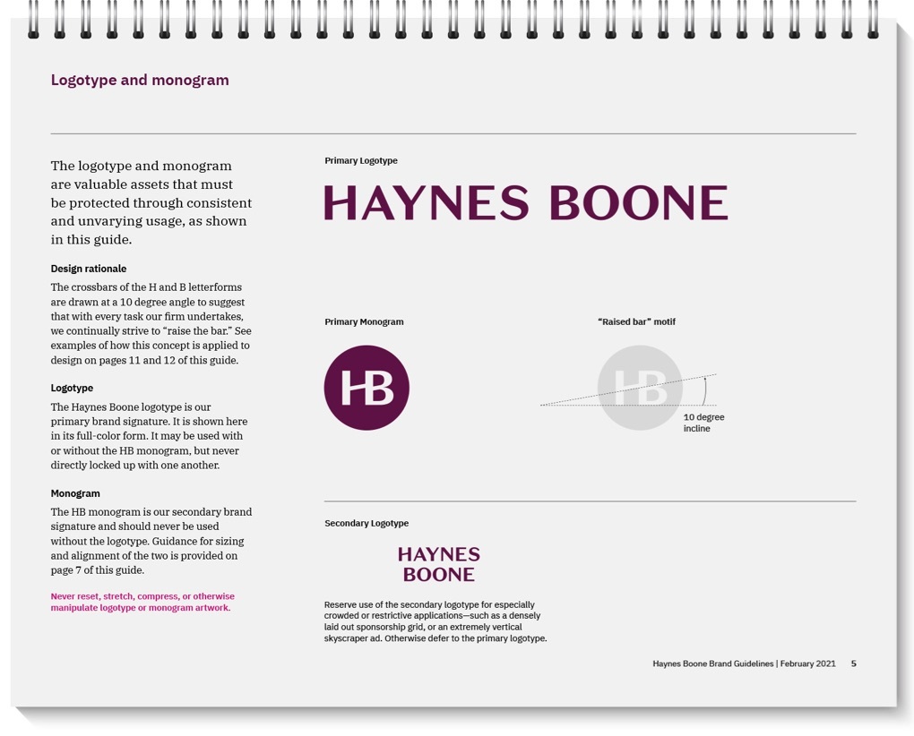
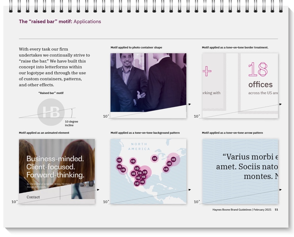
The new logotype was modeled after luxury automobile identities—evoking a finely engineered sensibility and connecting with “premier,” one of the anchors of the new Haynes Boone brand strategy. Subtle, upward slanting cross members in the H and B add a second layer of meaning—suggesting the idea of “raising the bar.”
The raised bar motif can be used in drop-down menus, screen transitions, and to mask imagery. It is further strengthened by another signature Haynes Boone identity element: HB Plum. We introduced the sophisticated, ownable color as a way to instantly set the firm apart within its competitive set.
Another central characteristic of the Haynes Boone brand strategy is “driven.” It manifests itself through the use of a high-energy color palette and edgy typography—along with an asymmetrical approach to layout and custom photography that is active and diverse. Editorially, the brand voice also underscores the firm’s drive, ambition, and focus on results.
Our concept mockup for the Haynes Boone homepage brings all of these elements to bear, and uses its people and experience to tell the firm’s story down the scroll.
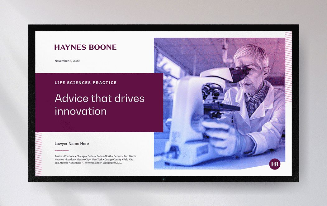
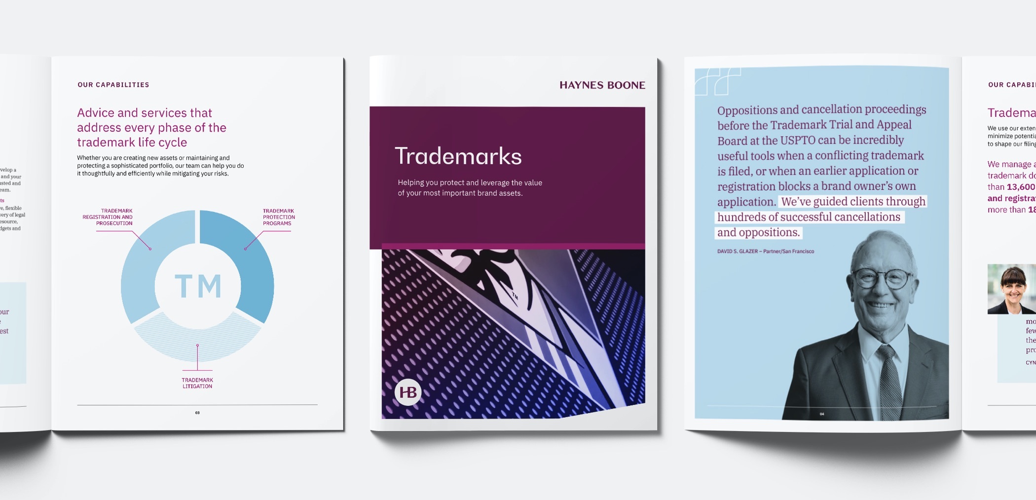
We developed templates and prototypes for practice area communications that included brochures, PowerPoint decks, and overview sheets—geared for both print and digital use.
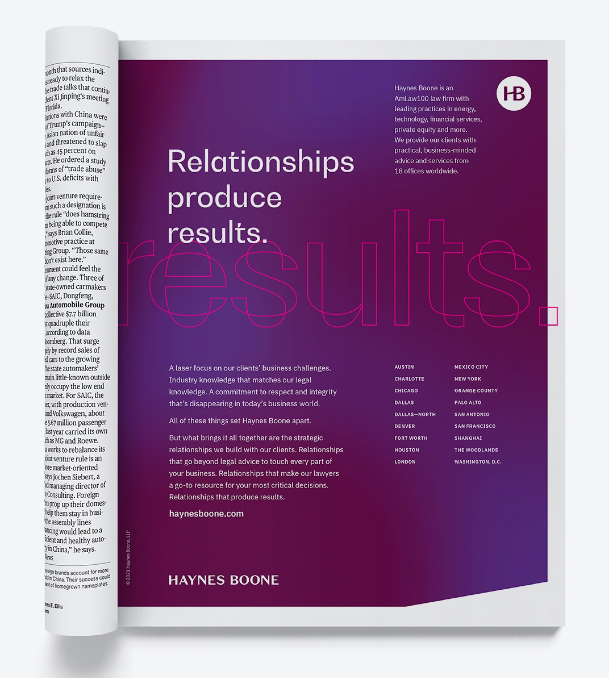
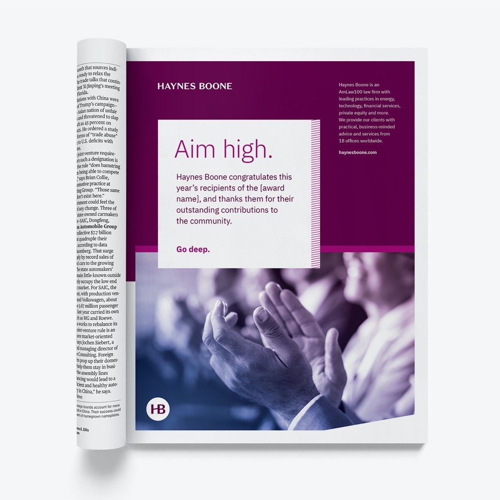
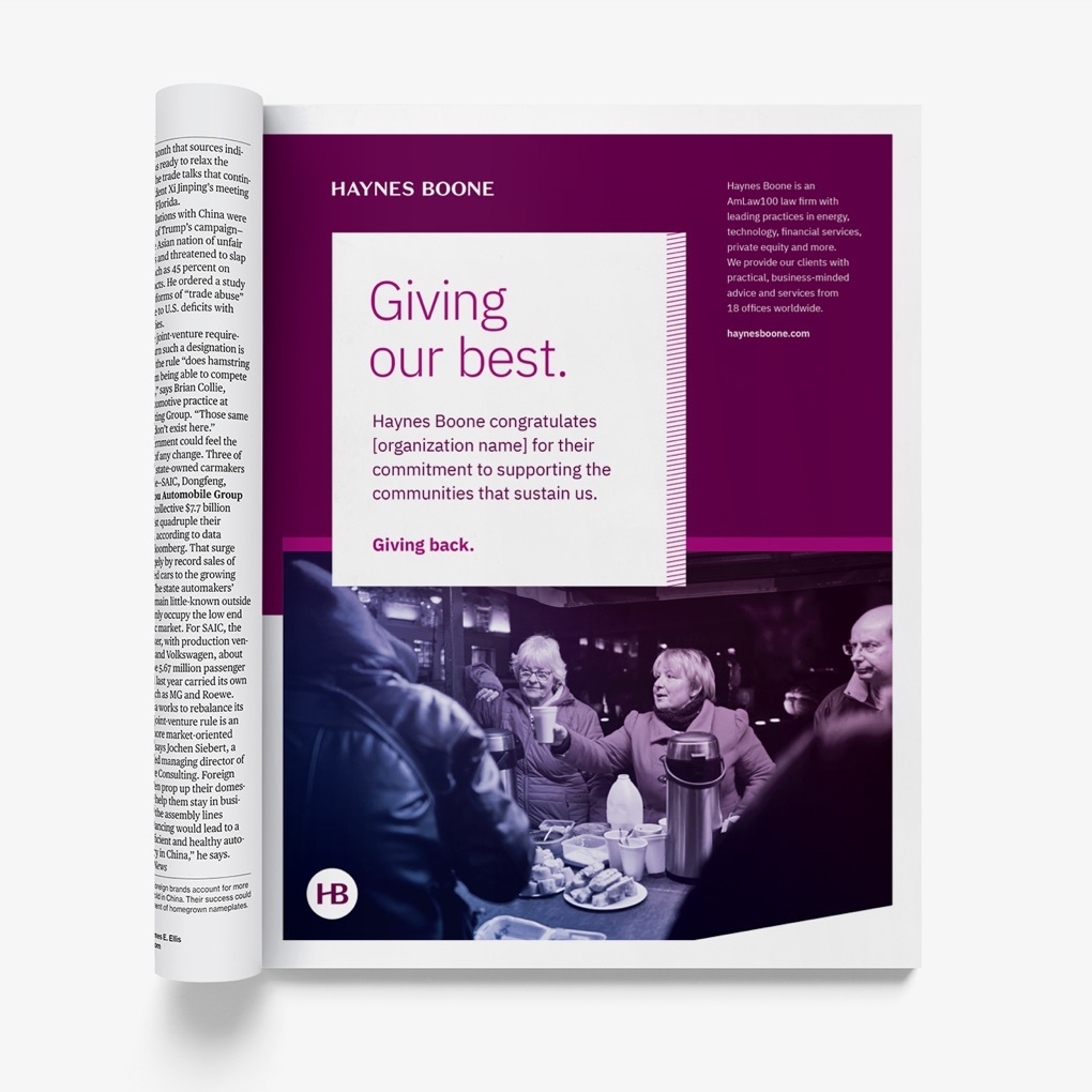
We proposed a system of image and sponsorship ads that paired sharp editorial headlines with key brand elements to produce a uniquely Haynes Boone look. The photo treatment for sponsorship ads was introduced to help unify often disparate stock imagery, and the clipped corners on the color fields reiterate the signature raised bar motif.
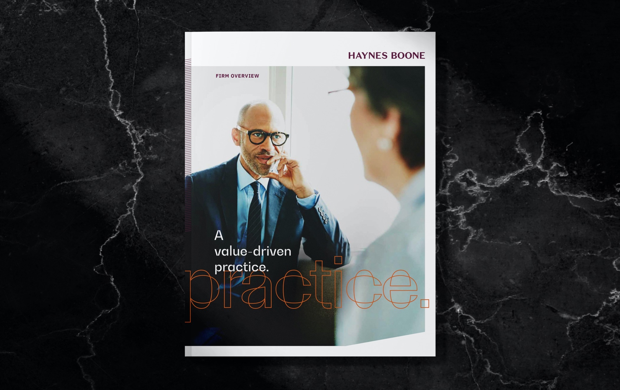
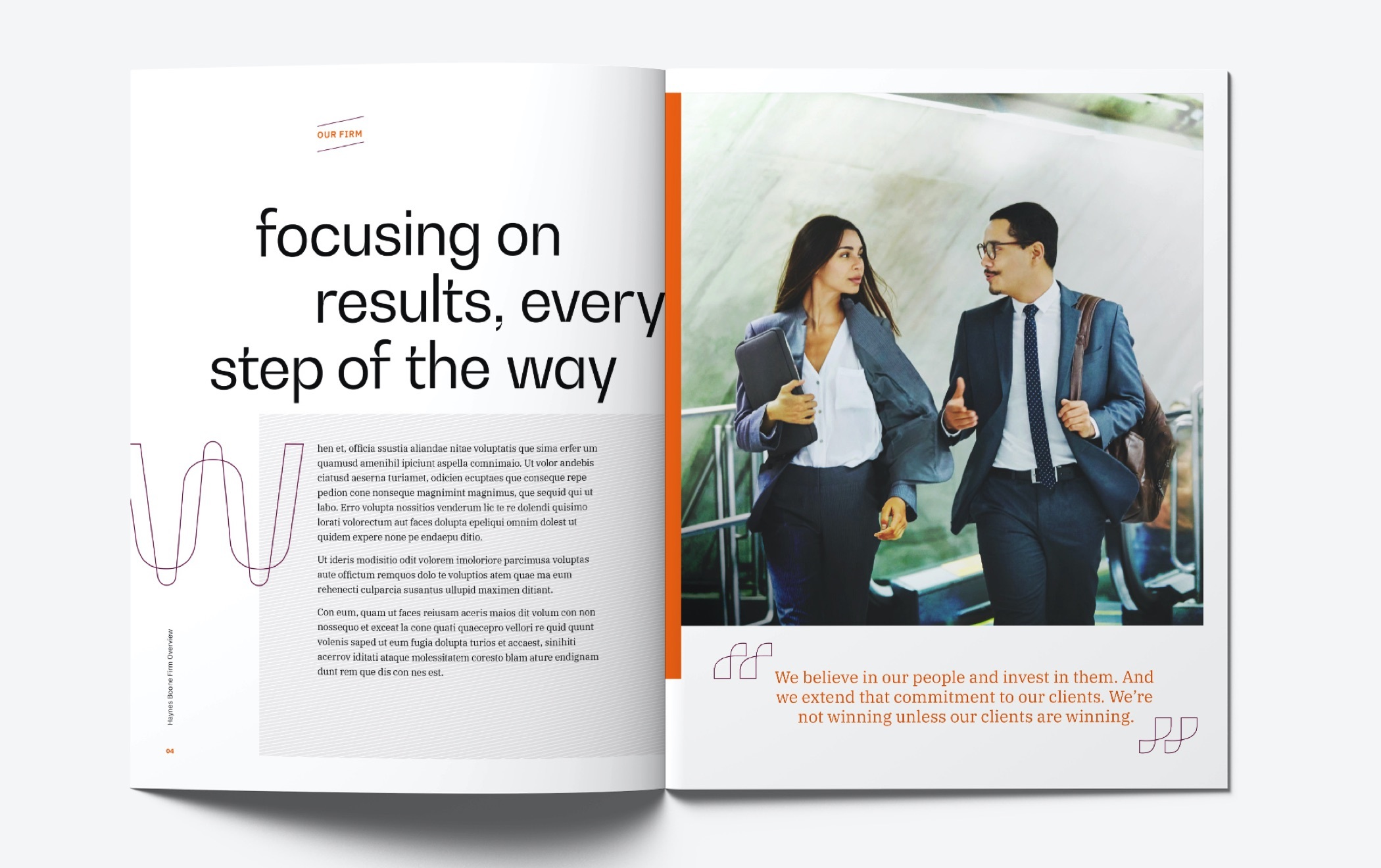
Our concept mockup of a firm overview print brochure illustrates a polished combination of photography, color, and typography in a longer form application.
All elements of the rebrand were tied to the firm’s brand strategy and five year plan—and were presented to the international partnership for their acceptance and approval with that in mind.
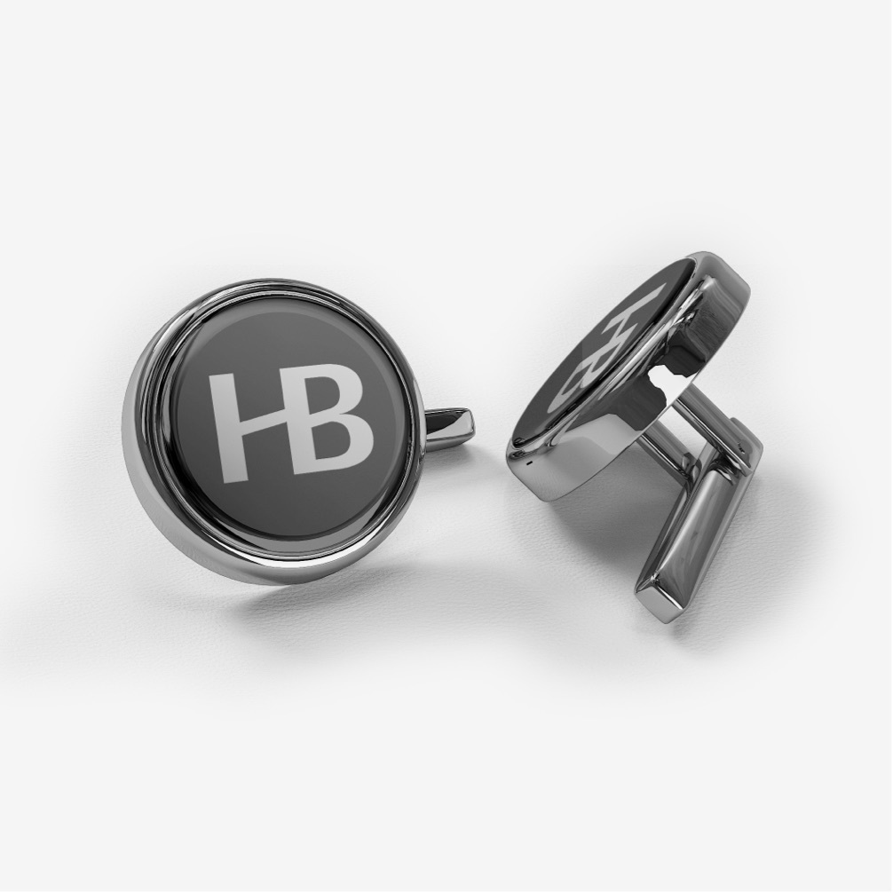
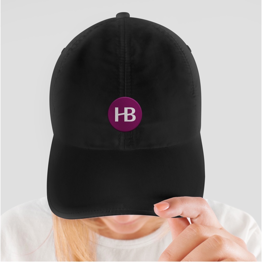
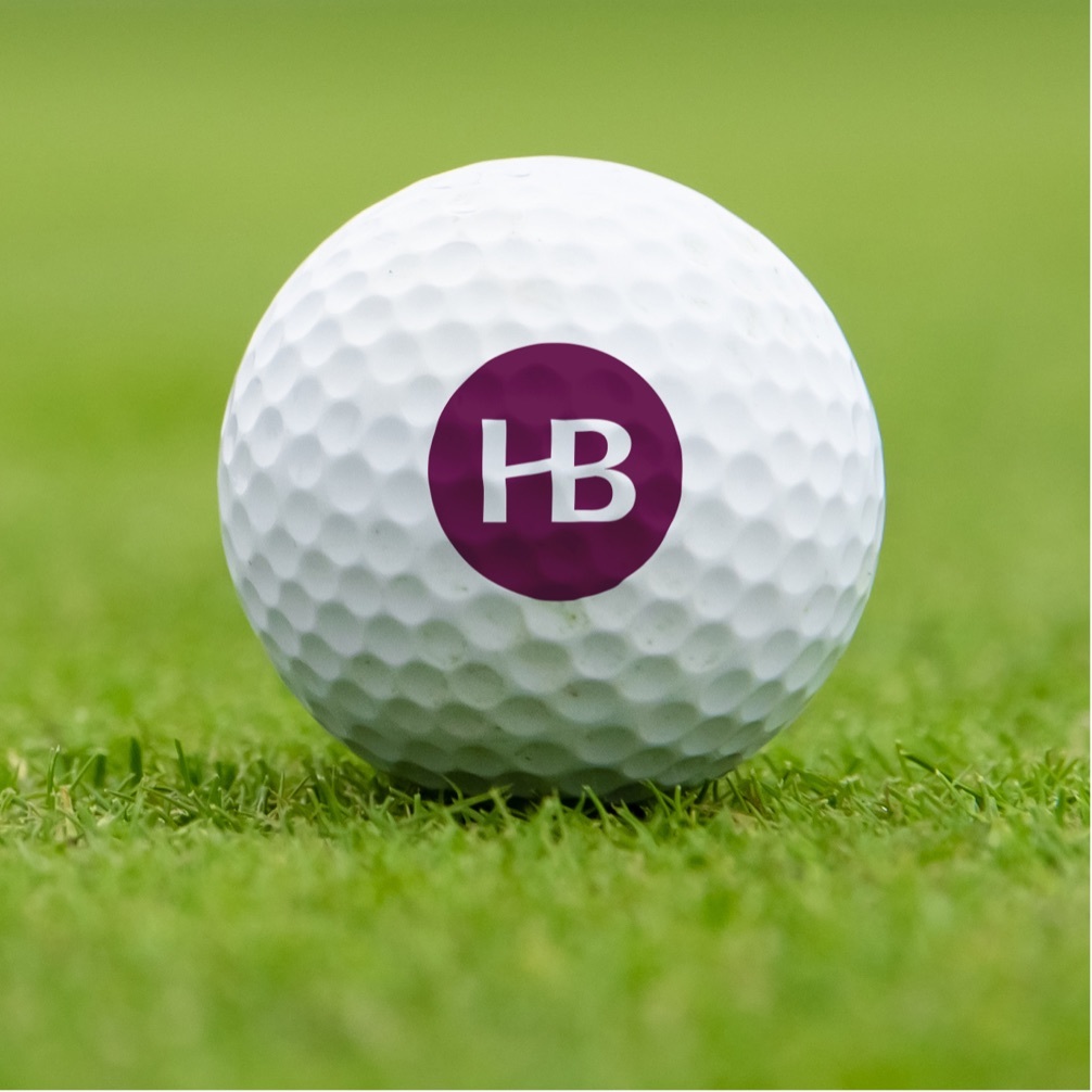
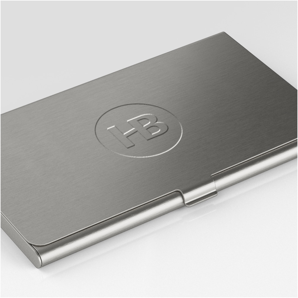
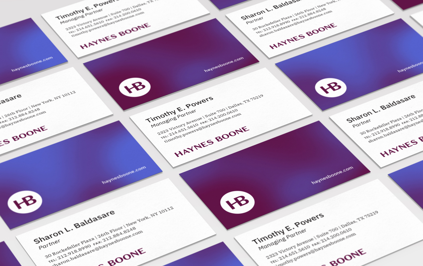
We developed the HB Monogram as a secondary brand identifier to support the primary logotype and for use on applications where space, and impact, are at a premium. The elegant mark fits tidily in a circle, which makes it ideal for a range of giveaways.
We designed and wrote extensive brand guidelines to provide the Haynes Boone marketing team with the foundation it needs to implement their new brand identity. The guidelines were accompanied by templates for fact sheets, PowerPoint presentations, stationery, and other business collateral that helped them hit the ground running on day one.