Steve’s Camp at Horizon Farms offers NYC public school students from systemically nature-deprived communities a free sleepaway camp experience. But outdated language and branding limited their ability to connect with campers and their communities.
Thinkso created a branding system that evokes nature and reflects the bold, blocky street style popular with NYC teens, while still appearing professional and credible to donors and caregivers. Their new tagline — “A summer of fun. A lifetime of growth.” — communicates the camp’s unique emphasis on mindfulness and self-care, without paternalistic language. It also reflects their new editorial approach designed to respectfully describe the communities served. Visit their new website, which we architected, wrote, and designed, at stevescamp.org.
“Thinkso left no stone unturned—and turned over stones I didn’t know we had—creating a brand that reflects the nuances of our history, mission, and the communities we serve, so we can expand our donor base and impact.” Terence Gerchberg, Chief Executive Officer, Steve's Camp at Horizon Farms

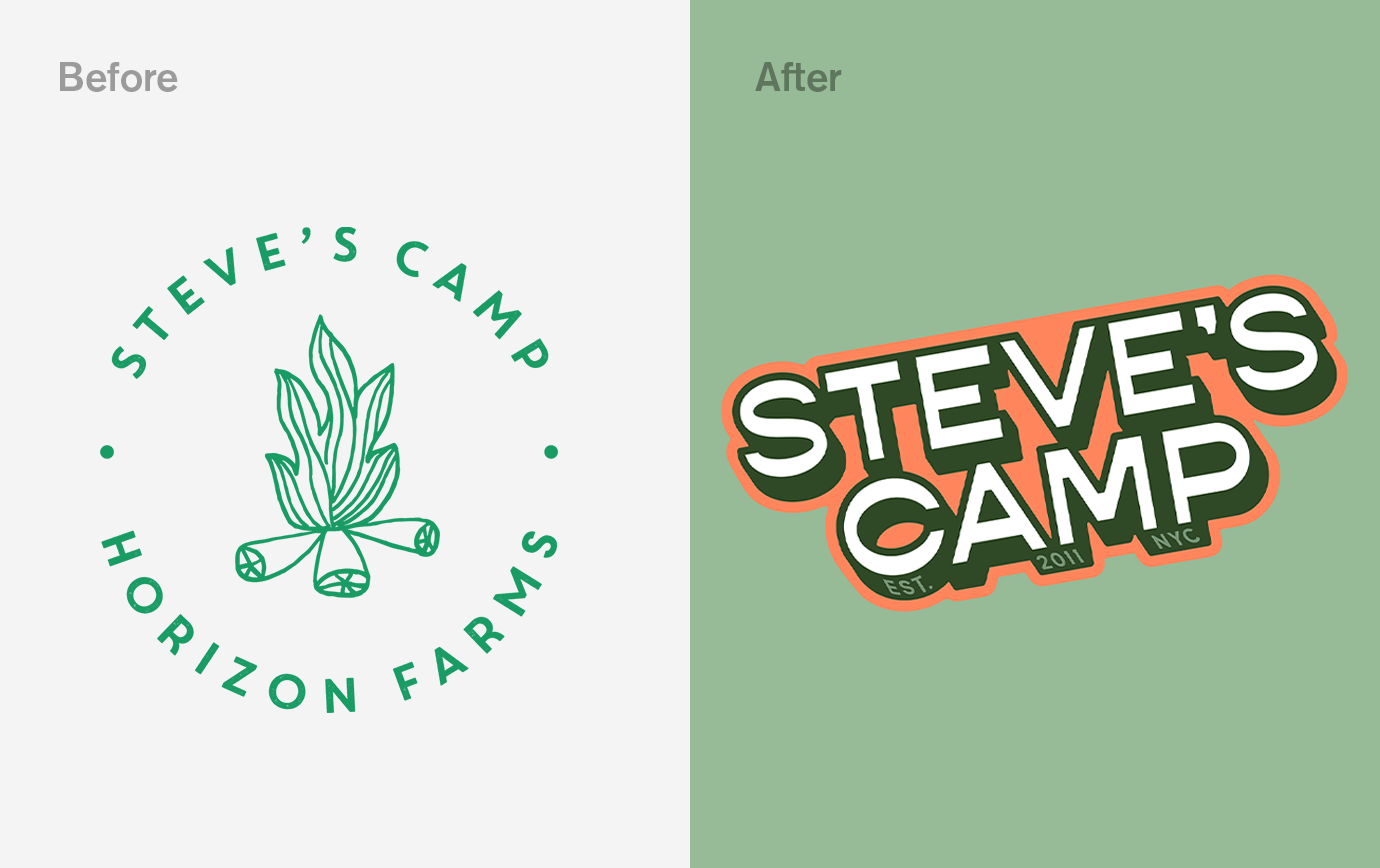
The wordmark we created uses weights and a shadowed effect to feel bold and grounded—values that the campers and staff of Steve’s Camp exude. The bold characters also make it flexible: it can be staggered to overlay photography, centered and contained in a shape for a more traditional look, or blockbuster for a more dimensional, dynamic effect. We provided several variations so that it can be tailored to the medium in which it appears.
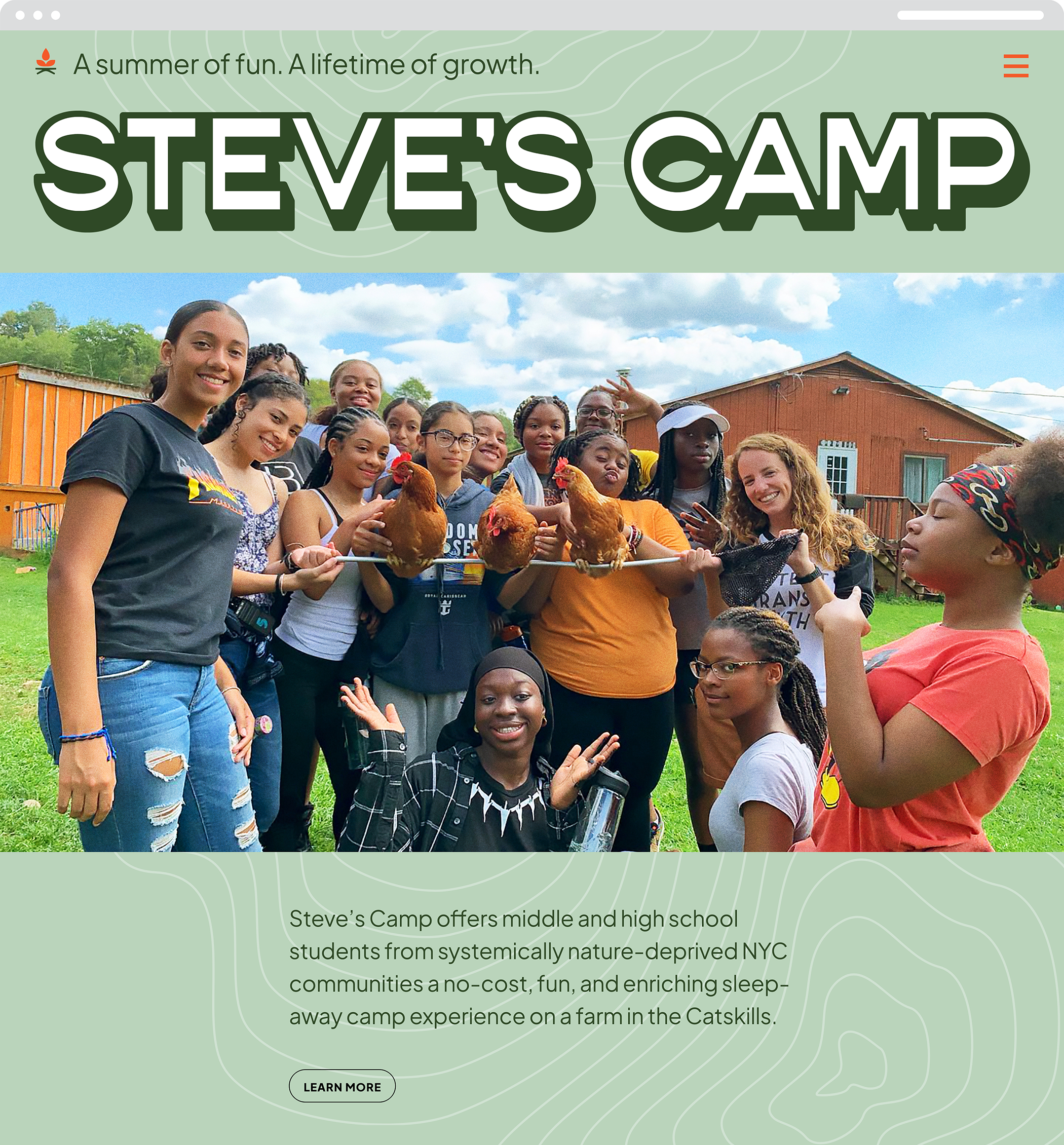
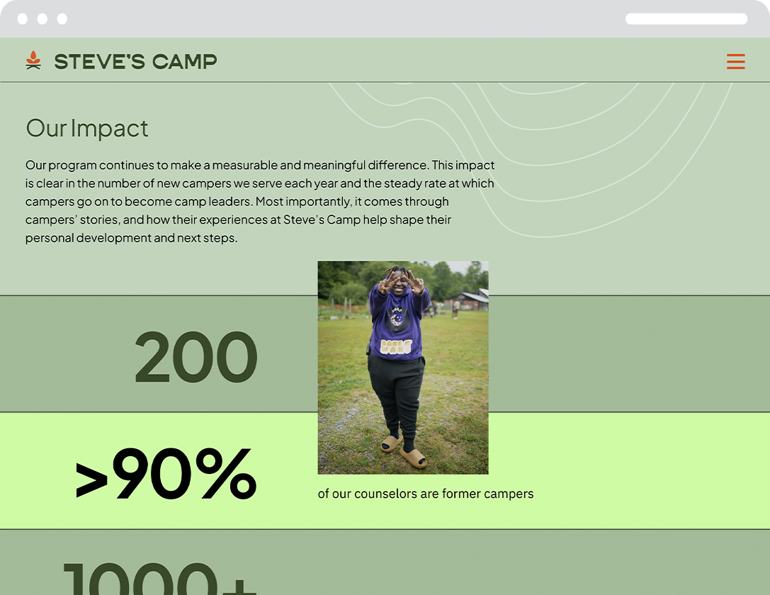
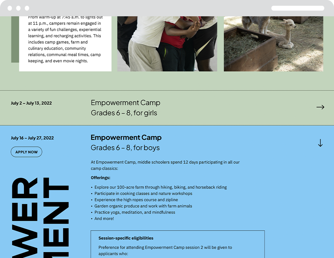
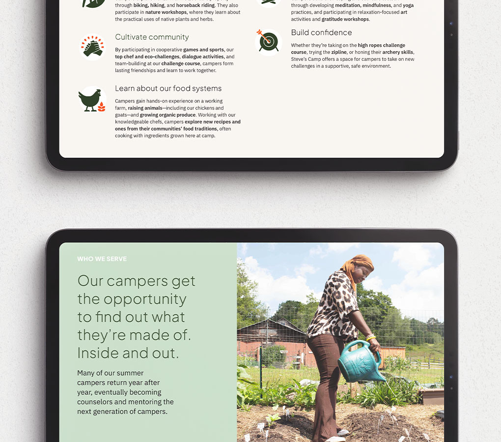
With our web development partner, Surprise Highway, we created a site laser-focused on the camp's mission, with increased functionality for donors, as well as campers and their families. Every page combines vibrant photography and a straightforward tone to keep the focus on the most important parts of camp: the mission and campers. Through both text and icons, the “Camp Experience” section ties each “camp classic” activity to a larger takeaway central to the camp's mission—connect with nature, cultivate community, learn about our food systems, practice self-care, and build confidence. The “Get Involved” section also focuses on the camp's vision and the need it fills before prompting users to donate. Visit the new website at stevescamp.org.
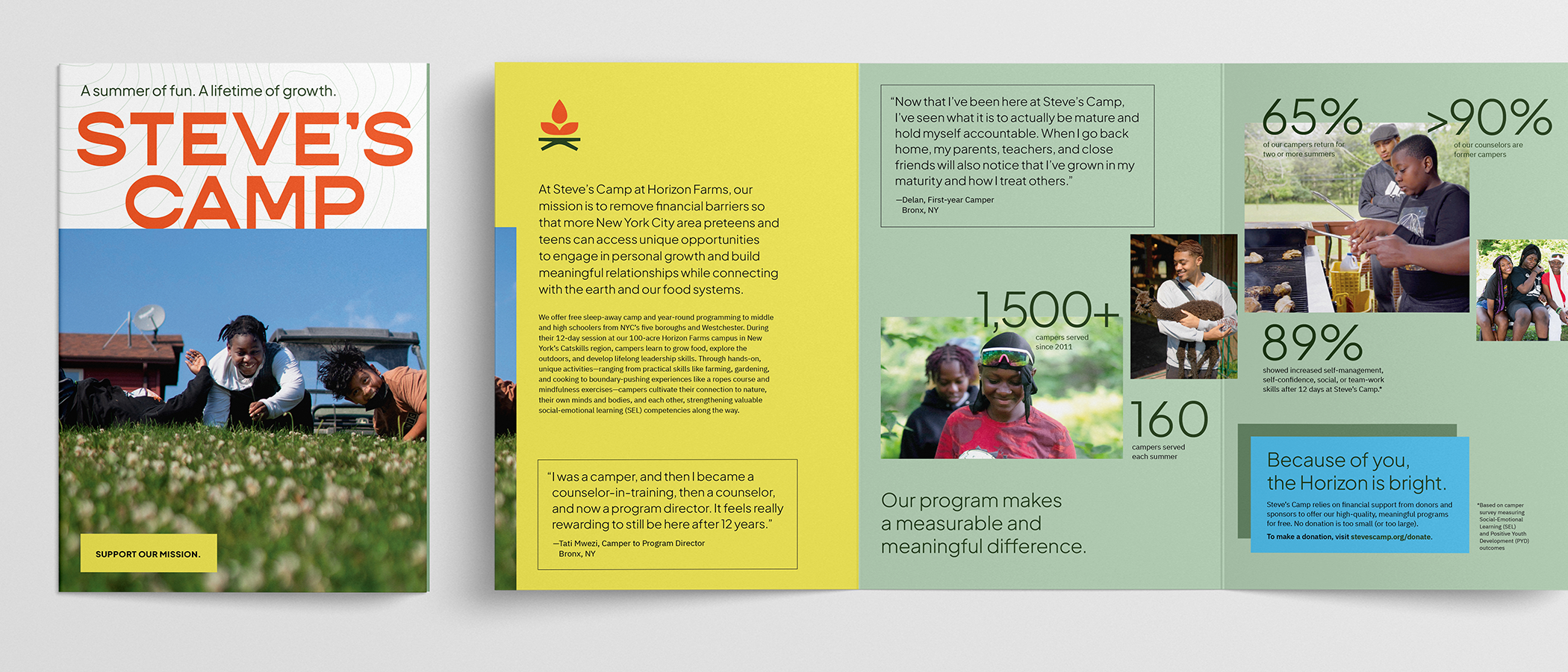
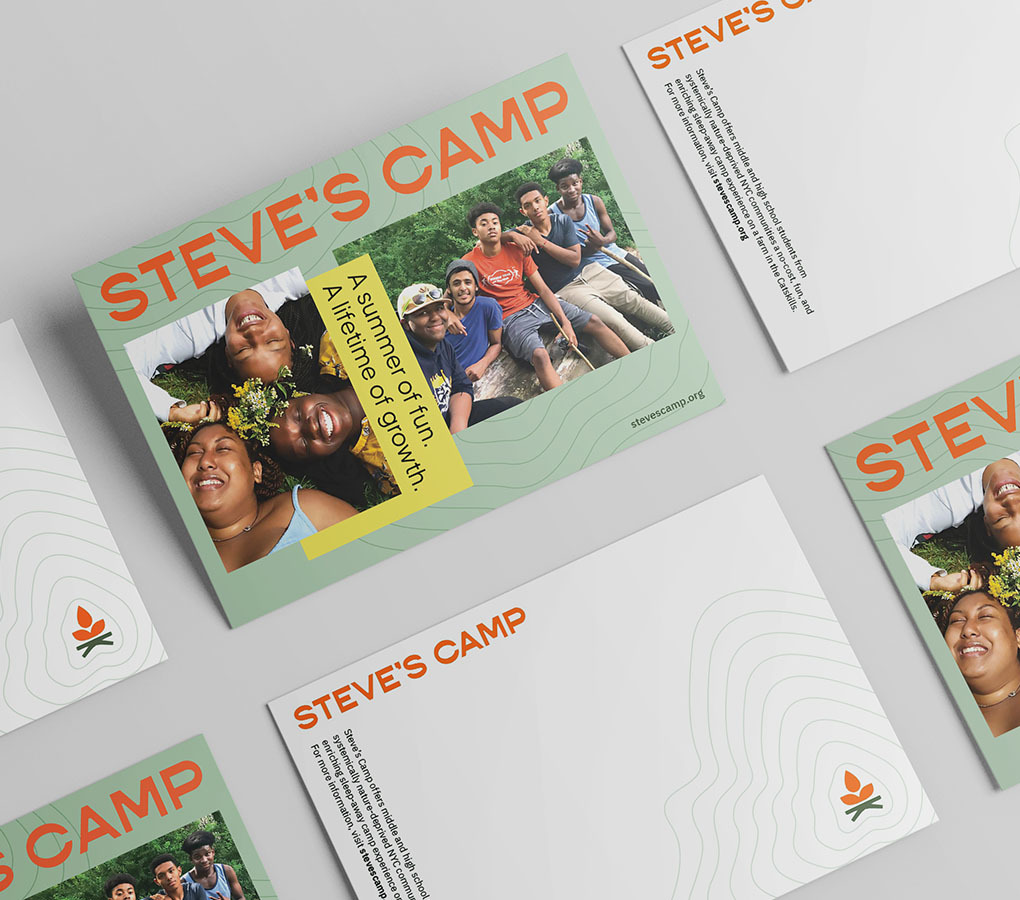
Steve’s camp has the challenge of communicating with two distinct audiences—campers/caregivers and donors. So, we created two distinct brochures with unifying icons and vibrant photos of campers to draw the audience in. The Camper brochure focuses on the day-to-day camp experience and the logistics of enrolling in camp to get students excited and alleviate nervous parents’ anxieties. The Donor brochure illustrates camp’s big-picture impact—citing metrics on campers’ social-emotional growth and number of participants—and demonstrates the importance of its mission through data on the scope and effects of nature deprivation in low-income communities. Our long-time partner Allied Printing Services printed the Donor brochures, along with business cards and postcards.
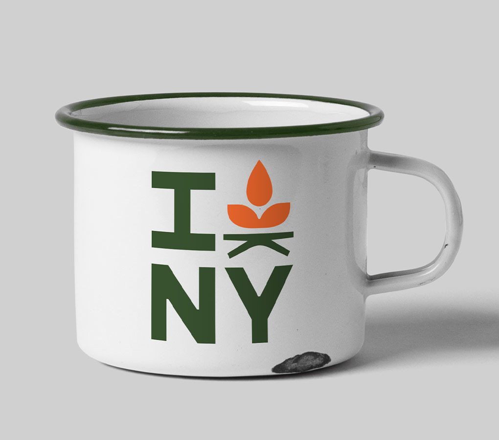
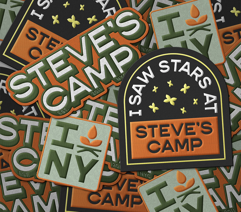
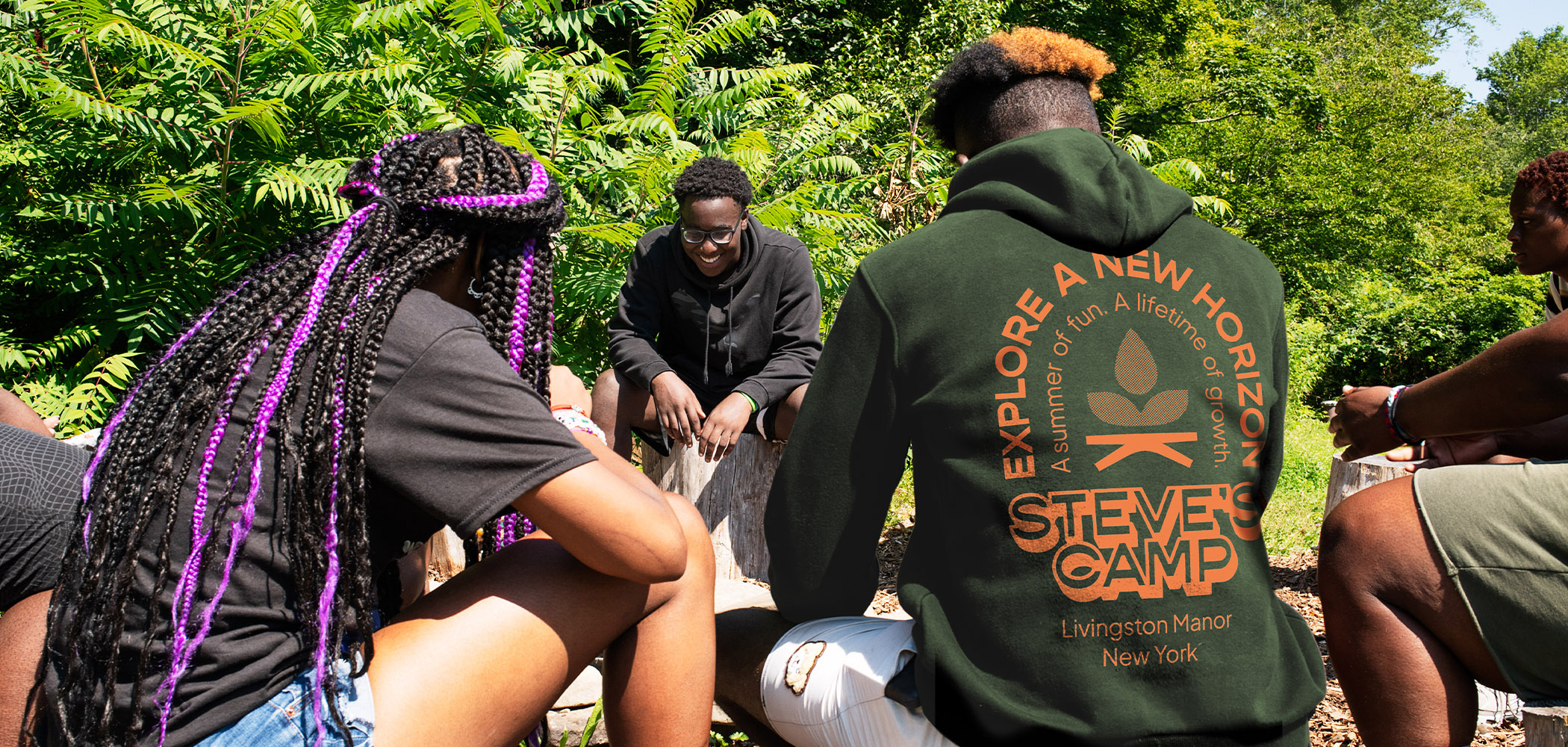
With on-trend tees and sweatshirts, mugs, and other swag, campers can take a little bit of camp home with them and represent Steve’s Camp in the outside world. Wearable, functional items raise brand awareness with potential campers, as well as potential supporters like school administrators and educators.
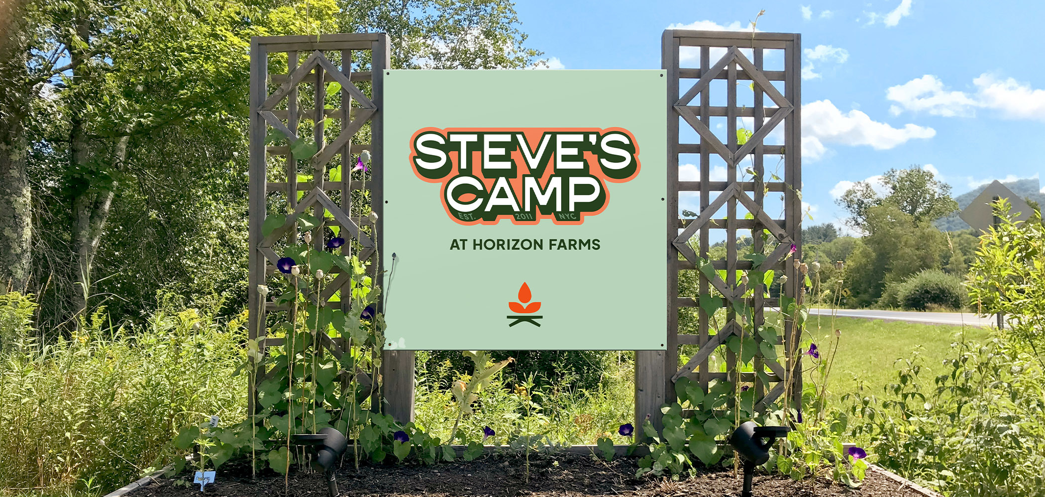
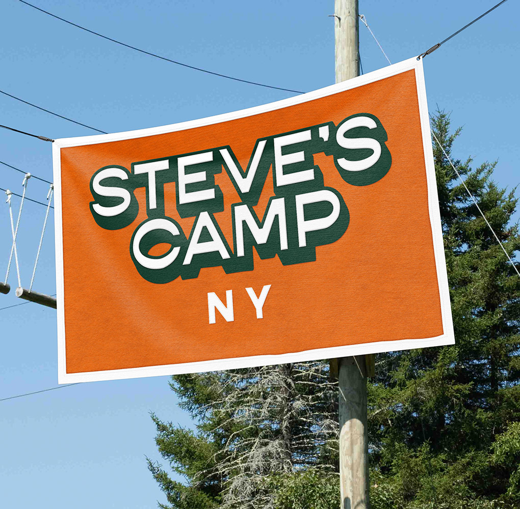
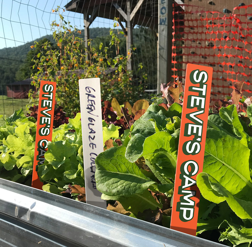
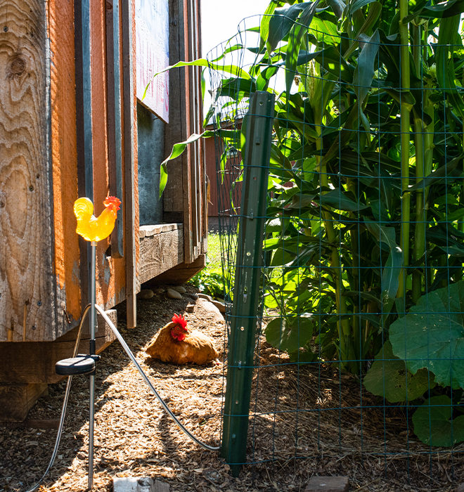
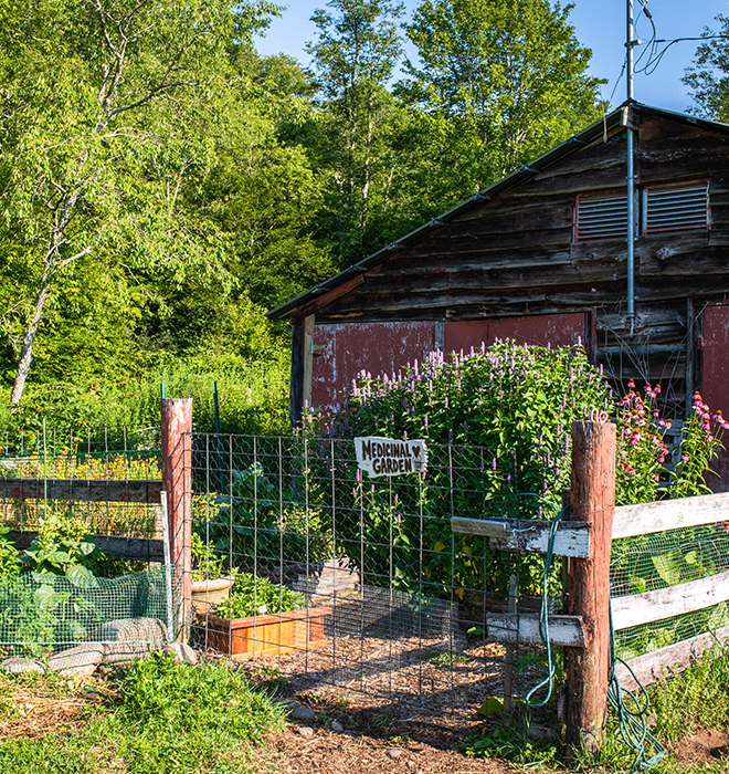
The Horizon Farms campus is essential to the camp's mission of fostering a connection between campers, nature, and our food system. To emphasize that connection, we designed branded plant markers for the organic garden. We further extended the new branding into the physical space with bespoke signage, including a dinning hall banner and a new entrance sign that is easily recognizable from the road. Gotham Color brought the entrance sign and plant stakes to life through fabrication.
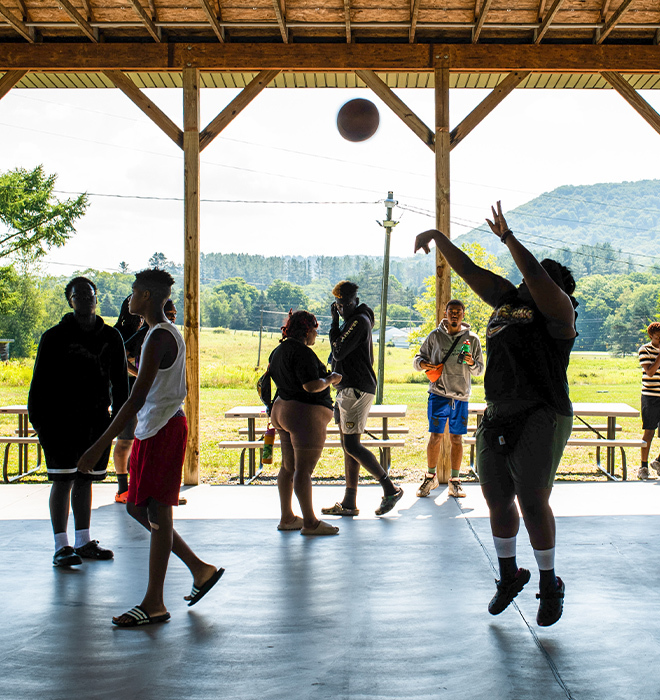
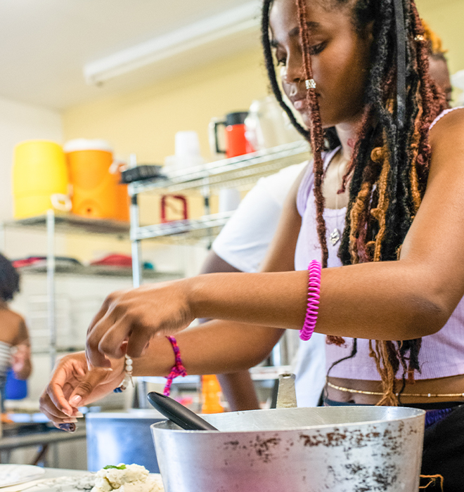
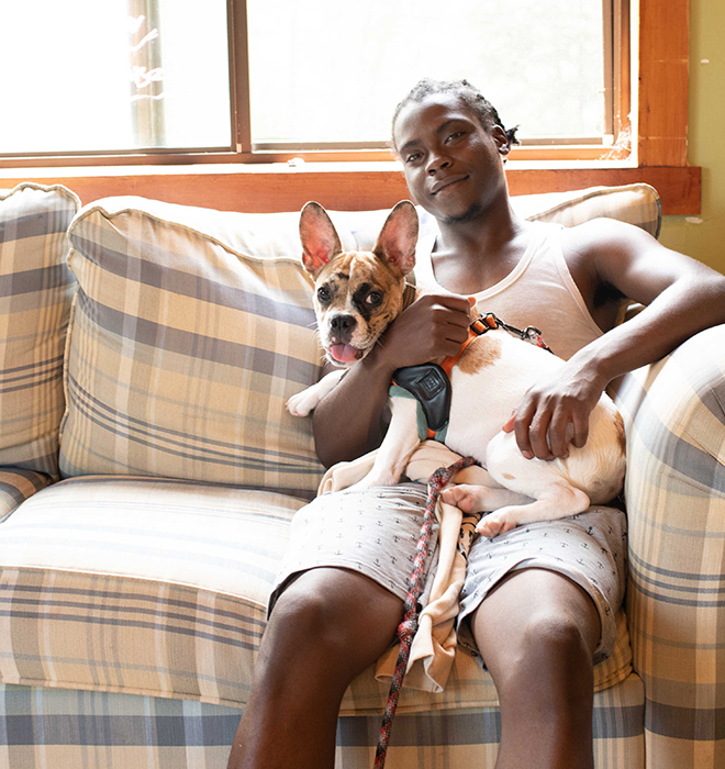
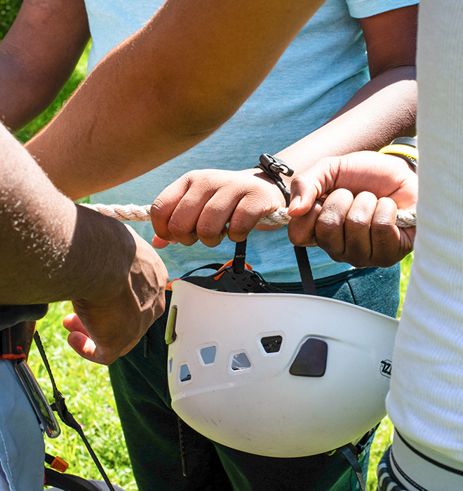
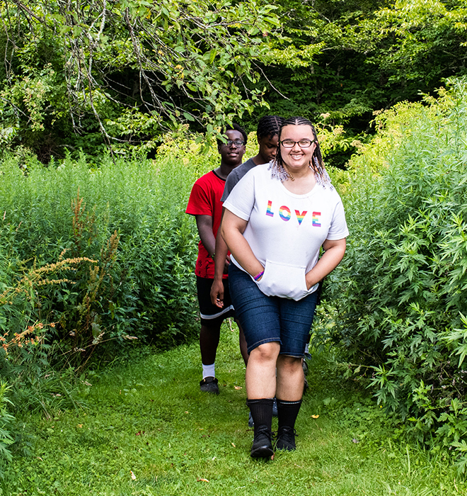
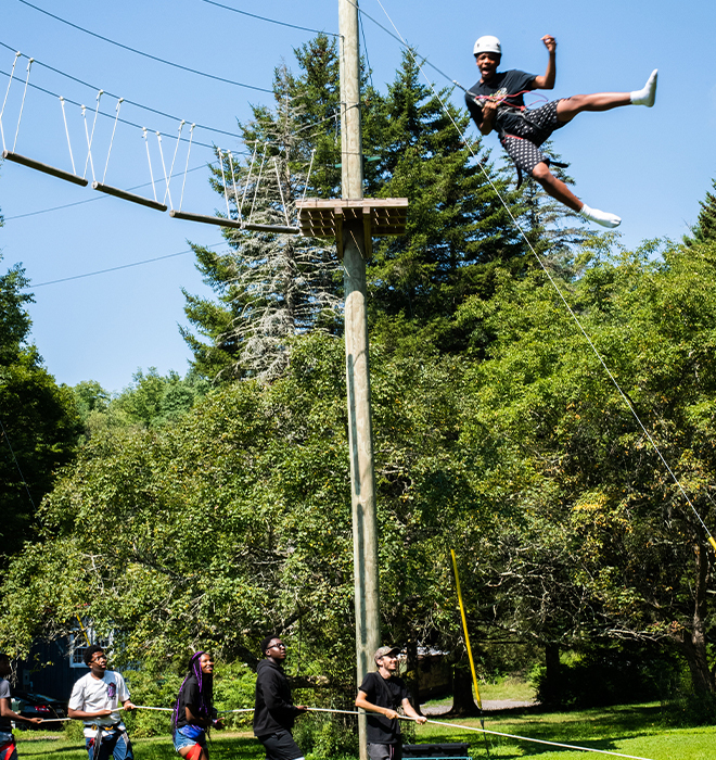
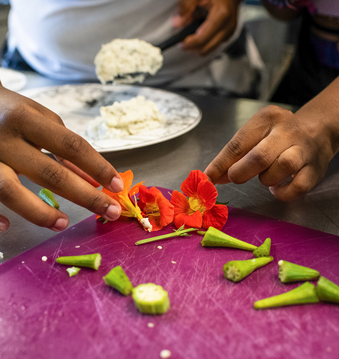
Photographer MacKenna Lewis captured the energy of camp with candid shots of campers in action—cooking, playing games, and spending time as a community. The photos show donors whom their money will impact and allow campers to imagine their own camp experience.