In the decade since its inception, A Free Bird has used therapeutic arts to uplift children battling cancer and other life-threatening diseases. But a garish identity, clumsy website, and unclear program descriptions prevented them from reaching more children and maximizing enrollment. After winning Give a Brand! in 2017, A Free Bird received the tools needed to take the organization to the next level: a refined brand identity, clarified messaging, print collateral, a polished, user-friendly website, and more.
To communicate A Free Bird’s core therapeutic disciplines at a single glance, the new logo symbol comprises a treble clef and a paintbrush. It’s paired with clean and elegant but slightly ornamental typography to portray the organization as both professional and creative.
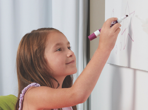
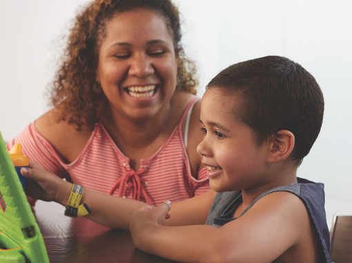
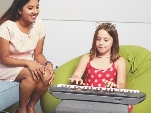
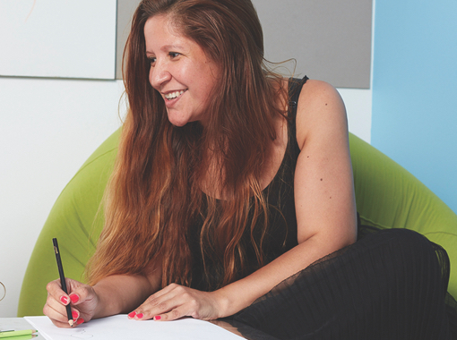
Working with photographer Matthew Septimus, we created a library of high quality images showcasing the young hearts and helping hands at the center of A Free Bird, furthering their mission’s visibility and credibility.
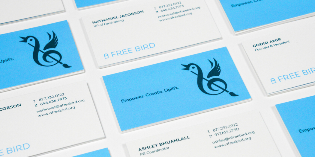
A Free Bird’s new tagline—”Empower. Create. Uplift.”—captures their goals succinctly and reveals to potential donors all of the positive efforts their funds would go toward. The organization also received new printed business cards, stationery, and a printed brochure, turning our design and editorial into tangible tools they could immediately put to work—thanks to Give a Brand! sponsor Allied Printing.
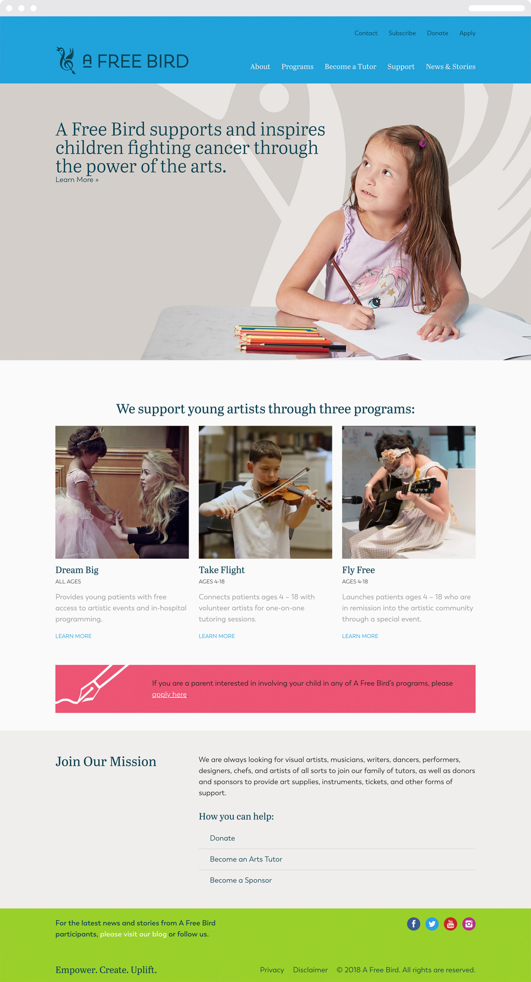
Working with programming firm (and Give a Brand! sponsor) Surprise Highway, we created a more professional, user-friendly website for A Free Bird that’s just as fetching as it is functional. The site features clearer program descriptions, prominent calls to action, and online applications, to name a just few of the upgrades.
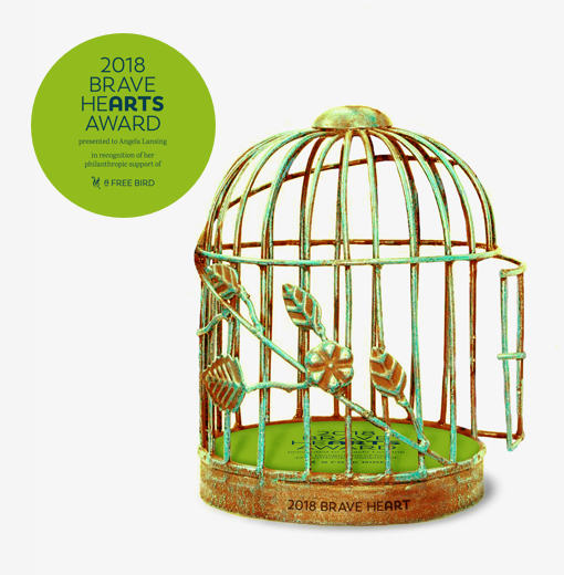
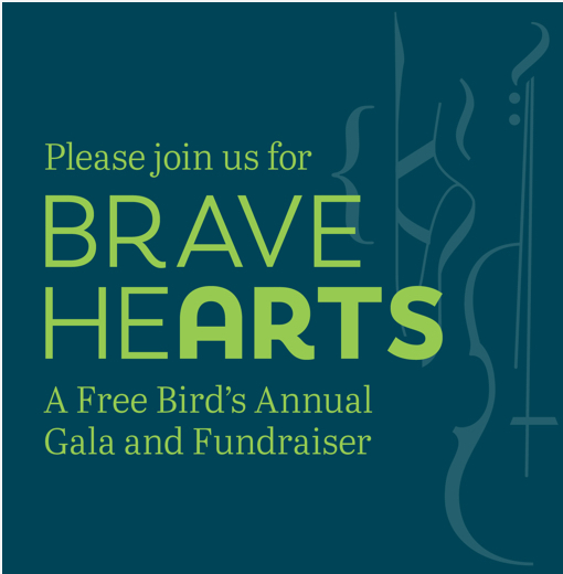
Thinkso renamed A Free Bird’s annual gala fundraiser (“Brave Hearts”), designed an attractive e-invitation, and even designed a custom award taking the form of a gold-clad birdcage accented with branding at the base.
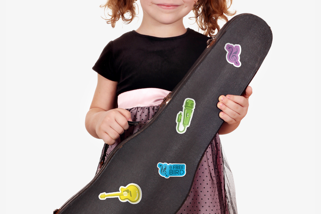
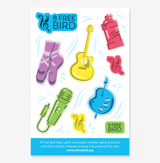
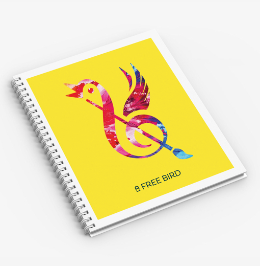
To help spread A Free Bird’s mission organically, we created a custom set of giveaways. A sticker pack features information about the organization’s mission, and an eye-catching notebook is the perfect receptacle for children to catalog their thoughts, feelings, and creative pursuits throughout their treatment and beyond.
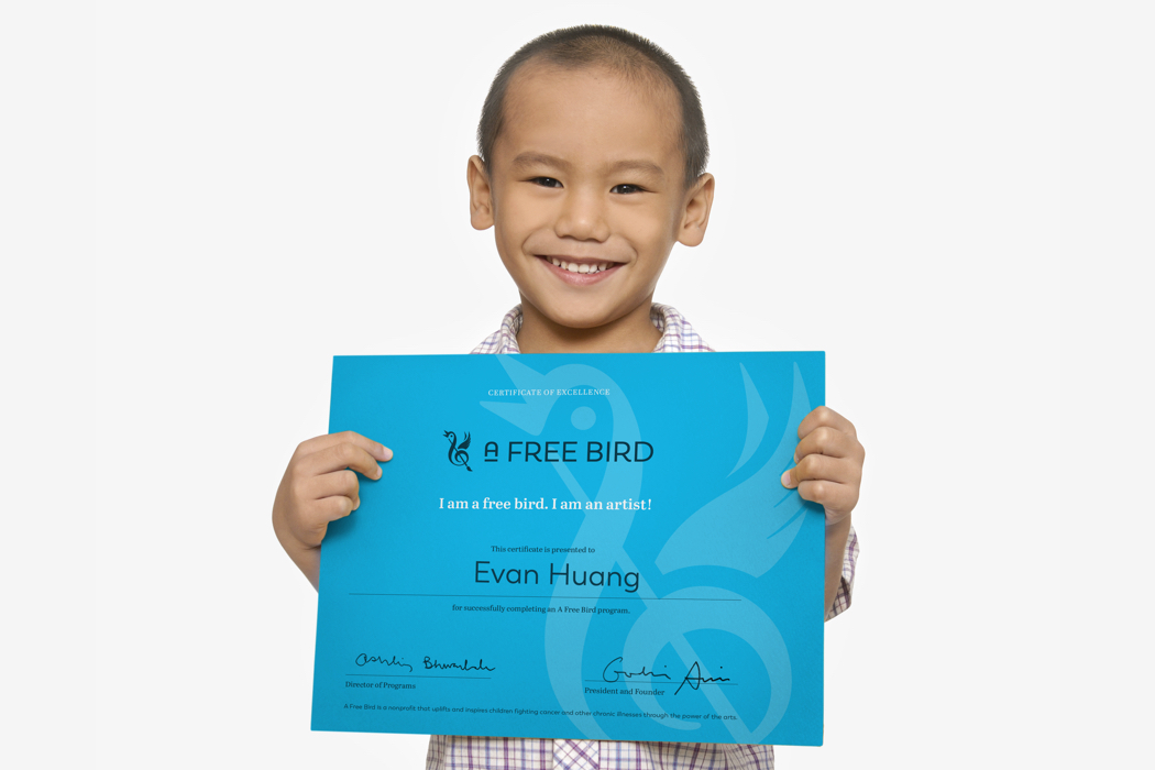
We designed certificates in the organization’s new signature identity color, to give children an extra sense of accomplishment upon completing one of A Free Bird’s programs.