A checking account! How cute!
Working with Thinkso the past two years, I have designed marketing materials for clients in the financial and professional services sectors. Most of the time, these clients require mature, serious, and reserved concepts and aesthetics. Even though we do our best to break new ground and create differentiation, we know that we can push so far before we overstep the bounds of what is appropriate for the target audience. As an immigrant from Asia, this sometimes strikes me as odd, especially for a culture like the U.S, so open and informal in so many ways — and especially when contrasted with the design and marketing world from which I come.
I was born, raised and trained as a graphic designer in Taiwan, which is heavily influenced by Japanese pop culture. One such Japanese design trend is Kawaii, the quality of cuteness. Its root word pretty much says it all: “ka” means “acceptable” and “ai” means “love.” The Kawaii style comprises soft characters, cute animals and child-like ideas. It’s used to convey that something is cool, acceptable, charming and, most important, non-threatening.
In CNN’s “It’s all Kawaii: Cuteness in Japanese Culture,” the author traces the style’s inception to the early 1970s and states that it was intended to evoke sentiments of maternity and affection, contrasting sharply with the male dominated society of Japan. I think Kawaii is indeed a sort of rebellion against what has been for centuries a very formal, rigid culture and aesthetic. (Read that CNN article to learn how Kawaii originally evolved from school girls’ handwriting!)
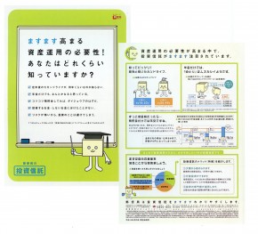
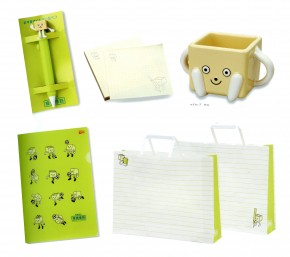
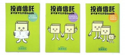
What interests me most is how the Japanese use the Kawaii for even serious business industries, such as financial services. The Japan Post Investment Trust has a very long history in the banking business, yet they have fully embraced Kawaii. They created a cute mascot as the main design element and use it on everything from promotional pieces to annual reports (pictured above).
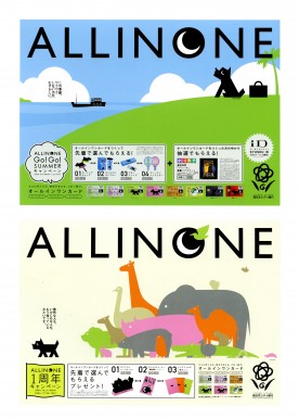
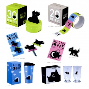
The Nishi-Nippon City Bank created their own Kawaii style campaign (above), but this time they pushed it even farther by developing a line of merchandise, including mugs, kitchen timers and tape dispensers. (By the way, Kawaii characters as well as the merchandise appeal to both men and women, another interesting difference between Asia and the West.)
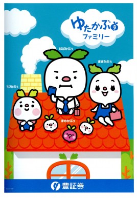
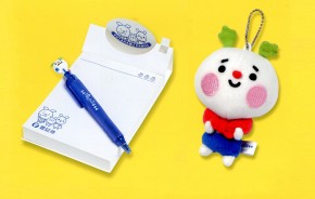
The Yutaka Securities Co. LTD, designed a campaign that specifically targeted young families. Yutaka created a family of Kawaii characters (rather than photos of models standing over computer screens or meeting with financial advisors) to portray the challenges faced by this target audience — buying a home, growing a nest egg, etc.
I can only assume that these three examples of banks leveraging the Kawaii trend is a very smart marketing strategy intended to make something as staid as financial services appealing to a young demographic. Knowing how popular Kawaii is throughout Asia, I think they made the right move.
This brings me to wonder why American banks aren’t following suit? I don’t mean using Kawaii, per se. (While Kawaii communicates trust, warmth and accessibility in Asia, here it would most likely be interpreted as frivolous, unreliable and weak.) But why aren’t U.S. financial and professional services taking a hard look at what’s really appealing to the younger generation and then use it to reinvent if not themselves then their marketing?