Becoming Best of Show
In the design world, quilting is often relegated to the same category as scrapbooking and rubber stamping. At best, it’s called “geekery.” But when I attended the American Quilter’s Society March show in Lancaster, Pennsylvania, I was struck by how much quilting and graphic design have in common.
I’ve been quilting since I was about eight, so it’s bizarre that this comparison has never hit me before. I’ve always worked hard to reconcile my career choice in commercial art with my private passion for handwork. Nowadays, they are syncing up more and more for me.
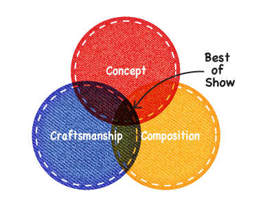
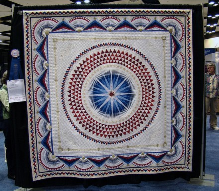
In fact, one of the winning quilts from Lancaster is the perfect expression of what makes a “best of show” design — in any medium. Sherry Reynolds’s America, Let It Shine quilt excels in the same three categories that make a design project a success: concept, composition, and craftsmanship.
Concept
Stories are what give visual design dimension and capture an audience’s attention. It’s always where Thinkso starts with a project. What story are we trying to tell? What makes this story interesting/unique/engaging?
Reynolds’s visually striking quilt, is made all the more captivating by its concept and backstory. She was helping her kids with their homework when she realized that she herself needed to create a quilt as “a tribute to America, its foundations and values, with the hope that they will guide us to a brighter future.”
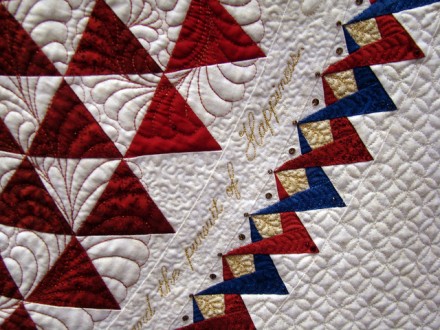
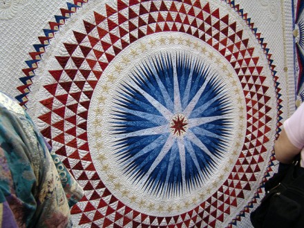
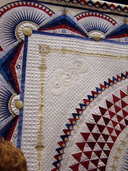
To communicate this concept she embedded into the quilt 50 gold stars around the central starburst, which signify the 50 states. Thirteen blue points in the bunting around the edges represent the original 13 colonies. She included the beginning of the Gettysburg address, as well as the Constitution and the Declaration of Independence, all quilted in gold thread. Finally, she inserted nearly 5,000 crystal beads, representing…all sorts of patriotic things. (It’s a long list).
 Composition
This is where the visual design comes in — and where many conceptual quilts (and commercial design projects) fall apart. Reynolds meticulously mapped out the design of her whole quilt on graph paper (not a computer, mind you). The composition is at once orderly and magical. The mandala-like structure conjures up so many references, from the spiritual eye of the universe to the ceiling of the Capitol’s rotunda. The pattern of semi-circles and triangles around the edges evokes traditional patriotic bunting, quintessential Americana. The quilting stitches themselves form motifs found all over the neoclassical architecture of Washington, DC and other state capital buildings.
In this quilt’s composition, Reynolds was able to strike a perfect balance between abstract and literal, simple and extremely complicated, solid and dynamic. It’s a detailed, even busy, design, but it holds together as a single, cohesive, grand statement. This visual know-how isn’t something that just anyone can do. It’s often a combination of innate talent and years of training and trial. (At Thinkso, we work very hard to make everything we do both visually and conceptually smart. It’s not easy.)
 Craftsmanship
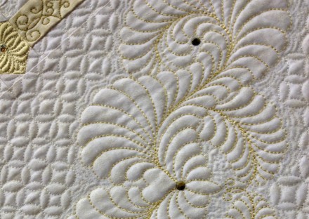
Whether you find quilting mundane or energizing, one cannot stand in front of this quilt and be anything but blown away by its detailed artistry and workwomanship. The tiny, white-on-white symmetrical stitch pattern is inconceivable, given that Reynolds did not use a computer-assisted or professional (“long arm”) quilting machine. She quilted every stitch using her 20-year-old Bernina 1001 (a classic home sewing machine; I think my mom had one.). Another nerdy quilting note that should awe you: Each piece of fabric is hand cut and then sewn so it aligns perfectly. The fact that she achieved symmetry with all those inner points and triangles unfathomable.
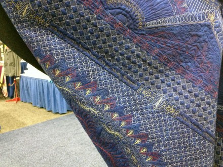
Looking at the back of the quilt gives a better idea of just how complicated the sewing is. The light stitches pop off of the navy background fabric and isolated from the composition, they alone tell a story.
This reminds me of how much behind-the-scenes work goes into what our graphic designers do for clients. Grids, mechanical construction, page coding, art direction of photoshoots, color selection, overseeing the printing, writing style guides! These are the stitches that hold the concept and composition together and are often lost on nonpractitioners.
Reynolds’s quilt has received many awards, as it has toured the country from competition to competition. I wonder if she knows that she’s not only an awesome quilter, but could also have the makings of a graphic designer.
Sherry Reynold’s America, Let It Shine has won numerous quilt shows and competitions, including Best of Show at the Pacific International Quilt Festival XX, Viewer’s Choice at the Road to California Quilter’s Conference, and Best Machine Workmanship at the AQS Lancaster show.
Photos courtesy Diana of the blog Dutchbaby and Chrissy O’Connor of Studio Handmade.