4 reasons to adopt a dynamic logo
As we’ve moved farther away from an analog world to a primarily digital one (thank you, Covid-19), brands have lost many of the touchpoints they once used to communicate with their audiences. As a result, every brand asset — especially one as ubiquitous as the logo — needs to work harder to grab and keep an audience’s attention across the remaining touchpoints.
But how? A dynamic logo can be a great solution. In the analog world, you need multiple touchpoints to convey the variability of the logo. But on digital platforms a dynamic logo can spin, flash, and morph through all its permutations in a matter of seconds.
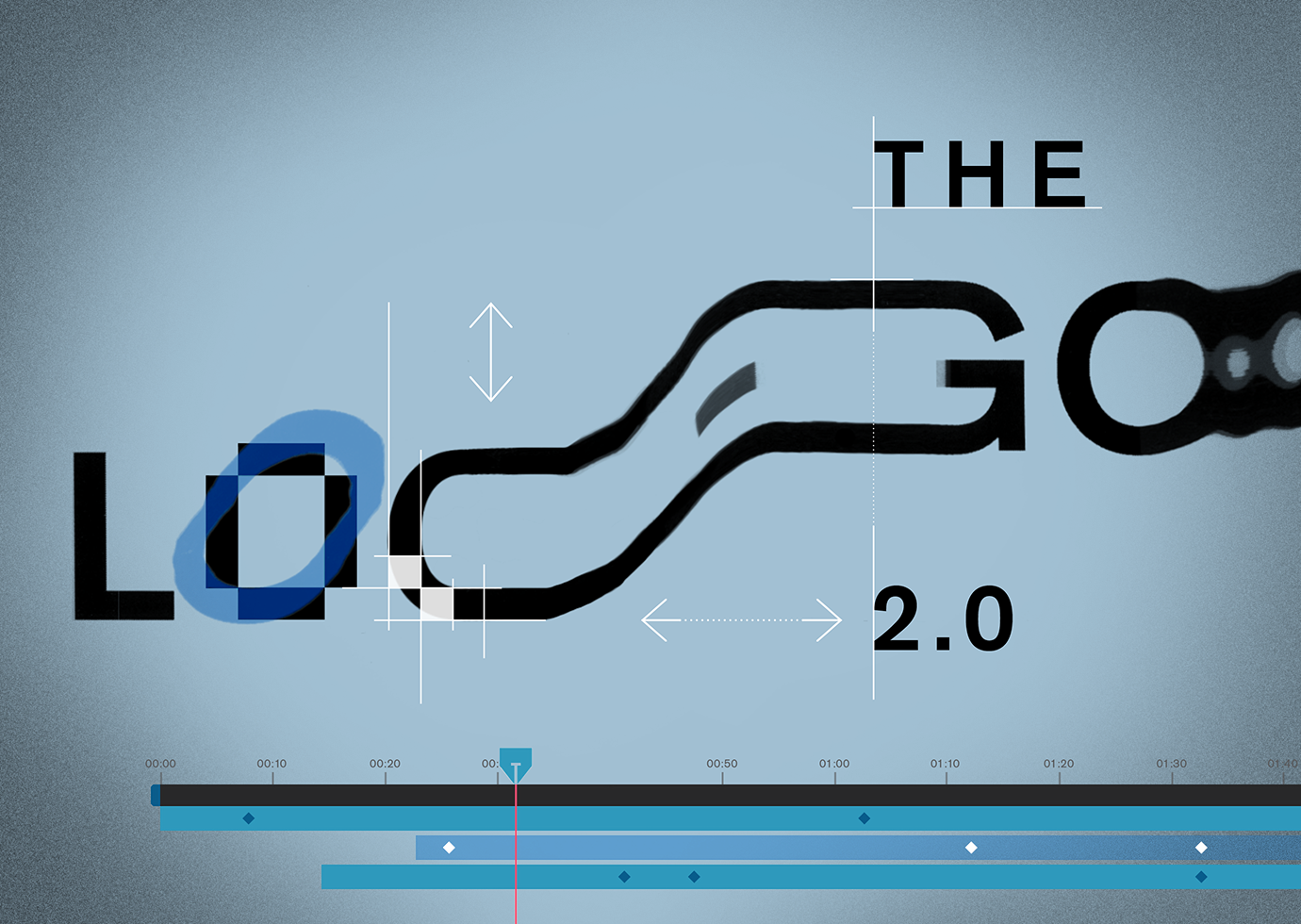
What is a dynamic logo and how does it work?
Like a traditional logo, a dynamic logo is a distilled representation of a brand identity. But rather than having one consistent design (that might come in a handful of slight variations: one-line, stacked, black, white, full-color, etc.), a dynamic logo has an element that changes. For example, some dynamic logos have a consistent typeface but its symbol or graphic elements change in a specific way. Maybe the shape and size of the symbol stays fixed but the color, imagery, and content within that shape shifts; or maybe it has a dozen or more different symbols used with the same typography. In any case, the variability itself is an important hallmark of the logo.
Examples of famous dynamic logos include the current Whitney Museum logo, AOL’s logo from 2009 – 2015, and MTV’s still-alive logo from the 1980s.
Four advantages to using a dynamic logo:
- It’s eye-catching and unexpected.
As branders and marketers, we have had the importance of brand consistency drilled into our heads. But we no longer have to sacrifice impact for the sake of consistency. Dynamic logos, when done well, still adhere to specific guidelines that make them consistent. But they have a much broader range of possibilities within that consistency. These possibilities are what can help a dynamic logotype cut through the noise in cyberspace, stand out, and be memorable.
Dynamic logos lend themselves particularly well to animation, and that makes them even “stickier.” According to one study, people remember moving images better than static images. In addition, our eyes are naturally drawn to movement to protect us from wild animals and other threats. Although today most of us are unlikely to encounter dangerous wild animals, we’ve retained that instinct. As a result, a logo that uses movement or animation will inherently draw an audience’s attention.
- It can tell a story.
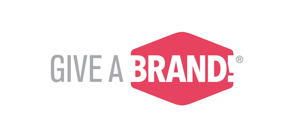
Dynamic logos, which morph and change, have more tools for storytelling built in. Take the logo for Give a Brand!, Thinkso’s annual pro-bono event that culminates in a high-energy, all-hands-on-deck “brand raising week.” Different colored shapes evoking “branding” rotate, while the words “Give a Brand!” stay constant. The logo’s fast-paced movement reflects the speed, energy, and flexibility with which Thinksorts work to deliver a total rebrand on a very compressed timeline. In addition, the cyclical nature of the logo mirrors the recurrence of the annual event. Ultimately, the logo makes full use of the digital medium, using fast movement and breadth of style to express the concept through a single brand asset.
- It creates a foundational brand with more depth.
Dynamic logos are inherently more flexible, and thus they can be designed for greater adaptability across various media and whatever context they’re put in, while staying true to the brand guide. The result is a foundational identity that has a richness and variety uncommon in those with static logos.
The logo of Casa Da Musica in Portugal is a great example. The symbol in its logotype is a simple line drawing of a 3-D shape that mimics the distinct architecture of the building. The shape of the symbol changes, reflecting how a viewer’s perception of the building changes depending on their vantage point.
At the same time, the logo’s system allows it to adapt to its surroundings. Within brand guidelines, the colors that fill in the symbol sample the colors from the photographs or other graphics nearby. As a result, it not only looks consistent with its environment, but it changes just enough to attract the audience’s attention without distracting by looking out of place with the asset as a whole. It is elevated from a generic blip that can easily be glossed over to a crucial piece of branding that actively engages the viewer.
- It signals innovation and creativity.
As demonstrated by the previous points, dynamic logos are different, forward-thinking, clever, and even edgy. They require innovation and creativity to create, and business savvy to implement. A company with a dynamic logo is not afraid to stand out and has the confidence to demonstrate ingenuity. What better way to signal that your company is all of these things than by adopting a dynamic logo?
Want to explore what a dynamic logo could mean for your organization? We’re ready when you are. Contact us at (212) 868-2499 or info@thinkso.com.