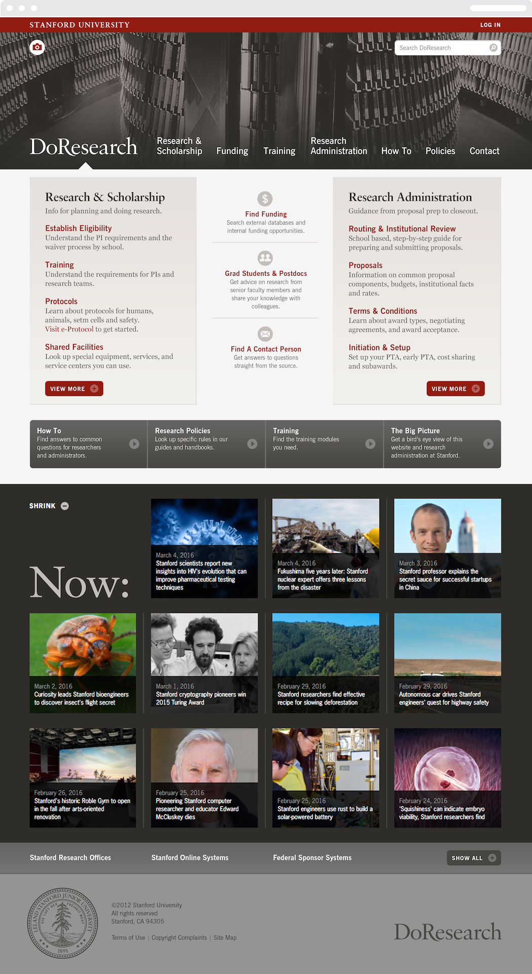
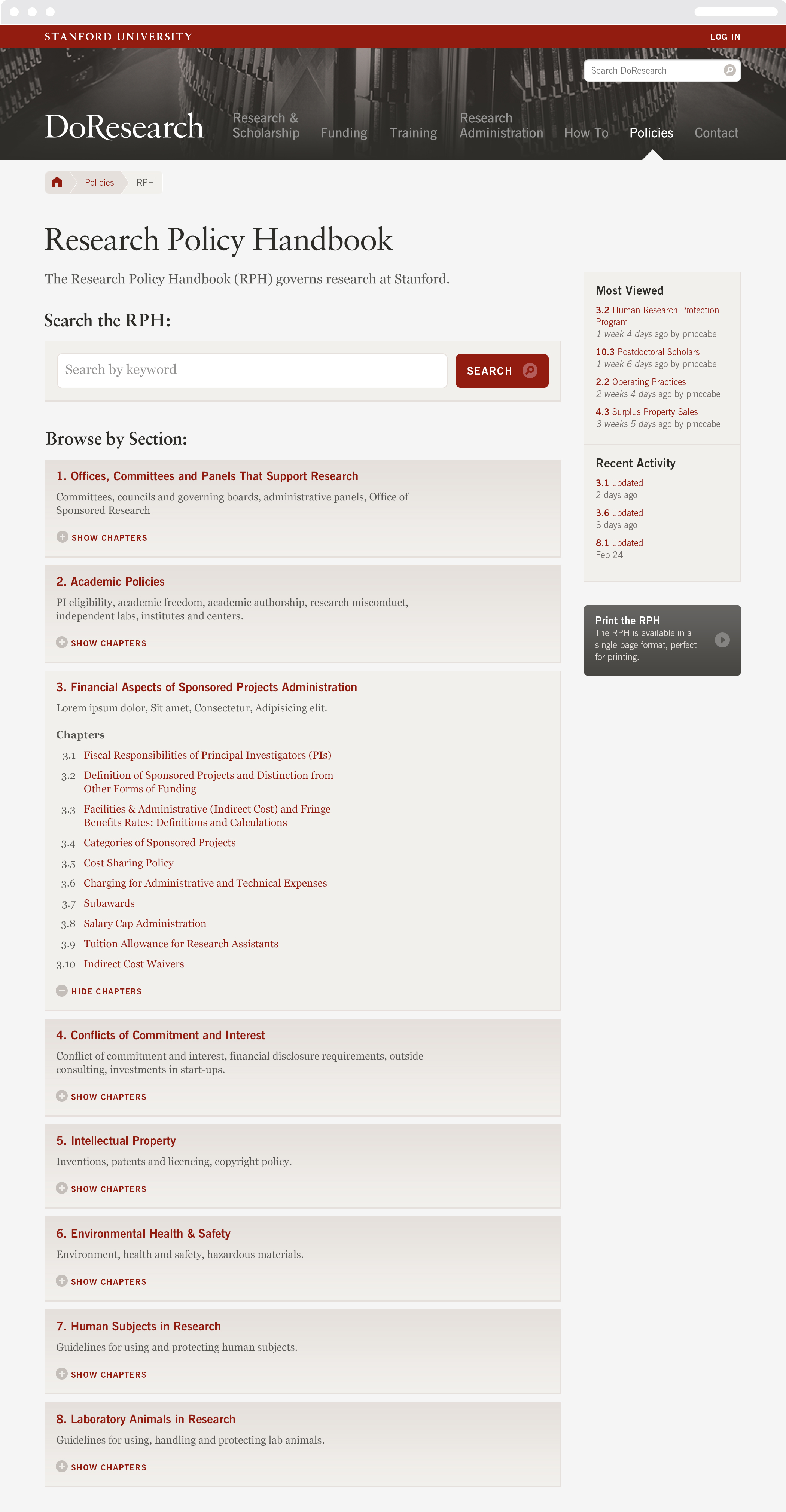
As one of the world’s elite centers for research, Stanford University conducts projects in engineering, humanities, medicine, science, and social science worth over a billion dollars annually. Thinkso, in partnership with Austin-based developer Four Kitchens, was asked to create a single, comprehensive website that would consolidate the institution’s research policies, protocol, and procedures into one place. To do so, we combed through, edited, and restructured volumes of content, spread across many departments, and packaged it in a modern, responsively designed interface. We named the site “DoResearch,” a play on the familiar “DoR” (Dean of Research) acronym, to imply ownership and provide a rallying cry for constituents.

BACKGROUND
Large universities tend to operate as loosely connected city states, which makes it difficult to centralize inter-departmental information. Departments manage their own research and faculty, and have distinct preferences for how material is organized and displayed.
Stanford was no exception. A global leader in research, Stanford had an enormous breadth of resources and processes spanning the organization. However, all of that was monitored and maintained across multiple websites, spreadsheets, and desktop lists. As a result, it was difficult for students, faculty members, and researchers themselves to find what they were looking for, whether they were seeking funding, securing patent rights, or finding lab space.
Stanford’s leadership realized they needed a new, university-wide hub that would make it easy to access all of the university’s resources in one place. As an added bonus, a dedicated, centralized site would further underscore the University’s dedication to research and build “buzz” that would serve as a valuable recruiting aid.
After conducting a thorough RFP process, Stanford called on Thinkso and Drupal specialist Four Kitchens to organize, design, and build the new site. Their requirements were clear: In addition to consolidating the university’s resources, the site had to adhere to Stanford’s graphic guidelines and offer a dynamic user experience. Addressing all department heads’ major concerns was non-negotiable — if the final site didn’t address all of their feedback, it would never be adopted.
APPROACH
We immediately saw the project for what it was: a huge content strategy exercise that would be overlaid with a limited, but dynamically designed user interface. In order to build a site that best served the university and met each department’s needs, we solicited input from over 20 stakeholders through diagnostic exercises, user testing, interviews, and surveys.
Then we dug into the content head-on. We identified, audited, and determined the validity of all existing research-related links, sources, and lists. And we combed through thousands of pages of policies, protocols, and procedures.
“At Stanford, research is a central piece of the university’s identity. For the first time ever, DoResearch established a comprehensive source for all research-related policy and activities across the institution.” Patti McCabe, Director of Training & Communication, Office of the Vice Provost and Dean of Research
After getting a handle on the existing content and stakeholders’ needs, we introduced a content strategy that assembled everything into a single, fluid framework. Then we designed a sophisticated, on-brand interface that was simple and intuitive to use, yet filled with distinctive features, including:
- Shortcuts that streamline the user journey We identified the most-used and searched-for information, and made it easy to access via the homepage.
- An expanding RSS feed Multiple feeds give the site a sense of drama and momentum, conveying that research at Stanford is deep, diverse, and continuously uncovering new material.
- A header image reveal
This photo leverages the institution’s amazing, eclectic collection of research imagery. Clicking the camera icon at the top of the page reveals the story behind the image — and gives users a way to participate in the thrill of discovery so central to research itself.
To ensure the content’s clarity matched that of the strategy and design, we edited and rewrote much of of the text, and created new pages from scratch.
Finally, we had to figure out what to call this new, university-wide resource. While the site fell within the purview of the Dean of Research (DoR), in practice it “belonged” to anyone doing research at the university. The name we came up with — “DoResearch” — made both of those key points clear. It maintained the DoR acronym, but imbued it with new meaning that served as a rallying cry for researchers of all types.
RESULT
This project is the perfect embodiment of what we refer to as “content-driven creative.” Our focus on collaboration, consensus-building, and well thought-out content strategy made the end product infinitely more effective for our clients.
Following the new site’s launch, the administrative chore of doing research at Stanford became more efficient, which freed up researchers to spend more time on their important work. The new site also increased interest in the department, aiding efforts to recruit the best and brightest to perform research at the university. Most importantly, it unified the research effort between departments, labs, and institutes at Stanford, and quickly gained international recognition as a best-in-class research portal.
Years later, the site remains virtually unchanged — a strong indication that the original strategy and design still serve our clients’ needs.

The site design incorporates the latest in Drupal web technology and best practices. The treatment of the expandable RSS feed menu and the footer’s clever compartmentalization of more than 50 related offices and systems exemplify this dual focus.

Although the site is primarily utilitarian, we added an element of surprise and discovery by leveraging the large cache of research stories and imagery available. Users who click on the little, intriguing camera icon are treated to a peek behind the scenes.

The backbone of the site is a rigorous content strategy that organizes thousands of pages of content—and makes everything accessible with just a few logical clicks.