Baylor College of Medicine was in a slump: still a strong and serious place for the health sciences, but lagging from their historic highs in both rankings and peer reputation scores. To make up this lost ground, they brought in a new president and CEO who determined a new communications effort was in order and — based on our successful work at New York’s Mount Sinai Medical Center — brought Thinkso on board to lead the project. With an outside-the-lab perspective and bold visual sense, the publications we developed helped Baylor make immediate progress with donors, doctors, and peers.
Background
Baylor’s team initially requested straightforward templates for a newsletter and reports, pieces that would look more sophisticated than what came before while still being produced in-house. After interviewing members of the Baylor community and spending time on their Houston campus, however, it became clear to us that what they really wanted was a story that they could share proudly. Instead of a simple newsletter, they needed publications that reminded the world at large about the quality of Baylor’s research and the creativity of their approach. (We also believed a bit of Texas flair wouldn’t hurt.)
Approach
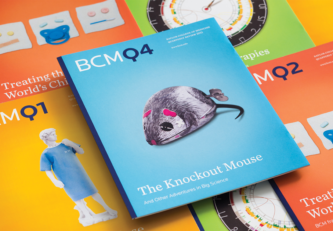
In close collaboration with their communications team, we developed two signature publications to revitalize Baylor’s narrative: BCMQ, a colorful quarterly to highlight timely news, accolades, stories and research developments; and The BCM Report, a long-form publication, published as needed around specific themes and ideas.
Medical school publications often share the same visual vocabulary: images of doctors and patients (highlighting the care they provide), images of students in training (highlighting the education they offer), and images in the lab (highlighting the research they do). There is value to this combination, but we knew we needed to do more to get Baylor back on the radar of those who influence the rankings; we needed Baylor’s publications to feel completely different.
As such, the pieces we developed for Baylor avoided standard medical imagery altogether. The BCMQ covers featured conceptual photo-illustrations, both witty and bold, that stood apart from competitor communications and evoked the creativity for which Baylor had long been known. The cover images and headlines were entirely concepted, written, designed, and photographed by Thinkso, and we developed a flexible and clear interior template to support BCM’s Graphic Communications Office as they took over implementation.
The BCM Report, as a comprehensive exploration of a given theme, was harder to encapsulate with a single cover illustration, so we chose to feature elegant photography that highlighted the real-world benefits of Baylor’s work as seen and felt in people’s lives.
“In a single year, the overall institutional ranking went up from 22 to 21 and the peer reputation score increased by 0.2. We attribute this jump to the marketing effort of which these publications were the backbone.” Debra Passner, Executive Director of Academic Marketing and Communications, BCM
It was important to us to use local talent that could bring a Texan eye to the project, so we worked with Austin-based photographer Katie Hayes Luke. In addition to their appearance in publications, we used the photos as part of a traveling exhibit, artwork that could hang around the Baylor campus or at fundraising galas and conferences. The community both in and around Baylor responded exceedingly well to these local images, and the administration appreciated the chance to extend their shelf life. (In Thinkso parlance, it was “work that keeps working.”)
That sense of value was important to Baylor, as was the ability to continue producing these pieces at a high level once their in-house team took over. As part of our development work, we established highly prescriptive style guidelines, while also ensuring a sense of cohesion from issue to issue. The two publications also felt connected to each other despite their unique designs: they were built from the same kit of parts (typography, color palette, etc.), and both were designed at the same trim size, so they could be bundled together as leave-behinds for donors. To ensure value throughout the entire process, all paper stock and print specs were consistent between the pieces, taking advantage of economies of scale during production.
RESULT
It’s not often that we are able to measure the full impact of a specific project, especially a print campaign. There are usually several other initiatives and projects in play. In this case, however, Baylor ceased all other marketing efforts in favor of the new publications, so we had a clear view into their impact.
After producing just five issues in the first year, Baylor went from #22 to #21 in the U.S. News and World Report rankings of top research institutions, and the peer reputation score increased by 0.2, a tremendous achievement for a single year.
Perhaps most important, these new pieces helped give life to the Baylor College of Medicine community. As new leaders of a complex organization, our clients were seen not just as decisive, but incisive. The Board of Trustees, a demanding group of local captains of industry, were inspired by this work to share the school’s message more broadly. And doctors and students rallied behind communications that truly reflected the quality of their work.
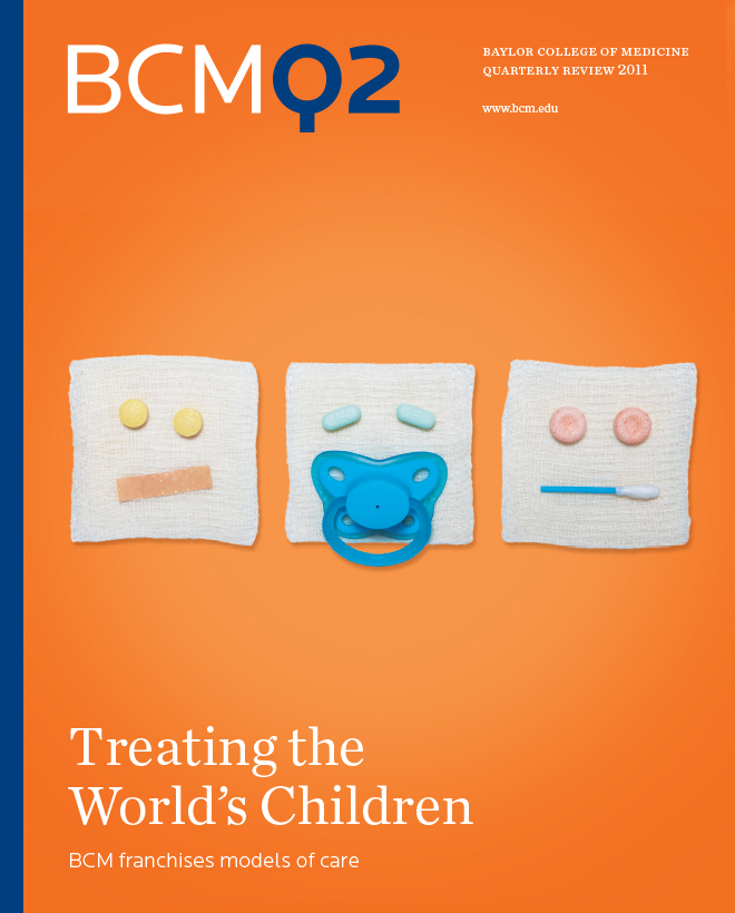
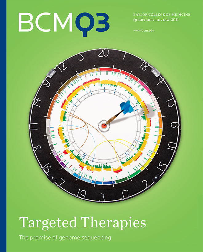
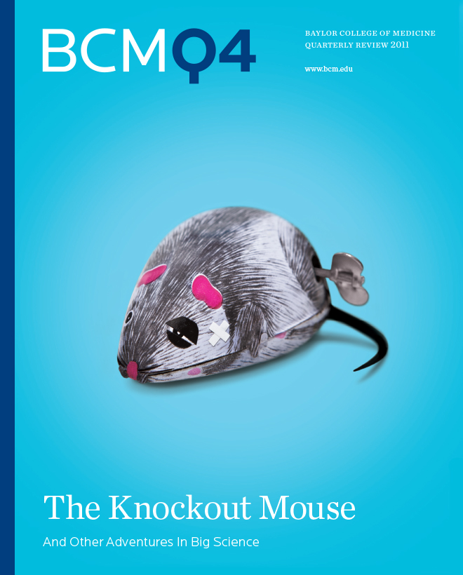
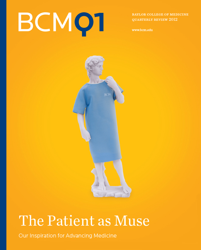
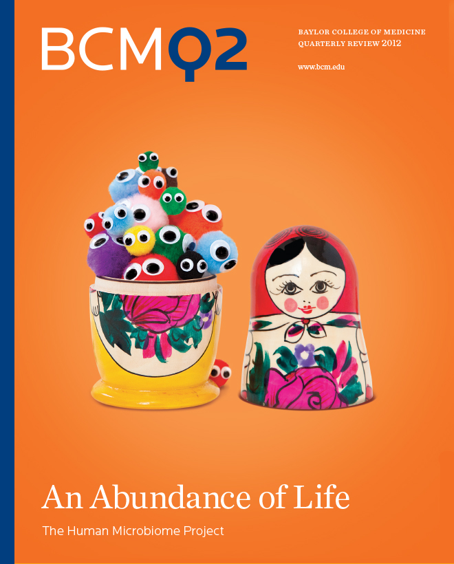

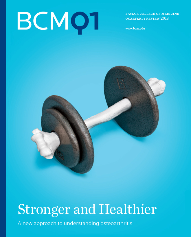
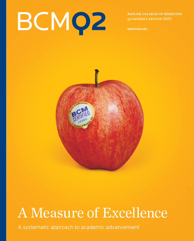
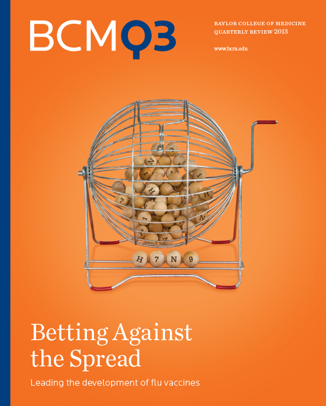
The covers of each BCMQ issue features bright, clever photo illustrations that grab the attention of industry peers and stand out from the sea of lab coats, pipettes, and smiling doctors that pervade so many medical publications. While BCM handled the bulk of interior production, Thinkso conceived of and created all covers.
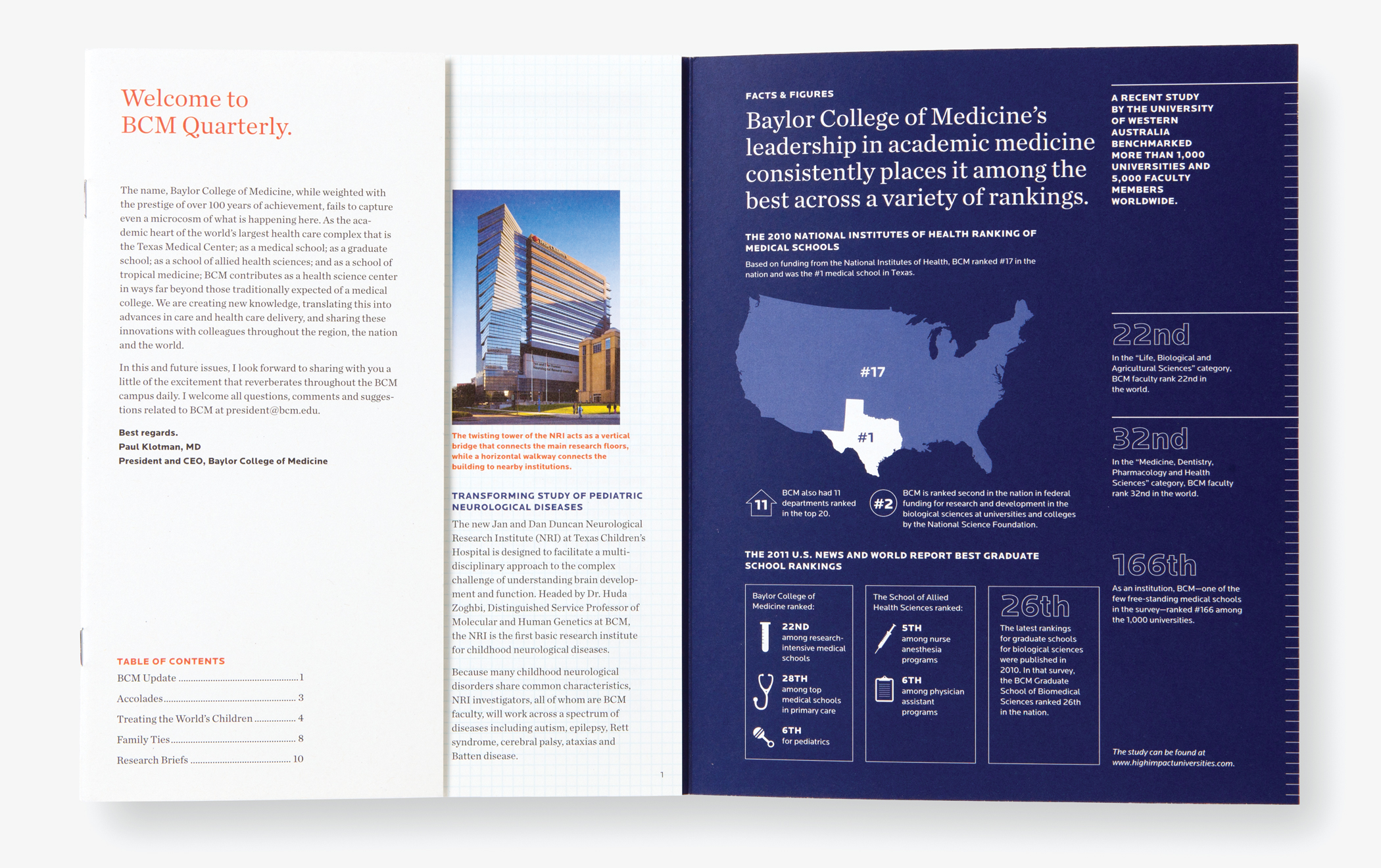
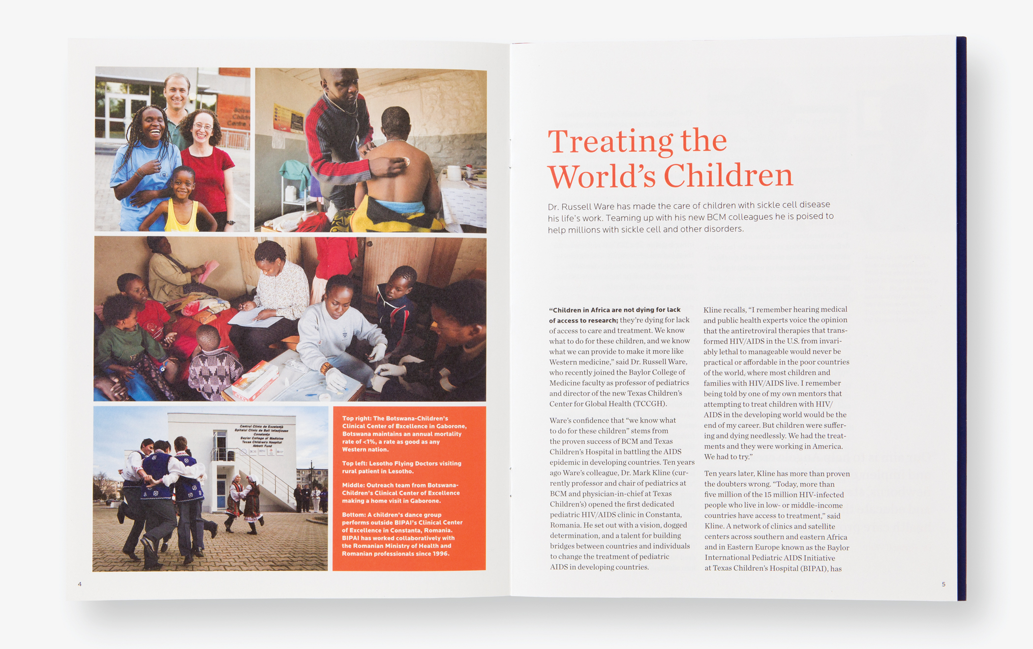
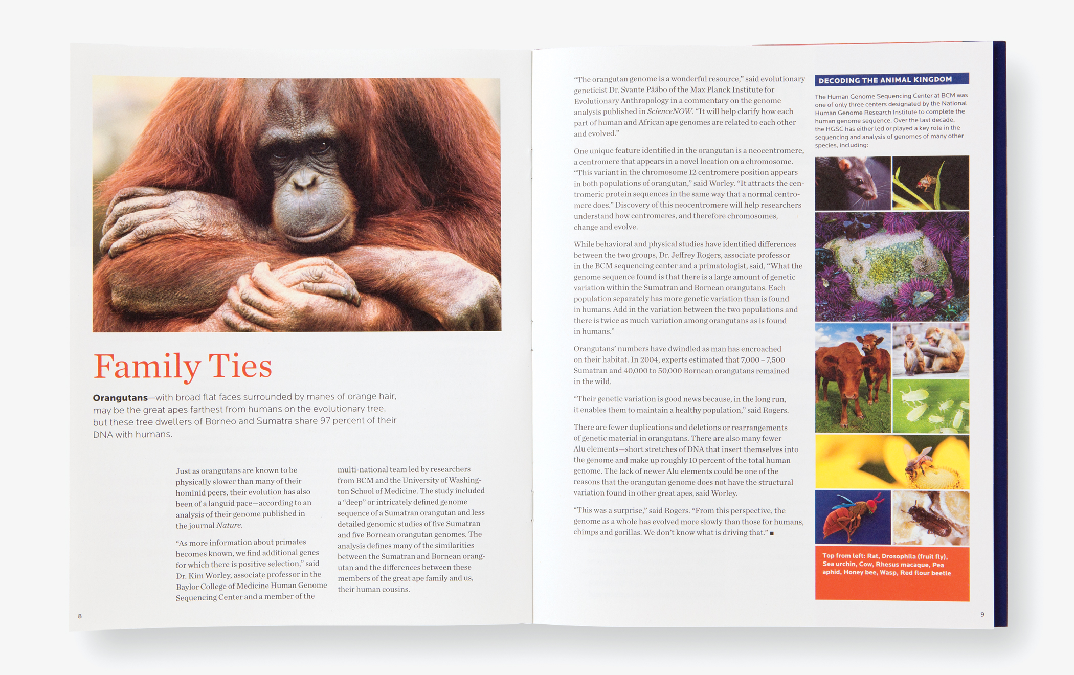
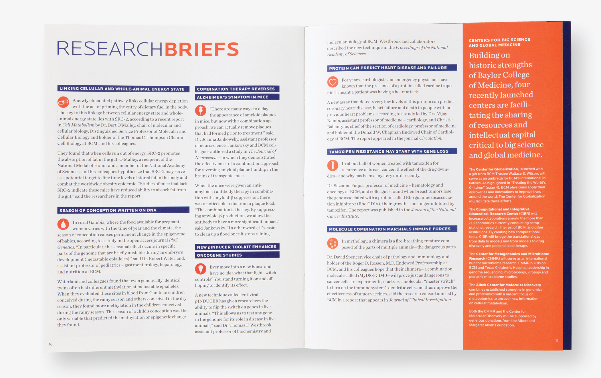
Thinkso provided highly prescriptive guidelines to govern ongoing design and production by BCM’s in-house communications staff, including infographics, alternate layout and sidebar options, and a library of icons.
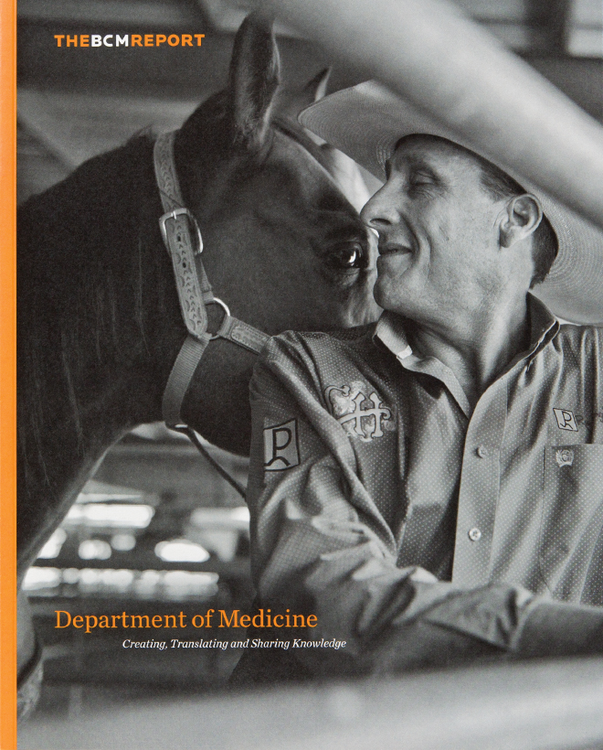
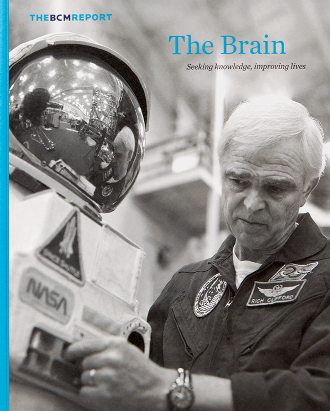
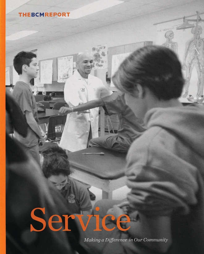
The BCM Report focuses on specific themes of Baylor’s work: the brain, genomics, community service, etc. Like BCMQ, it features distinctive cover art that avoids standard medical cliches: in this case, artful black-and-white photography depicts the benefits of BCM science and the lives of individuals that have been changed.
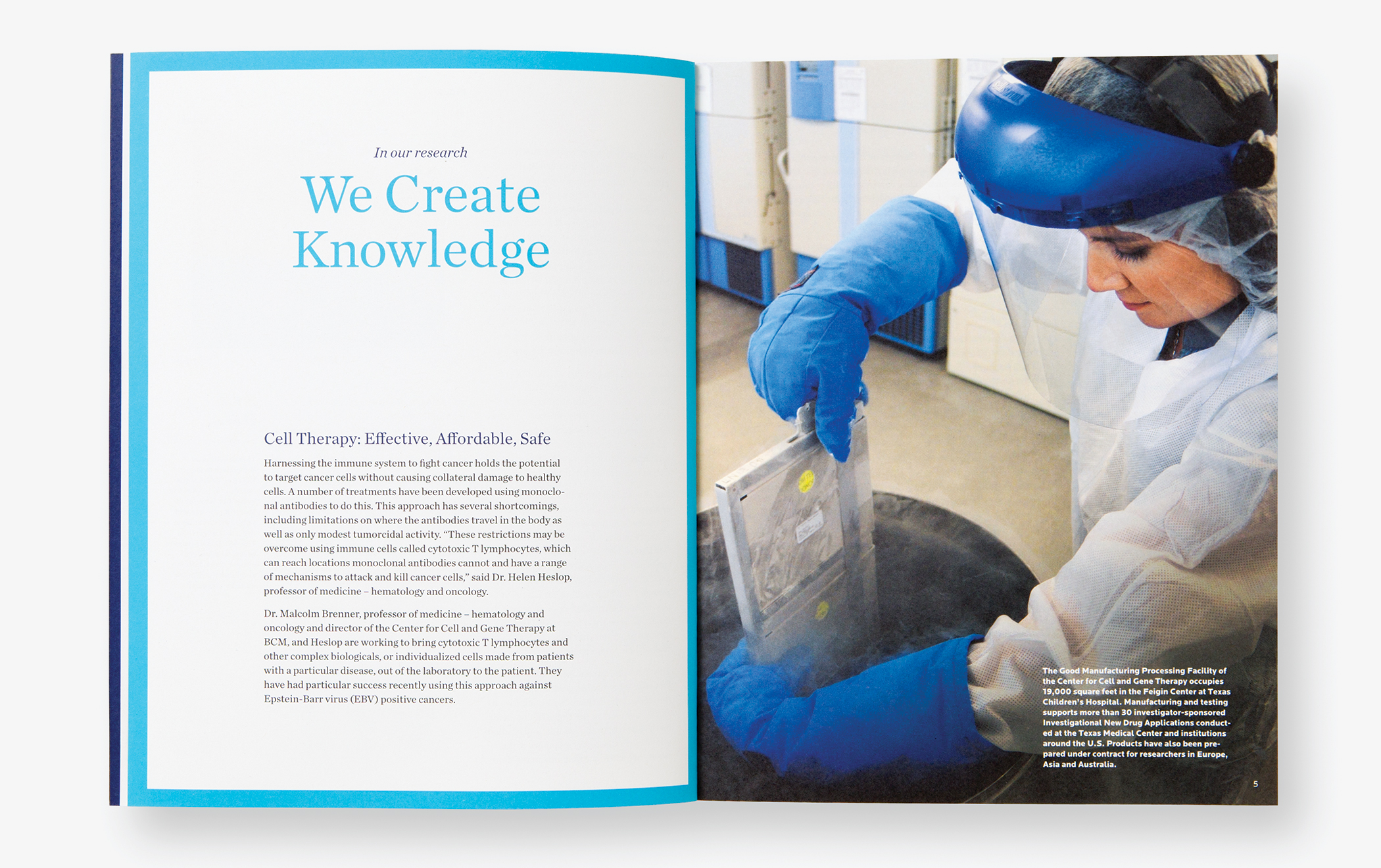
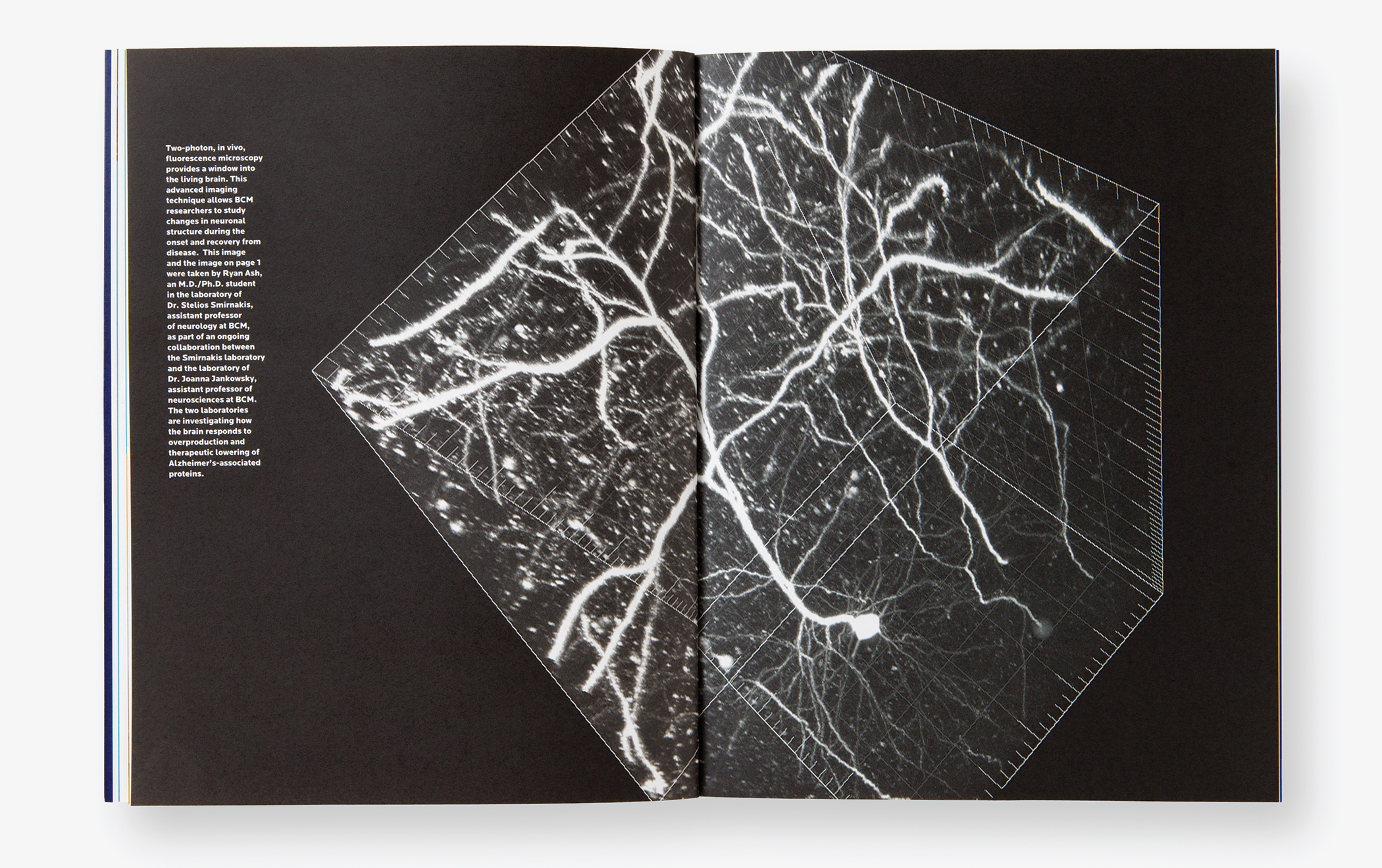
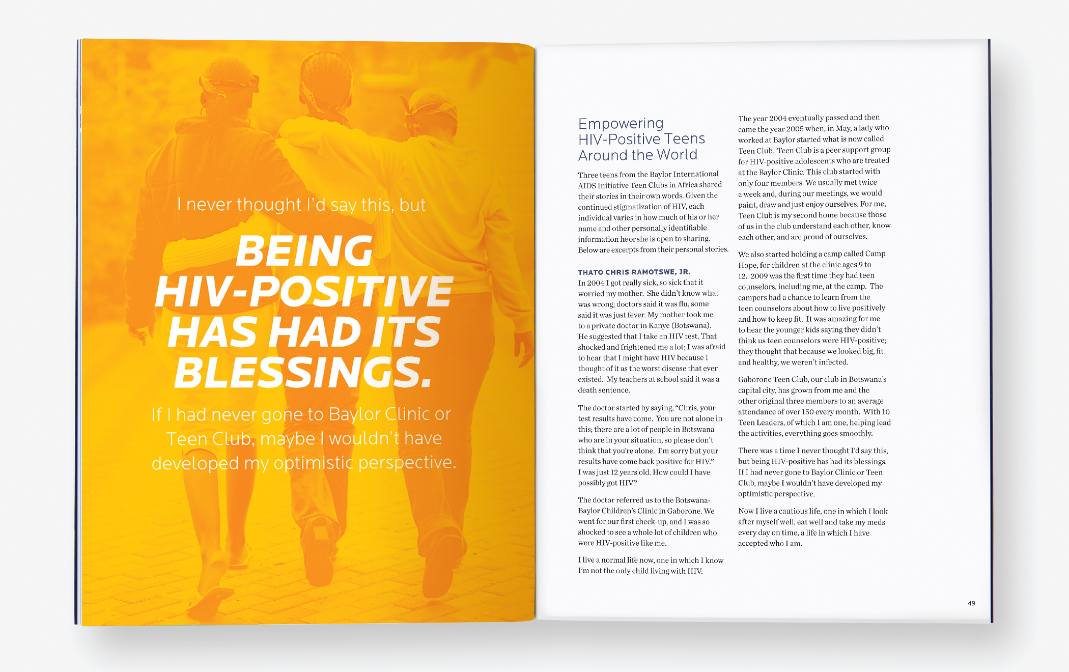
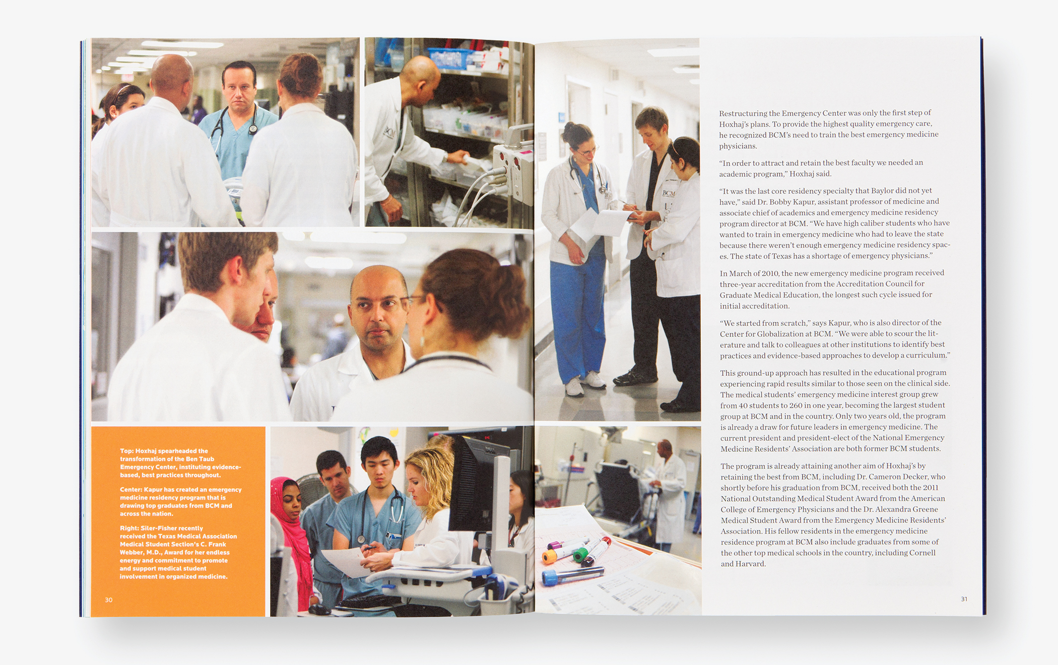
Decidedly longer-form, The BCM Report is more a collection of styles that can be combined to create distinct design schemes within the broader framework. The publication was alternately used to accommodate departmental content, medical themes, and institutional initiatives. This flexible framework afforded our client maximum flexibility and efficiency and did so in a way that is consistent with the personality of the BCM brand.