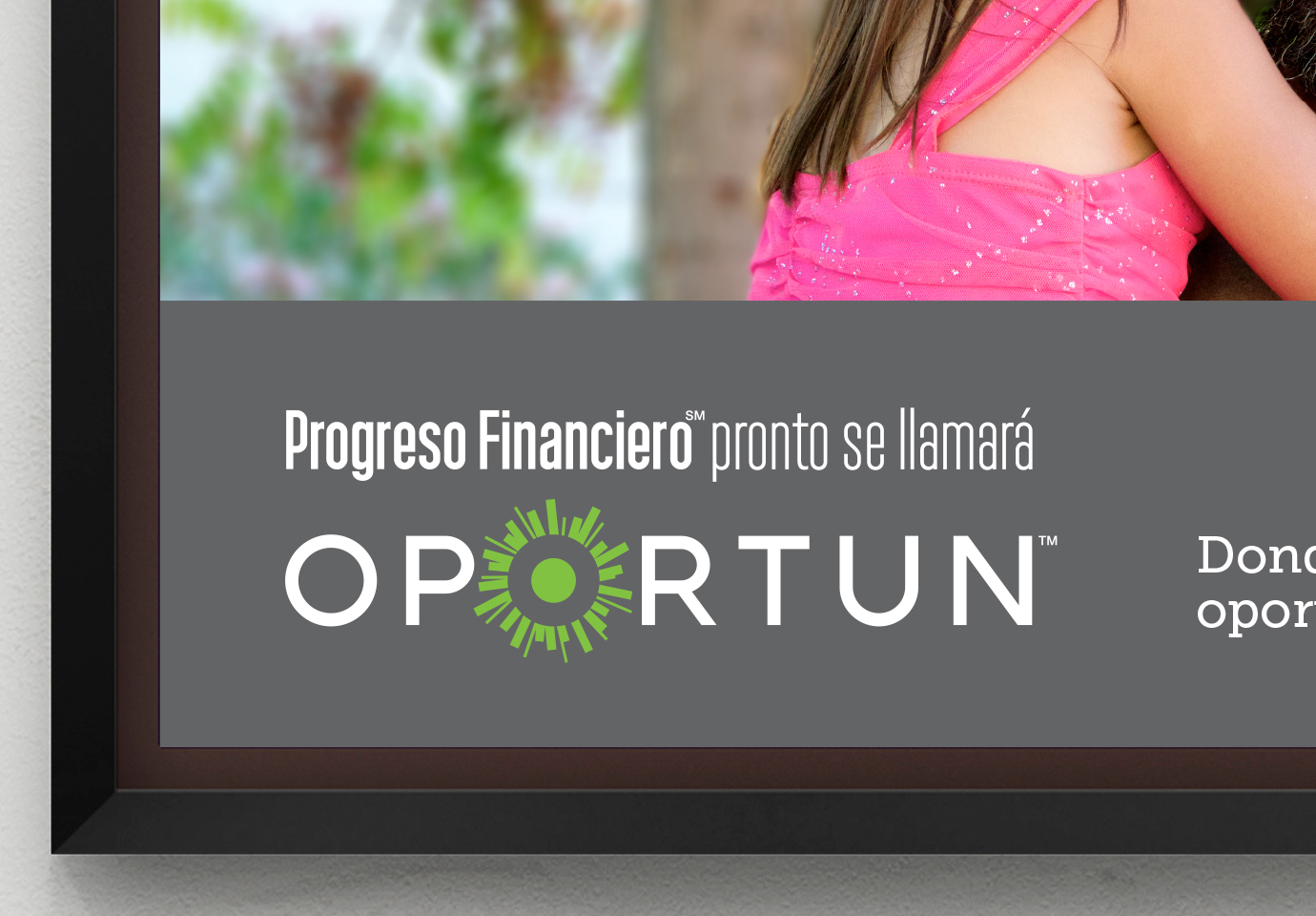
Progreso Financiero selected Thinkso to rename and rebrand the 10-year-old retail lender. Thinkso introduced the name “Oportun” to help the company extend its reach beyond the Hispanic market, which had been its primary focus since it was founded. A variation on the Spanish word “oportunidad” and the English word “opportune,” the name is easy to pronounce in both languages and underscores the company’s commitment to helping its customers find and seize financial opportunity.
BACKGROUND
For members of underserved communities, building credit and finding financial security can be daunting. Without a credit history or family resources, it’s difficult to secure a credit card or loan through a traditional bank. That’s why, when a need arises, many people consider short-term lenders — many of whom have predatory policies and charge as much as 600% interest on a short-term loan.
San Francisco-based Progreso Financiero was founded with a clear mission: to provide affordable, short-term, fixed-rate loans that help the Hispanic community build credit and work steadily toward their long-term financial goals. Instead of prioritizing profits, Progreso’s main goal has been to help customers reach theirs.
Their genuine concern for customers, proprietary methodology for evaluating creditworthiness, and warm, welcoming customer service helped the company grow rapidly. As it weighed a possible IPO and considered expanding into new markets, Progreso Financiero looked to rename and rebrand itself. They wanted to position the company to capture a broader demographic, but without alienating the Hispanic customers who made up its base and had driven its growth for over a decade.
The new name had to feel natural to native Spanish speakers, but inclusive to English speakers, too. It also needed to dovetail with the new brand positioning, which focused on understanding customers’ needs and providing them with a path to greater financial opportunity.
However, there were strong time constraints: The naming, brand identity, and launch materials had to be completed within a three-month window.
APPROACH
To gain insight into our client’s customer base, Thinkso deployed a Spanish-speaking editorial and design team to spend time in Los Angeles, where they participated in a series of bilingual focus groups. Hearing about customers’ financial challenges, life experiences, and the value they placed on having a resource for fixed-rate, credit-building loans helped inform the brand strategy, approach to naming, and the eventual brand identity.
We also led a challenging naming exploration process that involved senior management, the marketing team, and Hispanic marketing agency professionals. After presenting more than 70 naming variations ourselves, as well as managing the contributions of the group at large, we were able to narrow the list down to 10 names, all of which were tested with consumers. Our top recommendation — “Oportun” — performed best, perfectly aligned with the essence of the new brand strategy, and was ultimately selected as the new name.
“The name ‘Oportun’ is distinctive, fits perfectly with our brand positioning, and really hits the mark with Hispanic customers—in English and Spanish.” Juan P. Valdes, Vice President of Marketing and Communications, Oportun
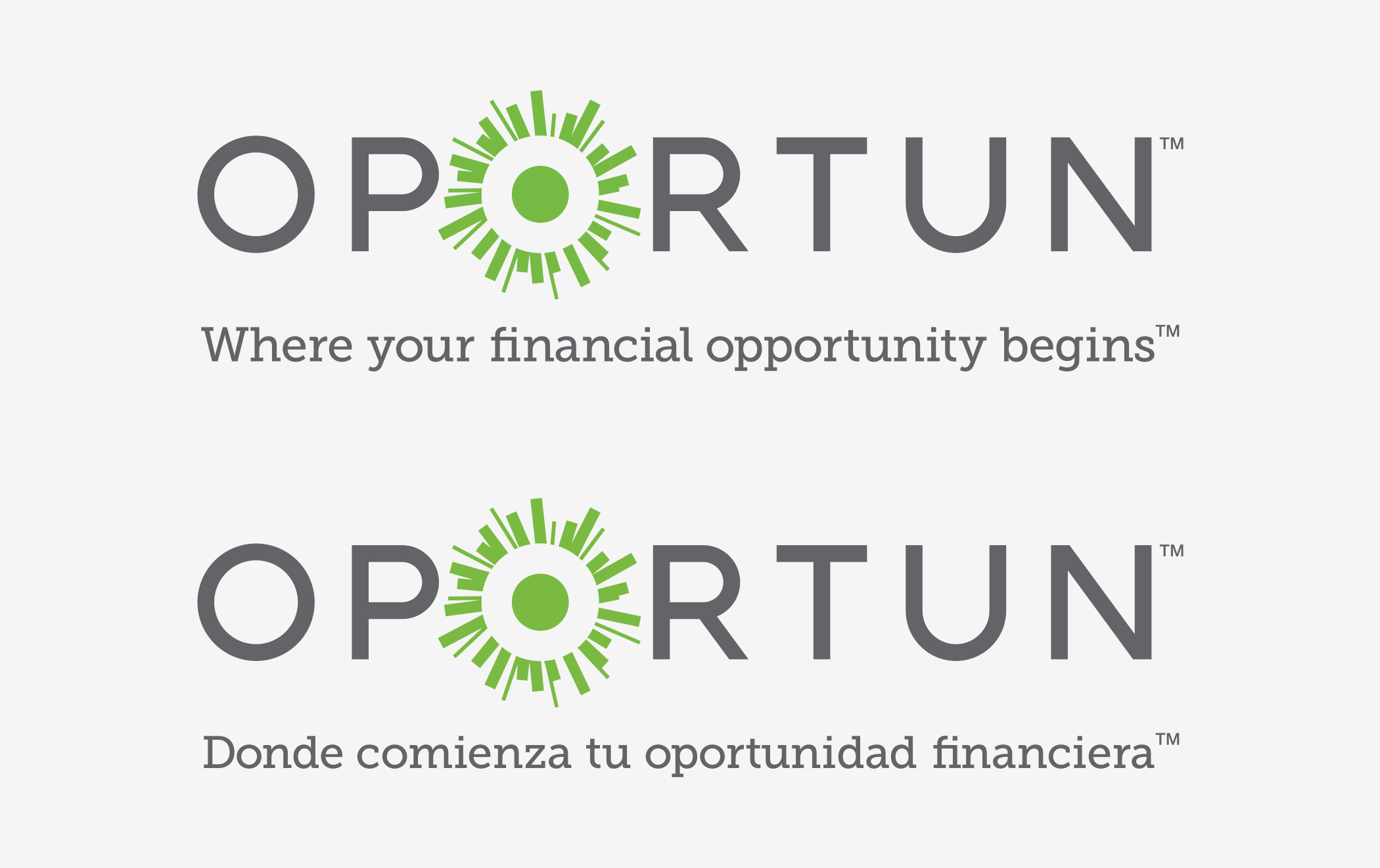
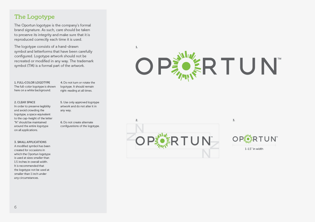
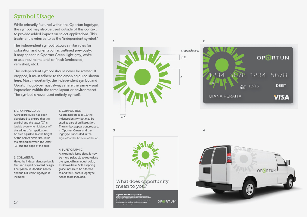
As we moved into design, a symbol we called “the opportunity mark” emerged as a key feature of the new brand identity. The mark replaces the second letter “O” in the custom-drawn wordmark and represents the “moment of opportunity” wherein Oportun is able to offer its customers credit-building financial products. The tagline “Where your financial opportunity begins” (“Donde comienza tu oportunidad financiera” in Spanish) is used with the logotype to further drive home the idea that Oportun’s services engender opportunity.
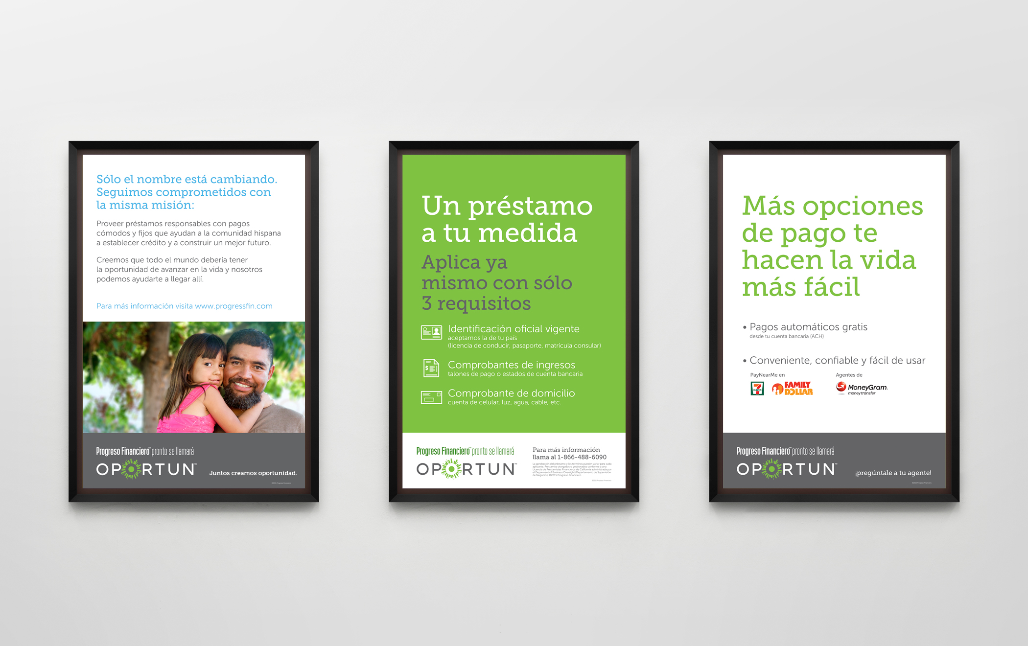
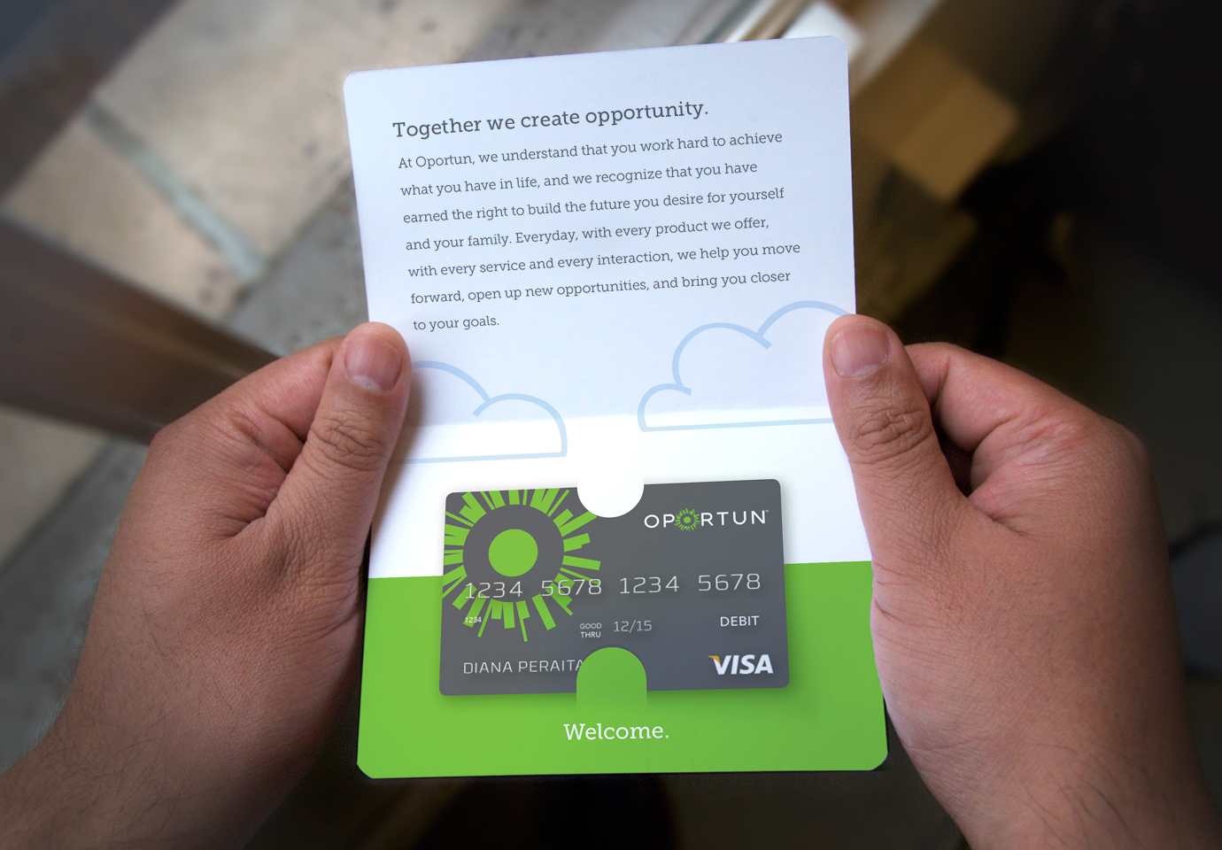
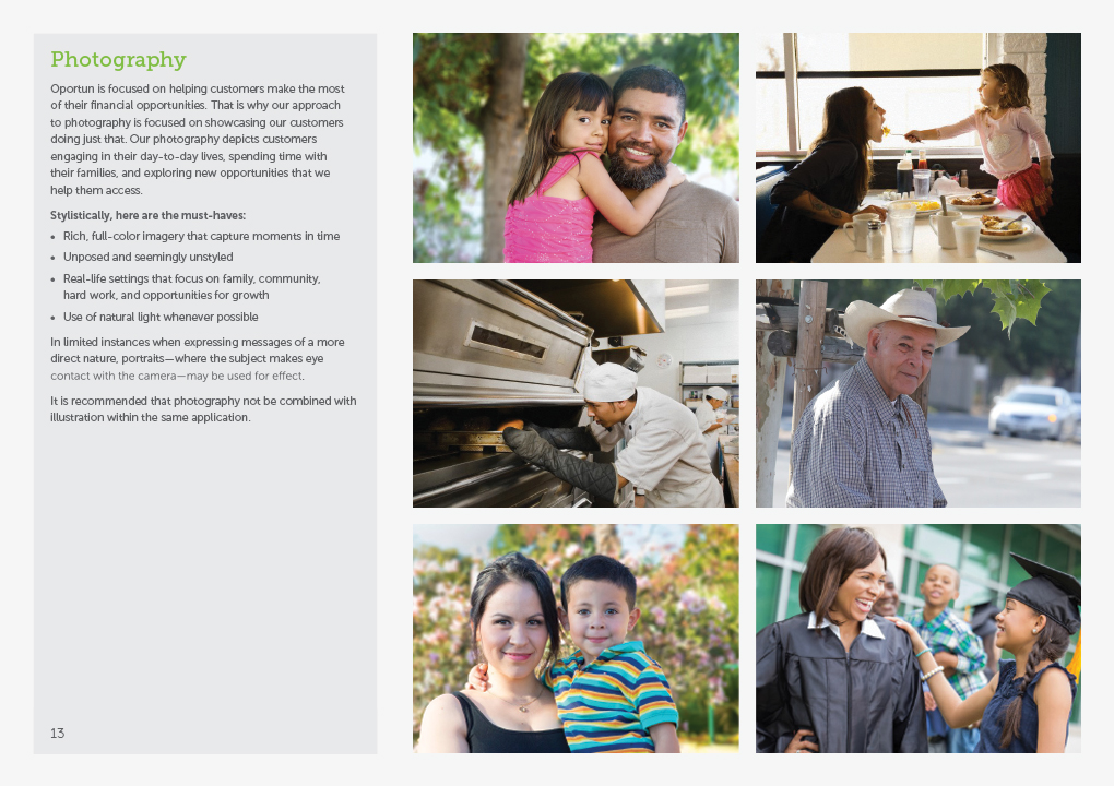
The final look-and-feel preserves Progreso Financiero’s signature green but features an expanded color and typographic palette. Straightforward, full-color photography shows customers benefitting from their newfound financial opportunity and helps bring things to life in an accessible, believable way.
As a counterpoint to the photography, we introduced a conceptual illustrative style to make creative use of the opportunity mark. Depending on the messaging in supporting copy, the mark can convert into countless positive symbols — such as a sun, flower, or fireworks, for example.
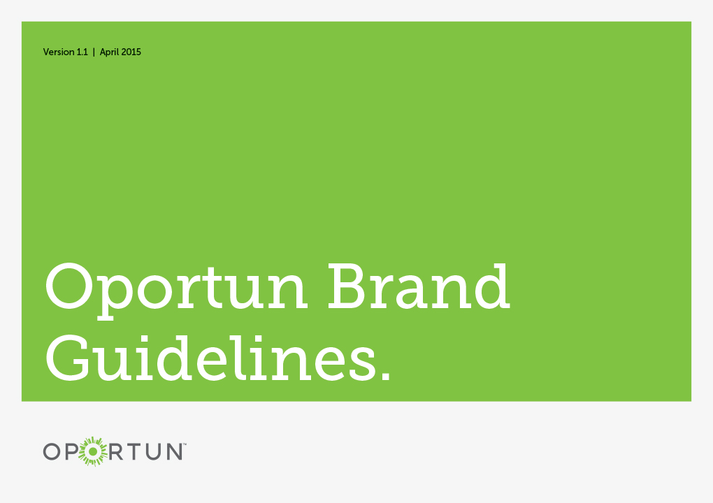
Finally, to ensure that Oportun’s in-house design team had what they need to consistently implement the new brand identity going forward, we developed comprehensive brand guidelines.
RESULT
The new name and identity program rolled out on time and to great acclaim. The launch materials and supporting collateral helped Progreso Financiero make a smooth transition to Oportun — which was especially important because thousands of customers’ loans were still in the process of being serviced by “Progreso Financiero” at launch.
Most importantly, though, the renaming and rebranding set the stage for a sizable, new round of fundraising and long-term growth, both of which will enable the company to help more customers make strides toward a better financial future.
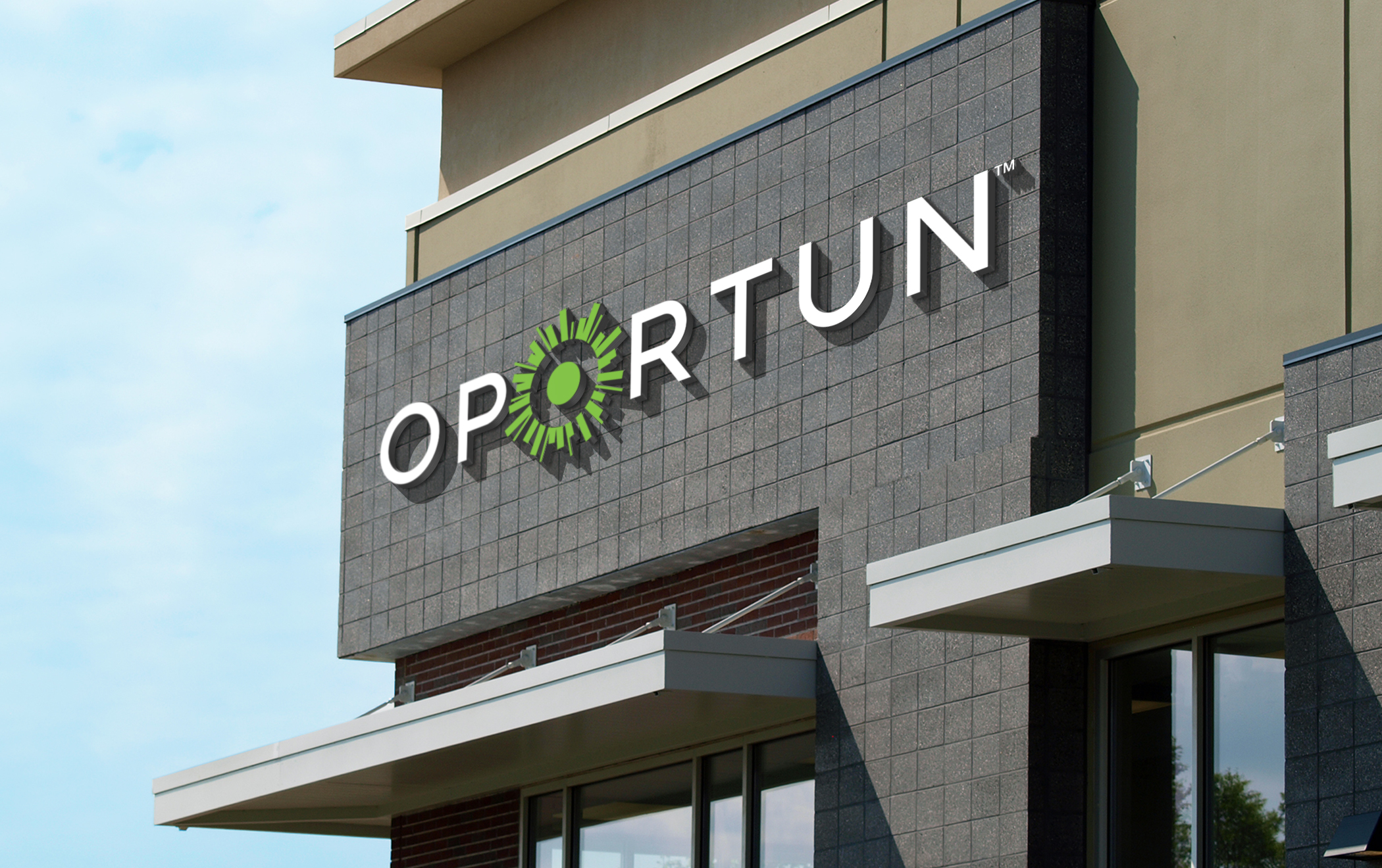
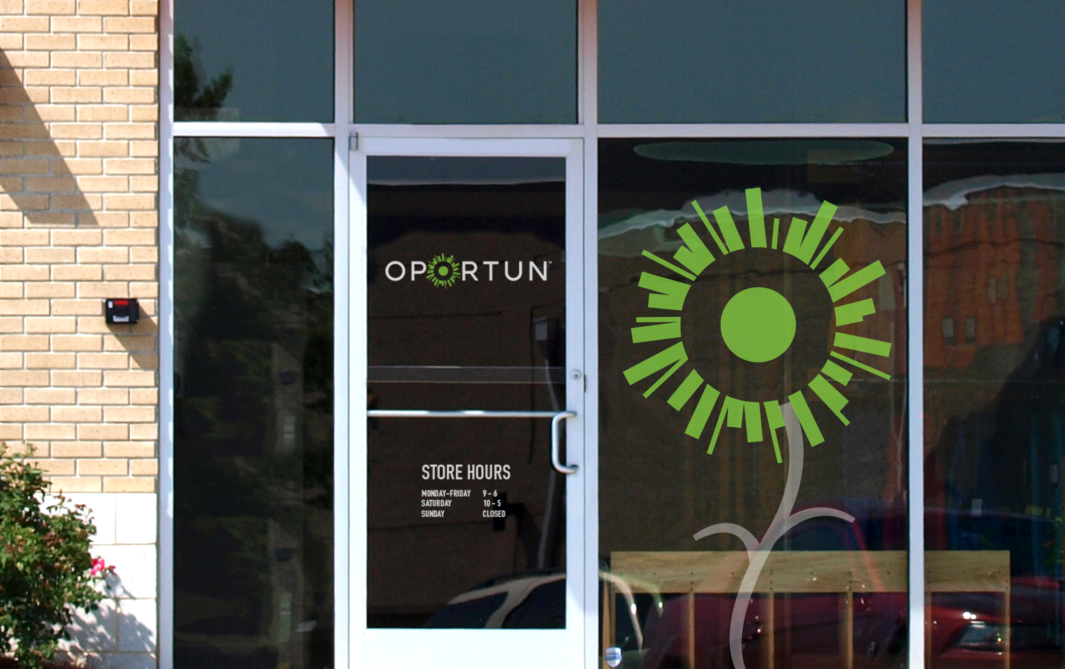
While customers can apply for loans and make payments online, the majority handle these transactions in person at hundreds of Oportun stores. While additional upgrades were being planned, we created straightforward branded environments that were simple, clean, and easy to deploy.
While the naming process was a challenge, the critical work was aligning it with a design scheme that could bring the brand positioning into focus and gracefully articulate it to both English and Spanish speaking customers. 3 of the 4 Thinkso people staffed on the project spoke fluent Spanish—which proved to be indispensable.
The visual identity preserves the brand’s bright green color, formalizes the color and typographic palettes, and features the “opportunity mark”—a symbol that represents the power and potential of financial opportunity.
Brand guidelines were developed for a variety of materials including loan collateral, launch materials, store signage, and environmental graphics to maintain consistency across communications and environments.