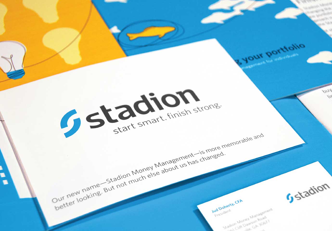
Seizing the opportunity to stand out in a troubled market, PMFM, Inc. tapped Thinkso for a complete rebrand. For years, this Georgia-based national money manager had been held back by their cumbersome acronym, and while their innovative investment strategy achieved unrivaled returns, it was complicated and hard to explain. Thinkso did a full-scale rebrand, from naming the company, to designing their identity system, to creating a new website — and everything in between. As part of our rebranding efforts, we gave the company a plain-English voice and low-cost, down-to-earth illustration system that set them apart out from the crowd.
BACKGROUND
Money manager PMFM had a lot of unique selling points. To start with, it radiated Southern charm, with a warm, positive culture, employees who loved their jobs, and a commitment to genuinely helping clients understand how to best invest for retirement. Additionally, their sophisticated, quantitative investment model enabled them to continuously assess and respond to changing market conditions. That, combined with their signature “winning by not losing” strategy, helped the company deliver satisfying returns with less volatility, long-term.
Unfortunately, their name was an acronym — a collection of letters that stood for “Personal Mutual Fund Management,” which was both difficult to remember and no longer relevant to their core business. Additionally, they had a service product, 401k Toolbox, that had become more well known than the company itself — but only spoke to a portion of their offering.
APPROACH
The vast majority of financial services companies don’t do a good job of connecting with everyday investors. Most marketing in “Financial Land” speaks in overly complicated terms and uses cliché imagery — making it harder for professional investors to do their jobs and impossible for everyday investors to engage with their 401k plans. In contrast, our goal when rebranding PMFM was to underscore the firm’s humanity and accessibility in each client touchpoint, and help retail investors truly understand the firm’s investing approach.
First, we developed a new name for the firm, one that alluded to the strength of their money management approach and unique, small-town location. The firm is located in Athens, Georgia, so “Stadion,” a reference to an ancient Greek foot race, was a natural fit. When combined with our new tagline — “Start smart. Finish strong.” — the company’s main goal became clear: to help investors “win” over the long term through consistent, risk-averse investing.
“Renaming and rebranding a company of 16 years was a challenging undertaking. Thinkso capably and effectively led us through the entire process. The result fits like a glove, and in just five years we grew our assets under management by 600%!” Steve Beard, VP of Marketing, Stadion Money Management
We then turned our attention to the visual identity and editorial voice. With 6,000+ mutual funds in the market and lots of retirement options, Stadion needed a visual system that worked well across a wide array of investment products and services. To reinforce the brand’s humanity, we created an illustration style that utilizes a paint-brush stroke texture, simple, conceptual images, and a bright color palette. A key part of each illustration is the omnipresent Stadion “line” that layers on top of every illustration, conveying the guidance and direction Stadion products and services provide to their investors. While the illustrations are powerful and differentiating, they’re also easy and inexpensive to replicate.
Editorial presented another opportunity to distance the firm from its Financial Land brethren. Anticipating that even collateral intended for financial professionals could wind up in the hands of everyday investors, we wrote all materials in plain language, with a lay audience’s needs and knowledge level in mind. Additionally, we confronted potential investor anxieties head-on: We explained away Stadion’s less-than-impressive short-term returns by emphasizing their impressive returns over the long term, which we illustrated throughout print collateral and an introductory video. Our down-to-earth tone and forthcoming style made it easy for all readers to understand Stadion’s investment approach and see them as a clear, straightforward alternative to other money managers.
RESULT
We created Stadion’s new website, videos, sales materials (from high-level capabilities brochures to fund fact sheets), promotions and giveaways, e-newsletters, and print and digital advertising.
Within two years of our rebranding, Stadion grew from $2 billion to $6 billion in assets under management, expanded their suite of funds and service offerings, and became a qualified default investment alternative for employers throughout the country. Thinkso has continued to work with Stadion as their agency of record, providing design, editorial, and strategy for product launches, marketing campaigns, and much more.

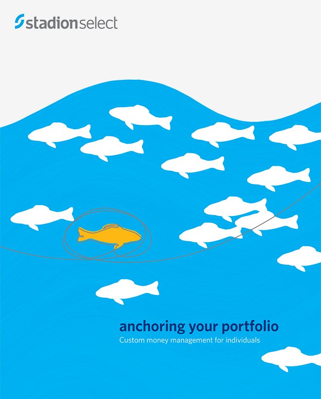
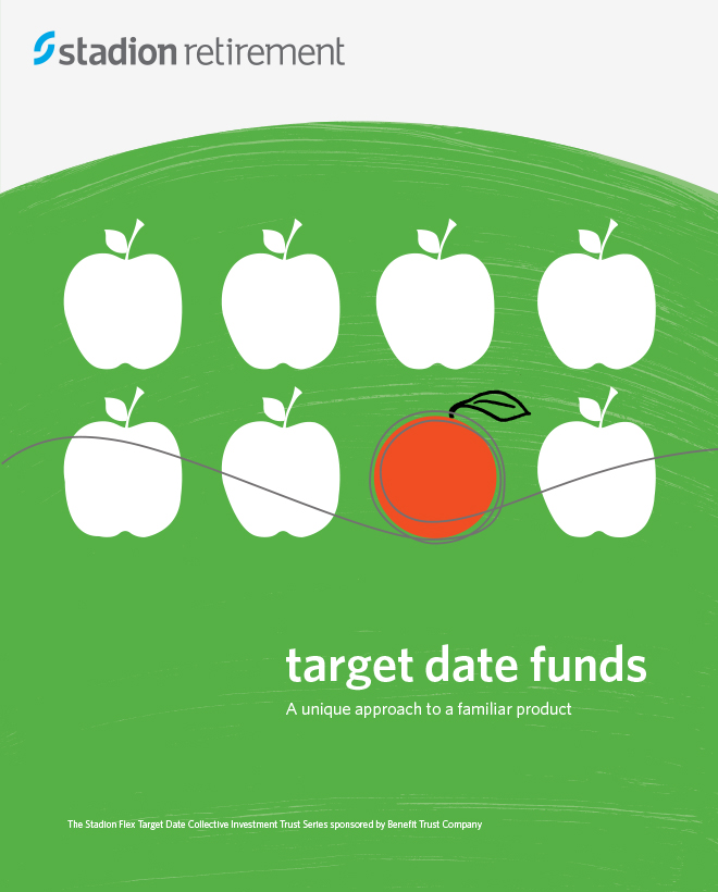

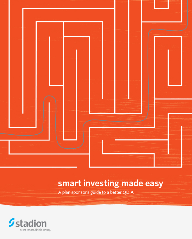

Thinkso established a simple illustration style for the system, and then produced all of the art in-house. The unexpected imagery helps Stadion shine in a cluttered marketplace.

Launched by Thinkso in 2016, Stadion's new site features carefully planned architecture designed to guide many disparate audience groups to the information that's right for them. The homepage tells their investment approach and brand story in simple terms any investor could understand. From the homepage, visitors can choose to go to parts of the site written specifically for “individuals and employers” or “financial professionals."
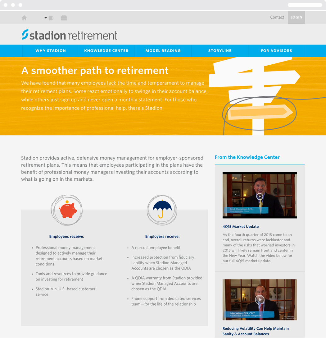
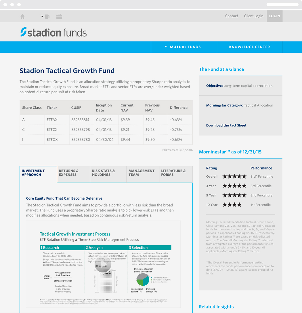
The site also includes several “knowledge centers” with white papers and motion graphics videos. To comply with FINRA regulations, the mutual fund section of the site appears on a separate URL.
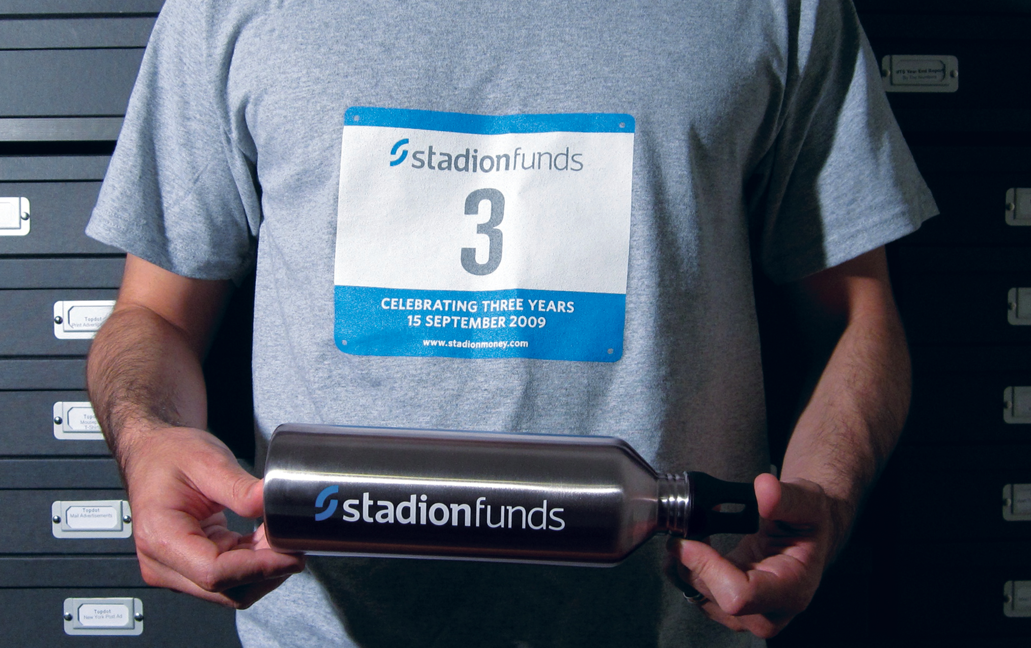
To celebrate the Stadion mutual funds and their remarkable three-year performance, Thinkso designed a promotional campaign that leveraged the brand’s race theme.

The new branding was applied to all client touchpoints, including coffee cups for everyday use at Stadion’s headquarters as well as for client gifts.
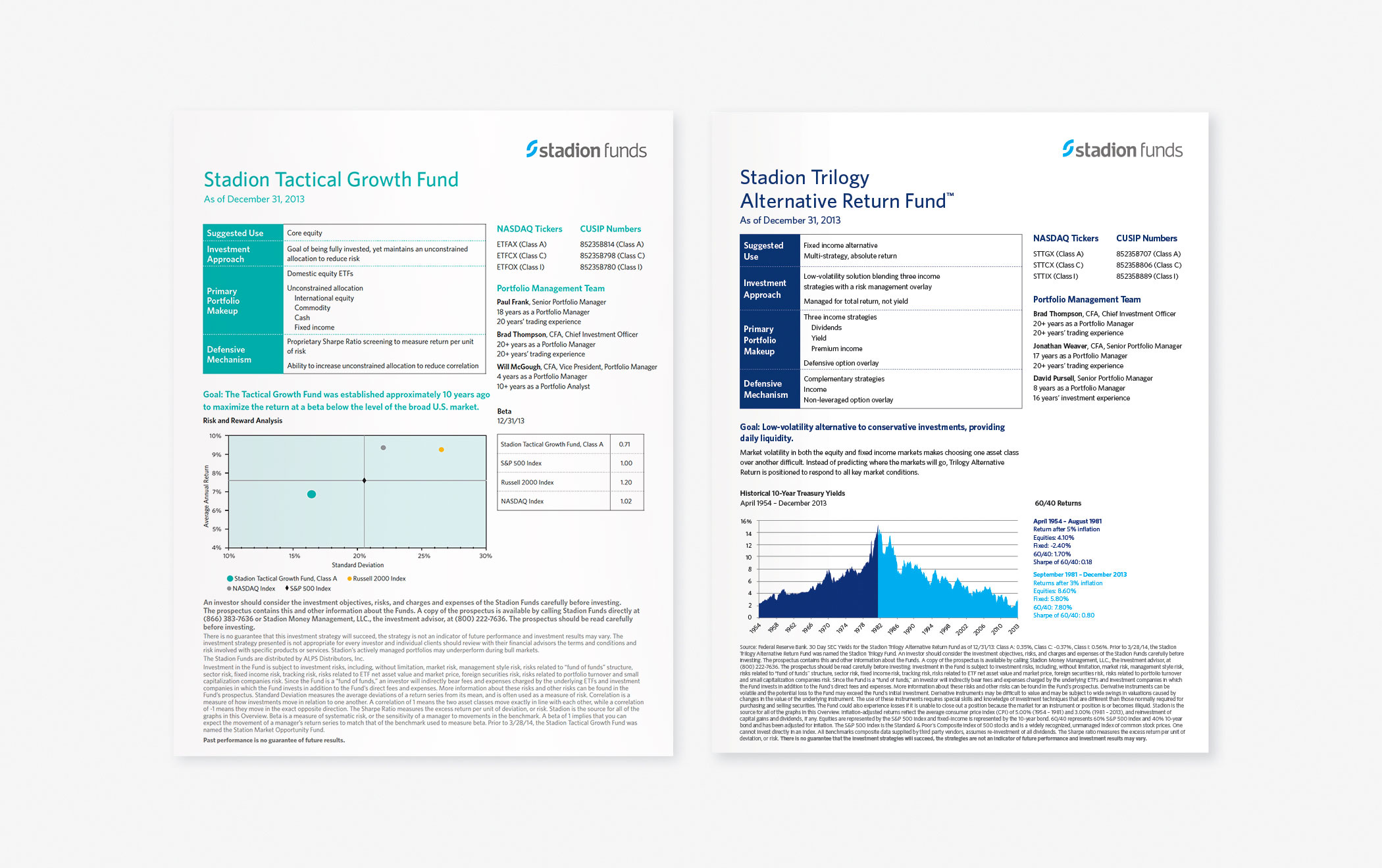
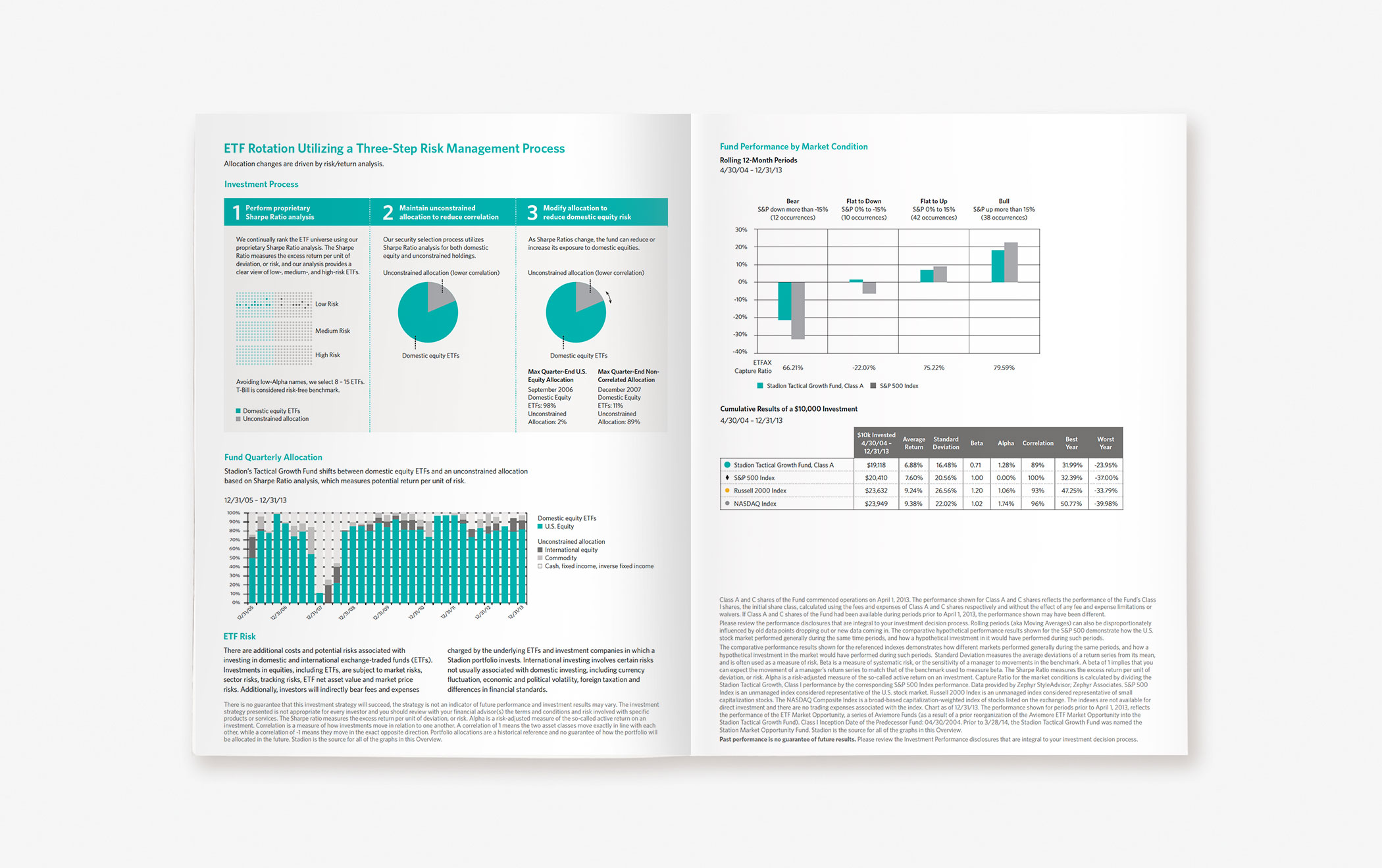
Mutual fund product sheets are valuable tools for wholesalers and financial advisors and, by extension, investors who meet with them. We redesigned and rewrote each of Stadion’s fund sheets to clearly articulate the structure, investing strategy, goals, and performance of each.