Up until United’s merger with Continental Airlines in 2010, Thinkso designed, wrote, maintained, and helped implement the global carrier’s framework of brand standards. That work, in partnership with colleagues at Pentagram Design, was focused on providing consistent, on-brand support to the hundreds of employees and other professionals who work on the brand’s behalf on a daily basis.
Background
In 2008, United Airlines was two years removed from the longest Chapter 11 filing ever in the airline industry. Having done a lot of work to better their balance sheet, they then looked to put their house in order for possible mergers and acquisitions on the horizon.
Part of that effort was to standardize brand guidelines and specifications across their network. From the way airport signage looked, to the tone of voice used in flight attendant announcements and the treatment of important sub-brands such as United Express, United needed a brand standards program that could be easily and efficiently accessed by partners around the globe.
Approach
United and their agency of record, Pentagram, seized on the fact that Thinkso’s creative director already had a profound amount of experience creating and working within United’s brand identity. Working closely with United’s marketing department, Thinkso conducted a thorough audit of existing guidelines, updating those that needed work and creating others from scratch.
After organizing content into five specific categories: Brand Basics, Sub-brands & Products, Facilities & Signage, Aircraft & Equipment, and Marketing & Collateral, Thinkso designed a highly functional graphic framework to showcase content and clearly communicate specifications. Editorial clarity, ease of use, and version control were all priorities in the new system.
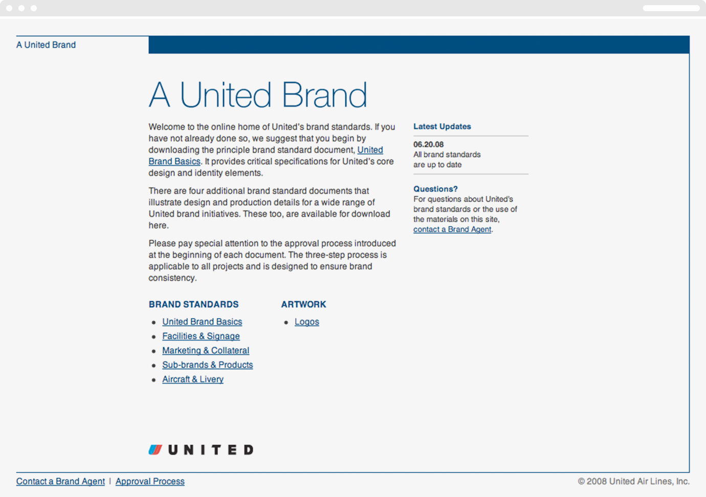
The five volumes of brand standards highlighted the unique challenges and considerations within each category, but also underscored the importance of consistency across the United brand. To minimize information overload, Thinkso designed the program to allow users to access either an entire volume or a single topic, depending on their need. Everything was housed on the brand standards website at aunitedbrand.com — which Thinkso designed, wrote, and programmed in-house.
“Local decisions are made every day, all around the world, that either build or detract from United’s brand. Our framework of brand guidelines is an invaluable resource for maintaining consistency across hundreds of global destinations.” Thomas McGrane, Manager, Brand Identity and Design, United
RESULT
For such a utilitarian initiative, the results were remarkable. For the first time ever, United was able to offer global partners immediate access to brand standards, logotype artwork, production templates, and other resources.
The airline was also able to do a better job of quality control, thanks to a three-step approval process introduced by Thinkso. It ensured that more of the work being done in the field made its way to United “Brand Agents” — a team of United employees and Thinkso designers — who provided timely feedback.
Ultimately, the revamped brand standards strengthened the United brand across the network. The quality and consistency of the airline’s design and branding initiatives increased. Brand Agents and users of the guidelines became true collaborators. And the program could be seen by potential suitors as evidence of United’s investment and renewed commitment.
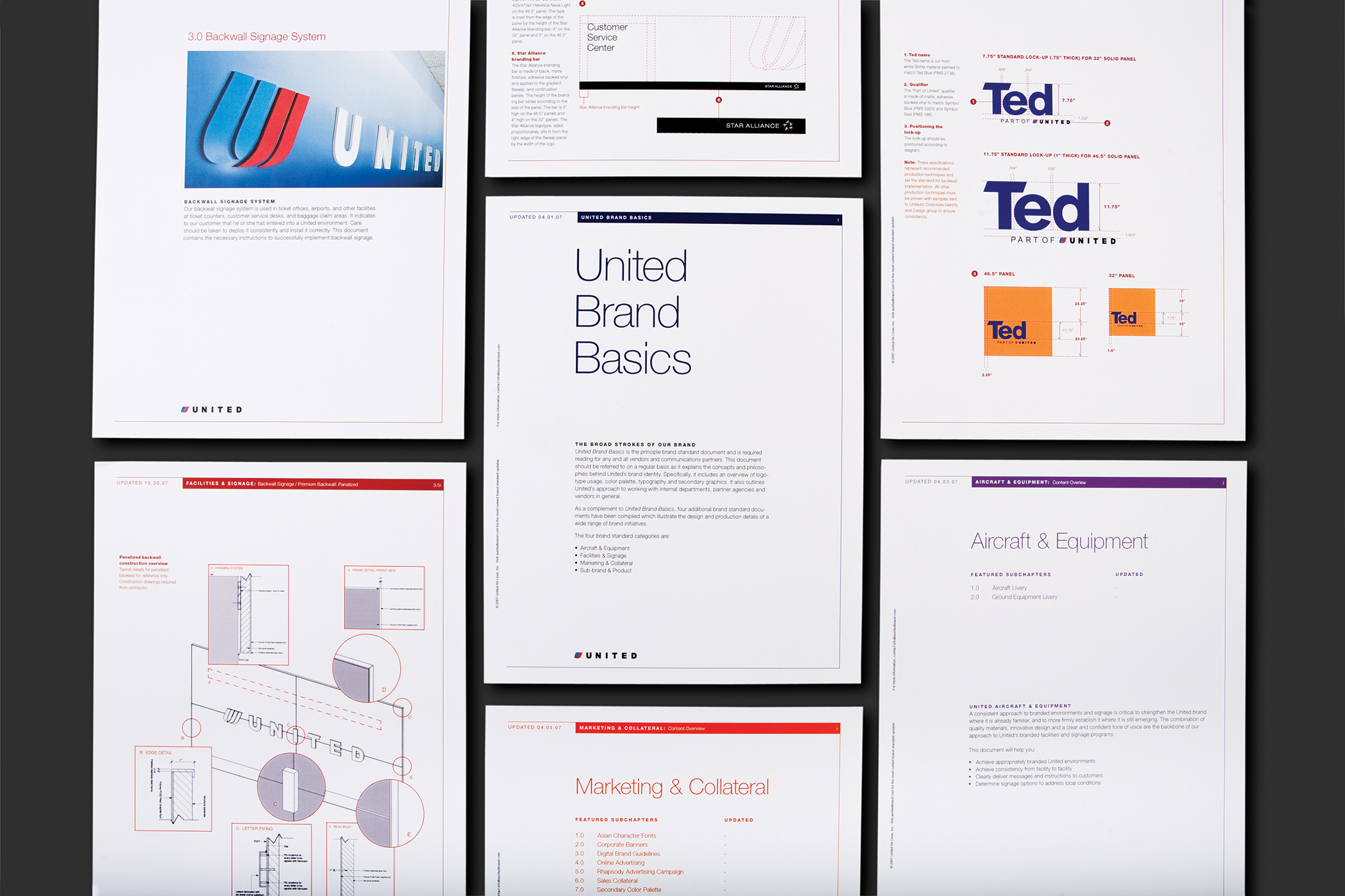
Thinkso completely rewrote and redesigned the airline’s brand standards program, organizing more than 150 pages of content and brand specifications into five categories—and making it all available online at aunitedbrand.com, which we designed, wrote, and programmed.
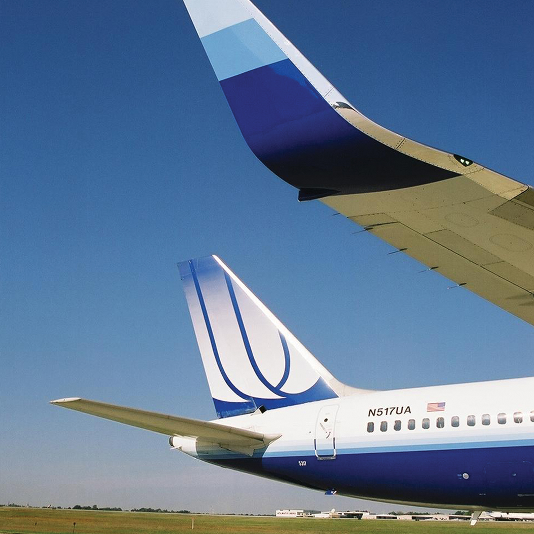
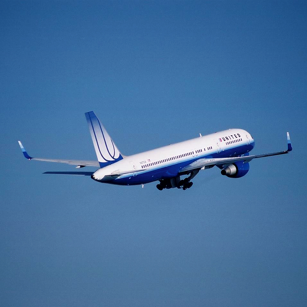
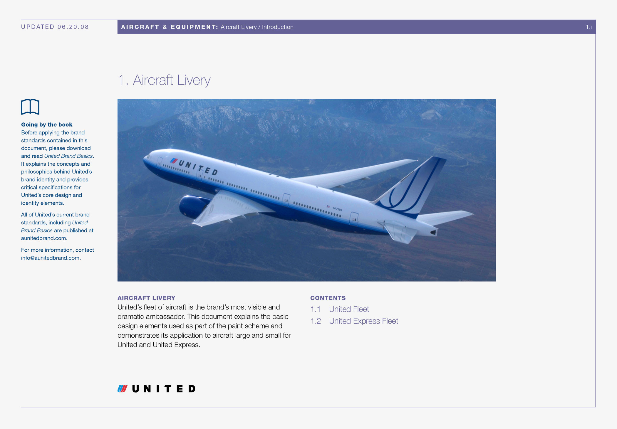
Having had previous experience working with United’s brand identity, including the design of the aircraft paint scheme, Thinkso designers were uniquely prepared to handle new design initiatives such as the addition of “winglets” to United’s Boeing 757 fleet. Design specifications then became part of the Aircraft & Equipment volume of brand standards.
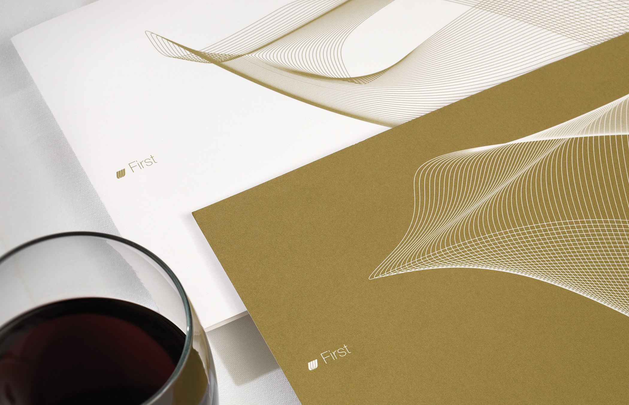
Sub-brands & Products provides specifications for the airline’s brand architecture—including its classes of service: United First, United Business, and United Economy. We applied the principles outlined therein to a simple, but elegant, redesign of United’s international menu program.
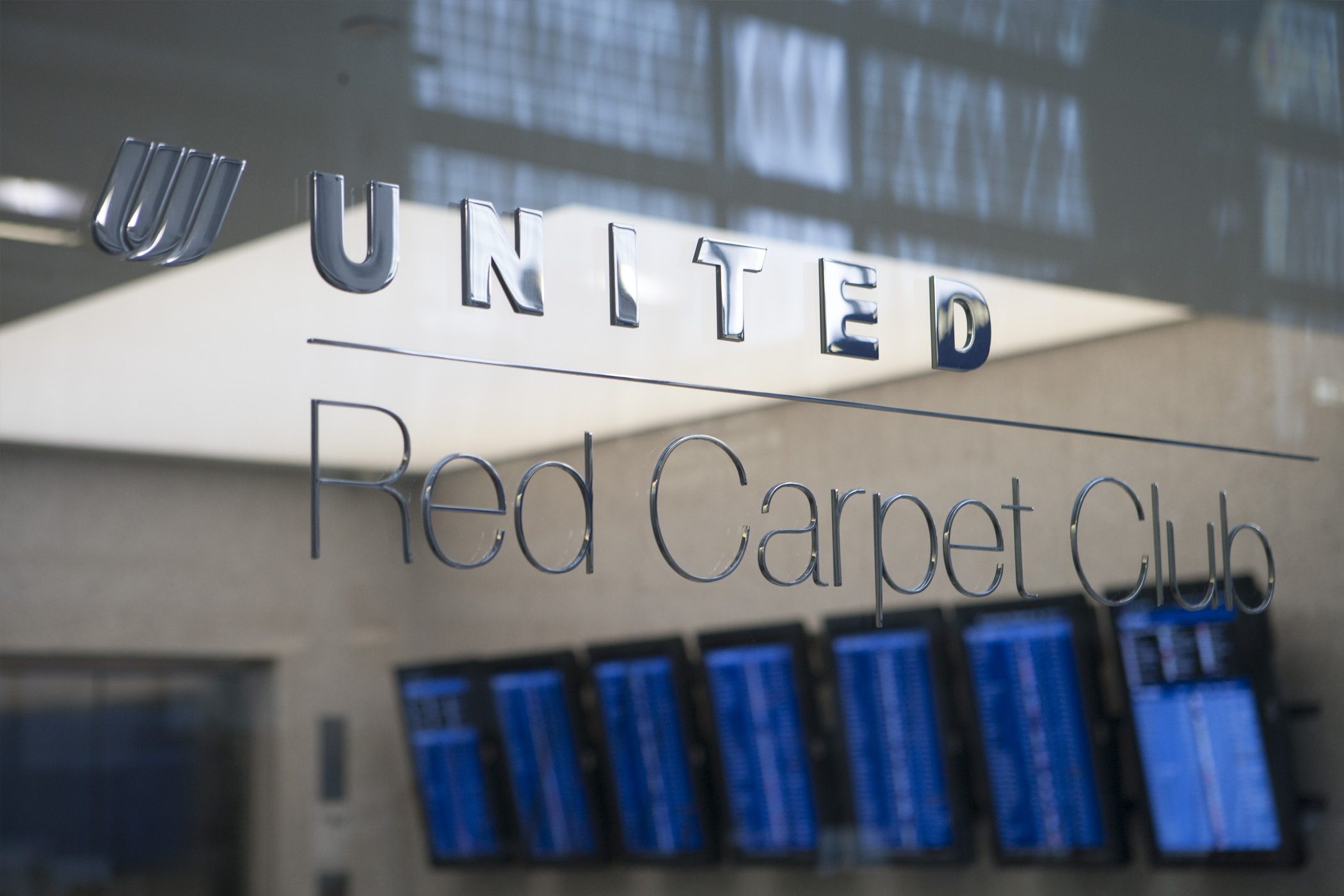
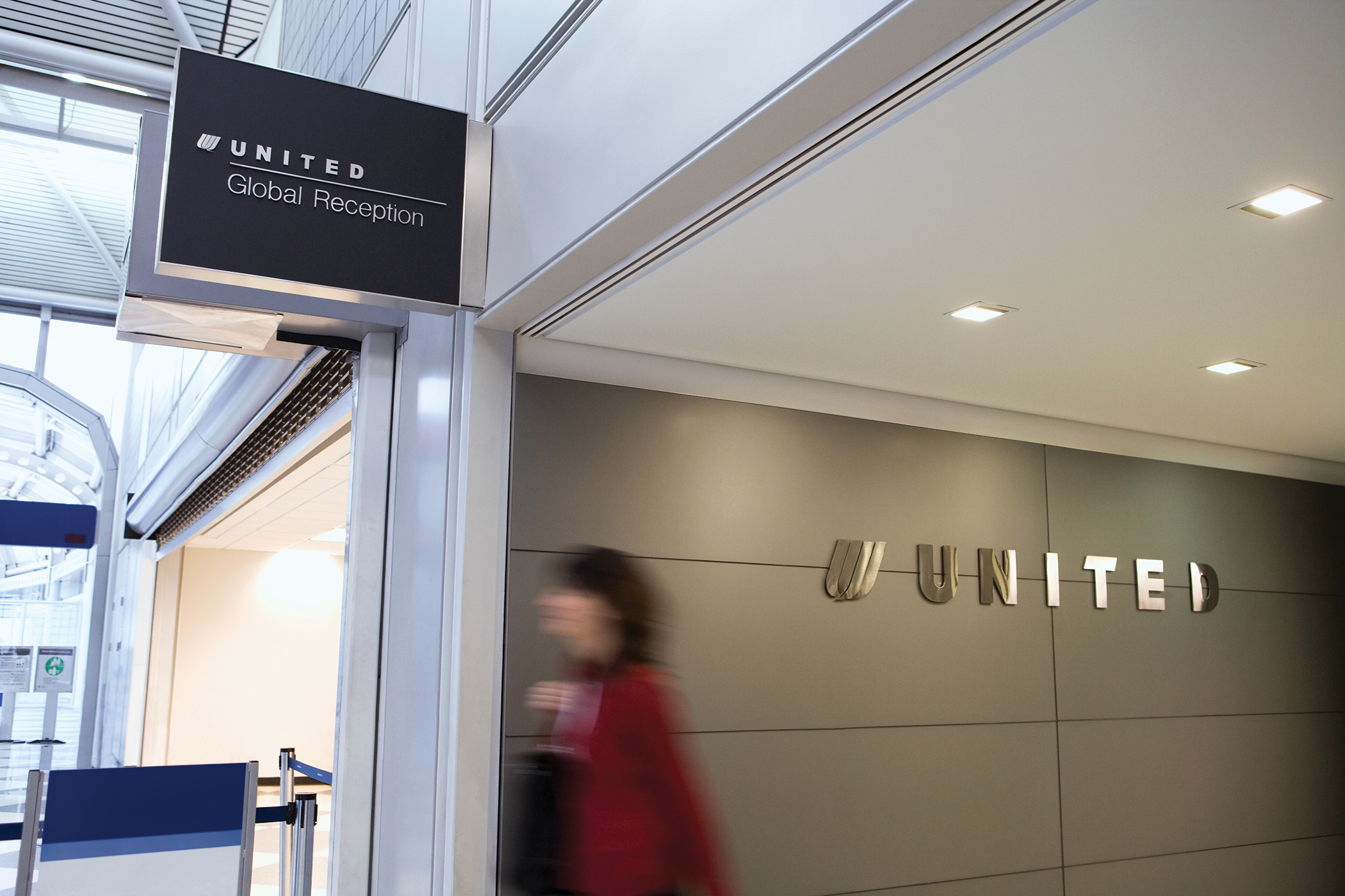
Working within United’s Facilities & Signage volume of brand standards, Thinkso designed lounge signage for a remodel of the facility at Chicago’s O’Hare International Airport. We also named and branded their newest lounge product, United Global Reception, that catered to the airline’s most premium customers.