As a pioneer in electronic stock trading, Instinet had been setting the pace for innovation in the industry for nearly five decades. With new opportunities, business objectives, and competitive challenges, it was time to revitalize the brand — and remind the marketplace of Instinet’s exceptional vision and value. Instinet’s new CMO brought in Thinkso to develop and implement a strategic, end-to-end brand overhaul with a new visual identity, solutions architecture, messaging, and editorial voice. The new creative system gave Instinet an energizing, modern edge that underscored its continued relevance, leadership, and unique way of doing business in an era of exceptional change — and exceptional opportunity — in the financial markets.
BACKGROUND
Instinet was the “original fintech,” having created the first electronic securities trading network. And with a long history of fundamental innovations, it had become a leading global agency trading firm. Instinet had always placed itself at the forefront of change in its industry — and the changes had been coming fast in the electronic markets. To help them stand out in an increasingly competitive marketplace, they needed a brand and message to celebrate their vision in shaping the markets, and to promote the fundamental benefits they provide for their clients every day.
APPROACH
Energized by the new marketing leadership and inspired by new opportunities in Instinet’s business, Thinkso set out to capture the company’s history and culture of innovation — and its continued commitment to pushing the industry and the markets forward. Our strategy focused on articulating the fundamental essence of Instinet’s value in a crowded marketplace: a combination of uncompromising technical excellence and continuous innovation that differentiates Instinet from its competitors. This balance of practical value and strategic vision became the thematic backbone of a dynamic new look, message, and voice.
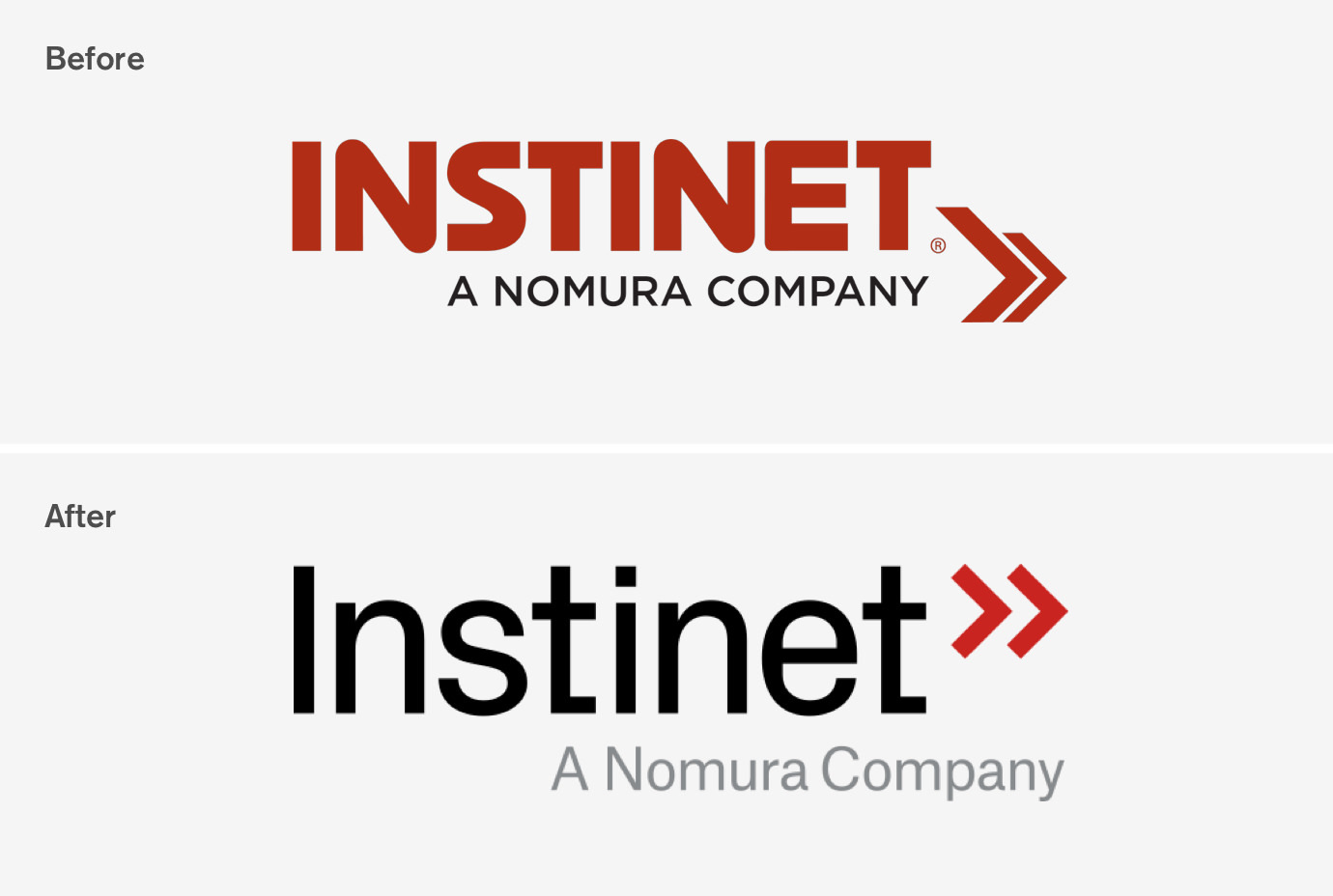
We evolved the logotype and other key brand assets to keep a connection to the established brand. This included redesigning and repurposing the chevron shapes that were integral to the legacy logotype and keeping the distinctive red and black-based color template. At the same time, we sought to develop a more energetic and unique look to capture Instinet’s personality — a stylish, clean, and thoughtful brand system and architecture to support and enhance its unique market position.
RESULTS
Foremost, Instinet’s new brand sends a clear signal to its client base, competitors, and the industry at large that the firm is optimistic and stronger than ever and thriving as it enters its sixth decade as a leading global trading firm.
With its more distinctive brand, Instinet can increase opportunities to grow its business and market reach with a coordinated message across its service areas and solution sets. In particular, a streamlined brand architecture provides a clearer view of what Instinet thinks, how it works, what it delivers, and how its clients benefit.
Thinkso’s work on Instinet’s new brand identity was recognized with a silver medal at the 2018 Financial Communications Society Portfolio Awards.
We also knew that a more direct, authentic, and fresh voice was just as important as a more up-to-date and energetic look. We recommended clear, jargon-free language and a more confident tone, with room to be edgy or humorous when it fit the audience and the message.
RESULTS
Foremost, Instinet’s new brand sends a clear signal to its client base, competitors, and the industry at large that the firm is optimistic and stronger than ever and thriving as it enters its sixth decade as a leading global trading firm.
With its more distinctive brand, Instinet can increase opportunities to grow its business and market reach with a coordinated message across its service areas and solution sets. In particular, a streamlined brand architecture provides a clearer view of what Instinet thinks, how it works, what it delivers, and how its clients benefit.
Thinkso’s work on Instinet’s new brand identity was recognized with a silver medal at the 2018 Financial Communications Society Portfolio Awards.
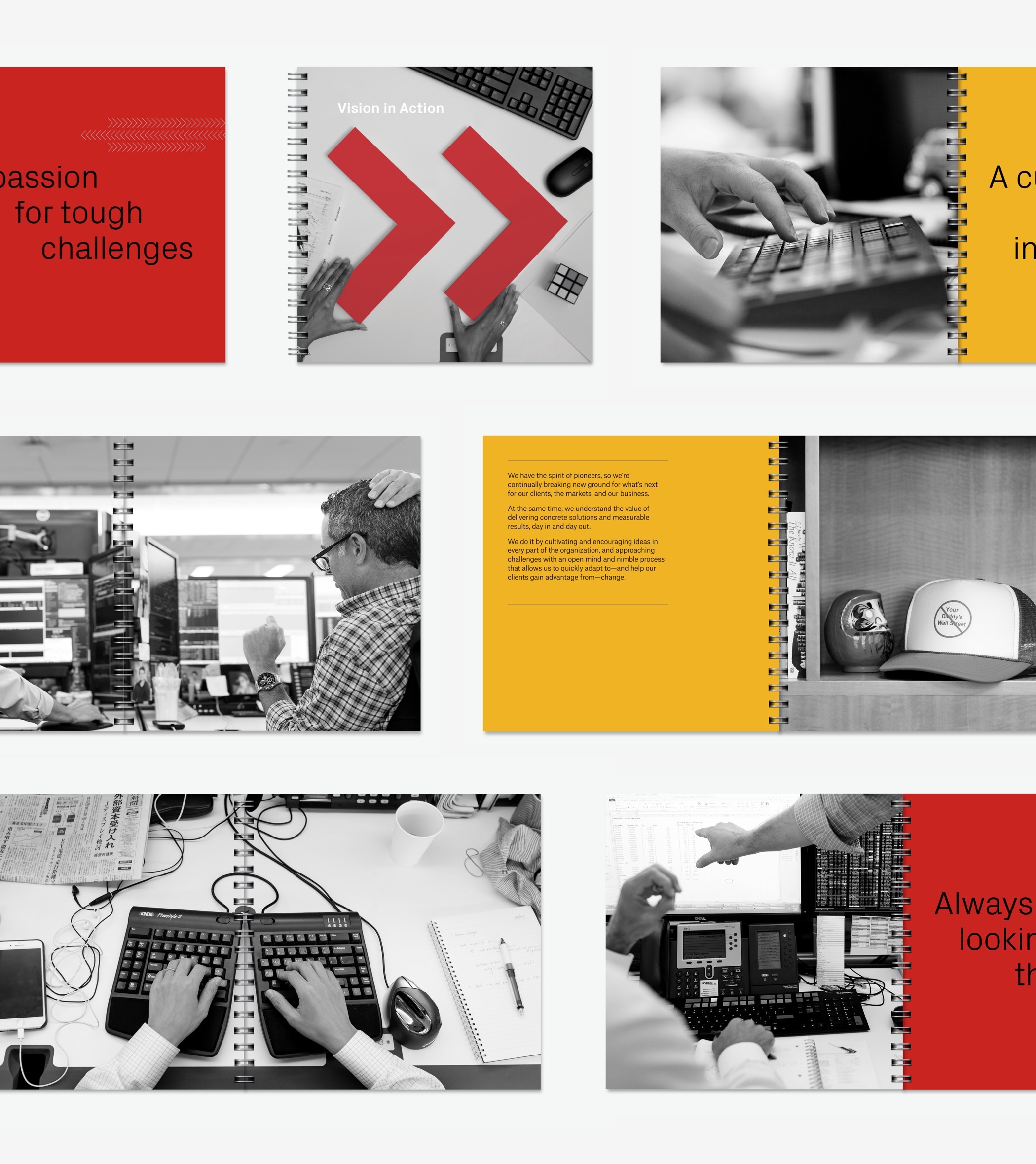
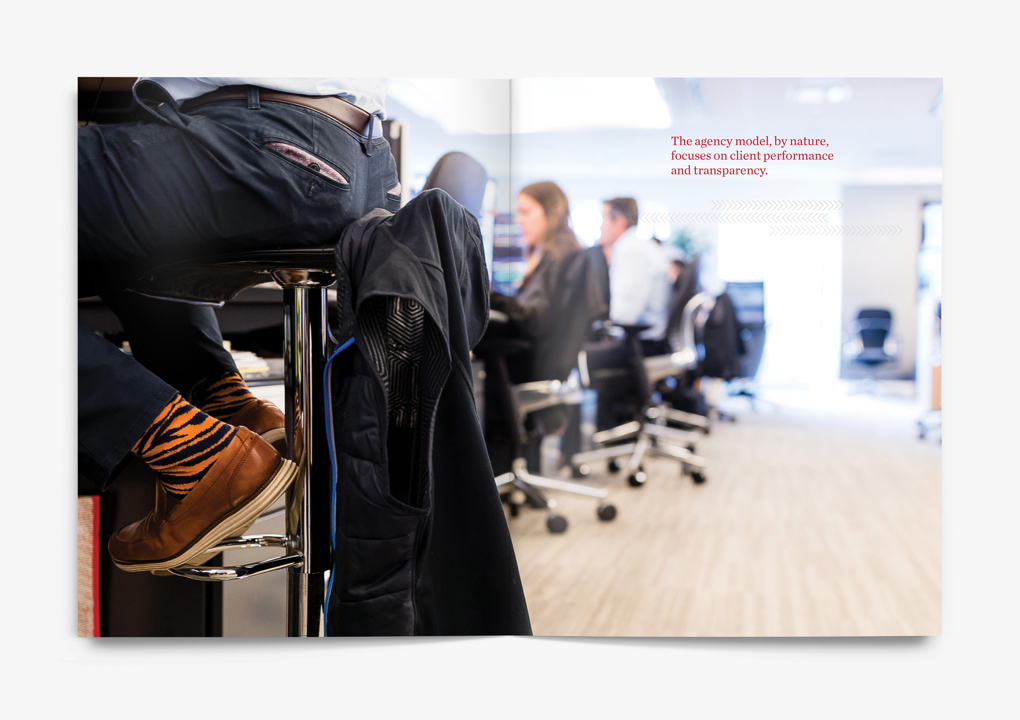
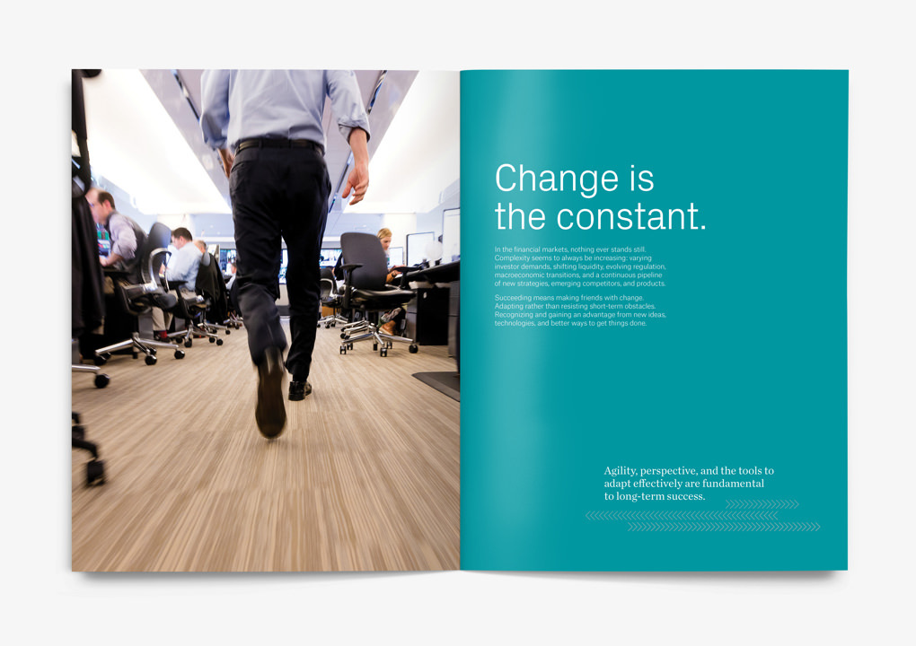
Instinet’s new brand identity was introduced internally through “Vision in Action,” a short but powerful handbook that describes the spirit of Instinet and what the brand stands for. As part of this book, we commissioned a custom, reportage-style photo shoot to capture the buzz of the trading floor and Instinet’s unique people.
The refreshed logo changes the treatment of the name from the original all-caps acronym (Institutional Networks) to that of a proper noun—uncovering a new sense of friendliness and personality that had always been there, but had been obscured.
The typography dovetails seamlessly with the hard right angles of the revamped chevron motif, which is then utilized as a central element throughout the brand architecture.

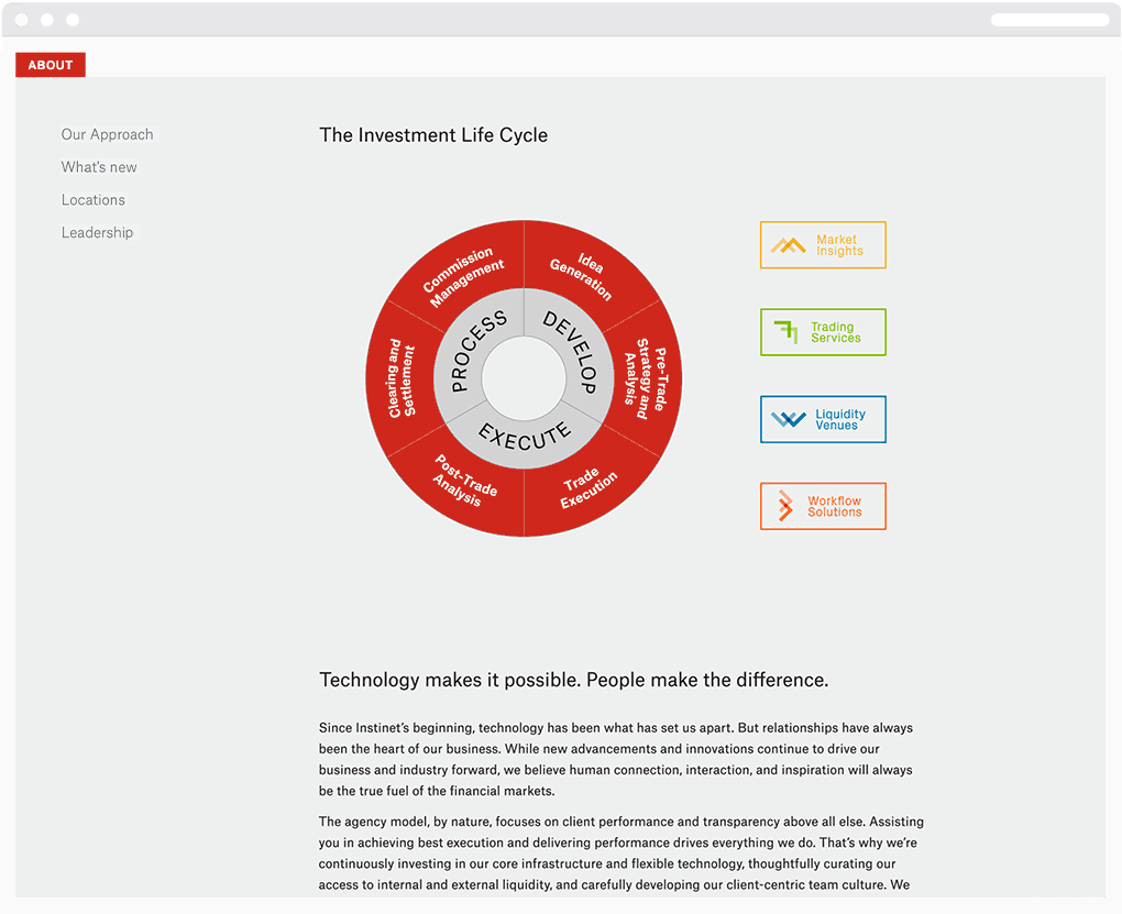
Chevron shapes combine with an energetic color palette to create a series of service labels. They are used to identify and group communications within the overall brand architecture. Interestingly, although only comprised of two elements, the icons create visuals that conceptually tie in to the subject matter: right-pointing arrows for Workflow Solutions, upward trending indicators for Trading Services, a mountain range for Market Insights, and water ripples for Liquidity Venues.
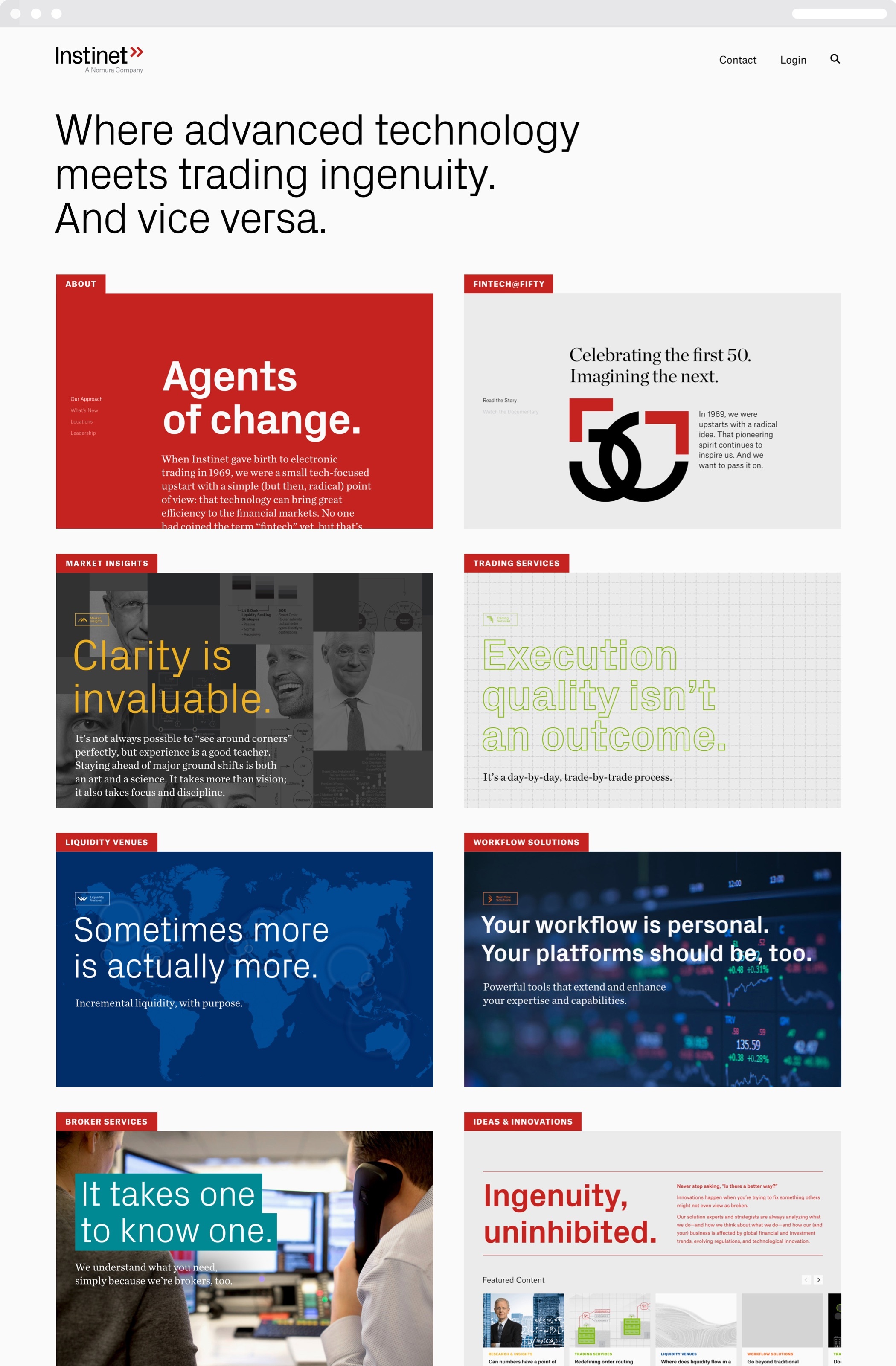
A fresh website design reflects the brand’s new energy and showcases a more provocative and engaging editorial voice. Visitors are invited to explore Instinet’s story and services from a menu of a set of discrete “homepages” for its core capabilities, each with a distinctive take on the brand’s visual vocabulary.
A series of simple brand advertisements were used to introduce the industry to Instinet’s new brand identity, including this example that appeared in Times Square during the firm’s NY Liquidity Party in 2018
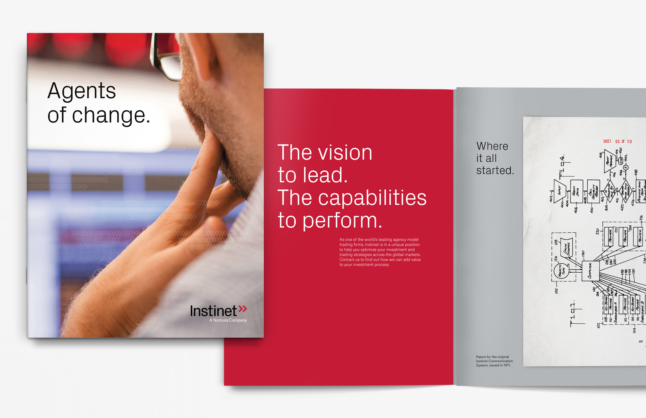
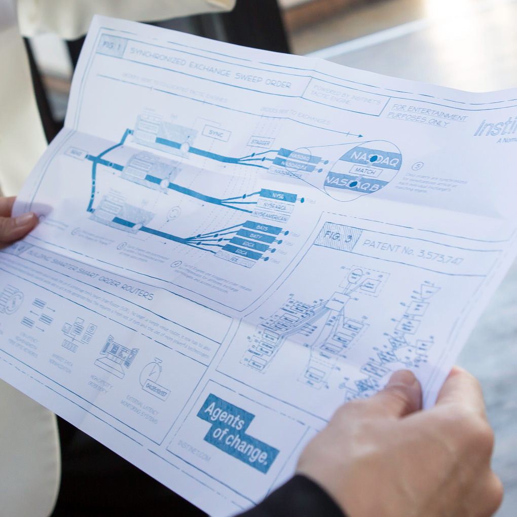
The firm brochure, “Agents of Change,” underscores Instinet’s role as a leader and innovator within financial technology. A facsimile of the patent for the Instinet Communications System—the first electronic trading platform—is juxtaposed with the high-tech, fast-paced trading floor of today and the quirky personalities who thrive there.
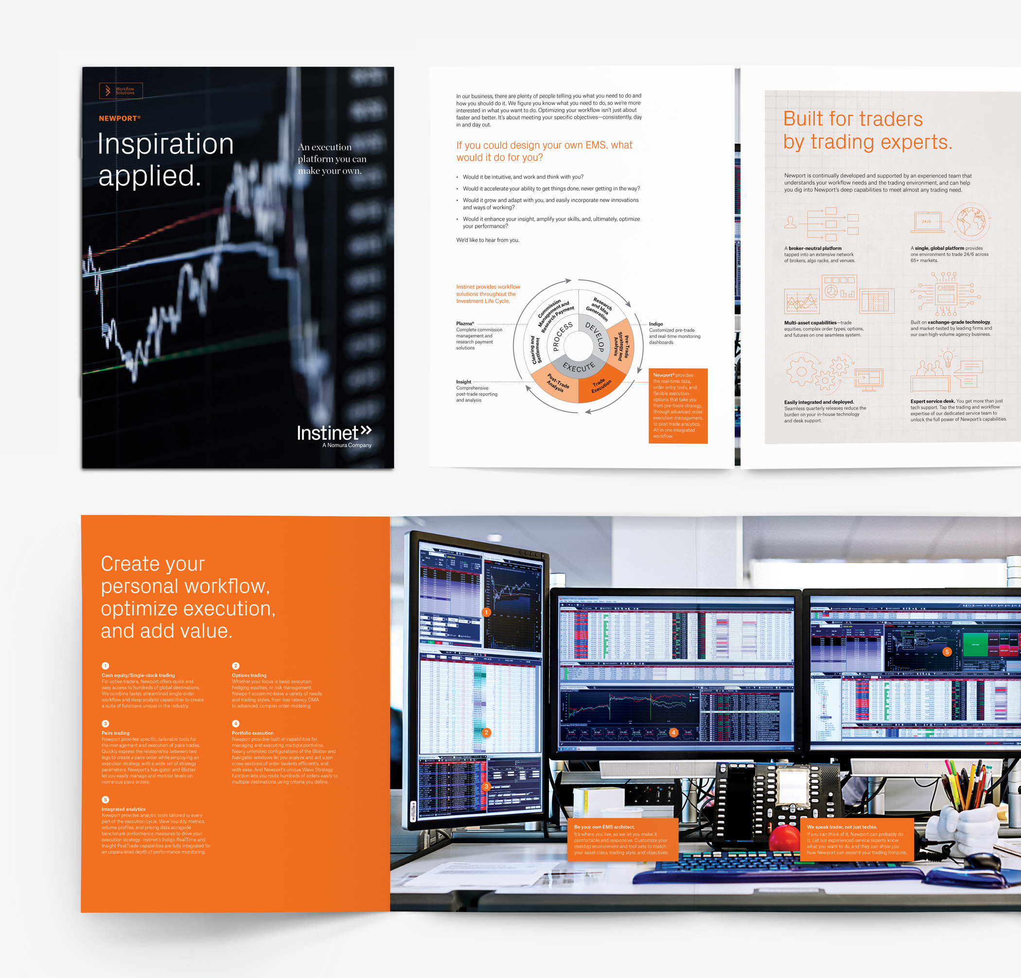
Since most of Instinet’s products exist as electronic interfaces, they became the inspiration for the artful and abstract cover treatments. On the interior, however, we put a premium on clearly describing and accurately depicting its offering. The Newport® brochure, for example, uses the bright orange of Workflow Solutions to call out its unique features over an expansive gatefold image of a trading terminal.
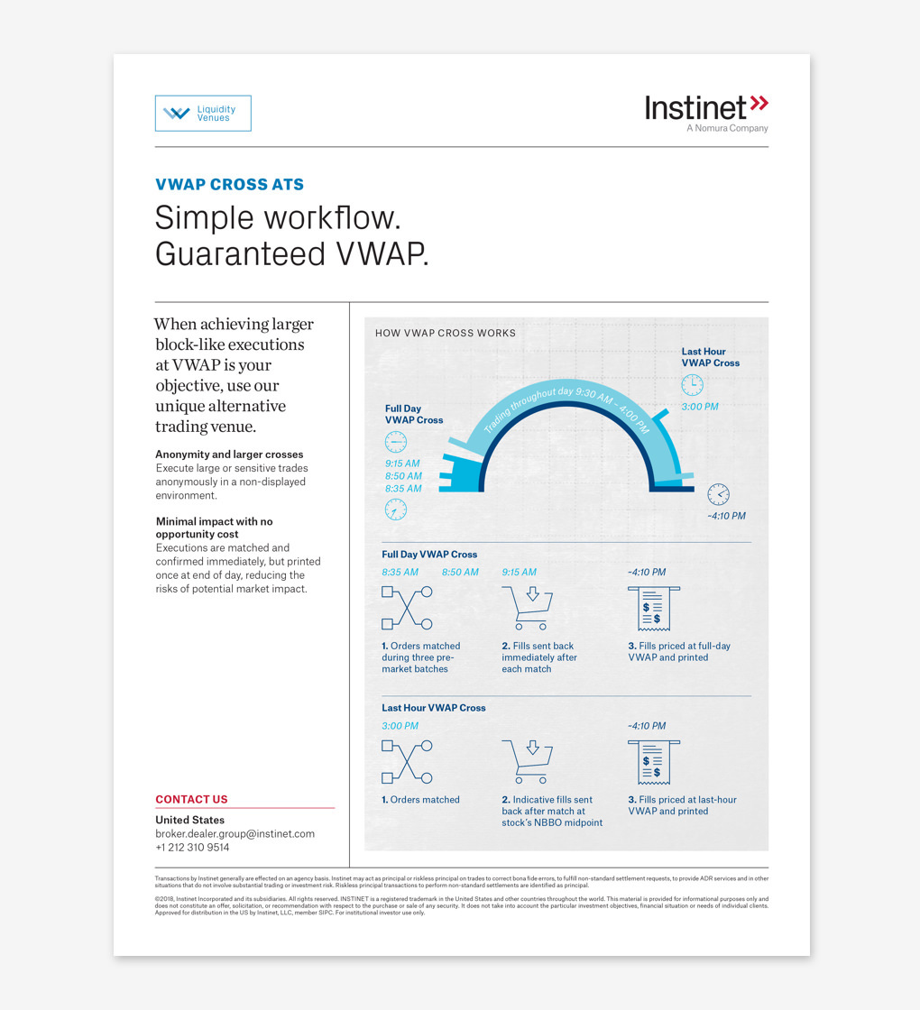
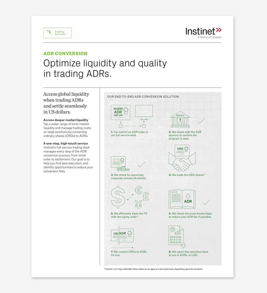
At the single solution level, we created a set of highly-visual sales sheets that extend the brand vocabulary with clean-lined pictograms and charts. Design is straightforward and practical, packing layers of information into easily scannable layouts. Editorial is audience-focused, driven by large headlines and brief and clearly delineated copy.
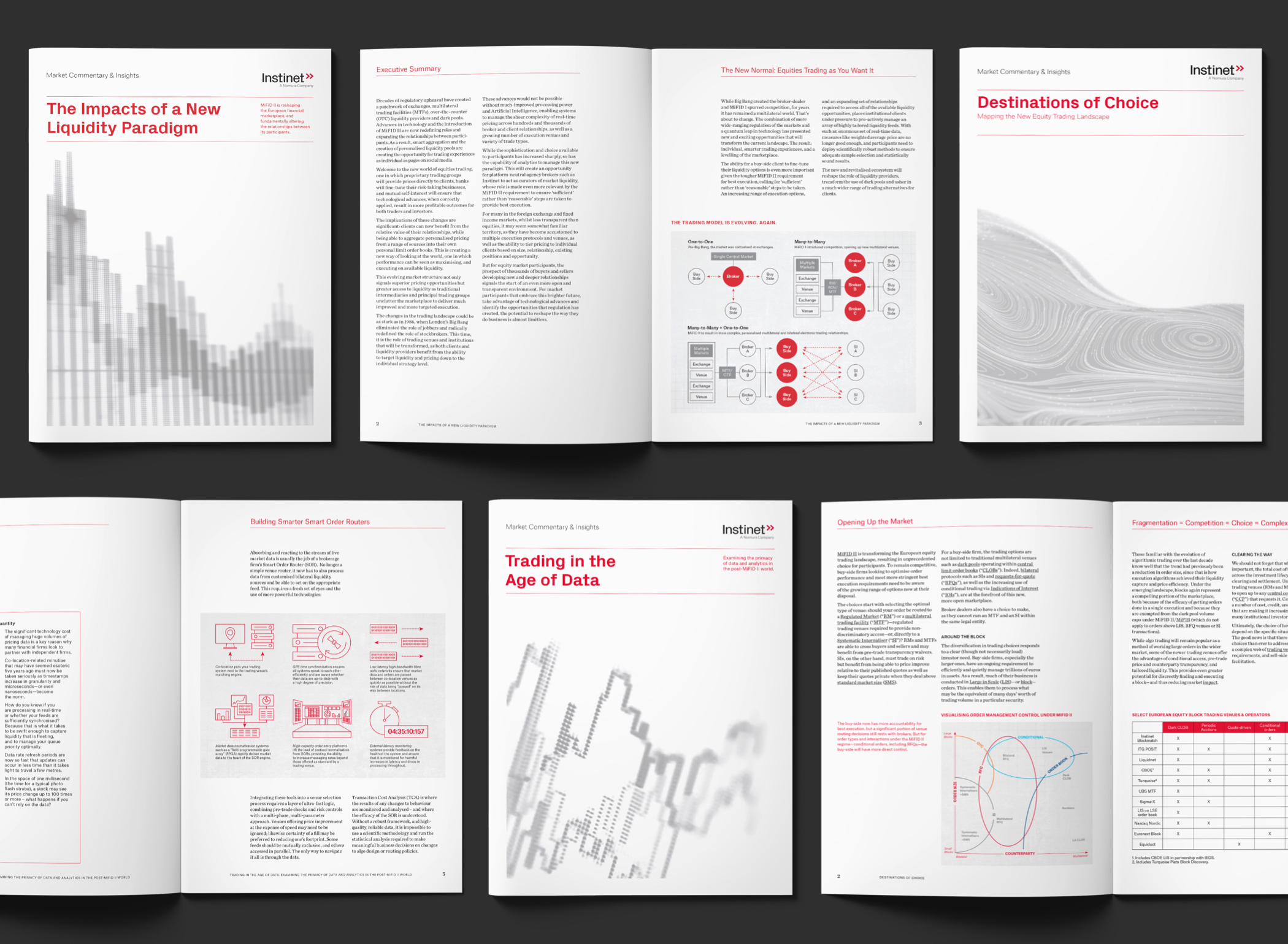
Thought leadership publications leverage the chart and illustration style of the one-pagers, simplifying the palette to emphasize the primary brand colors with ample white space. Layouts deliver high-word-count copy cleanly and clearly.
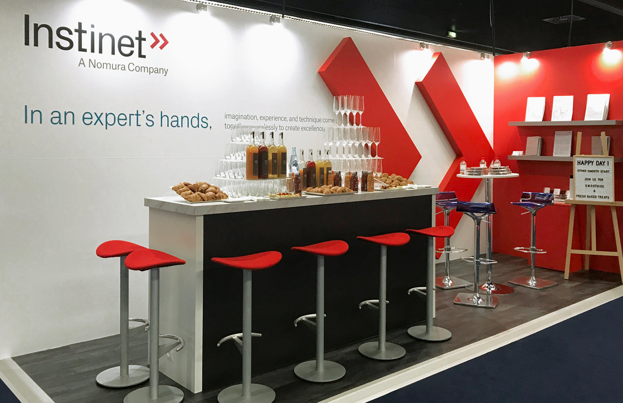
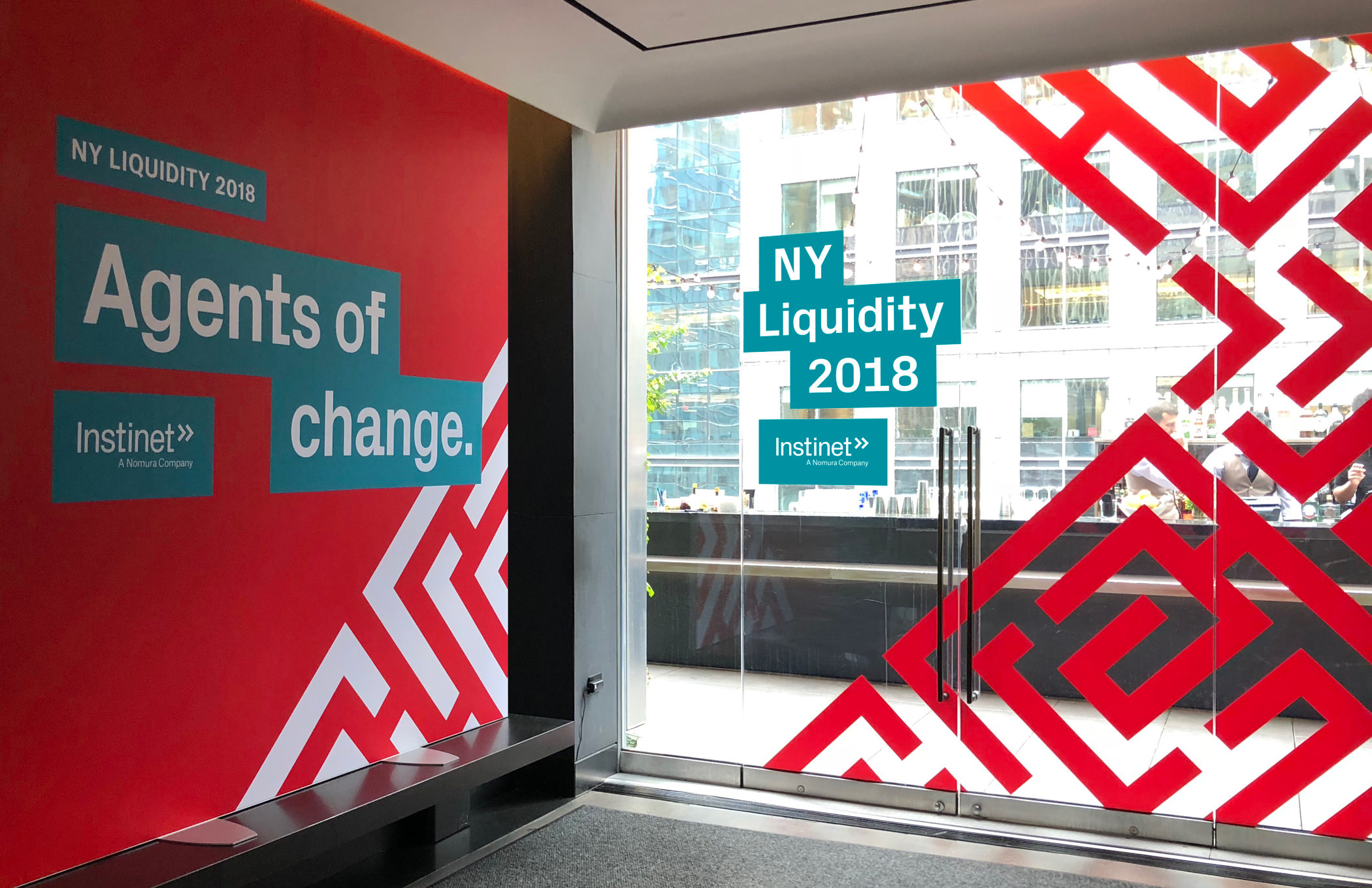
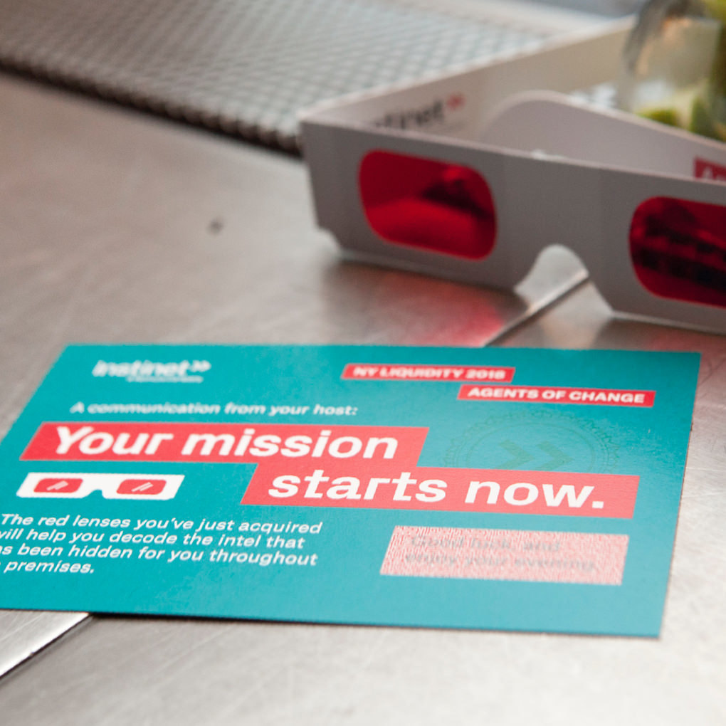
In collaboration with our clients in Instinet’s marketing department, we created bold and eye-catching concepts for trade shows and other corporate and industry events that helped them truly stand out from the crowd. Colorful, clever, and fun, they help express Instinet’s forward-looking brand identity.