A campaign keepsake that makes the case for Princeton

Princeton University’s alumni engagement and fundraising office looked to Thinkso to design a printed report documenting the impact of its mission-driven “Venture Forward” campaign’s first year. Entitled Dare to Venture, the report is structured around a series of “what if?” questions that probe the University’s unique approach to the liberal arts and highlight the campaign’s accomplishments to date. Using premium materials and printing techniques, the oversized volume was engineered to make a strong initial impression, engaging constituents with its impressive physicality and storytelling. The report received a silver Circle of Excellence award from the Council for Advancement Support of Education.

A grid of the covers of the Princeton Venture Forward campaign brochure. The front is black with cut outs in the shape of a chevron revealing an orange page underneath. The center reads “Dare to Venture” and the bottom right corner reads “Venture Forward.” The back of the brochure is white with gray and orange text that reads “Venture Forward.”
“The striking design was integral to successfully telling the story of the campaign’s first year—and emphatically set the tone for the next three to come.” Lisa A. Burke, Director of Design, Princeton University Advancement Communications
The front and back of the Princeton Venture Forward campaign brochure. The front is black with cut outs in the shape of a chevron revealing an orange page underneath. The center reads “Dare to Venture” and the bottom right corner reads “Venture Forward.” The back of the brochure is white with gray and orange text that reads “Venture Forward.”

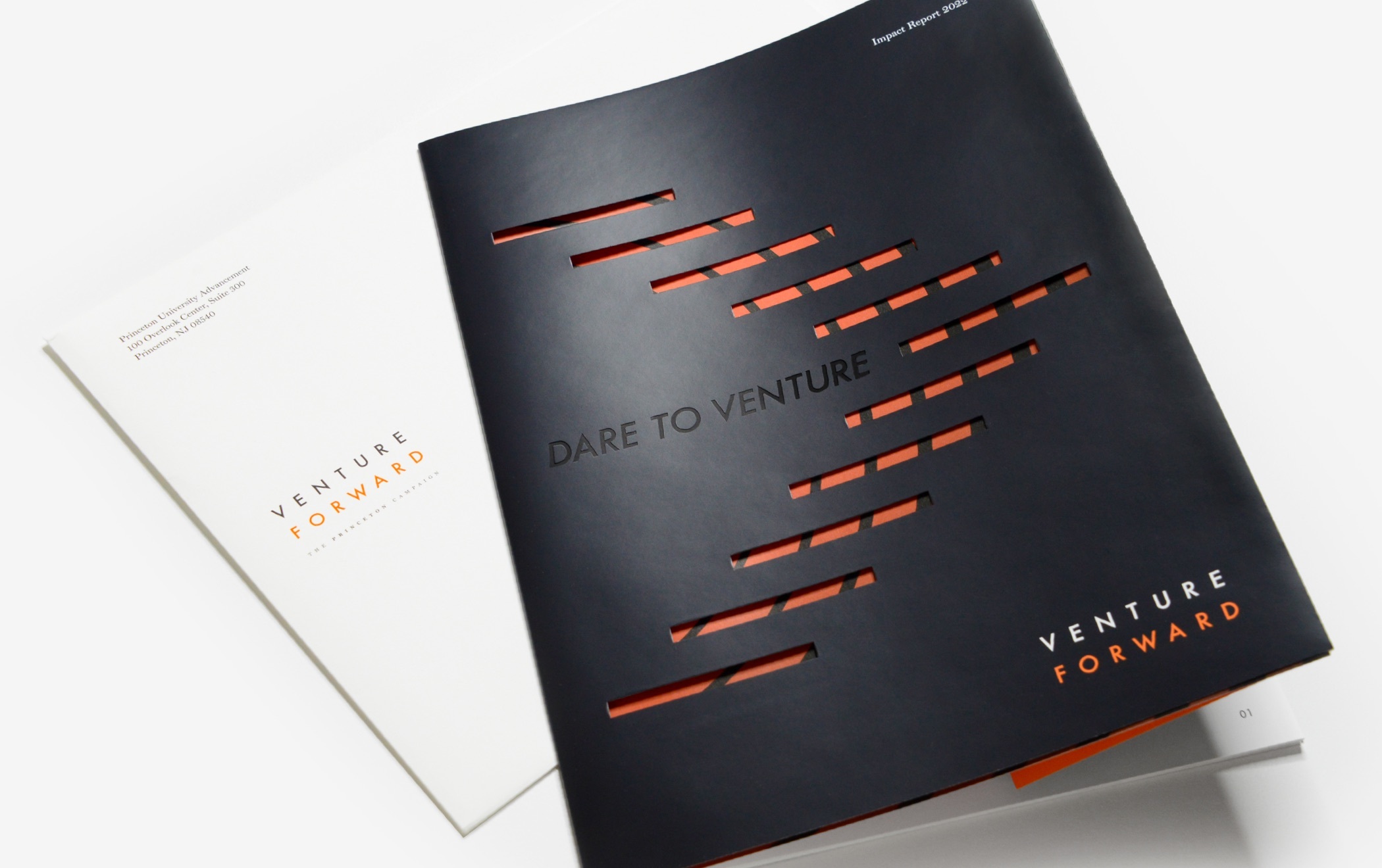
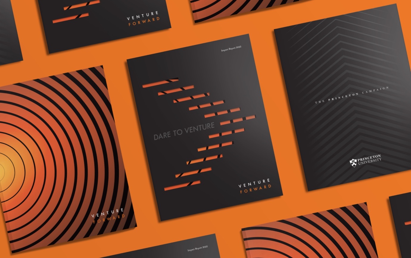
The report’s high production value, materials, and finishes reflect Princeton’s reputation as an institution of higher learning and “speaks the language” of its sophisticated audience. The lightweight dust jacket carries the title and campaign branding—adding dimension, interest, and a high quality sensibility. Its intricate chevron die-cut and the concentric motif that shows through tie back to the Venture Forward campaign identity.

A close up detail photo of the design components from the brochure. The copy reads “What If” in orange text at the top. Partially visible in the frame is large black text asking a question with smaller black text answering the question below.
A close up detail photo of the design components from the brochure. Photo shows the inside front cover of the report, which features a photo of an asian man speaking at a podium microphone and a black, glossy flap that reads “Dare to Venture.” The image shows the flap opening up to reveal the table of contents.
A close up detail of the design components from the brochure. A QR code with partially visible text that begins, scan me.
A close up detail of the design components from the brochure. The photo shows shows orange text on a light gray chevron background that reads, 81.8 million dollars was the total amount raised in the 2021-22 Annual Giving campaign; the highest total in Princeton history.

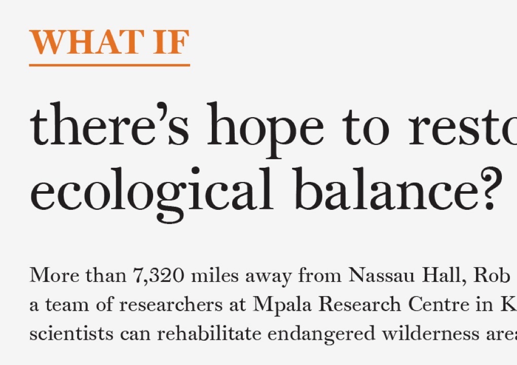
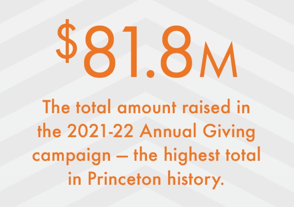
A handful of common components combine from spread to spread. They include a consistent position and treatment of the “what if?” question, the use of QR codes to sync to a variety of videos and other pertinent online content, as well as bold statistical claims to reinforce the message. As a nice surprise, the inside front cover of the dust jacket flips out to serve as a mini table of contents for the report.

Various images of the interior pages of the report, featuring vivid photos of the Princeton campus, students, and professors, as well as consistent “What If” headers, testimonials from students, and statistics highlighting the program’s impact. Each page uses Princeton’s orange and black colors.

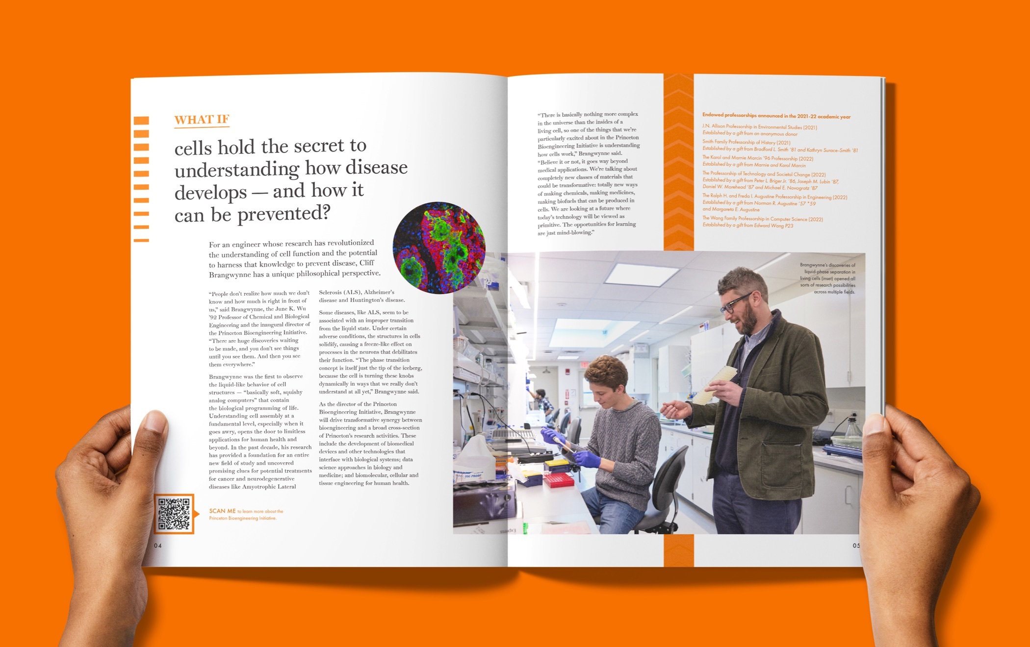
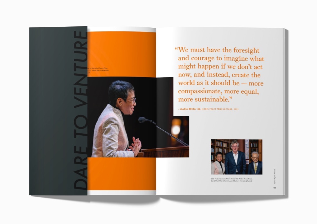
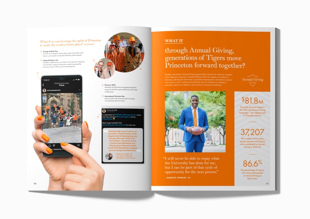
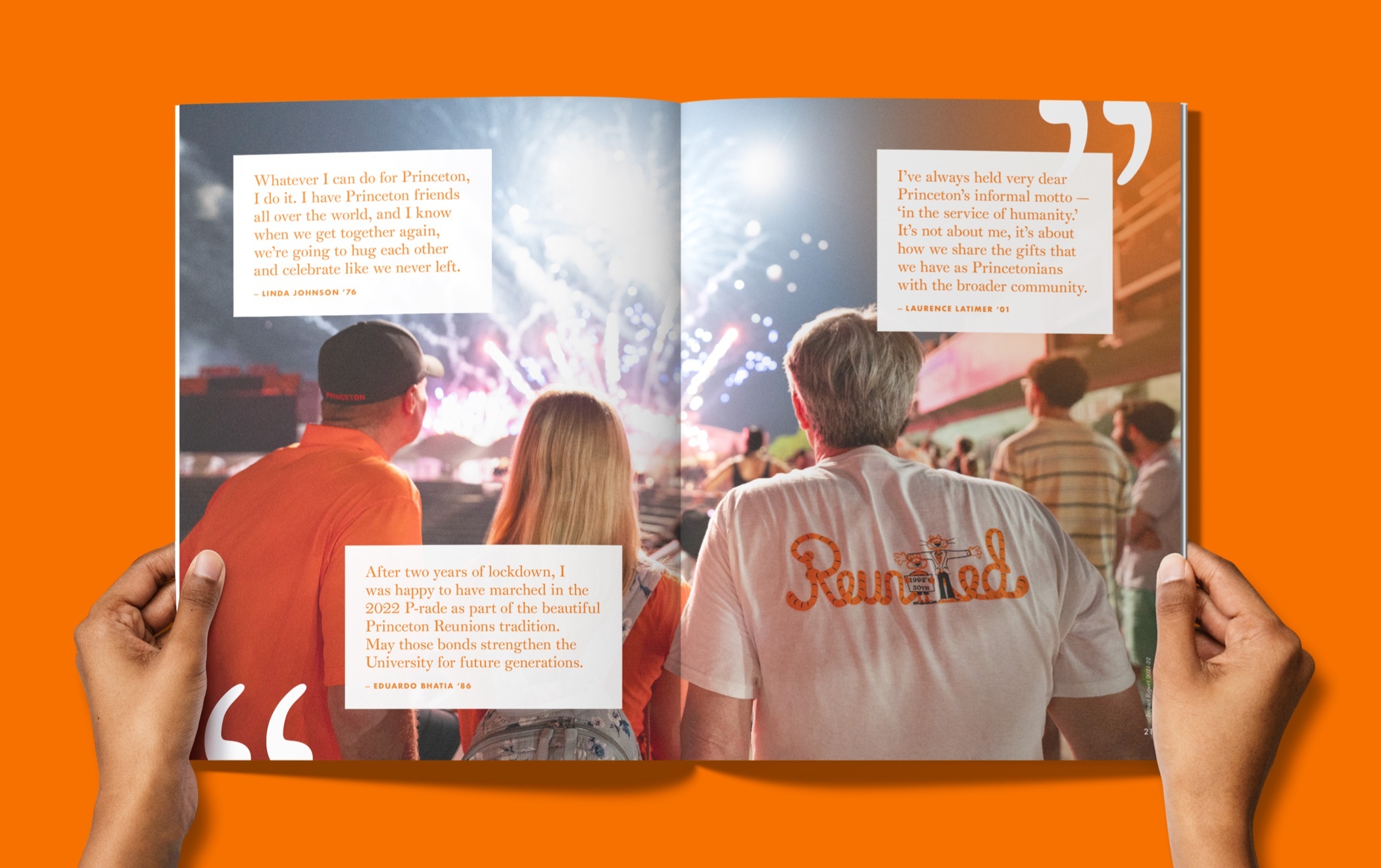
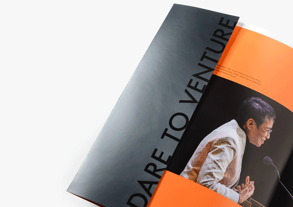
The report’s magazine-like spreads are energetic, inviting, and hold the reader’s attention. They highlight sidebar stories, introduce alumni and student quotes, and reflect the vibrant spirit of the university and campaign. Additionally, the oversized format communicates confidence, stands out in recipient’s mail and is much harder to throw away than a typical brochure.