The Reform Pension Board was founded in 1944 to ensure the clergy, educators, and professionals at Reform Jewish synagogues could have a dignified retirement. After flying under the radar for nearly 75 years, RPB wanted to better connect with its participants and communicate its value. Thinkso worked with them on a total rebrand, from brand positioning and messaging, to a new brand identity and moniker, to a full suite of communications materials and a new website. Not only did the new look and voice raise RPB’s profile with target audiences, but it also helped participants get more out of the benefits the organization offered.
BACKGROUND
RPB is the default retirement plan for most Reform Jewish synagogues; pre-retirement enrollment is virtually a given. However, after retiring, participants can opt to withdraw their RPB account savings — usually to consolidate their finances at another, larger financial institution.
At the same time, the RPB plan is vital to the Reform Jewish Movement’s strength and longevity. The Movement needs strong benefits in order to attract top talent to its synagogues. And the plan needs a critical mass to stay viable.
Recognizing that today’s investors have more and more choices and financial services companies are getting more and more aggressive with their marketing, the Reform Pension Board’s new leadership decided it was time to step up its branding and communications.
“In designing our new identity, Thinkso found the perfect balance between representing us as a trusted financial services organization and a caring religious nonprofit. Both are important to who we are—and to the value we provide to our retirement plan participants and their employers.” Stephanie Berger, Director of Marketing and Communications, RPB
APPROACH
Although far smaller and less resourced than large financial services players, RPB has a lot of differentiating strengths. Essentially a nonprofit — with no shareholders to please or sales quotas to meet — it can operate truly in its participants’ best interest. And to that end, the benefits it provides are first class. It has retirement expertise and fund options on par with the best plans out there.
Thinkso’s goal was to bring these differentiating strengths to life. Our strategy included establishing RPB as a top-tier financial institution with the warmth and altruism of a nonprofit.
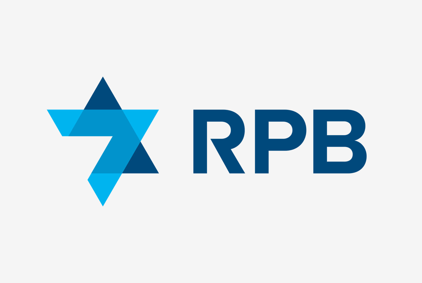
The identity we developed references the organization’s Jewish heritage yet could hold its own in the financial services sector.
- The RPB color palette is a modern balance of “trustworthy” blue tones accented with pops of vivid color.
- We developed the tagline “Invested in your future” as an affirmation of RPB’s primary goal: to prioritize the interests of its participants above all else, and to help them prepare for a dignified retirement.
- The crisp, clean typefaces echo RPB’s style of clear, direct communications.
- And we developed an editorial voice that portrays RPB as a tuned-in, contemporary financial services firm with a warm, smart tone.
RESULT
Thinkso launched the new RPB identity in 2018 to rave reviews from RPB participants, employers, and its board. We designed and wrote a new public website, (built by our development partner, Surprise Highway). We produced brochures, event materials, an enrollment kit, videos, a blast email system, and much, much more.
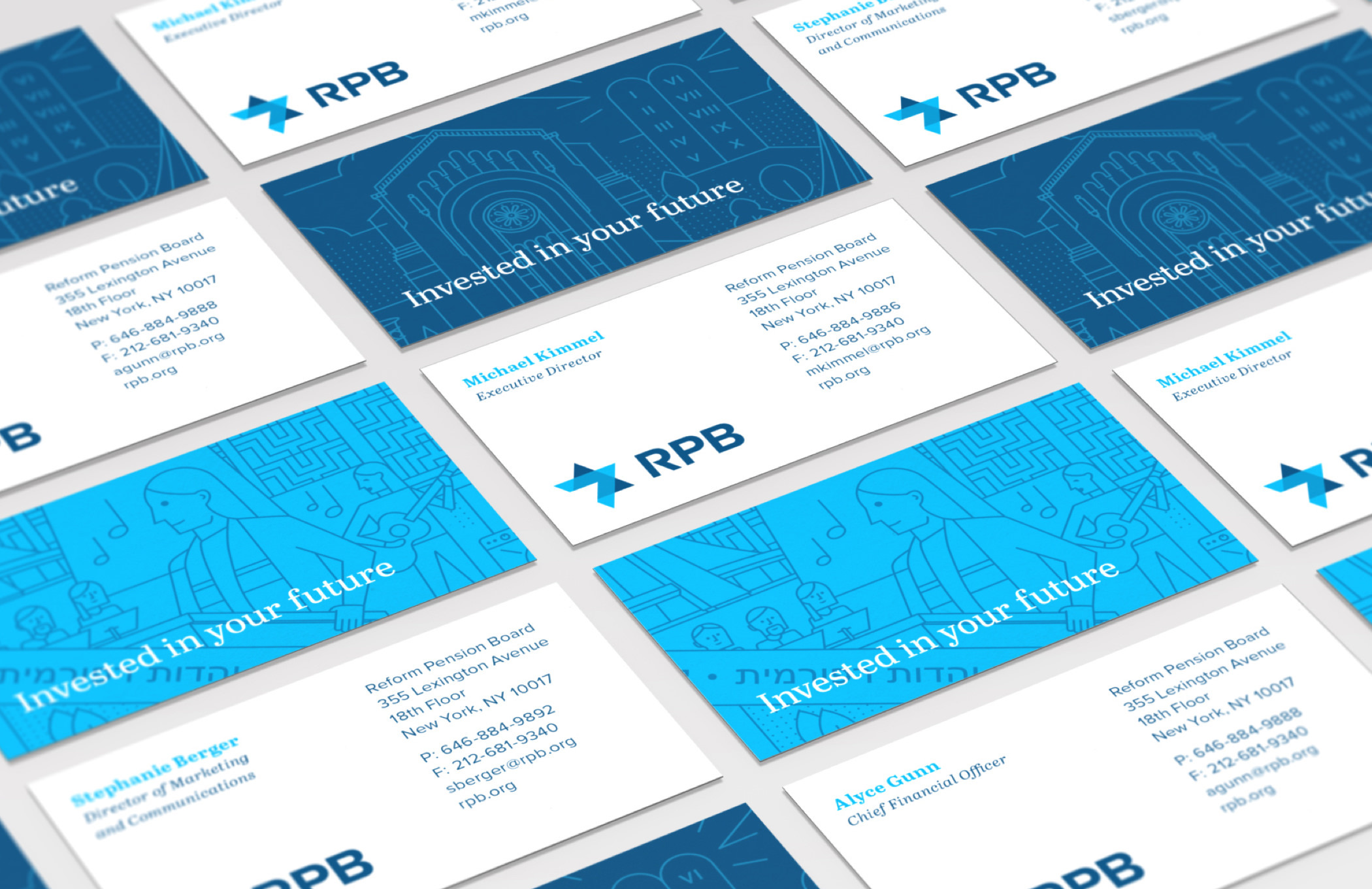
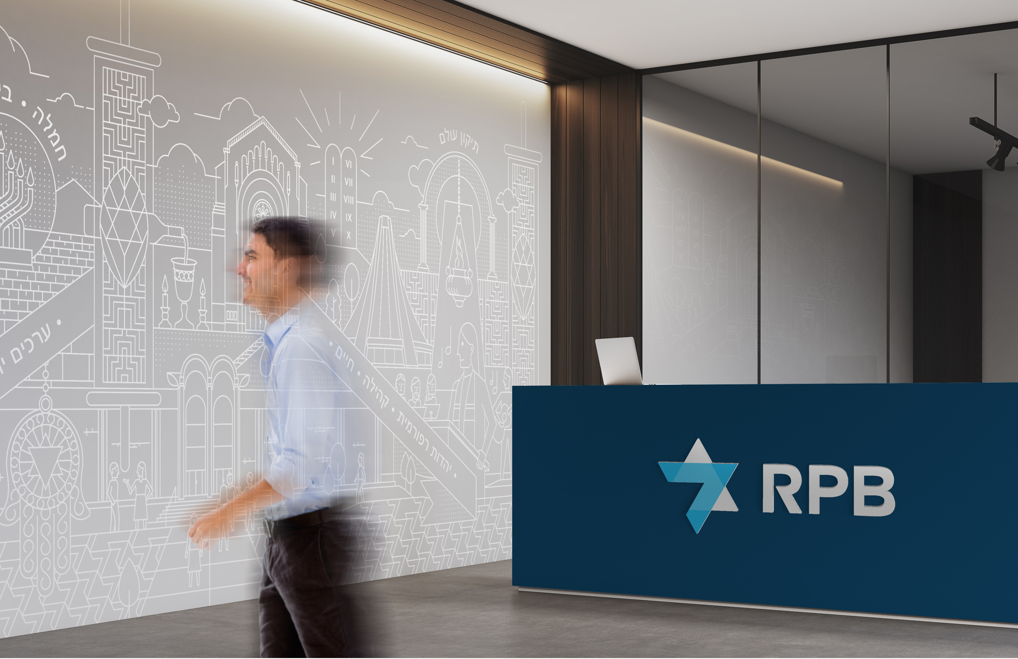
We designed a signature pattern for RPB and use it in swatches and as backgrounds across the organization’s communications materials. It contains symbols and illustrations related to RPB participants, including Reform Movement synagogues, Israeli landmarks, religious icons, and traditions.
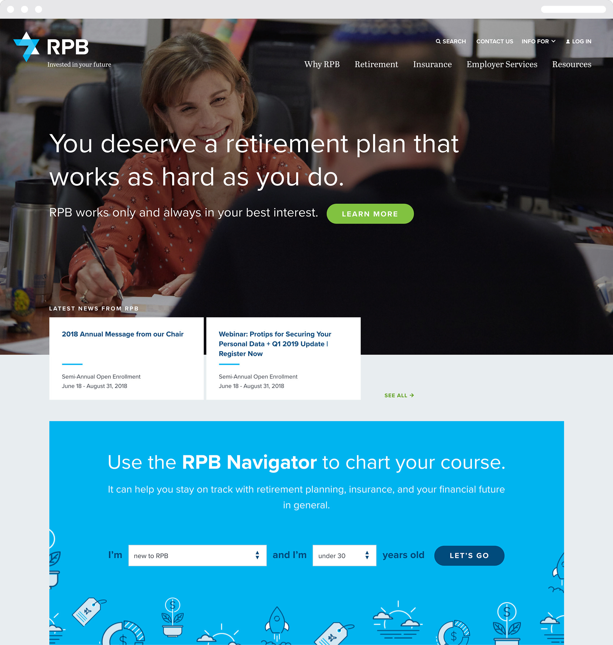
The website features custom photography of actual plan participants and RPB staff, conveying the warmth and caring of the organization. The site’s navigation guides participants through the information they need in order to understand the plan and other benefits RPB offers. We designed the RPB Navigator as a way for participants to quickly identify what they need to be doing and thinking about to prepare for retirement, based on their age.
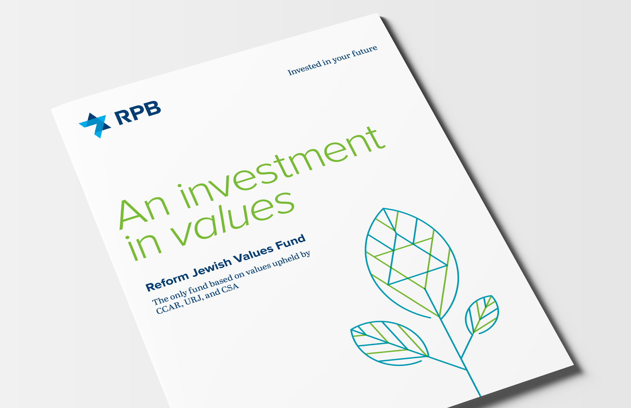
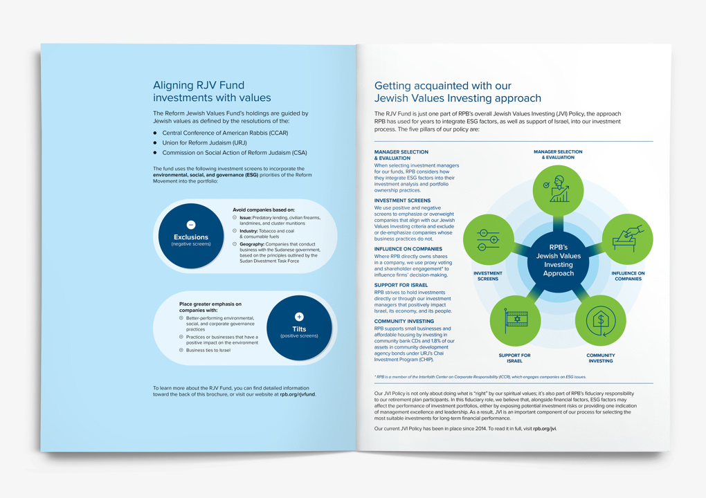
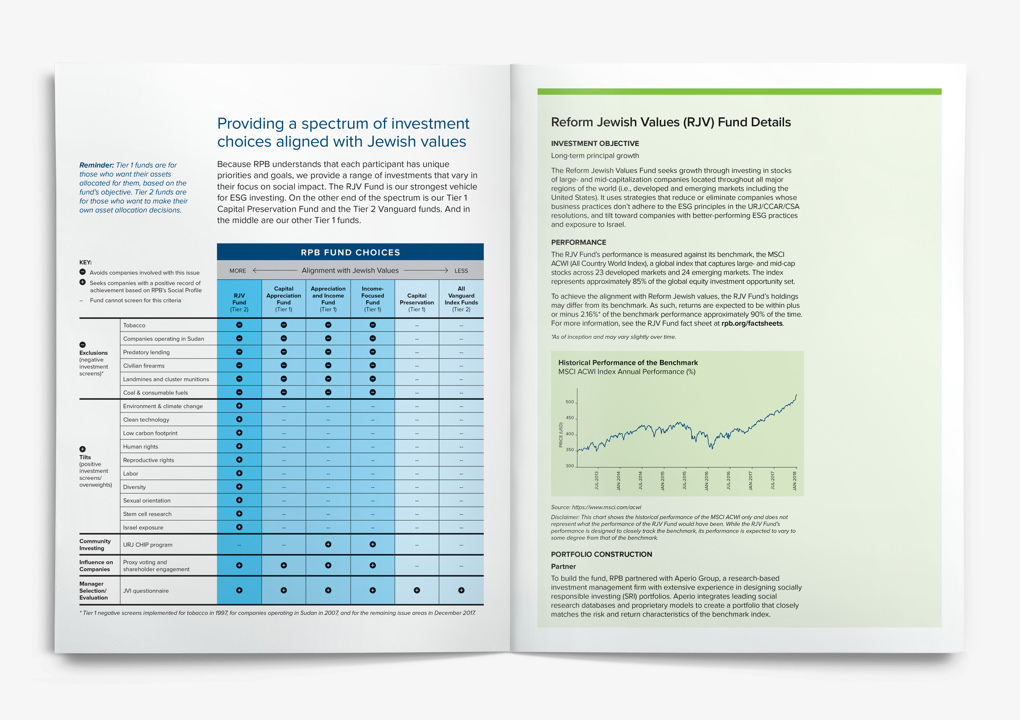
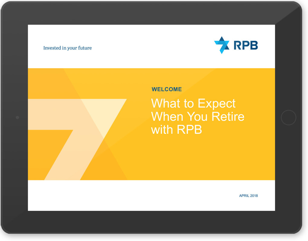
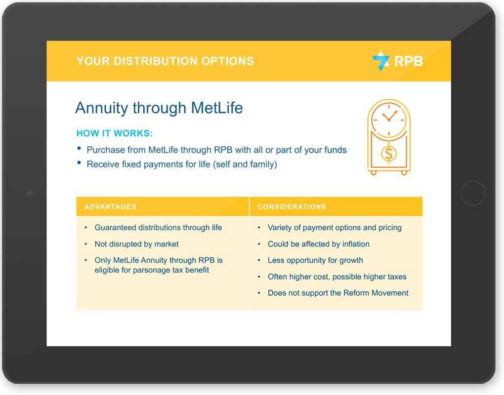
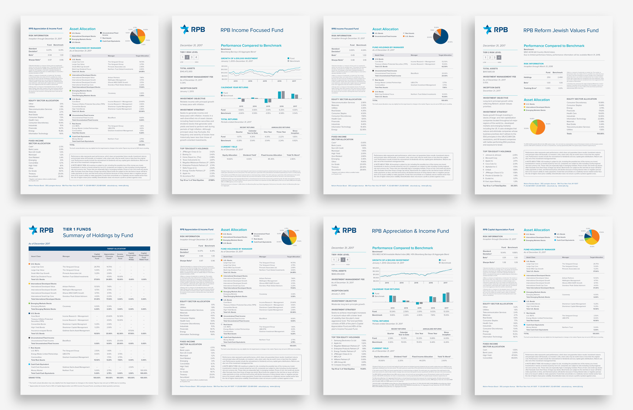
Written in simple, engaging language, these product brochures, slide shows, and fund fact sheets reflect RPB’s bright, positive brand identity while still feeling credible and businesslike.
With videographer Matthew Septimus, we wrote and produced this video to give participants and employers a quick overview of what RPB is all about.
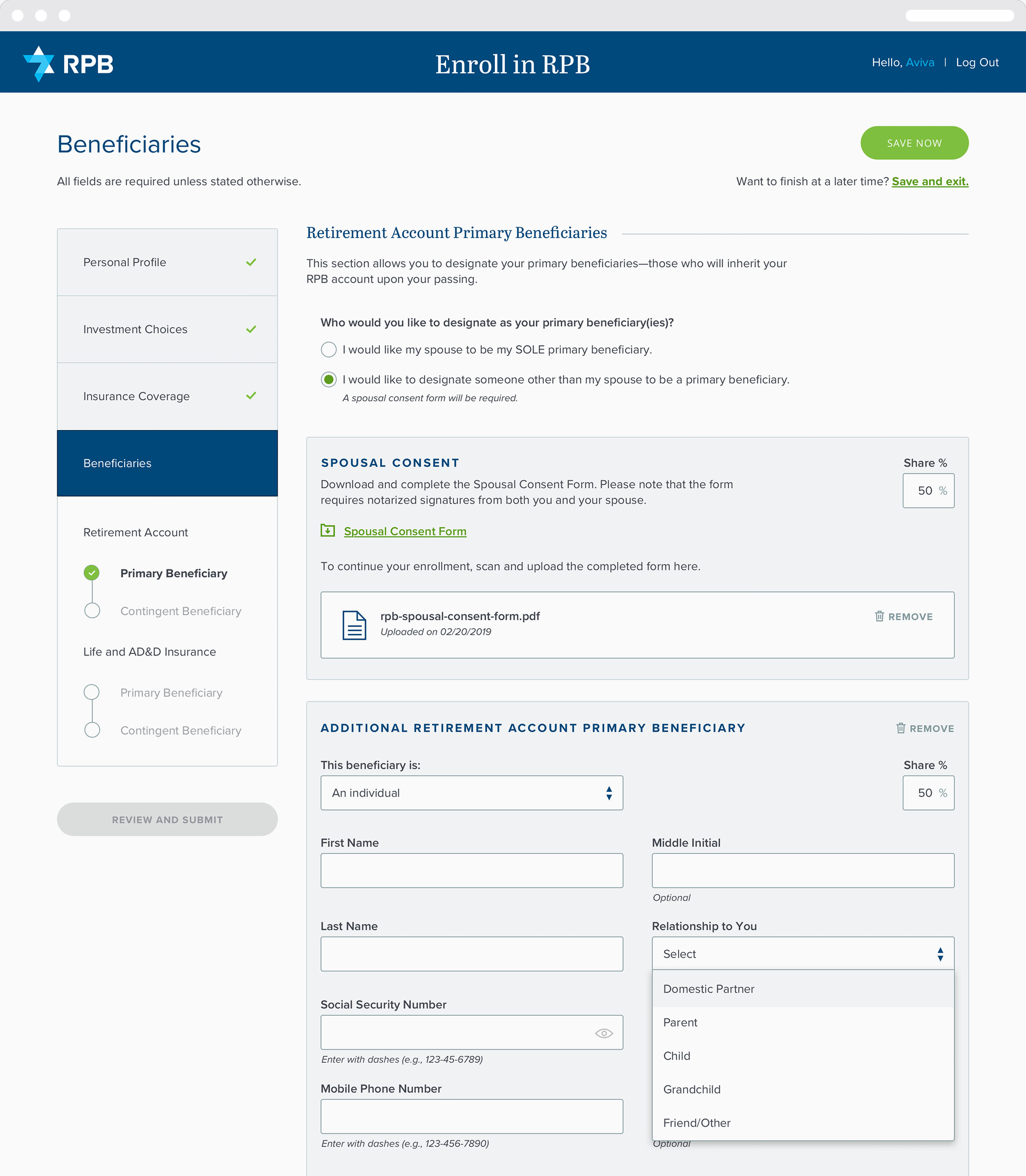
Thinkso worked with RPB to design the user experience and interface for their new enrollment portal.
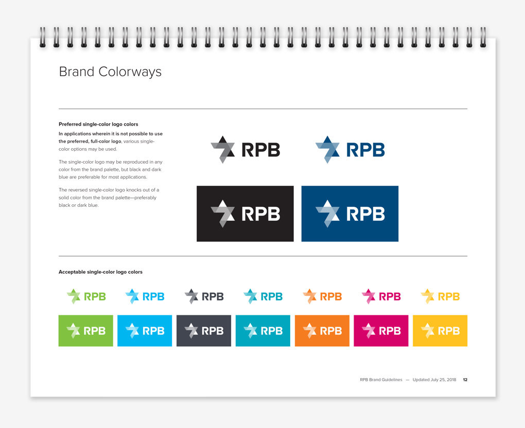
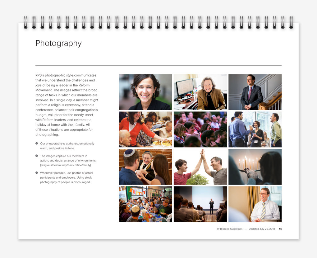
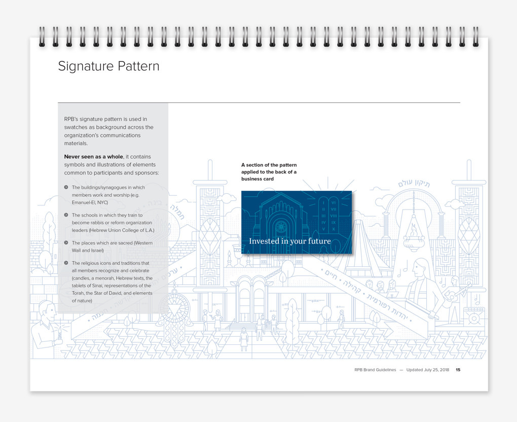
A simple brand guidelines document ensures that the new identity is used consistently and properly by RPB and its consultants.