Sarah Kauss was on a mission: to decrease pollution caused by plastic water bottles and improve hygiene, sanitation, and access to safe water in developing countries. In 2006, she turned to Thinkso to name and brand her start-up. The friendly name that we developed was inspired by the idea of a gathering force, and of course, the focus on water. To make it more distinctive, we added a twist. An apostrophe shaped like a water droplet created a conjunction that stood in for the organization’s core beliefs: “Sip well. Serve well. Sleep well.” Today, S’well is a $100 million company. Their bottles — and our logo — can be seen everywhere from Oprah’s Favorite Things list to Target to airports around the world.

BACKGROUND
In 2009, Thinkso was approached by the founder of a mission-driven, for-profit start-up named “Can’t Live Without It.” Its first product was a double-insulated water bottle, specially designed to keep drinks cold for 24 hours or hot for 12. But what truly set it apart was its vision: The company’s founder was deeply committed to contributing to clean water initiatives and eliminating the global scourge of plastic water bottles.
APPROACH
We decided that “Can’t Live Without It” was better suited as a holding company for future products, and that we should put our time, energy, and limited start-up budget into a distinct name and brand identity for the water bottle itself.
One of the options that our naming exploration produced was “Swell,” which we liked because of its layers of meaning. “Swell” alludes to a wave or another kind of gathering force, speaking directly to the company’s mission-driven ambitions.
“Working with S’well’s founder early on in her start-up process was key to its successful naming and branding. Six years and thousands of bottles later, the work has not only endured, but has helped define a category.” Brett Traylor, Senior Partner, Thinkso
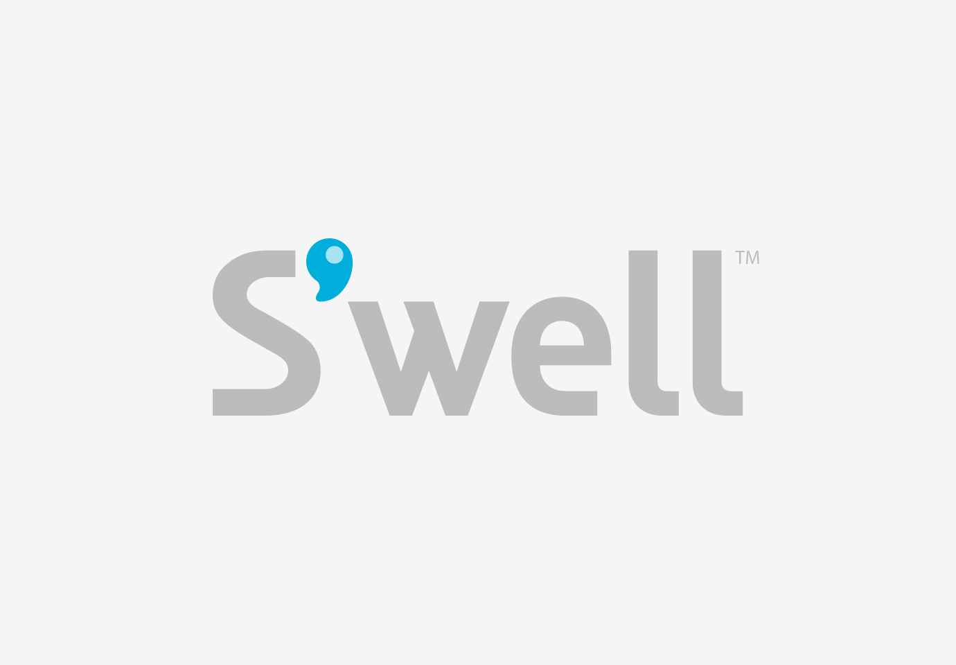
But with an apostrophe between the “s” and the “w,” “S’well” became a conjunction for the brand’s positioning statement: “Sip well. Serve well. Sleep well.” To make the name even more distinctive, we turned the apostrophe into a symbol — a water droplet, built right into the custom-drawn logotype.
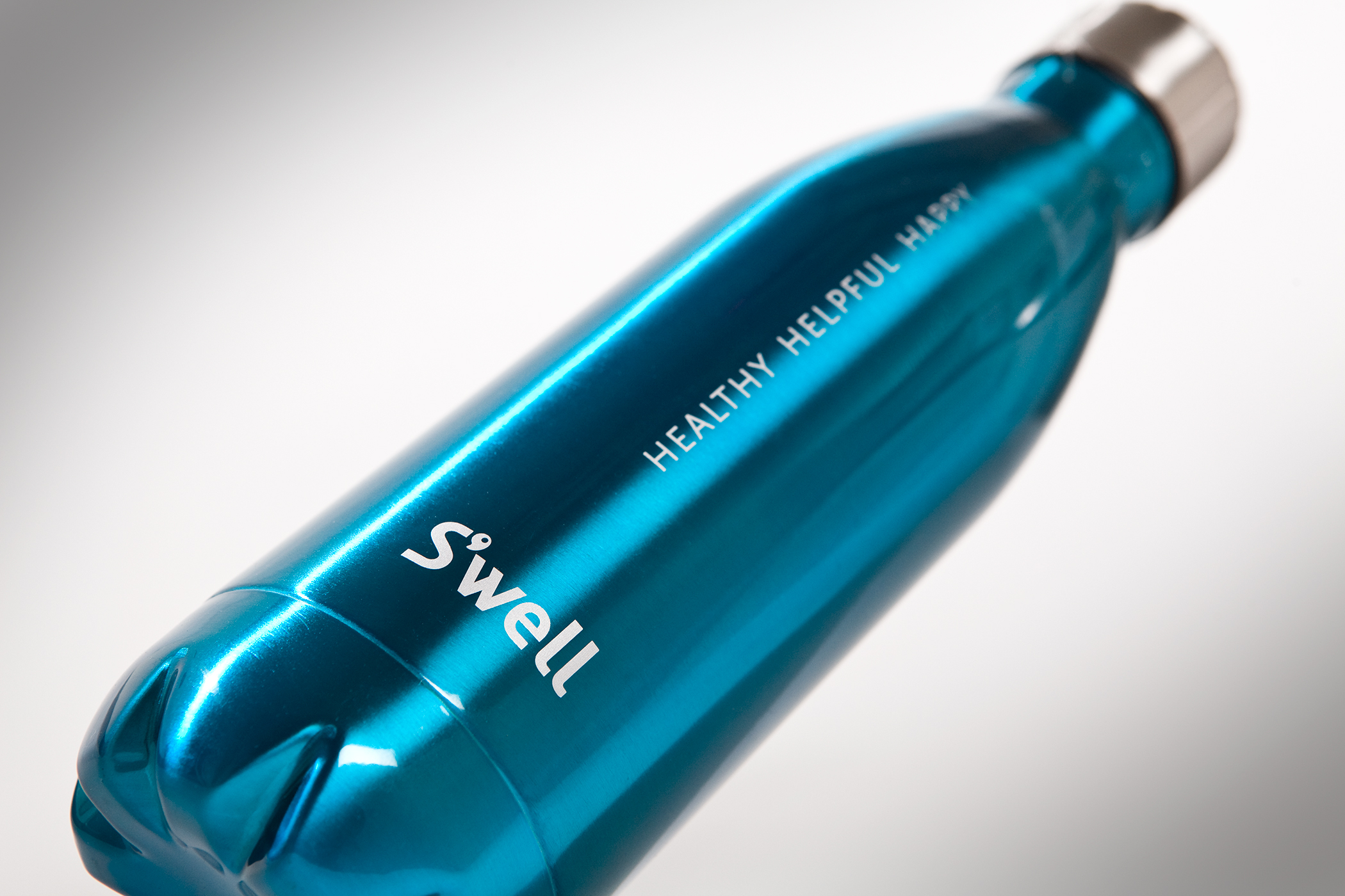
When designing the look of the original S’well bottle, we used an anodized cyan that reflected the brand’s core color, and included a simple treatment of the “Healthy, helpful, happy” tagline.
Taken as a whole, the name, conjunction, and overall look-and-feel differentiated the bottle significantly, which strengthened the burgeoning brand and positioned it for a successful launch.
RESULT
Working with start-ups is challenging, but fun. Because we were engaged with the product from its inception, we were able to help lay the foundation for what has become an enormously successful brand.
Today, S’well bottles come in many different colors, designs, and sizes (even one large enough to carry a full bottle of wine!). They are sold in 35 countries worldwide, and have become a leading water bottle brand in the US. The thousands of bottles sold have prevented millions of plastic containers from reaching landfills. And in keeping with the founder’s vision, hundreds of thousands of dollars have been donated by S’well to water projects all over the globe.

Before the current explosion of colors and patterns, the original, Thinkso designed S’well bottle, was blue with a silver cap and included the “Healthy, helpful, happy” tagline.