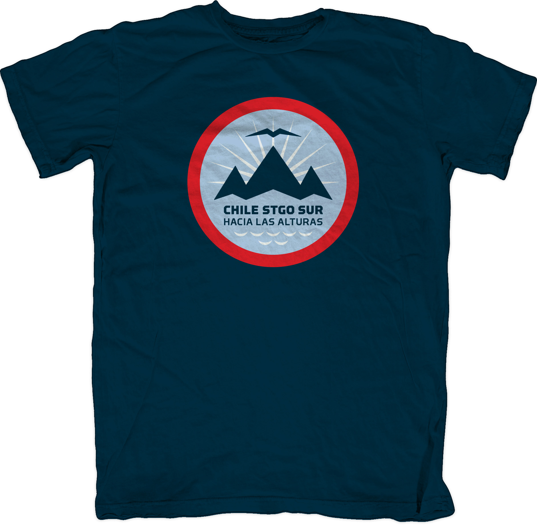
Branding, big tobacco, and the Mormon Church
 Alright, so the title definitely sounds more scandalous than it actually is. This isn’t really an exposé of the LDS Church. But I had to do something so that the search engines would pick up the story.
While the majority of you know what you know about Mormon missionary service from having seen a certain Tony Award-winning Broadway play, I’m here to tell you that the real thing is about half as musical and twice as eventful as what’s portrayed on stage. The time I spent as a missionary was the most exciting, difficult, and enlightening of my life. This is just an interesting side note, really, but it provides an interesting, entertaining commentary on the value of design and the importance of protecting intellectual property.
When I arrived in Santiago, Chile in 1991 as a fresh-faced 19-year-old missionary, I sat down for my first monthly interview with my mission president, the man appointed by the Church to direct the work within that given geographical slice of the globe. After talking for a bit, I shared with him that I had just completed my first year of design school at BYU. He responded by asking me to design a logo for the mission: La Misión Chile Santiago Sur.
In my professional experience, I’ve learned to be wary of requests for free work, but I was inexperienced and on the Lord’s errand, so I agreed to help. Besides, nobody was going to join (or leave) the Church based on what I might do. The Church of Jesus Christ of Latter-Day Saints spends a lot of money and energy on their public-facing image as it is. This little mission logo wouldn’t try to replace or circumvent that effort. Still, I left that interview thrilled to be doing something so important.
As I made my way to the lower-middle-class suburb of Santiago where I was to labor for the next three months, it occurred to me that I had very little in the way of time or material to actually execute such an assignment. We did missionary work 14 – 16 hours a day, seven days a week, with only one morning dedicated to personal time. This was still pre-Macintosh and the only art supplies I had were the colored pencils that I used to highlight verses of scripture. But I forged ahead, and created a hand-drawn logo that included, at my president’s request, an eagle — combined with an abstract Chilean flag and the phrase “Hacia las alturas,” which translates as “Toward the heights.”
I proudly presented my design to him at my next interview. He thanked me and seemed pleased, but like so many “freebie” clients, didn’t know exactly how to give feedback, resulting in lots of smiles, handshakes, and pats on the back, but not a lot of clarity on what should happen next. Several months went by without mention of the logo. I was so busy knocking on doors, learning Spanish and adjusting to life in South America that I didn’t really think about it either until one afternoon when I was paired-up to work with one the president’s assistants. He was a missionary like me but with more experience. I asked if he had heard anything about my logo. He did his best to sound official, mentioning something about the Chilean government not allowing any logos or graphic treatments that alter the national flag. “This wasn’t something mentioned in the brief,” I thought. And I had seen tons of examples of abstracted flags used for all sorts of things. “Besides,” he continued, “the president ‘found’ something he liked and we’re going ahead with it. But thanks.” Dejected, I headed back to the dirt road community of lean-tos I had been assigned to and continued teaching and preaching.
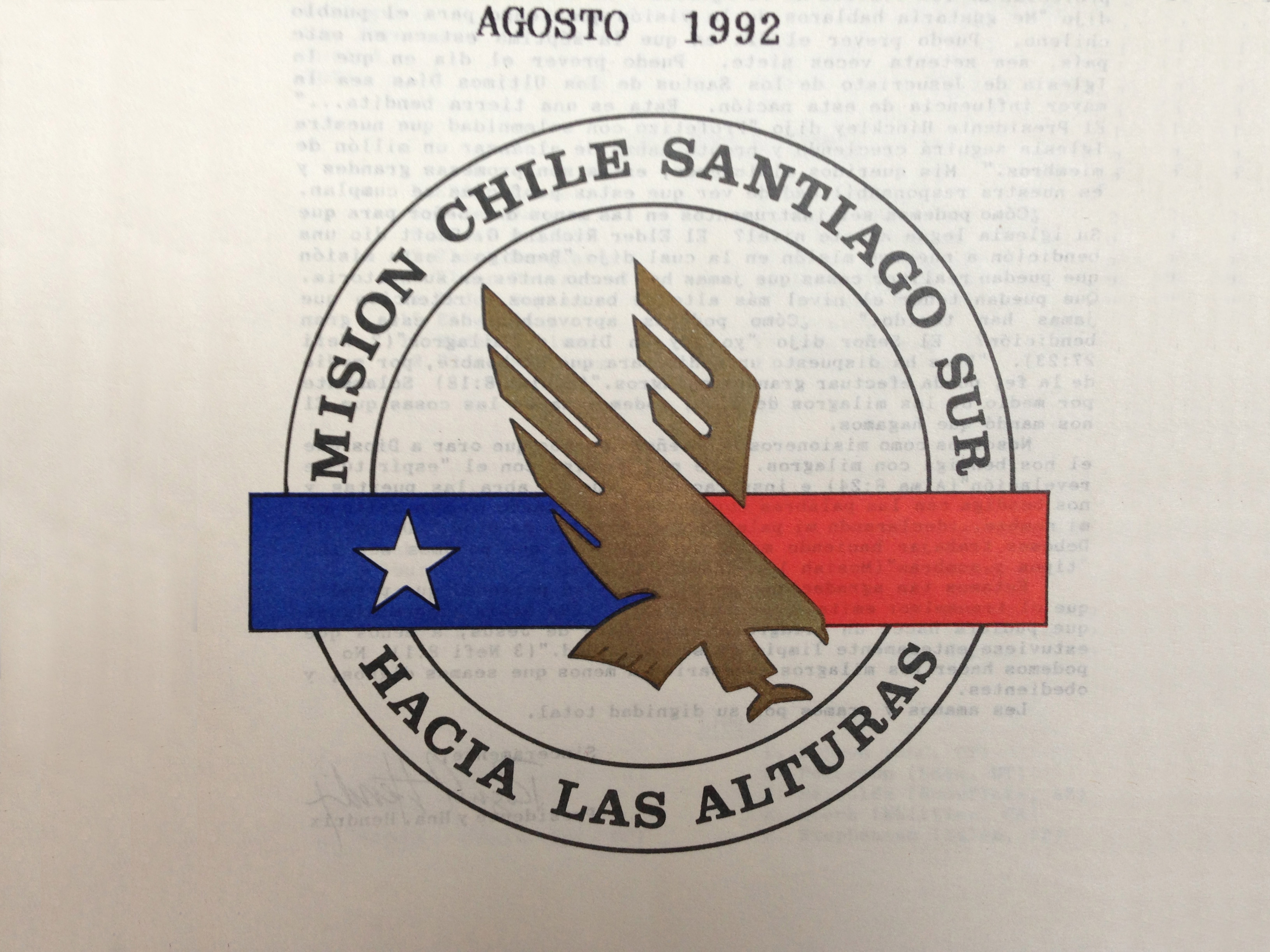
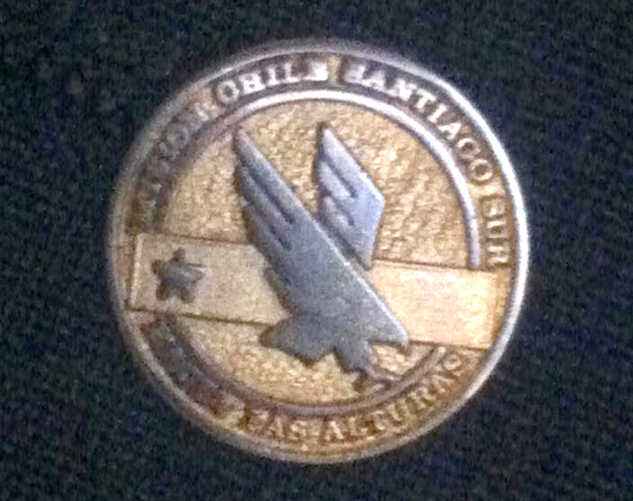
A few months later, the new mission logo rolled out. It used a stylized eagle in the middle of a circle with a band of blue, a band of red, and a star (was this not an abstraction of the Chilean flag?) I knew I had seen that eagle somewhere before, but the fact was that my logo didn’t get picked and I just needed to let it go. Besides, I was plenty busy being a missionary and didn’t have time to focus on it. I put it behind me and worked hard for the next 18 months — and didn’t give it another thought until two months ago.
This past summer, within weeks of each other, there were two new developments that resurrected this little story, and, even better, gave me the opportunity to redeem myself by completing the design project that I had been commissioned to do all those years ago.
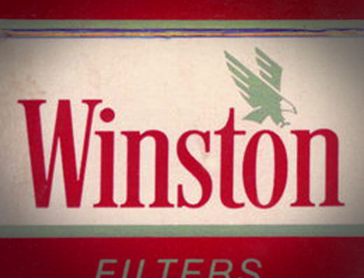
One night in August, while watching ESPN’s 30 for 30 production of You Don’t Know Bo, there was a clip of the 90’s era All Star, Bo Jackson, hitting a home run to right field. For a split second the camera panned across the bleachers over the back fence. And there it was: the unmistakable form of the stylized eagle my president had selected to represent our mission and that had defeated my meager, color-pencil proposal.
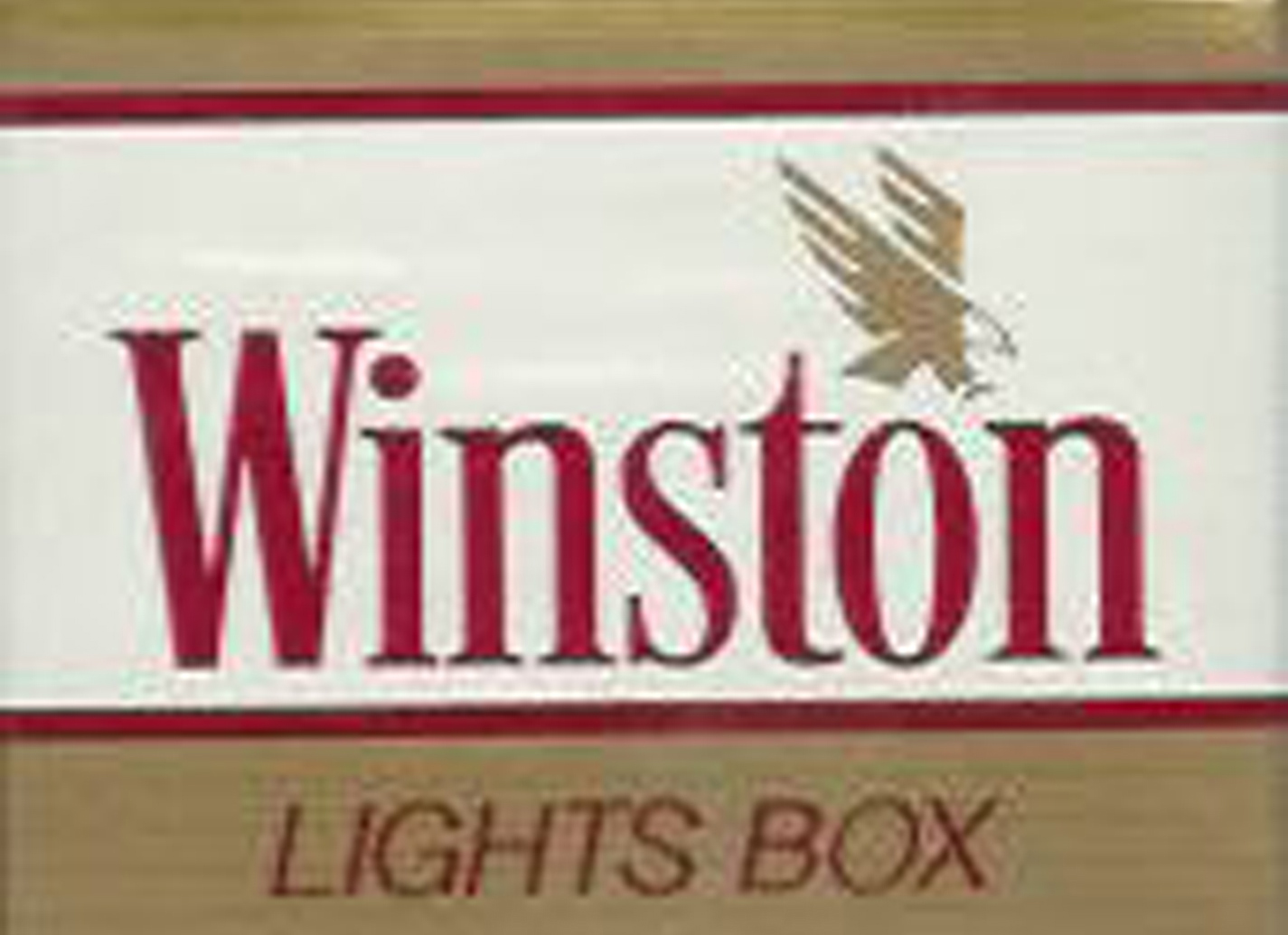
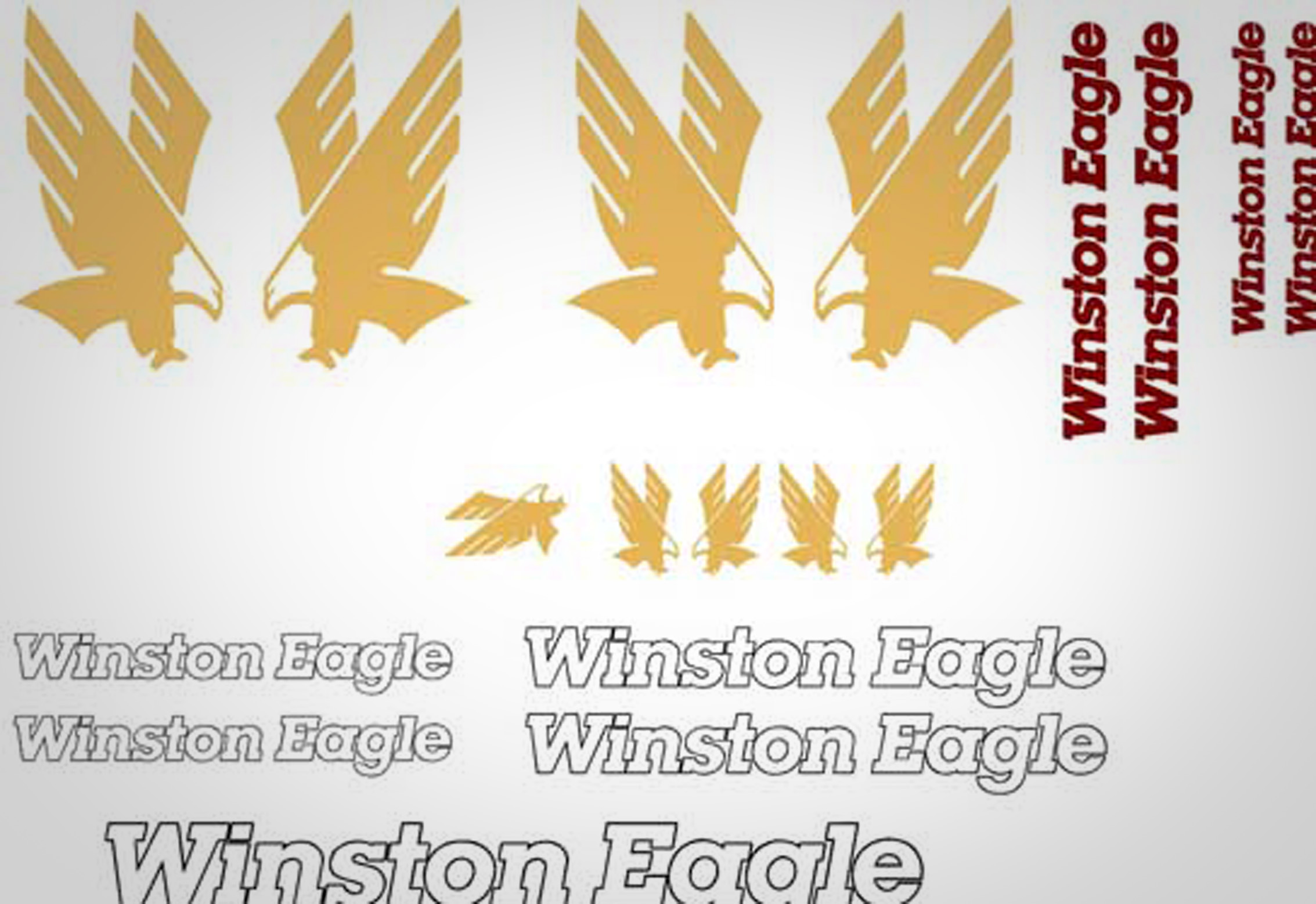
But what was it doing in Chicago’s Comiskey Park? As I rewound and replayed the .25-second clip, I soon figured it out. The eagle used in our mission logo wasn’t just a piece of clip art that my mission president had found. It was the logo for Winston Cigarettes, an RJ Reynolds Tobacco brand. Another company that spends a lot of money on their brand identity.
In addition to everything you learned on Broadway, you might also be aware that Mormons don’t smoke. In fact, tobacco is specifically prohibited for human consumption as part of the Word of Wisdom, a doctrinal code of health within our religion. So, yes, I was shocked. But I have to admit that I found the irony extremely entertaining. The fact that the Winston Eagle was flying around South America promoting cigarettes and Mormonism at the same time? What a discovery!
For most designers, part of the creative process includes researching what’s out there: seeing who has done what, collecting samples, comparing and contrasting, etc. So the fact that my mission president or his staff found and admired the Winston eagle, even though it might seem an odd source for inspiration for a group of Mormon missionaries, is perfectly understandable. What’s difficult to swallow is that somehow, at some point, somebody on the mission staff made the decision to lift that artwork and stick the mission name underneath it. I know in my heart that whoever made that decision would never steal a car or shoplift an iPhone, but no alarm bells went off when it came to swiping the Winston eagle. What would the LDS Church have said at the time if they found out? (Read their own trademark usage policies here) Is it something that RJ Reynolds would have been willing to just shrug off as harmless? Maybe. But maybe not. In my mind, however, the real crime here wasn’t the fact that the Winston Eagle had been repurposed, but that the decision to do so was such a no-brainer. It was just a drawing, after all.
The final and most exciting development occurred while browsing a group page on Facebook dedicated to missionaries that had served in the Chile Santiago South mission. Amidst the yellowed mission photos and artifacts posted there, I came across a post from a gentleman from Rochester, NY who had just been called to serve a three-year term as the new mission president of the Chile Santiago South mission. Among other things, he indicated that he had to create a mission logo. As part of his research on the subject, he was looking for information about an old version he had found from years before — one with a stylized eagle in the middle of a circle with a band of blue, a band of red, and a star. “Did anyone know the history of this logo?” he asked. “Well,” I began, “let me tell you what I know about it…”
The results
Eventually, the new mission president and I came to an agreement in which I resumed my design of the mission identity on a pro bono basis. I made sure that he committed to spending time helping to create a solid project brief, and that he would be available to answer questions and give feedback on what I would show him. Additionally, he promised to be a good collaborator and to take my recommendations as I provided them as long as I could reasonably justify why I did what I did. I gave him one design and did two rounds of revisions.
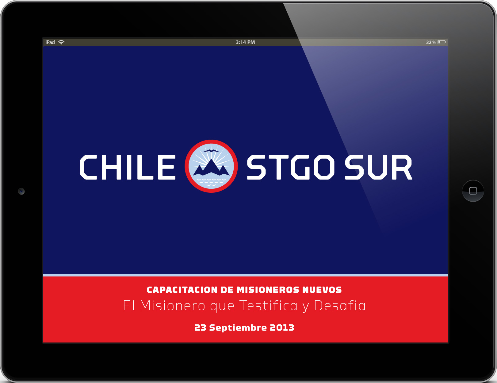
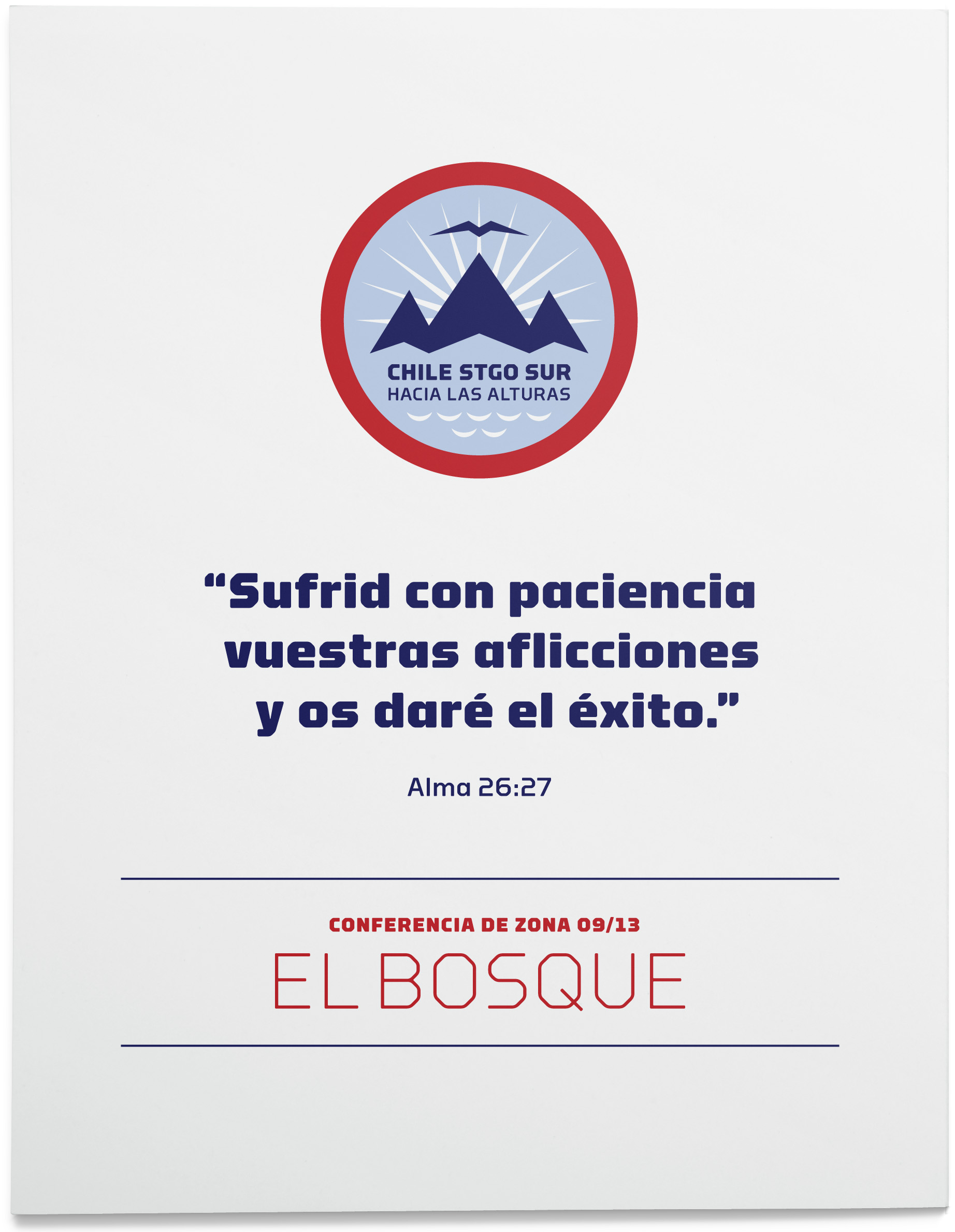
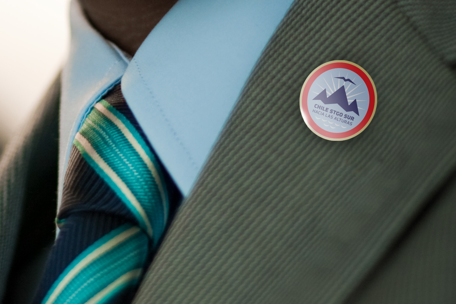
A mountaineer himself, the new mission president liked the idea of using the cordillera (Andean mountain range) in the logotype along with the legacy phrase “Hacia las alturas.” We decided that it would be important to represent those reaching for the mountain heights — the missionaries. The eagle from the former identity was too American, so we used a stylized version of a Chilean condor, the country’s national bird, instead. In addition to the obvious symbolism, there is an underlying reference to familiar Christian themes such as the Mountain of the Lord, the light of Christ, the descent of the Holy Spirit and the waters of baptism.
Lessons learned
- There’s a difference between being asked to do free work and agreeing to work pro bono. The first is most often a no-win situation for both designers and their clients. It devalues the work and cheapens the creative process. Pro bono work, on the other hand, is undertaken with a clear articulation of objectives, expectations, and “compensation,” even if that just means a formal agreement to uphold them. A scope is defined and each party works to deliver on their end of the agreement.
- Looking at the work of other designers to grease your own creative wheels is a perfectly acceptable practice. However, there is a line between inspiration and infiltration. While we may be influenced by what we see around us, we are legally and ethically bound to avoid plagiarism in any form.
- The business world, including design clients must learn to look at every logo, editorial concept, and visual execution as something that someone else paid to have drawn, conceptualized, or written, and that it is property just like a car or an iPhone and that using it without permission is stealing.
- Trademark and copyright laws are there for everybody’s protection, not just the owners of the intellectual property. If an organization is careless as to how it goes about communicating and representing its brand, it may be subject to legal trouble, unnecessary expense, or at the very least, the embarrassment of associating its brand with something entirely contradictory to the image and values it claims to embody.
- Not everything shown on Broadway is the “gospel truth.”
