Designer’s journal: Unexpected lessons
As a designer, I’m always looking for the most effective ways to communicate. So I keep my eyes open for new inspirations and fresh strategies. When my son Emerson and I started to read together, I found both in an unexpected place.
At Thinkso, many of our clients have complex businesses. Our role is often to help simplify and bring clarity to what they do. When I began reading storybooks to my son, I had an epiphany: These authors and illustrators use fundamental design strategies to achieve an essential level of communication that could, incredibly, keep a four-year-old raised in the digital age immersed and engaged. The designs are simple and clear, but still sophisticated and packed with meaning.
“Good children’s literature often parallels a designer’s basic goals: using visual language to communicate clearly, both intellectually and emotionally.”
It was an eye-opening experience, and one that reminded me of the value of design fundamentals (and fun), even when our grown-up subjects are serious and complicated.
Here are three illustrated children’s books that I think demonstrate those principles perfectly. If you have young kids, we recommend them. But even if you don’t, they can teach you something about effective design — even for sophisticated B2B and professional services brands.
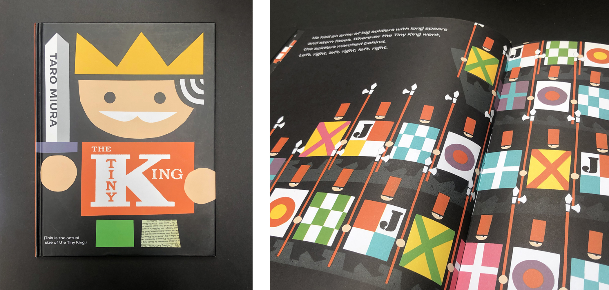
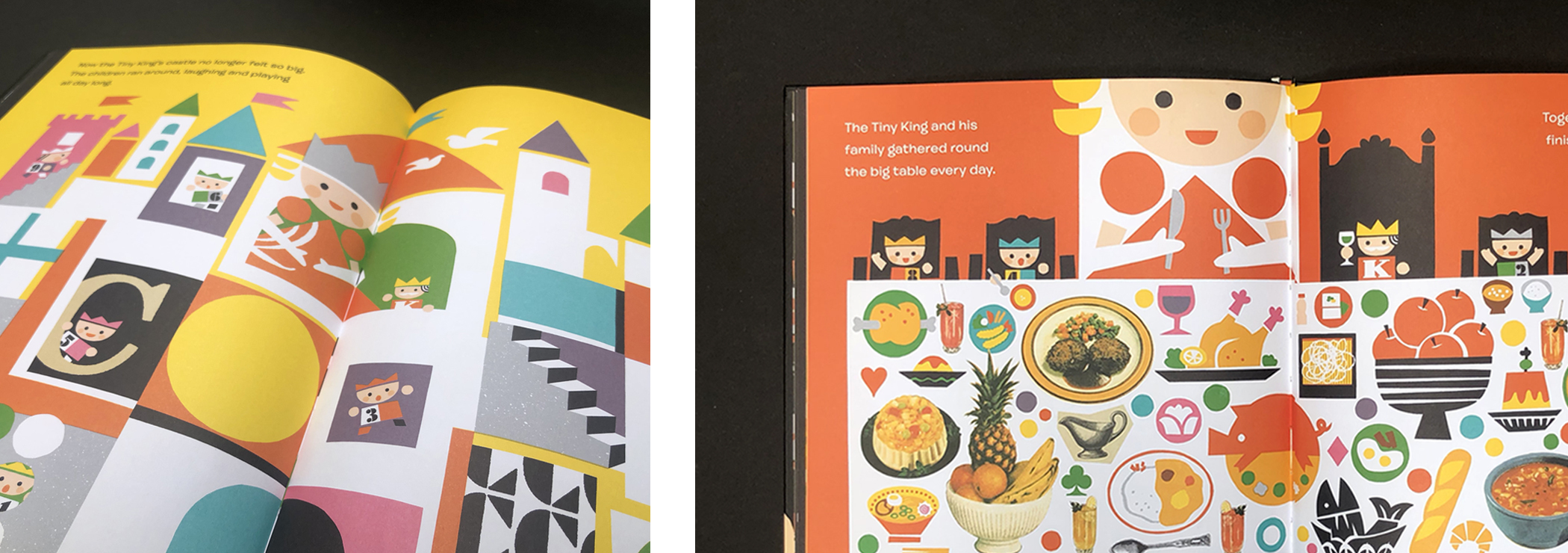
The Tiny King by Taro Muira
This beautifully designed book is a lesson in fundamental design, using visual, spatial, and idea-based patterns to build a rich narrative. The elements are basic — geometric shapes, a mostly primary color palette, and collaged and cut-out photos. Put together, however, they demonstrate aesthetic sophistication and elegance, and capture the spirit and emotion of the story without fuss or cleverness.
Building groups of patterns and images is one of the strategies we use in developing brand identities. These building blocks add visual cues, depth, and a sense of cohesiveness to brand materials. Taro Muira’s fundamental, yet sophisticated approach illuminates how these systems work and when and where can use them.
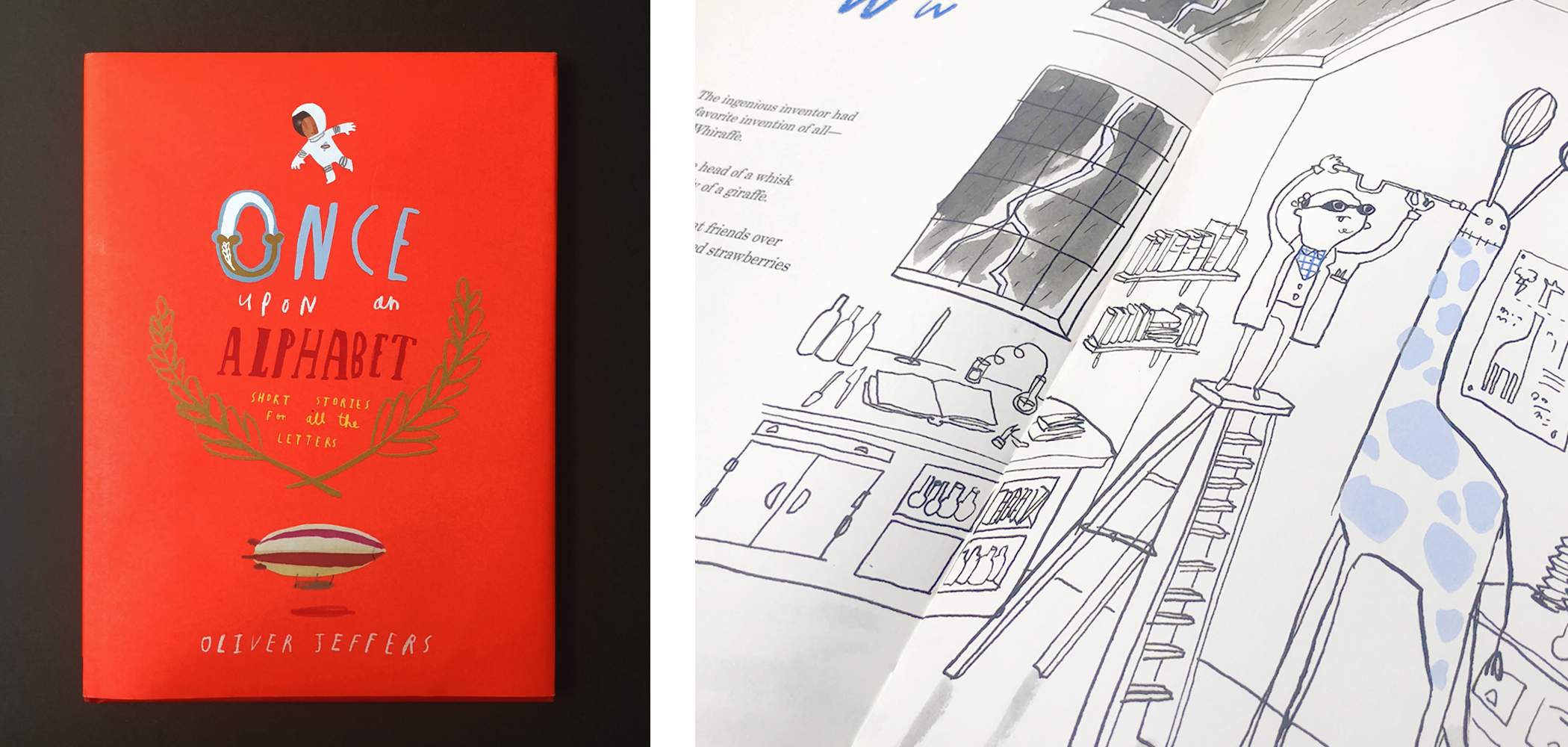
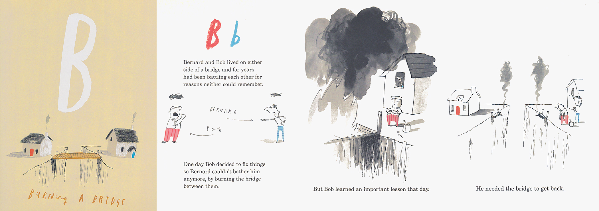
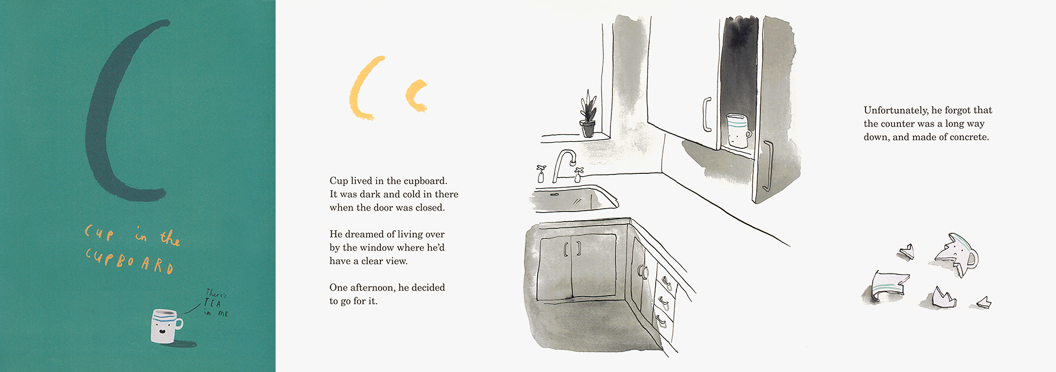
Once Upon an Alphabet by Oliver Jeffers
Executing simplicity without being generic, boring, or overly minimal is hard, but Mr. Jeffers — with his playful and imaginative style — shows us how it’s done. He proves that concepts and narrative, even when illustrated in stylish detail, can be conveyed in simple and streamlined ways for ultimate clarity.
From Jeffer’s approach, we can take away the value of clear space in the compositions as a way to focus the eye and emphasize what’s important, and also when and where to add detail to slow the viewer down and give them a chance to figure things out — a important value that can get lost in our high-speed digital world.
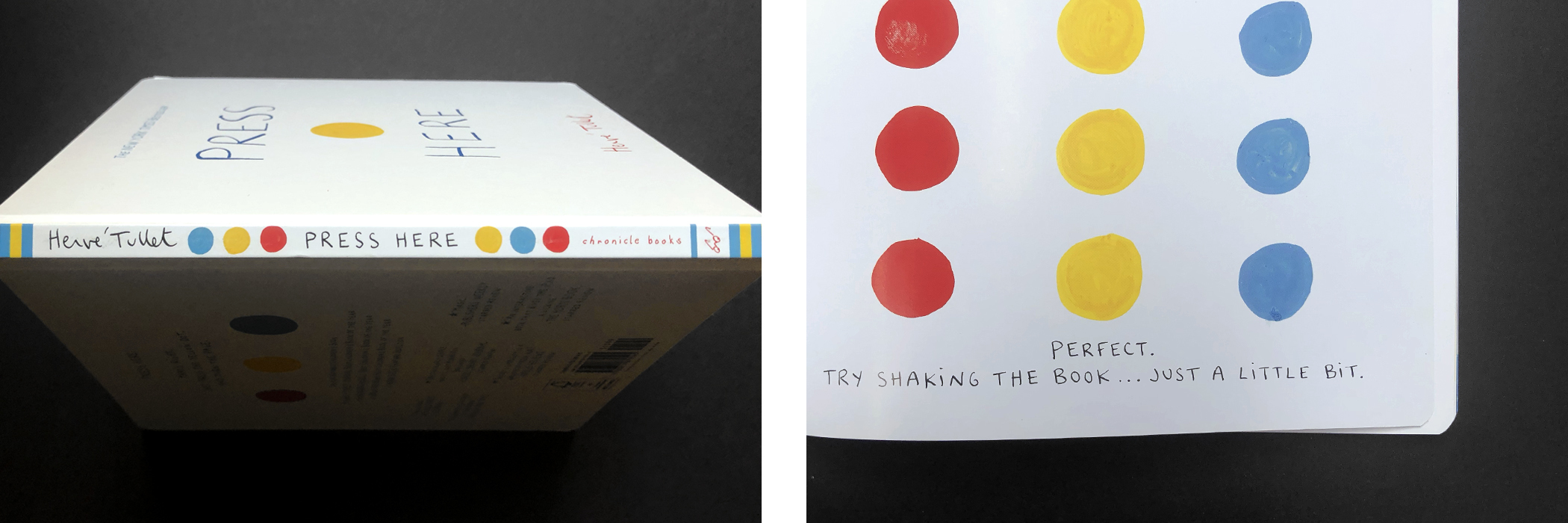
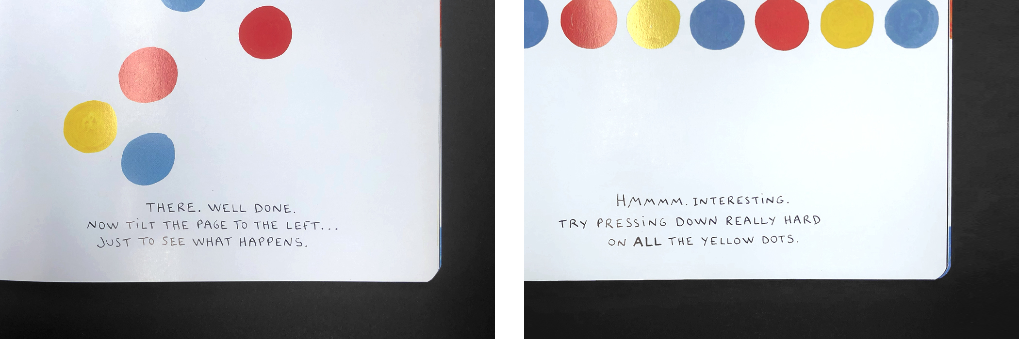
Press Here by Hervé Tullet
When we hear the term “call to action” we don’t necessarily think about it in terms of design. But in many fundamental ways, design can be used to model a viewer or reader’s actions — and more importantly in today’s digital world, his or her interactions.
In Press Here, Hervé Tullet breaks user interaction down to the basics, empowering the reader to actively participate in the story, and giving them payoffs after each interaction. We can all learn something about user experience from his clear and basic approach — especially when we’re asking our audiences to navigate the kind of complex and multivariate experiences found in today’s web and app environments. Often, it pays to keep Tullet’s simple action/reaction/reward approach in mind. Of course, he keeps it fun with a dash of the unexpected now and then — another thing we can learn from.