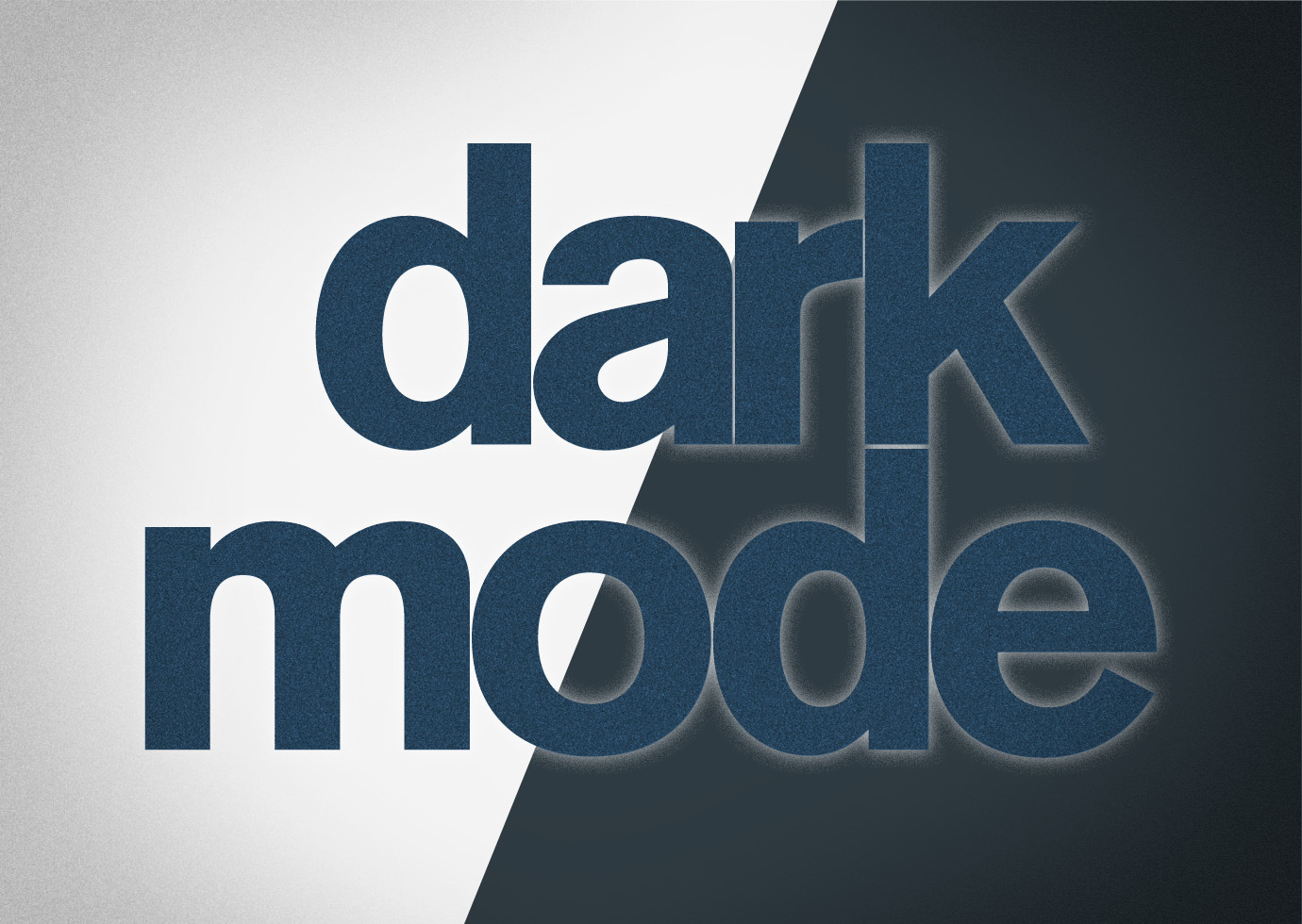
Designing email for dark mode
Although the concept originated on computers in the late ’70s and early ’80s, dark mode has re-entered the mainstream. Android and iOS introduced dark theme and dark mode, respectively, on their devices in 2019. Since then, nearly 300 apps — including Facebook, Twitter, Slack, Gmail, and Microsoft Office — now support dark mode, and users have quickly adopted the setting. A 2020 Litmus study found that 36% of iPhone users reported using dark mode, while an early 2020 poll from Android Authority reported that nearly 82% of its base prefers dark mode.
As more people opt into this device setting when absorbing information and engaging with content, it’s important to consider the design implications of dark mode — especially in your email marketing. Dark mode automatically changes the colors in an email, making light colors dark and dark colors light. This means that your logo, color palette, and graphics could dramatically shift in vibrancy and legibility, making your eblast harder to read and understand. But there are simple design steps you can take to ensure your emails are dark mode-friendly. Here are 3 things to keep in mind when creating eblasts so that maintain design quality for your dark mode readers.
- Use images and graphics with transparent backgrounds. With the exception of social media icons, using images with transparent backgrounds will allow the background color to change more seamlessly between light and dark mode while keeping the design still intact, creating a consistent, polished look and keeping your template design from looking cheap.
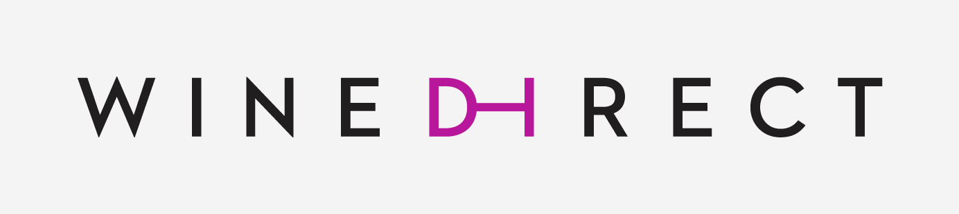
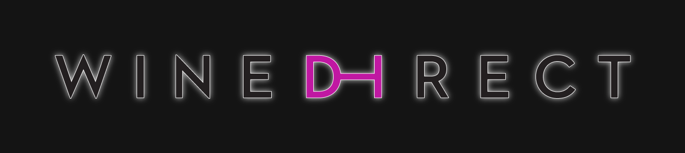
In the example below, you can see which images have a transparent background (e.g. the “Buy Now!” button) and which ones don’t (e.g. the lightning bolt). - Make adjustments to logotypes and other iconography to ensure they work on both light and dark backgrounds. The goal is to preserve the integrity of your brand identity when dark mode switches your logo on a white background to a dark background.In this example, you can see, in the first image, the original WineDirect logo on a transparent background. The second image shows what it looks like in dark mode. To rectify this, as shown in the third image, we added a thin stroke to outline the WineDirect logo and applied a white drop shadow to create further separation. Those don’t show up in light mode but protect the integrity of the logo in dark mode.

Whichever technique you and your designer ultimately settle on, err on the subtle side. A little goes a long way in dark mode.
- Always test your emails in dark mode before sending them out. This is best practice with any eblast, only now, make sure you’re sending the test to a device using dark mode, too. You can also use a tool like Litmus or Email on Acid to see how your eblast design will render in a wide range of email clients and on various devices and operating systems.

(Image source: Medium)
You can find out how many recipients on your list use dark mode by using tools like Litmus Dark Mode Detection. But automatically designing with the dark mode pitfalls in mind helps ensure that your eblasts will be clear and compelling, no matter what setting someone uses on their device.