In the beginning: John Klotnia
 “In the Beginning” is an ongoing series dedicated to providing snapshots of how various designers were inspired to enter the creative industry. John Klotnia is a Partner at Opto Design in New York.
What is your earliest design inspiration/impression?
Cigarettes and Beer.
Looking back, I recall two distinct design memories, one influenced by cigarettes and the other, beer. As a kid, I found cigarette packaging fascinating. Clean rectangular packages wrapped in folded cellophane, foil labels and flip top lids enclosing perfect white paper cylinders filled with tobacco and lined up in orderly rows.
Winston looked best to me. In the fourth grade I especially liked the experience of purchasing cigarettes from a vending machine. A neat display of buying options, insert a few coins, a mechanical pull on a plastic knob attached to a metal rod and the soft skidding sound of a pack sliding into view below. Beautiful, and I liked the smell of tobacco too.
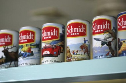
Beer on the other hand smelled awful, but there too I was completely floored by the packaging. I had a vast collection of beer cans gathered from roadside ditches and the trashcans of Illinois. Beer cans in all sizes and shapes, tall boys, cone heads, flat tops, and the occasionally gigantic, Fosters Lager (found well before we learned to speak Australian.) One brand I truly loved for their design and visual ideas was Schmidt beer. Schmidt had a simple white can, red label with yellow trim and a knocked-out Gothic font. But what I really liked was their use of illustrated vignettes: wild deer and race cars, jumping fish and grizzly bears all majestically adorned their product line creating these little 12oz billboards of the great outdoors. Beautiful.
What was the first project you worked on as a professional designer?
I designed a 20-page price list for a furniture company named Cadsana while working for Bonnell Design Associates. A brutal entry into the complicated world of typesetting instruction, type fonts, measured tabs and various weighted rules. I had no clue how to communicate what I wanted and I have no idea how it got done, but it did. It was a great lesson for me on my transformation from student to designer.
What is the most memorable/meaningful project you’ve worked on to date?
After 70 years of enjoying a visually logo-free existence, the Ford Foundation hired me to design their mark and brand and to capture Ford’s role on the front lines of social change throughout the world. Awesome experience.